4 Step Process for Testing New Product Ideas with Landing Pages
Using landing pages to test new product ideas is a smart strategy. And, it’s not too complicated. The process can be boiled down to four steps.
But, what makes landing pages a useful tool to test new product ideas? Landing pages are quick to set up; it’s one of their biggest assets. You can use an app like Startup or Slides for a quick mockup. Additionally, many landing page builders, like Unbounce, come with A/B testing features. When you take the time to optimize and iterate on your landing page, your test results become more substantial.
This process isn’t exclusive to testing product ideas, either. To name a few, you can also test:
- New business ideas
- New service ideas
- New feature ideas
- New funnel ideas
Let’s break down the process of creating an excellent landing page, step by step.
Step 1: Distill Your Idea
The offer you make on your landing page will significantly impact your test. That’s why it’s essential that you take the time to distill it.
Keep referencing your target audience’s needs and pain points to phrase your offer best. Otherwise, your offer won’t resonate with them. Even if you have the next billion-dollar idea, it won’t get validated if you can’t communicate your product idea’s offer clearly to your audience.
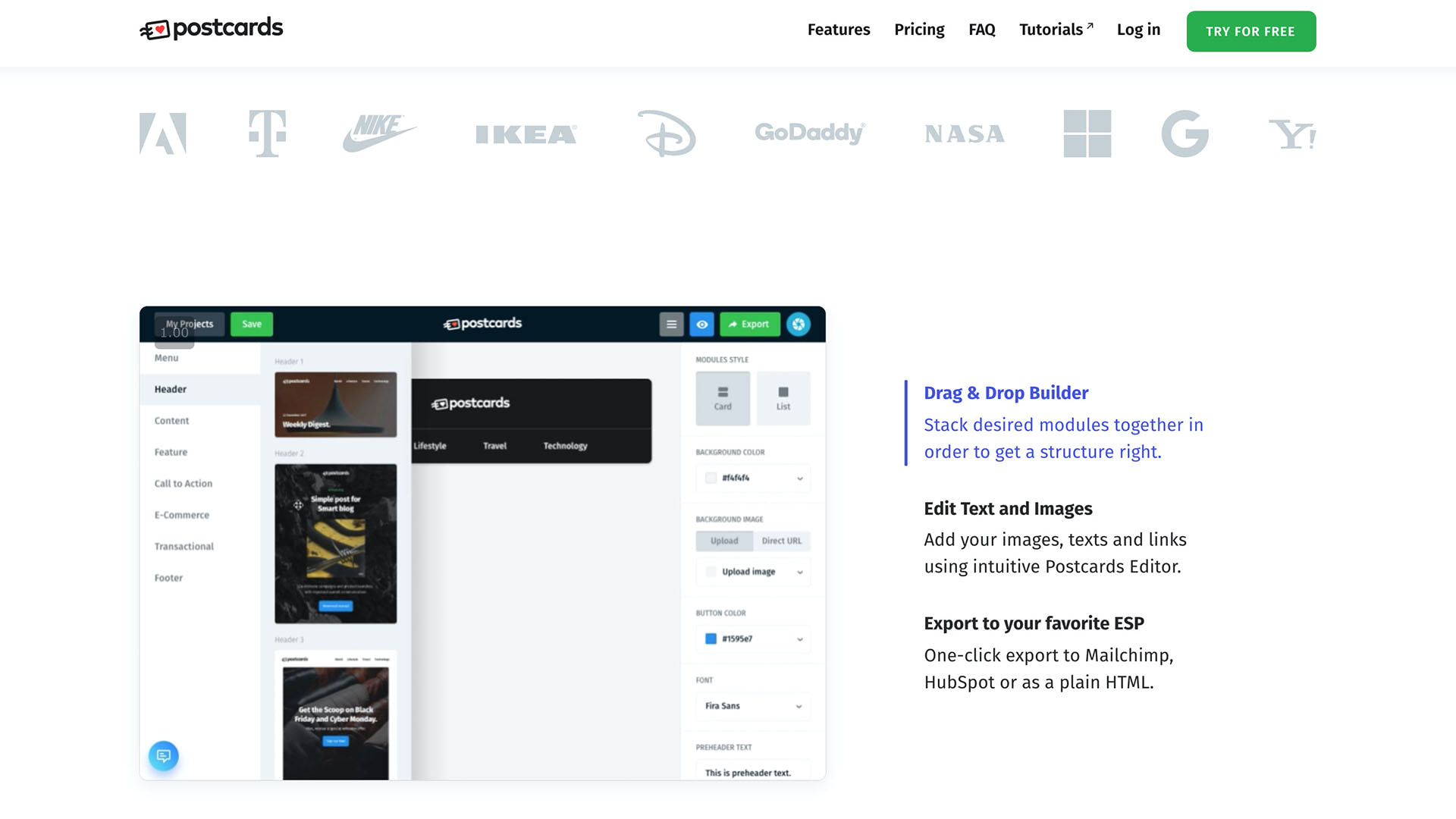
With Postcards Email Builder you can create and edit email templates online without any coding skills! Includes more than 100 components to help you create custom emails templates faster than ever before.
Free Email BuilderFree Email TemplatesYou will need to identify three pieces of information within your offer that you will showcase on your landing page. Those three pieces are:
- The problem the product solves
- The benefits or value propositions of your product
- Showing how your product will solve the problem
Pro tips for distilling your product idea:
- Remove as much jargon and ambiguity as possible
- Keep it short, sweet, and to the point
- Know your target audience and their needs
- For now, keep focus on getting the offer and message right
Double-check your idea
Turn what you’ve written (problem, value propositions, and solution) into a 30-second elevator pitch. Run it by someone who’s never heard of your idea to determine if your pitch makes sense. Then, run it by someone who fits into your target audience to gauge how relevant your pitch is to their needs. It may take a few tries to simplify your idea concisely.
Example elevator pitch
Here’s an example of a concept elevator pitch for Designmodo’s Postcards:
“Many professionals find it hard to create well-designed responsive emails quickly and reliably. That’s why we’ve created Postcards. Postcards is a drag and drop tool that requires no coding knowledge – anyone can use it. Easy to use, to design, to input content, and to export to any ESP. Fully compatible with all ESPs.”
Step 2: Build a Landing Page
Landing pages are quick and inexpensive to set up. It’s a big reason why they’re a great testing tool. After all, it’s not a proper campaign, but a test. The branding or visual design of the page doesn’t matter anywhere near as much as the offer for now. (If you follow accessibility and usability standards and you’ll be fine.)
If you feel comfortable creating your own landing page from scratch, go for it! However, using a page building tool is an easier and quicker option. You can use any one of the following page builders:
Read through our quick tutorial on creating a custom landing page with Startup.
With Pulsetic you’ll be instantly notified the moment your website, API, or server becomes unavailable. Monitor uptime from multiple global locations and respond to incidents before your users are affected.
Create beautiful status pages in minutes to keep customers informed during outages and build trust with transparent communication.
Start Monitoring for FreeHeading and subheading
Both the headline and the subheading have two distinctive functions. The heading captures the visitor’s attention and piques their interest further. Whereas the subheading gives them a taste of the solution and keeps them wanting more information with it.
Pro tip: If your elevator pitch can be boiled down to 10 words or less, make it your headline.
- 15 Contact Pages Showcasing Great User Experience
- UX and Content Strategy: How They Are Related and Why You Should Care
Examples of fantastic headlines
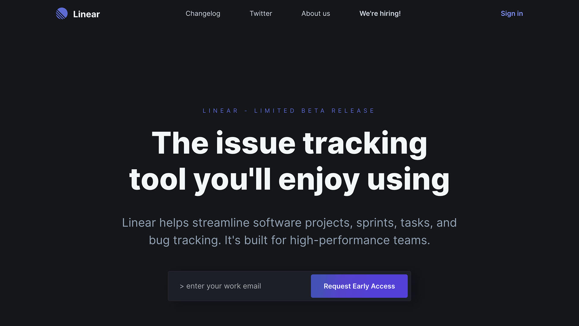
Linear’s heading and subheading get right to the point without beating around the bush or being unnecessarily cheeky.
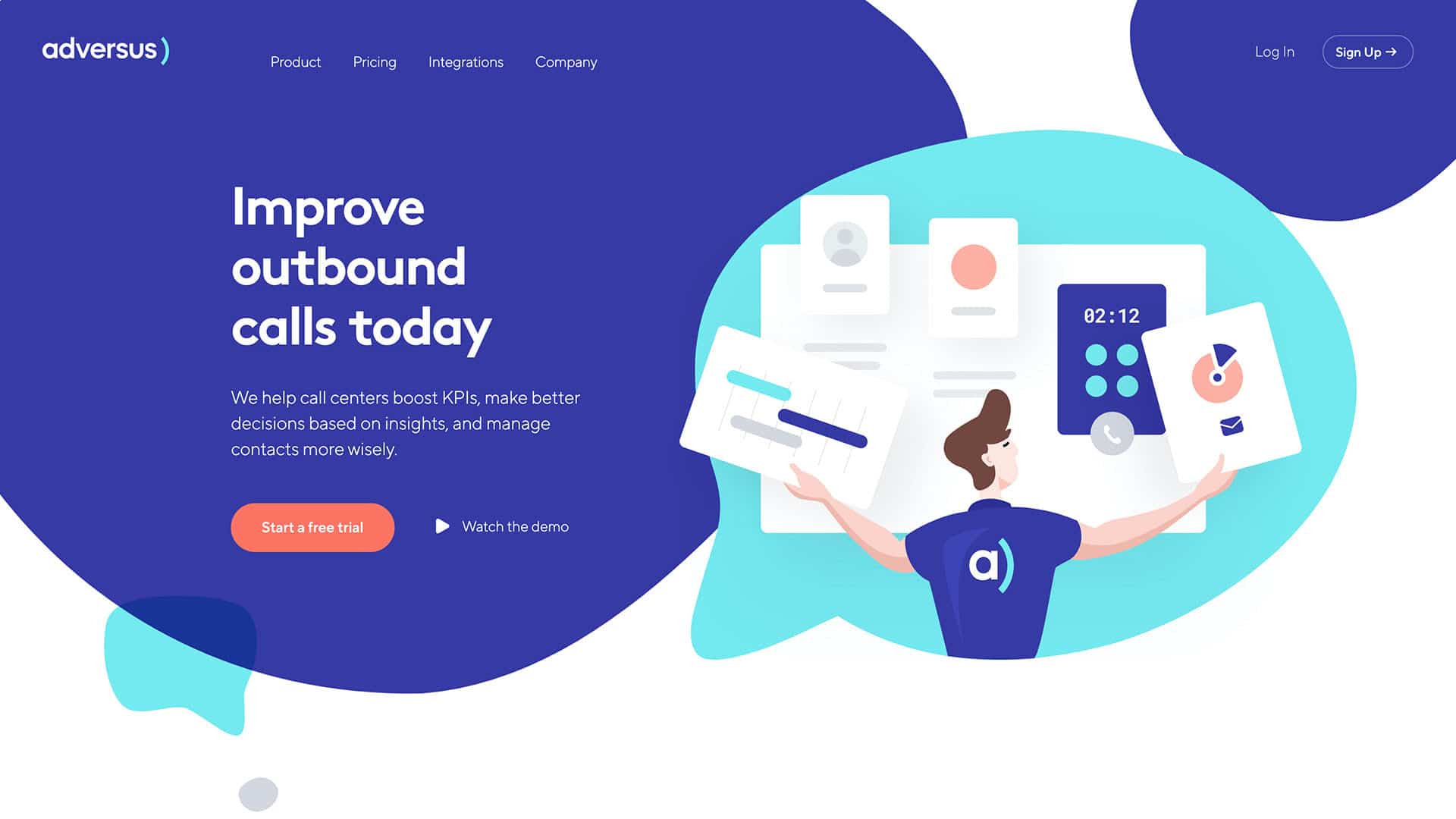
The same can be said for Adversus. Their headings are exceptionally well written.
Hero image
Use a hero image to show how your product will solve a problem. For example, you can show off the product in action or the effect of using the product. The keyword here is “show.” Visualize your product for the visitor. Our brains process images much faster, use that to your advantage.
Using images and visualizations throughout the whole landing page is also essential. However, the hero image is special because it’s the first one a visitor sees as they land on the page. It doesn’t have to be high-fidelity, perfect imagery. Stock photos are okay here.
Example of great hero images
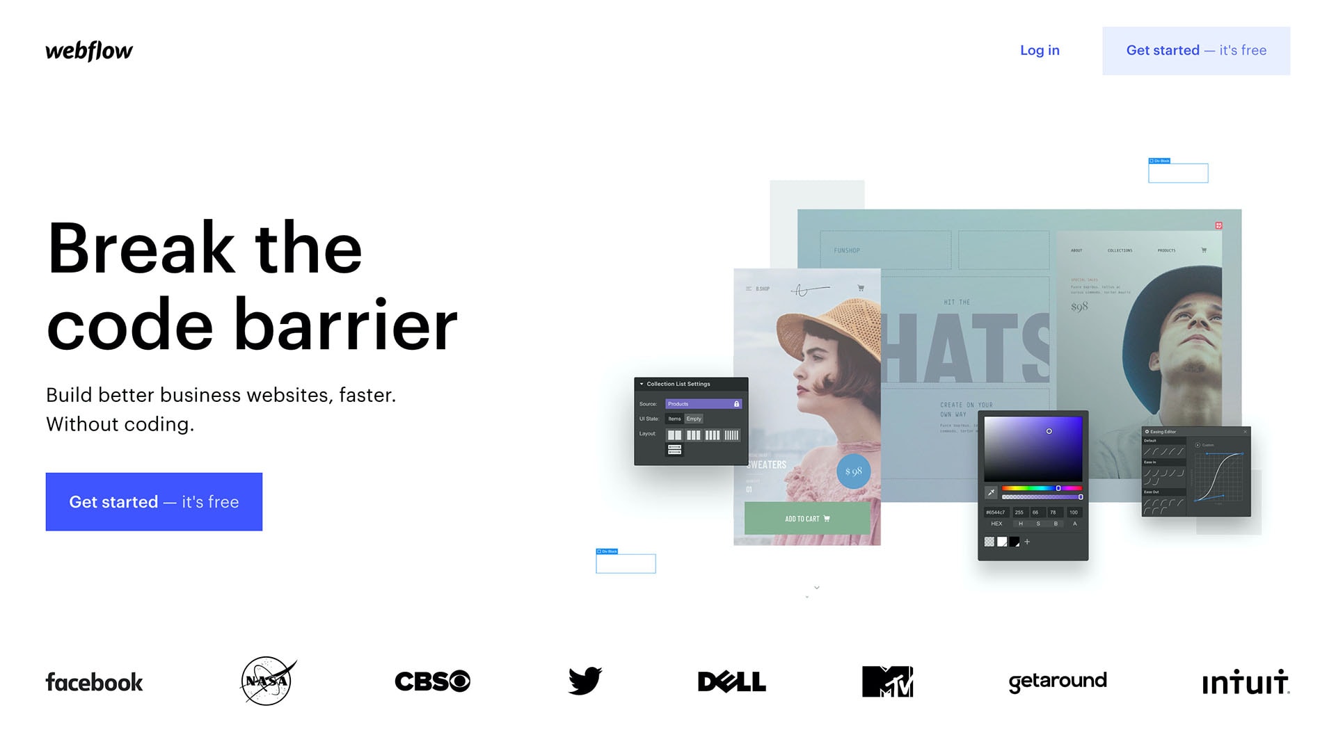
Webflow’s hero features a visual representation of how their product’s UI can generate high-quality designs.
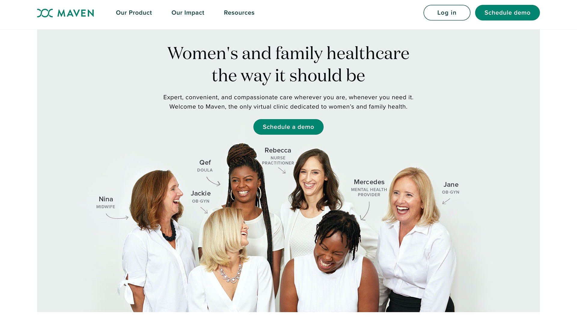
Maven is a women-first healthcare provider. To illustrate this, they are showcasing a diverse group of their female staff, including their names and medical disciplines.
CTA
The thing that makes landing pages a reliable test is the fact that people take action, they convert. It’s a form of commitment. Asking for a preorder is asking for the most commitment. Someone is literally giving you money before your product is ready. Even if someone enters an email address to get on your waitlist, that is still a significant commitment. Essentially, they are permitting you to pitch your product once it is ready. Play your cards right, and those on your waitlist will buy your product as soon as you let them. Someone willing to sign up for a waitlist is more reliable than someone telling you what you want to hear in a focus group.
Pro tips for nailing down your call to action include:
- Be direct and concise
- Use first-person language
- Use one for the whole page and nothing else
- It’s okay to reword your CTA if you have multiple buttons on the page
Examples of landing pages with great CTAs
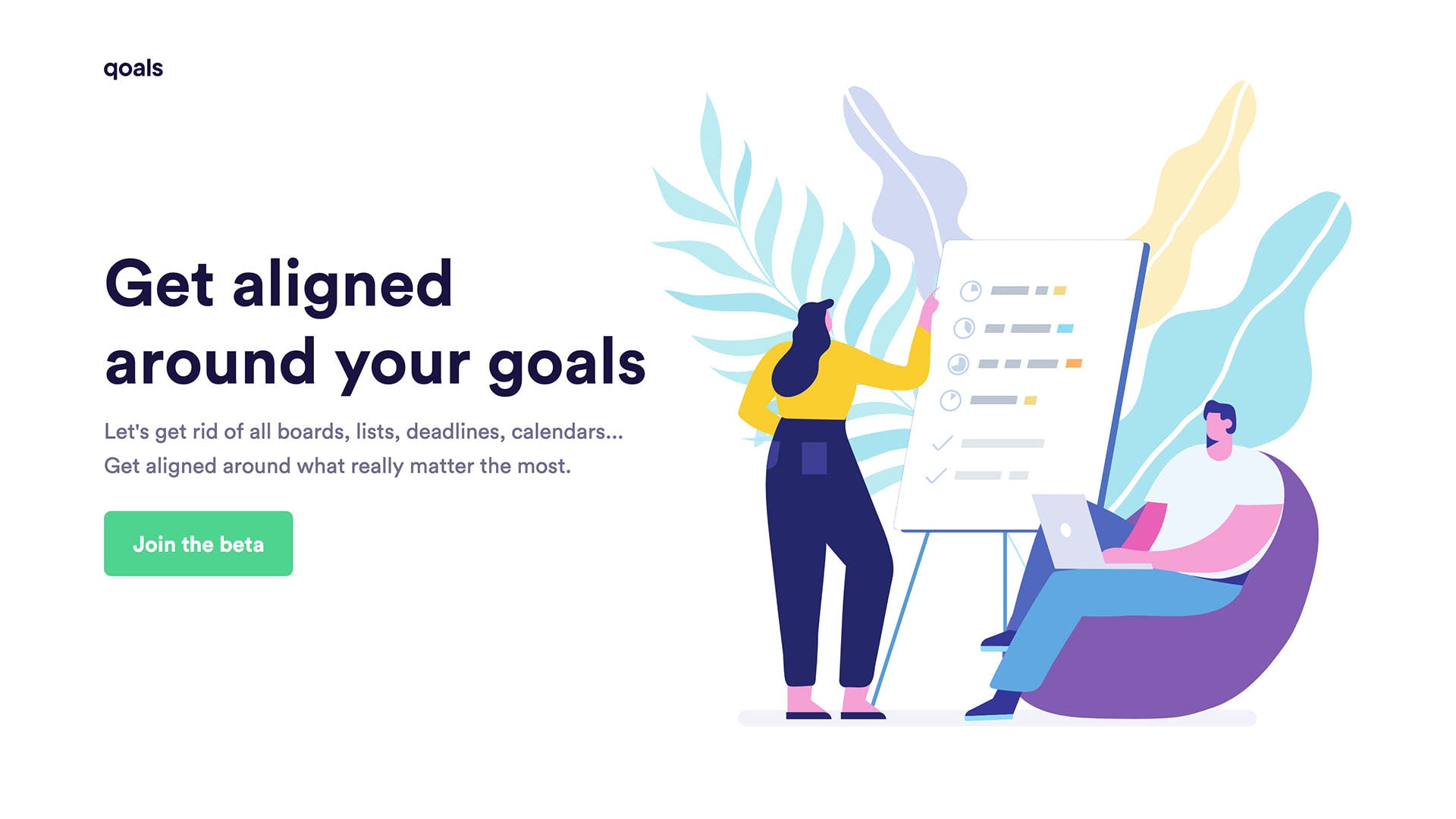
Qoals has only a single CTA, to join the beta. It’s perfect.
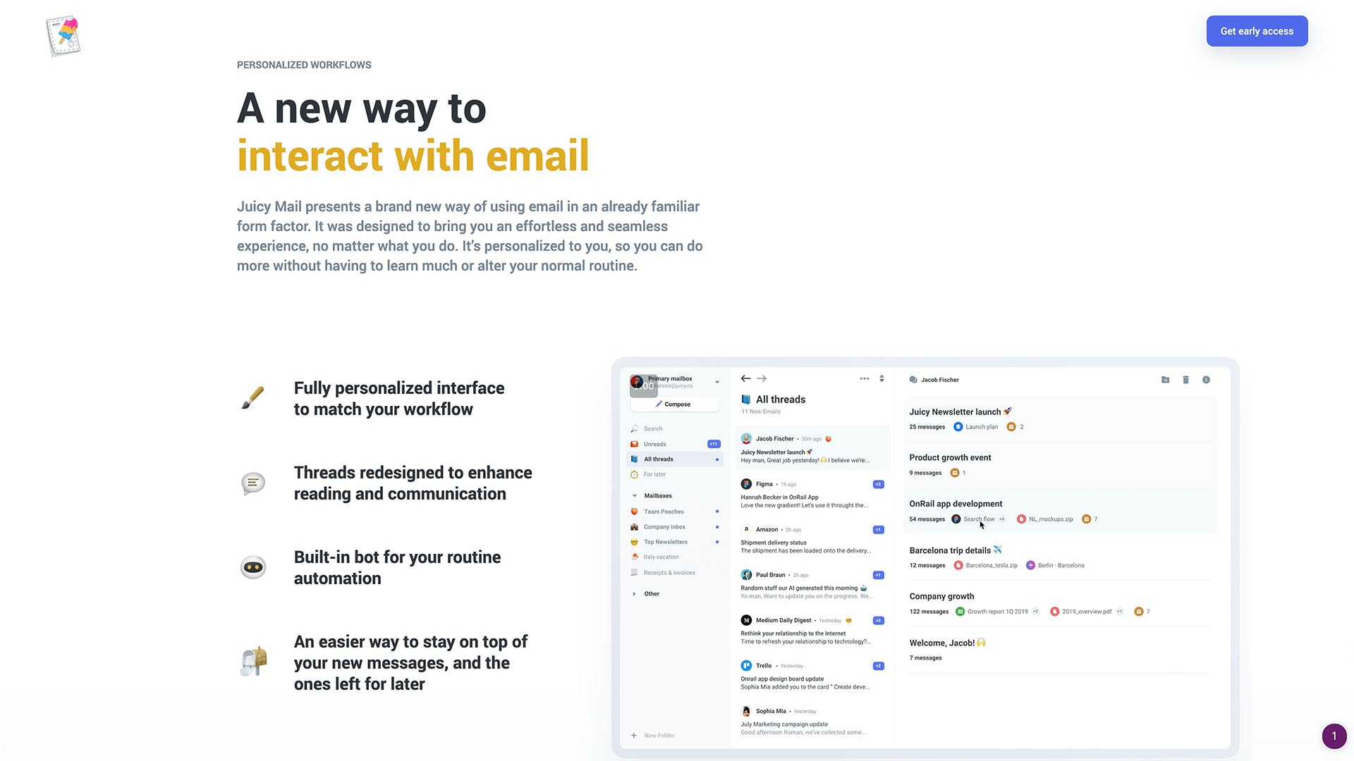
Juicy Mail’s CTA is even better! Not only is it the only CTA on the whole page, but it also scrolls down with the visitor!
Step 3: Set Up and Use Your Mailing List
Whether you’ve set up your landing page for preorders, a waitlist, or anything in between, you must set up and use your mailing list. Without the mailing list, what’s the point of the landing page?
If you need help creating pretty and responsive emails quickly, check out Postcards.
Keep in touch, regularly
When the time comes to sell the product, subscribers should be awaiting the launch so they can make a purchase. However, they won’t if you ghost them. The ROI of your mailing list is the strongest when you communicate with your subscribers regularly. Regular mailing list etiquette still applies.
- Tips to Design Engaging Newsletter Layouts Newsletters still offer the best way to reach your audience
- Free HTML Email Newsletter Templates
- How to Design a High Converting Email Newsletter [Infographic]
- Emojis in Email Newsletters: What You Need to Know
Use the list to help the product idea
Your mailing list is a source of lots of useful information. Get a better understanding of your audience’s needs by asking them about it. Send them surveys. Conduct interviews. Find out exactly what attracted them to your offer and how you can make it and your product better.
Example of a company leveraging its mailing list
Here’s a great example from Juicy Mail (again). It’s the automatic welcome email triggered by signing up for their early access on their landing page.
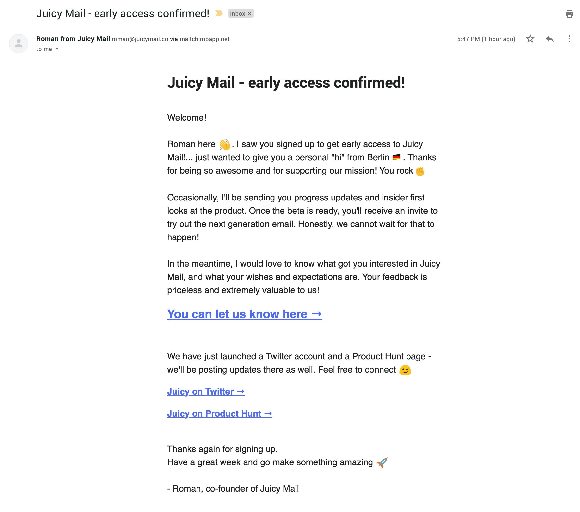
Notice that the biggest link in this email is about providing information on “what got you interested in Juicy Mail, and what your wishes and expectations are.” That’s what I’m talking about!
Find beta testers
Subscribers make fantastic testers. If you’re working on a new mobile app, invite subscribers to user- or beta-tests. If you’re writing a book, you can invite some of them to review your transcript for feedback. Subscribers are perfect people to help make your product better.
Examples of beta test emails
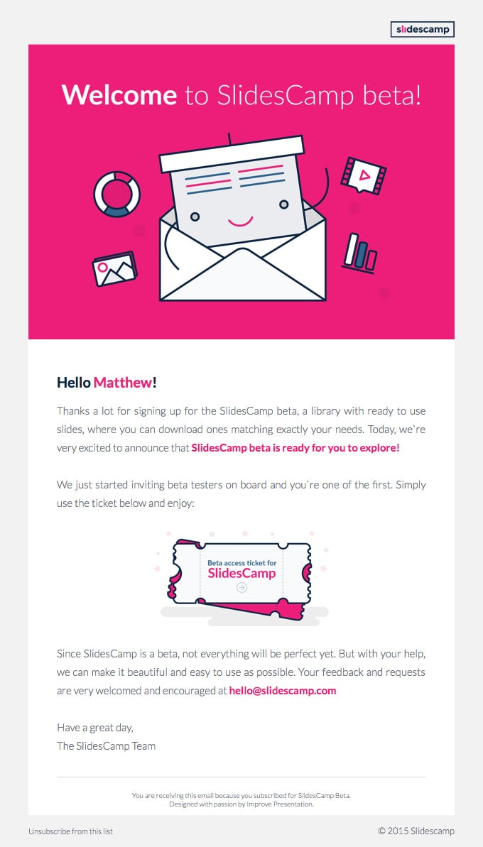
Here’s a real email from SlidesCamp inviting a subscriber to a beta test.
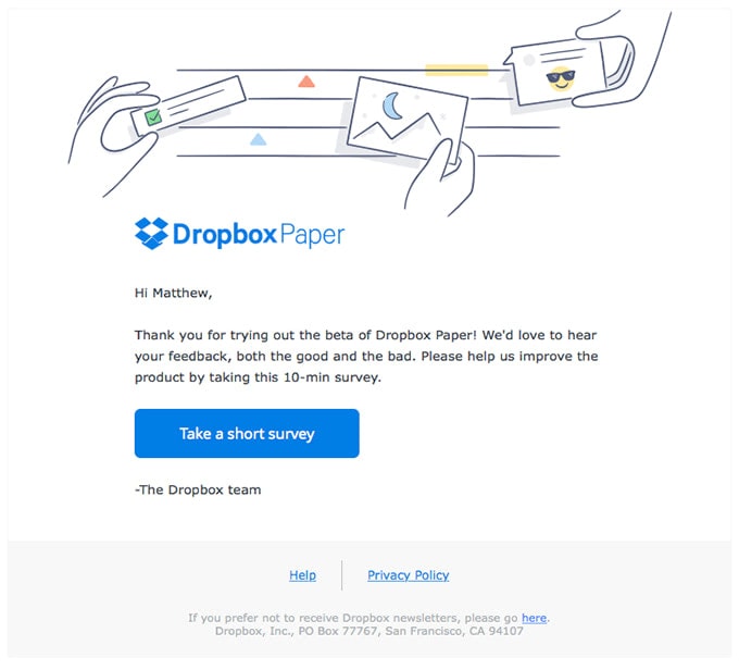
Next is an email from Dropbox asking a beta tester for feedback.
Step 4: Testing and Iterating for Best Results
It’s a good idea to test and iterate your landing page. It’s pretty hard to get your offer perfectly right on the first try. Testing variations in your offer and landing page will tell you more explicitly if your product idea is truly good or not.
What are good results?
A rule of thumb is to aim for 25% conversion rates and 100 opt-ins. That’s a wonderful-case scenario. Anything better and you’re doing exceptionally well.
If you’re getting low traffic and poor results, your priority should be to get more eyeballs on the landing page. Only then, reevaluate your conversion rates.
However, if you’re seeing good traffic flow but not the conversion rates you’re hoping for, iterate on the landing page. For example, maybe the value propositions should focus on a different pain point. Only after you’ve tested some variations, but you’re still getting poor conversion rates should you, unfortunately, call it a day.
Conclusion
As you can see, using a landing page to test a new product idea isn’t complicated. The whole process can be summarized in four steps. All it takes is a well-versed offer, a few iterations, and you can swiftly identify if you’re sitting on the next billion-dollar product idea. Now, all you have to do is get some eyeballs on that landing page!


