Examples of CSS Website Designs for Inspiration
The expansion of modern technologies like WebGL or Three.js has opened numerous doors to the web developers; however, they still keep coming back to CSS and effects powered by it.
Whatever extravagant tools and solutions we have, we still fall for simplicity and transparency that CSS offers us. Being one of the main pillars of modern web design, this timeless language has numerous possibilities that are a pure joy to explore and, most importantly, easy to handle. Therefore, CSS websites and CSS designs are still increasingly popular.
Slides: HTML Static Website Builder
Pros and Cons of Creating CSS Websites
CSS is a style language that rules them all. Though, its massive popularity is caused not only by this fact. The deal is it has some other strong pros. For instance,
- It allows separating content from design.
- It gives better control over the layout.
- It ensures excellent design consistency.
- It provides flexibility.
- It offers easy maintenance. This advantage is incredibly tangible in massive projects like online magazines or live portals.
- It has numerous formatting options that let your imagination run riot and bring incredible ideas to life.
- It is lightweight that results in fast loading time and bandwidth savings.
- It has excellent performance.
- It stands behind great user experience.
- It has modern tools for creating animations, dynamic effects, and interactivity.
- It enhances good SEO ranking.
- It is printer-friendly.
- It assists accessibility.
- It is time-saving since you can reuse blocks or apply preprocessor scripting language based on CSS.
- It is continuously evolving to meet current requirements.
The advantages of creating CSS designs are great; however, there is always other side of the coin. In the case of CSS, there are two significant problems.
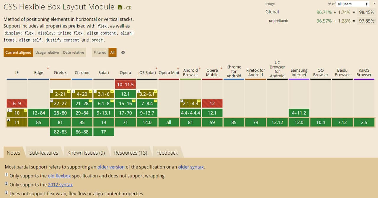
First and foremost, it is browser incompatibility. Believe it or not, even though CSS has been with us for ages, still users bump into the inconsistency of CSS website display. There is no consensus among the popular browsers. The situation is getting worse when it comes to new features. It is here where you cannot survive without fallbacks, prefixes, and JavaScript-based hacks.
With Postcards Email Builder you can create and edit email templates online without any coding skills! Includes more than 100 components to help you create custom emails templates faster than ever before.
Free Email BuilderFree Email TemplatesThe second big issue with CSS designs is vulnerability. Being an open text-based system, it is prone to attacks. Therefore, it requires superior protection.
These two obstacles are significant but not insurmountable. There are time-tested way outs that let you create CSS designs without worrying that everything will crash and burn.
How to Create CSS Website Designs
Before we move to the basics of creating CSS websites, it should be noted that there are two general ways to use it. The first one implies embedding CSS styles into HTML code using the inline technique. The second one suggests the utilization of a separate external file.
The first option was increasingly popular in the early days of CSS. It is still the only surefire way to build email newsletter designs today. However, when it comes to websites and mobile applications, things have changed drastically.
No one uses inline styles without having a good reason. It is highly recommended to separate layout from design and put all your CSS styles into an external file to reap all the benefits featured above. Therefore, the second method is the unquestionable leader. All the standard ways of creating CSS designs these days are based on it. Let us consider the most popular ones.
Create Everything from Scratch
The traditional way is to create a CSS website from scratch. It is here where you need to know CSS, HTML, JavaScript, PHP, and SQL. If you need to create a CMS-powered CSS design, you should add to this toolkit some knowledge in this particular area.
Although the process of creating everything by your hand is time-consuming, it is still rewarding. With every such finished project comes wealth of experience, new knowledge, findings and of course the satisfaction of transforming your idea on paper into an actual digital variant.
With Pulsetic you’ll be instantly notified the moment your website, API, or server becomes unavailable. Monitor uptime from multiple global locations and respond to incidents before your users are affected.
Create beautiful status pages in minutes to keep customers informed during outages and build trust with transparent communication.
Start Monitoring for FreeUse of CSS Grids
The second option is based on CSS grids. Much like the previous path, this one implies putting into practice your developers’ skills. However, this time, you have a solid starting point on which you can build a sterling project, skipping a time-consuming step of laying out the foundation. The web is teeming with various CSS grids so that you can find the best match for your particular project.
However, it should be noted that CSS grids are dying these days because of Flexbox and CSS Grid’s. Although these native CSS layout module systems cannot boast of complete browser compatibility, they are up-and-coming tools that give third-party CSS grids a hard time. You may want to check the latest web design trends before you start designing.
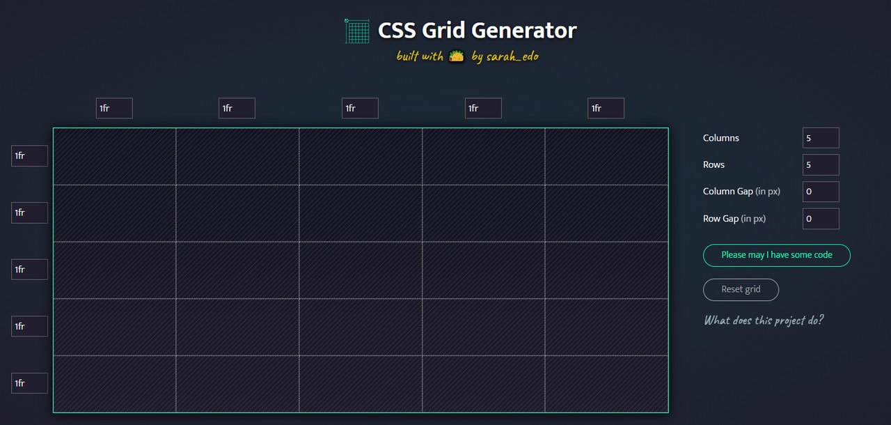
CSS Grid Generator by Sarah Drasner
Use of Ready-Made CSS Templates
The third option implies the utilization of ready-made templates. They come in all shapes and sizes. Starting from free versions and ending with premium versions, you can find the solution that fits every budget. The main advantages of using ready-made CSS templates are
- All you need to do is to customize the theme. Your CSS design will be ready in no time.
- Many freemium templates have great functionality, beautiful design, and optimal user experience.
- Easy to use. You do not have to be an advanced web developer to alter such templates. The basic skills can be enough to adjust them to comply with your brand image.
CSS Website Builders
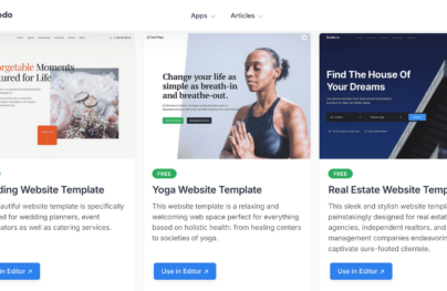
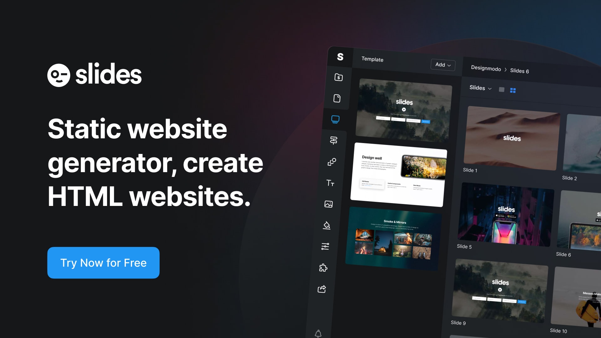
Website builders occupy their own niche. They provide an intuitive environment and tools to create stylish and reliable CSS websites without any coding and design skills. Take Slides as a representative example.
This online app ships with more than 200 customizable handcrafted modules. With its handy interface, you can create any website within minutes. Neat.
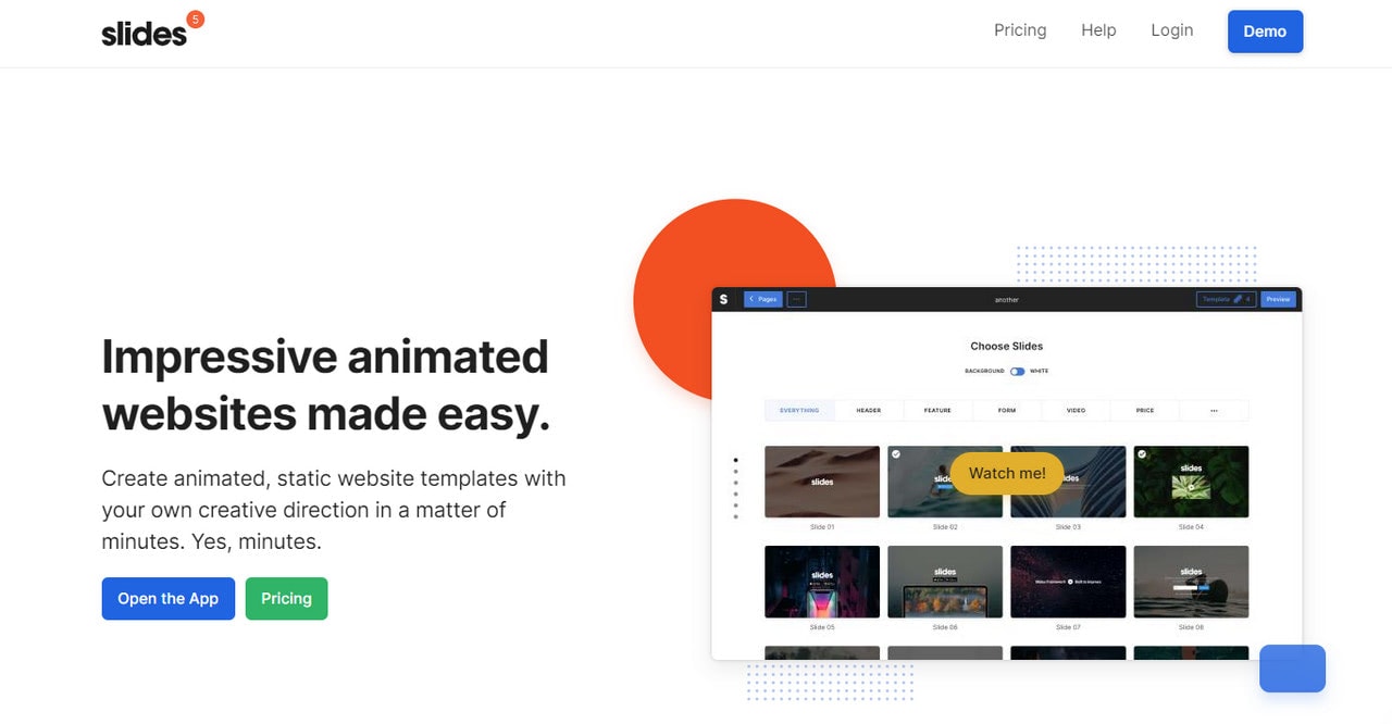
To sum up. Each way has its pros and cons. Depending on your tech skills, amount of time, and money, you may find one or another solution appropriate for your project.
Browser Compatibility Issues with CSS Websites
As we have already mentioned, browser incompatibility is still one of the most significant issues when it comes to creating CSS designs.
The sad truth is to make a website display consistently across different browsers is a challenge. The reason for that is that browser incompatibility manifests itself in three ways:
- The browser does not support the feature at all.
- The browser supports the feature but only partially.
- The browser supports the feature completely but renders it differently.
Each type of inconsistency requires its solution.
Where to start? The first step to overcome browser inconsistencies is to know your tools of the trade. Visit Can I Use to determine whether CSS features you will use on your next project work consistently across browsers. Depending on this information, you may use fallbacks or other time-proving solutions.
To find out how to deal with each of these three types read A Guide To CSS Support In Browsers by Rachel Andrew.
Accessibility in CSS Designs
Accessibility is of great matter these days. Since CSS allows excellent flexibility, you can create anything you want and turn a link into a decorative element with several code lines. However, you should not do this.
CSS should give people vital clues to navigate the website comfortably. Therefore, to create a CSS website that meets accessibility requirements, you should use the appropriate semantic element. As banal as it may sound, your task is to stick to common conventions to avoid confusion and provide a comfortable user experience. The component of the user interface should look and behave as expected; and, CSS should assist in this matter.
Follow these best practices to make CSS designs accessible.
- Style heading elements appropriately so that it is easier to define them in the text.
- Use suitable font size, font style, line heights, and letter spacing to create an optimal readability level.
- Change rules for text to hit an optimal readability level in small screens.
- Make buttons and links stand out from the reading flow.
- Make lists look like lists by using proper formatting, bullets, numbers.
- Use colors that create a startling contrast between the foreground elements and background. This helps people with visual impairments like color blindness to read your content.
- Change the mouse pointer from the arrow icon to the hand icon to identify the link and interactive elements.
- Line up labels and inputs to get them looking neat and tidy.
- Grant focused or chosen elements with different styles to give users feedback when interacting with them.
- Use @media block to alter styles or hide elements to create CSS design suitable for printing.
- Hide elements that are redundant for screen readers like icons or image-based bullets.
- Make the website easily navigable by keyboard with the help of styles for focusable elements.
For more information, check out CSS Techniques for WCAG 2.0
Tools for Creating Better CSS Websites
Whatever CSS design you create, it should meet current standards. It should be responsive, mobile-friendly, browser compatible, accessible, valid, and lightweight.
To find out whether your CSS design satisfy all these criteria, you can use special third-party tools. They help to point out your mistakes and give some insights on how to handle them correctly. There are three key instruments that you should have in your arsenal:
- CSS Validator. It checks code for errors and correct syntax encouraging you to build a CSS design without grammatical mistakes.
- Website Responsive Test to show you how the CSS website looks and behaves on different screens and browsers.
- CSS Compressor to decrease the size of a CSS file to boost performance and reduce the number of HTTP requests.
Last but not least. CSS Resets. These files override browser’s default styles that may cause some inconsistency in website display. In case your CSS style sheet sets rules for each and every element of the interface, or you do not mind minor differences in the appearance, then you do not need this. However, bear in mind, redefining every aspect may result in big file size, leading to low loading time and unexpected errors.

CSS Validation Service
Examples of Amazing CSS Websites
CSS designs can be static, dynamic and interactive. Dive deeper into our collection of CSS design examples to see each one in live and get a hefty dose of inspiration.
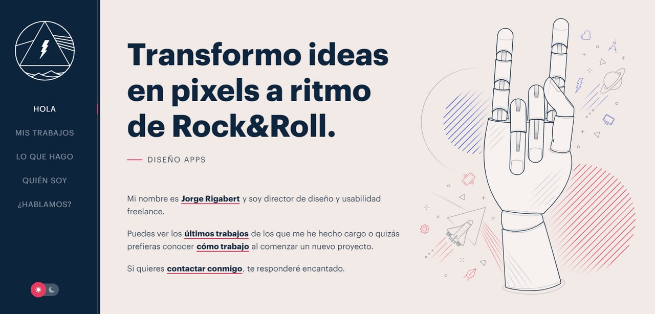
Personal Portfolio of Jorge Rigabert
Jorge Rigabert has a stylish personal portfolio that perfectly blends into present-day realms. It has a single-page layout split into two uneven sections to accommodate all the information and, at the same time, provide handy navigation. Its key feature is a symbiosis between texts and visuals. The content occupies its own place under the Sun, while scroll-activated animations reveal beautiful illustrations to support each statement.
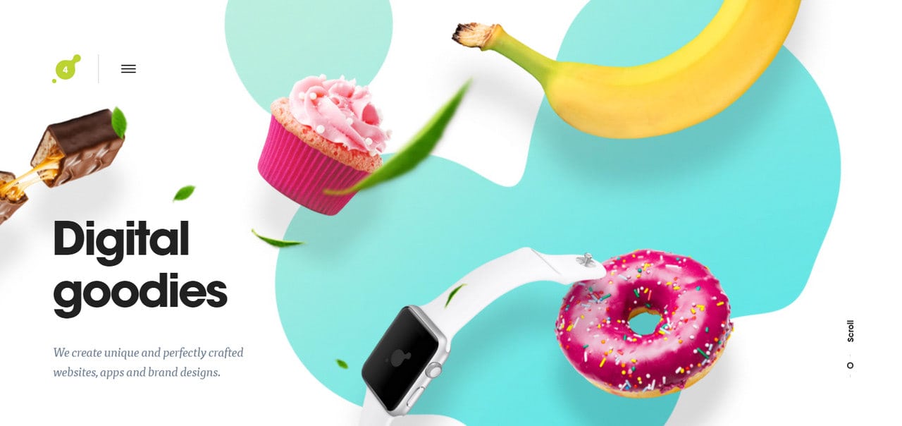
The homepage of Art4Web meets us with a fancy parallax-based hero area. Even though this solution was incredibly popular several years ago, it still catches an eye and produces quite an impression.
The rest of this CSS design is quite conventional. It has a striped-based layout where each section is a combination of text and images spiced up with lovely CSS dynamic effects and animations.
Simple yet effective.
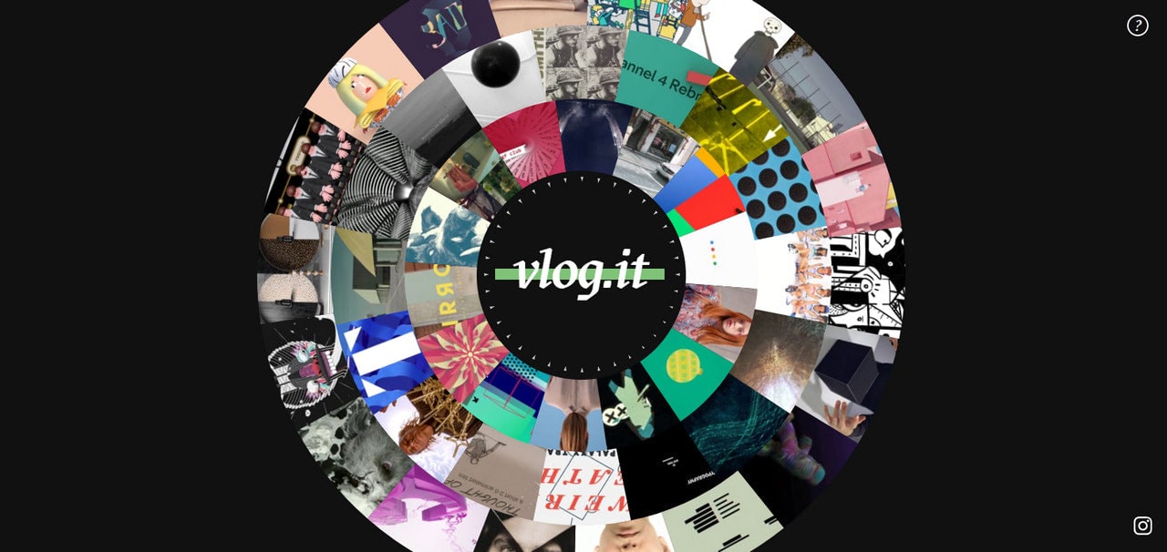
Vlog stays true to its roots through the years. Their CSS website looks the same as several years ago. It opens with a wheel-inspired centerpiece that sheds light on the agency’s works. Although WebGL does not power this solution, nevertheless, CSS has made it look simply incredible. The idea certainly separates the brand from the others with its creativity and originality.
The great thing is that you do not need to move anywhere else since all links open inside the homepage. Nice move.
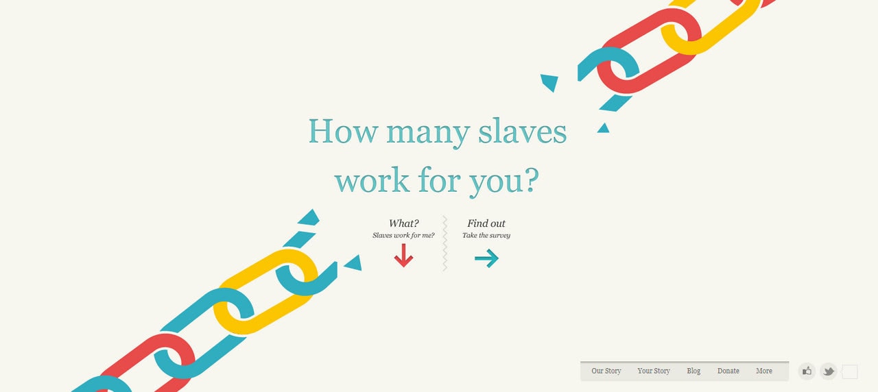
The team behind Slavery Footprint for their CSS design has adopted one of the most popular solutions in this area, storytelling experience. They have used scroll-activated animations, illustrations, and CSS effects to tell a story about slavery in an engaging manner.
Note there is no lavish effects; the team uses mostly sliding transitions. However, it is enough to set the prime focus on the content and ignite interest.
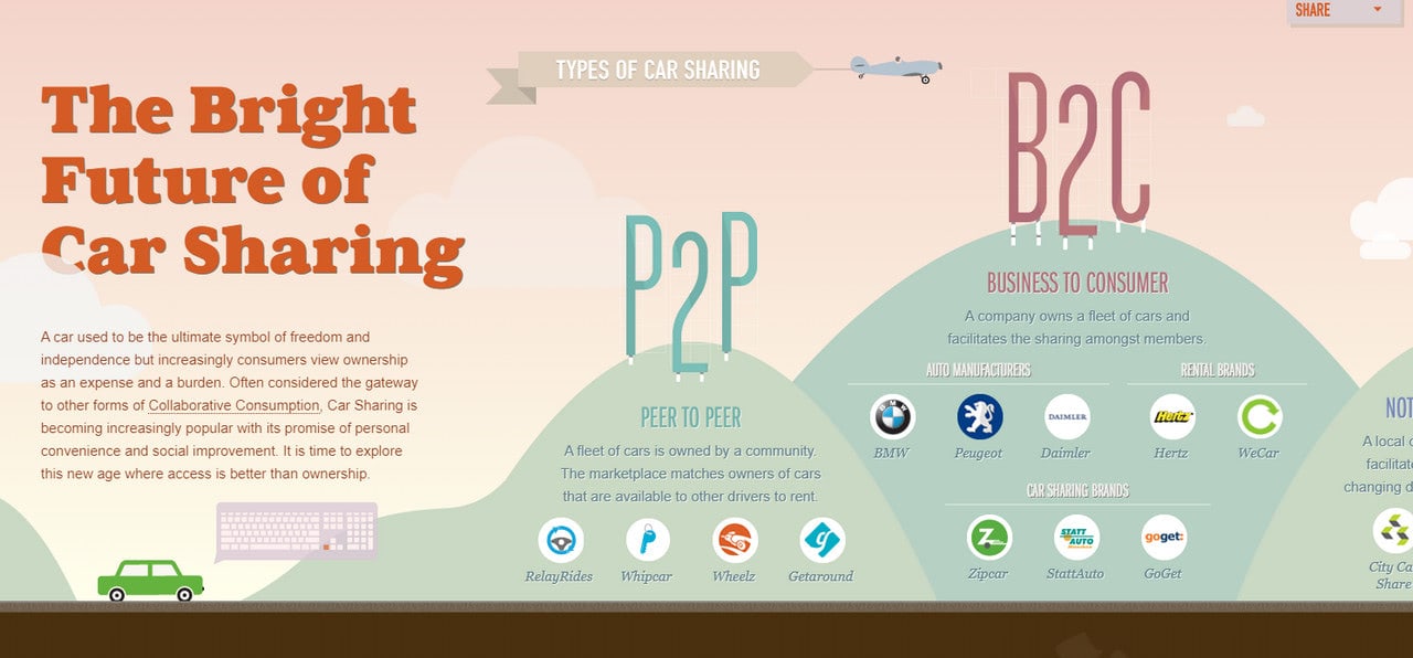
Future of Car Sharing
Much like Slavery Footprint, Future of Car Sharing is a CSS website example where storytelling experience lies in the heart. However, it has one small exception: the story reveals itself in a horizontal plane.
Again, we can see how the team was managed to turn boring content – statistics – into an engaging piece simply by using illustrations and CSS effects. Simple yet brilliant.
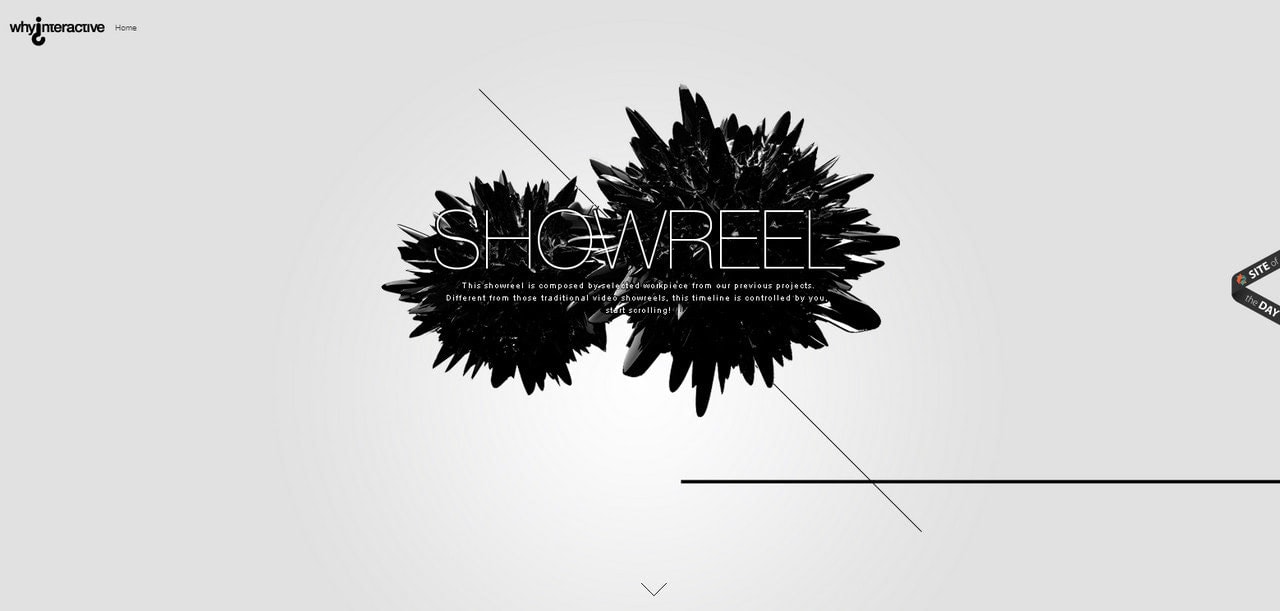
Why Interactive presents a relatively straightforward and compact CSS website example with a prime focus set on the content. The showreel section is an interesting take on the multilayered approach that, at some point, reminds renovated scrapbooking.
Although the website lacks in actual interactive features, still the team was managed to make their point strong, and user experience engaging, relying only on CSS possibilities.
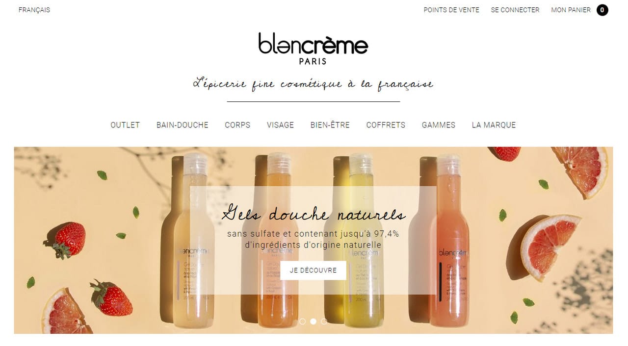
Blancreme is a small online store that targets the local crowd. Therefore, it comes as no surprise that the team is opted in favor of personal and cozy atmosphere. To do this, they have chosen a well-structured grid to accommodate all sorts of information and some lovely CSS features such as dynamic details, beautiful coloring, and elegant typography.
In a core, the solution is banal and primitive. Nevertheless, the wrapping based on modern CSS features saves the day and turns this project into a pleasant place where goods sell themselves.
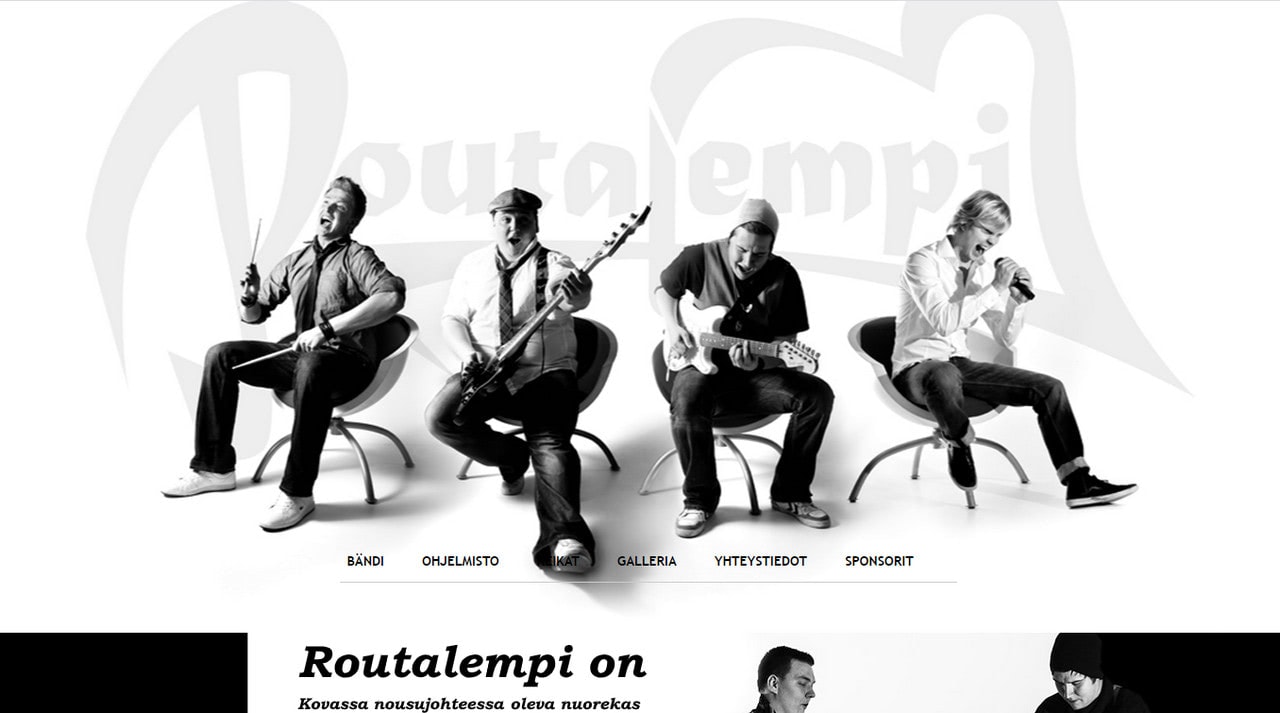
The official website of Routalempi exploits a monochromatic approach to the full extent. The black and white coloring shows its best side here. It is just amazing. The readability is great, and the user experience is lovely.
The CSS design does not have extravagant CSS features nor dynamic solutions. Nevertheless, it looks fantastic. The team uses time-proven techniques like beautiful typography-based centerpieces, marvelous illustrations, and unusual formatting bringing about the project with a cozy vibe and charisma worthy of the band.
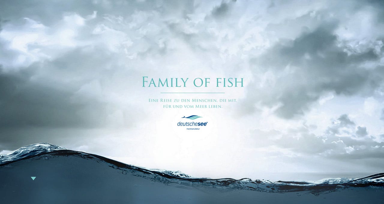
Family of Fish
Family Fish is a CSS website example that is incredibly oversimplified. It is just a single page where all the sections are displayed one by one in a strict sequence. Each unit is an image with a link. However, its simplicity is its advantage since the page loads very fast and provides all the necessary information to the crowd in no time.
What’s more, such a modest approach has a businesslike vibe that creates the proper atmosphere for the target crowd.
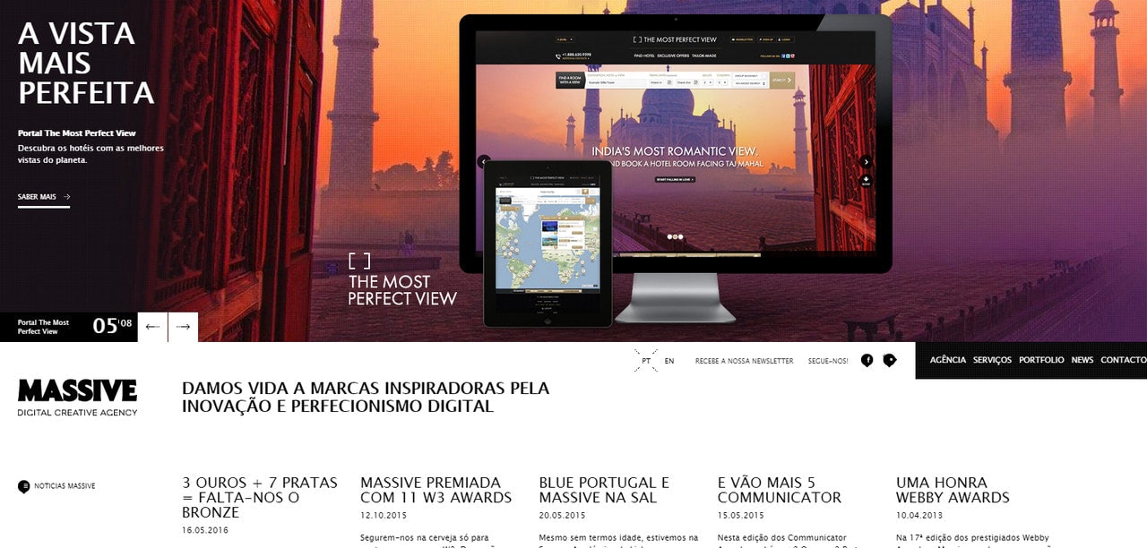
It’s Massive
Its Massive is a CSS website example of a creative agency that stands in stark contrast to the majority alike on the web. The deal is it leverages a news magazine layout that is atypical for such kind of interfaces. Nevertheless, the idea certainly works here since it grabs attention, dishes up information in a pleasant manner, and makes the company look exceptional.
One more thing, even though the design has a heavily packed structure, there is still a place for CSS effects. They are used in various blocks to unobtrusively enhance the overall design and contribute to the user experience.
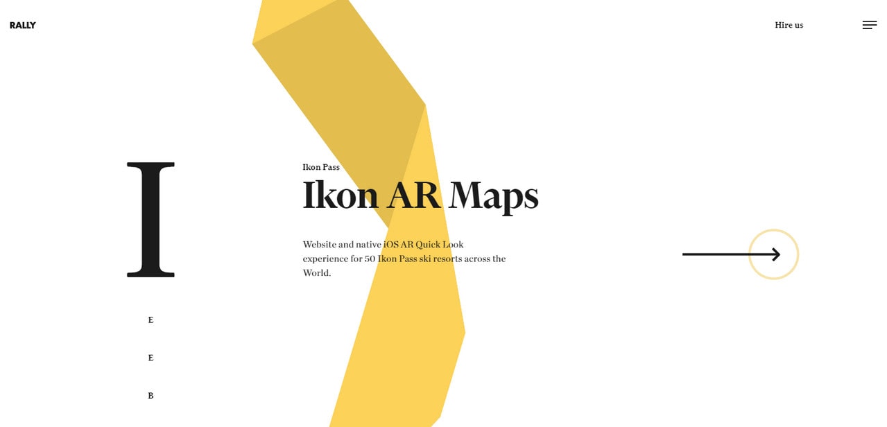
Rally Interactive is one of those CSS website examples that capitalizes on interactive features testing the limits of CSS.
The home page is a unique showreel that is broken into separate sections where each one has its color and theme. The dynamic ribbon on the back ties everything together, creating a common space, and providing a distinct eye track from top to bottom.
As we all know, details make the whole difference. And here, this dynamic ribbon makes the project exceptional.
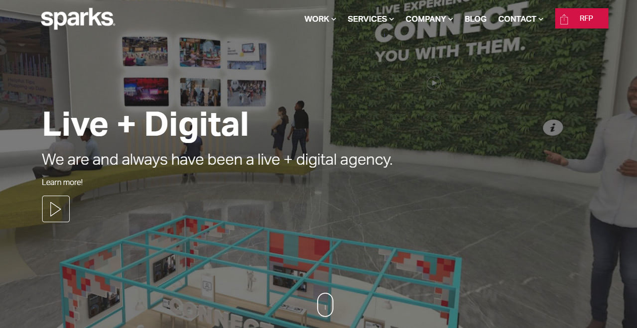
Sparks has a traditional CSS design that sheds the light on agency in an organized and well-structured manner. The team employs all sorts of popular modules and components.
For instance, the homepage has an image-based hero area, full-screen slider, gallery, and even a blog section. This CSS website example is a source of inspiration for those who want to create a corporate website with a businesslike vibe and perfect structure.
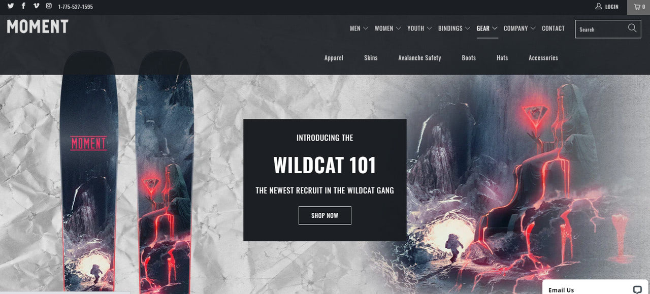
Moment Skis has a CSS design with a modern look and feel. It has a personality that livens up the content and makes the products look desirable.
Note how the team has displayed the content. They have taken a common two-column layout and spiced it up with beautiful coloring, impressive imagery, and some tiny CSS effects. As a result, we can enjoy interface with clean, neat aesthetics that exudes creative juices on all fronts.
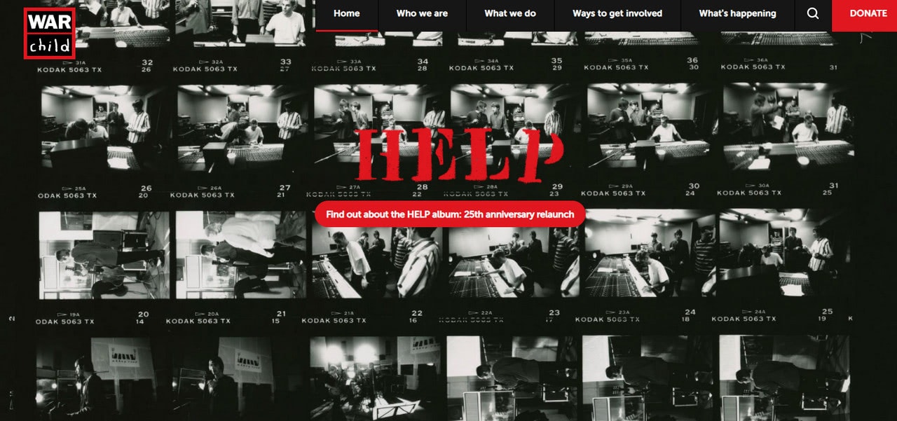
War Child
The team behind War Child has changed the design of their CSS website several times. However, every time CSS was the top choice of providing the team with reliable tools to bring their idea to life. Today’s version of the project that aims to protect vulnerable children has a regular structure. The team sticks to a one or two-column layout to put a natural focus on the content.
Note, although the project addresses the serious issue, still the team opted in favor of several creative CSS details. For instance, they use decorative fonts and fancy backgrounds. As a result, the website feel inviting instead of gravy and dismal.
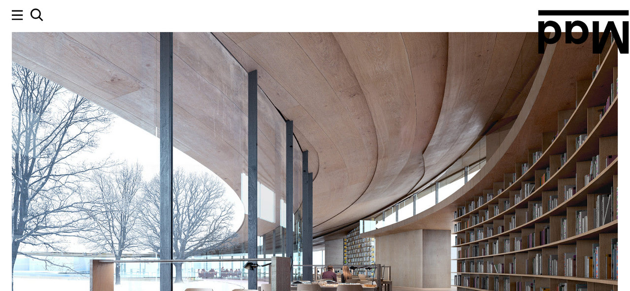
Mad AS is a beautiful CSS website example where modern solutions meet the classic businesslike appeal. The website looks polished, sophisticated, and elegant.
The homepage has a traditional static image-based hero area, hamburger button, and logotype—nothing unusual, whatsoever. However, the team was managed to give it zest. Using huge gaps around the image and making the logotype flipped, the team has given the design a nice trendy touch.
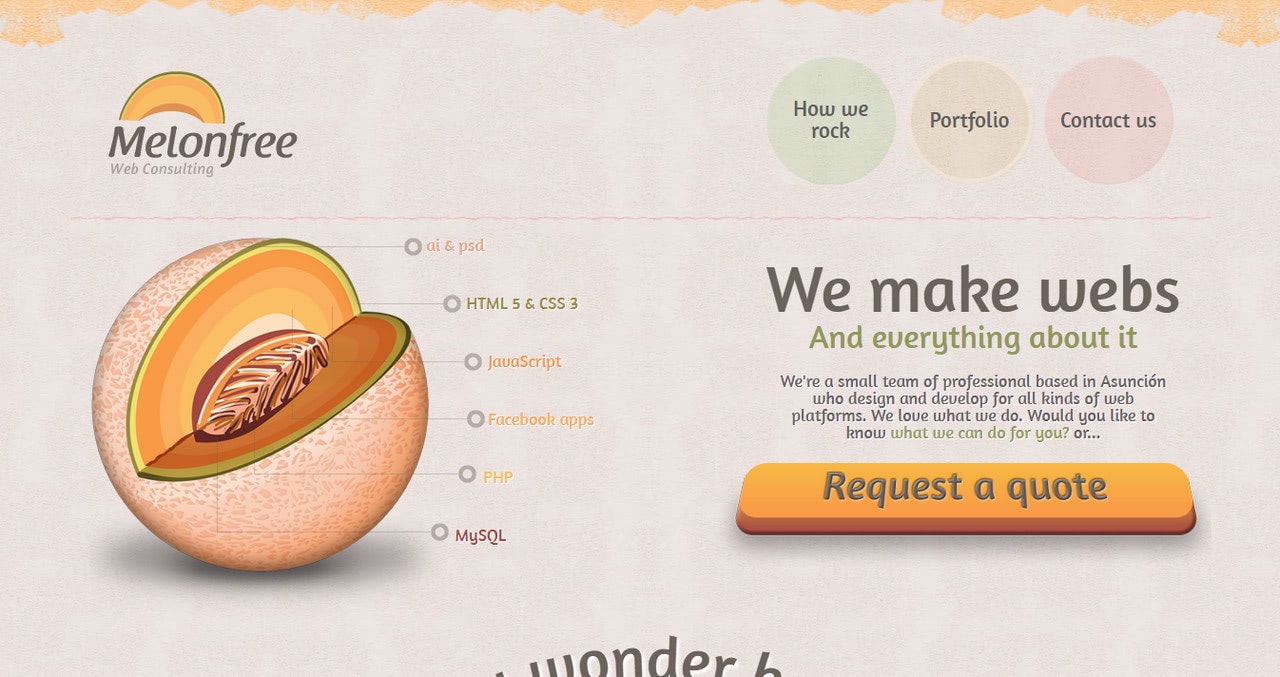
Melonfree
Melonfree is a CSS website example that feels like a blast from the past. It is increasingly artistic and decorative. Note the button on the hero area: it is so pushy that you want to hit it right away. The team has done a colossal job. The interface is packed with beautiful textures, bevel and emboss effects, shadows, decorative borders, illustrations, and fancy typography.
Although the website embraces the skeuomorphic approach that is out of fashion, however in a sea of flat style websites, such a dark sheep is like the breath of fresh air. It draws attention and makes you stay for a while to explore all the interface’s tiny details.
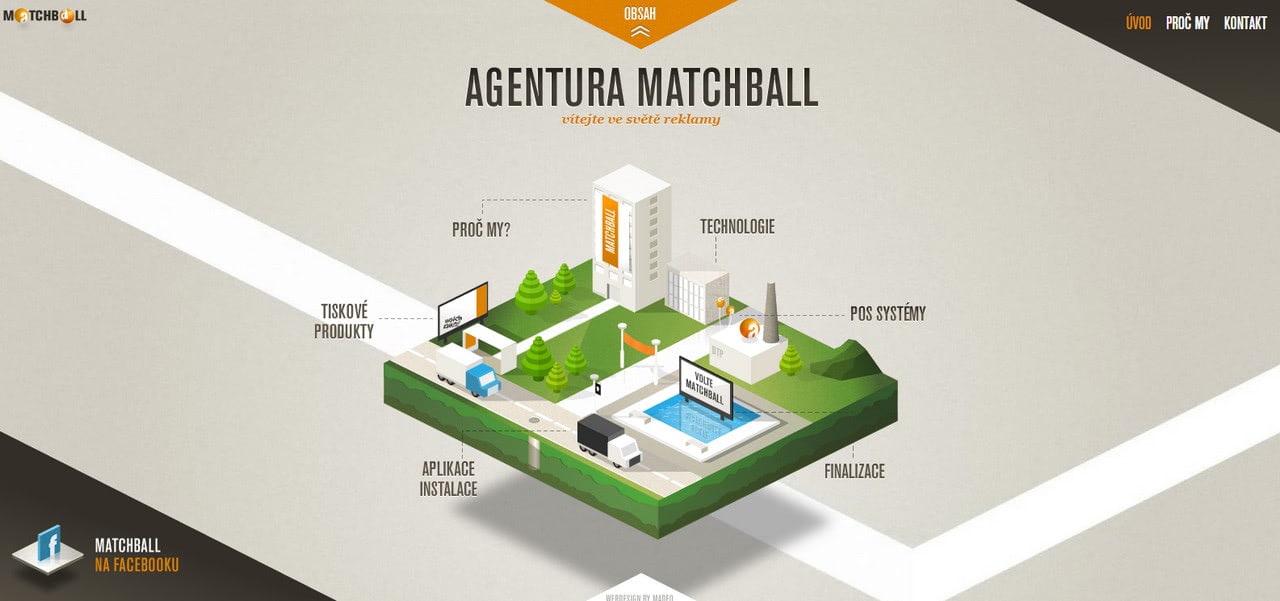
Matchball
This is another CSS website example in our collection that feels pleasantly old-timey. Unlike the previous case, we are invited to enjoy an isometric approach that gives the interface a fantastic 3D feeling.
Note the 3D island on the homepage. This scene is fully interactive. All the important details are navigation links. How cool is that? The same theme but on a smaller scale can be seen on the page that reveals the content. The idea is brilliant.
The website has just two pages that are one click away one from each other. It makes navigation through the project quick and intuitive.
This CSS design is an excellent point in the case of well-thought-out capsule approaches.
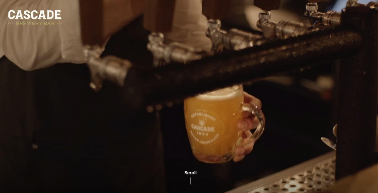
This is another capsule CSS website in our collection. In essence, it is just a homepage with two sections and several PDF files. Nevertheless, it is enough for this business sector.
The team capitalizes on minimalism prioritizing the information that is of actual value for the customers. The homepage includes some video templates hero area that hints about the establishment and all the essential links that lead to a PDF file with a menu, pop-up contact form and booking service.
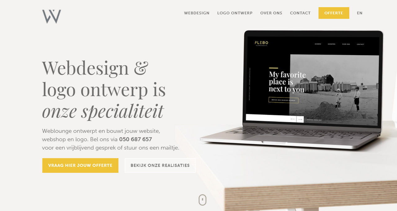
Weblounge falls into a large group of CSS designs that are popular among startups and small companies these days. It has a relatively simple structure based on a two or three-column skeleton, elegant stylistic options that make the interface look polished and neutral coloring.
Traditionally, such CSS designs have some nice hover effects and small CSS animations that are used to enhance the businesslike atmosphere. Weblounge is no exception. It has a stylish interface with nice interactive features.
Conclusion
Whatever complex project you intend to build, CSS is going to stand in its foundation. It has features to handle and control all aspects of the interface. Although it experiences some browser inconsistencies and vulnerability issues, it still has vast potential that gives the power to bring any idea to life.
Using various hacks and fallbacks, you can fully exploit CSS and derive all the benefits it implies while creating a true masterpiece.
