Free jQuery Notification Message Plugins for Websites
JQuery notification message plugins for websites hold a unique opportunity for entrepreneurs all around the World. Although sometimes they carry a negative connotation, since when poorly done, they can be obnoxious and annoying; nevertheless, they are the ones that effectively build real-time, in-the-moment connections with your prospects and customers.
According to recent studies, web pop-ups may drastically increase subscriptions and boost leads; they have decent click-through rates and, most importantly, engage users without much effort. They have many uses that translate into increased engagement and, as a consequence, quality leads and customers.
Although people are custom to believe that jQuery notification message plugins are tricky since the technical aspect is involved, the truth is anyone can handle them. All you need is to know the basics, stick to the best practices and get a free jQuery notification plugin that meets your technical skills.
Let us walk through all these key aspects and find the perfect solution in our collection of free jQuery notification message plugins for websites.
So, first things first. What is a notification message? What types we have in the wild, and why do you need one?
On-screen notifications have countless uses. They can share updates, marketing messages, or push info to new users who sign up to a website.
With Postcards Email Builder you can create and edit email templates online without any coding skills! Includes more than 100 components to help you create custom emails templates faster than ever before.
Free Email BuilderFree Email TemplatesNotification message started with desktop OS’ but they’ve since been ported to the web with some great plugins. And I’ve curated this list of my top 11 picks for jQuery free notification plugins that’ll knock your socks off.
These all have unique designs and features so no two plugins are alike. But they all share the same values of being 100% free, open-source, and pretty easy to setup with just a copy of jQuery.
What is a Notification Message?
The notification message is a message that pops up on a website UI. It comes in all shapes and sizes and appears whenever you need it to.
As a rule, it has a body copy, some marketing-centric UI elements like form or call-to-action, visuals to support the statement, and of course, controllable elements like the “exit” button.
Types of Web Pop-up Messages
Generally speaking, web pop up messages can be divided into several big groups:
- errors,
- alerts,
- a cookie consent banner,
- simple notification messages.
While the first three are relatively narrow in use since they do what they say; the latter type is the biggest and most comprehensive. It can be broken into subcategories depending on design and realization. The most popular ones are:
- lightbox pop-up,
- exit-intent pop-up,
- toast notification,
- snack bar pop-up,
- passive pop-up,
- notification box,
- notification buttons.
Why Do You Need a Notification Message on a Website?
Although notification messages can be obnoxious sometimes, they still have one significant advantage over other web design tools. They instantly draw attention. Therefore, marketers and entrepreneurs use them to accomplish various marketing goals, such as
- Draw attention towards the latest deals;
- Let visitors know about the latest updates;
- Make simple announcements that are important for the brand;
- Onboard new subscribers;
- Get feedback from visitors about the success or failure;
- Address contact’s issues with the product;
- Increase satisfaction level;
- Escalate open and click-through rates;
- Gather feedback from surveys;
- Boost signups to events;
- Establish an ongoing connection with a potential customer;
- Deliver targeted, personalized messages;
- Drive action;
- Boost sales;
- Retain clients;
- Build trust;
- Give your visitors a better end-user experience.
Finally, one of the main reasons you need (and probably, most of the website’s owners have these days) a mechanism for showing notification messages on a website is that we are all obliged to follow the law, General Data Protection Regulation.
With Pulsetic you’ll be instantly notified the moment your website, API, or server becomes unavailable. Monitor uptime from multiple global locations and respond to incidents before your users are affected.
Create beautiful status pages in minutes to keep customers informed during outages and build trust with transparent communication.
Start Monitoring for FreeIt is our duty to notify our precious visitors about the cookies and information that we collect about them. This notification message should not only inform but also get users’ consent to the use of cookies in a website so that your company can work around the Globe without risking hefty fines from the government.
Therefore, even if you do not intend to use jQuery notification message plugins in marketing goals, you still may need one to make your website meet the necessary regulations.
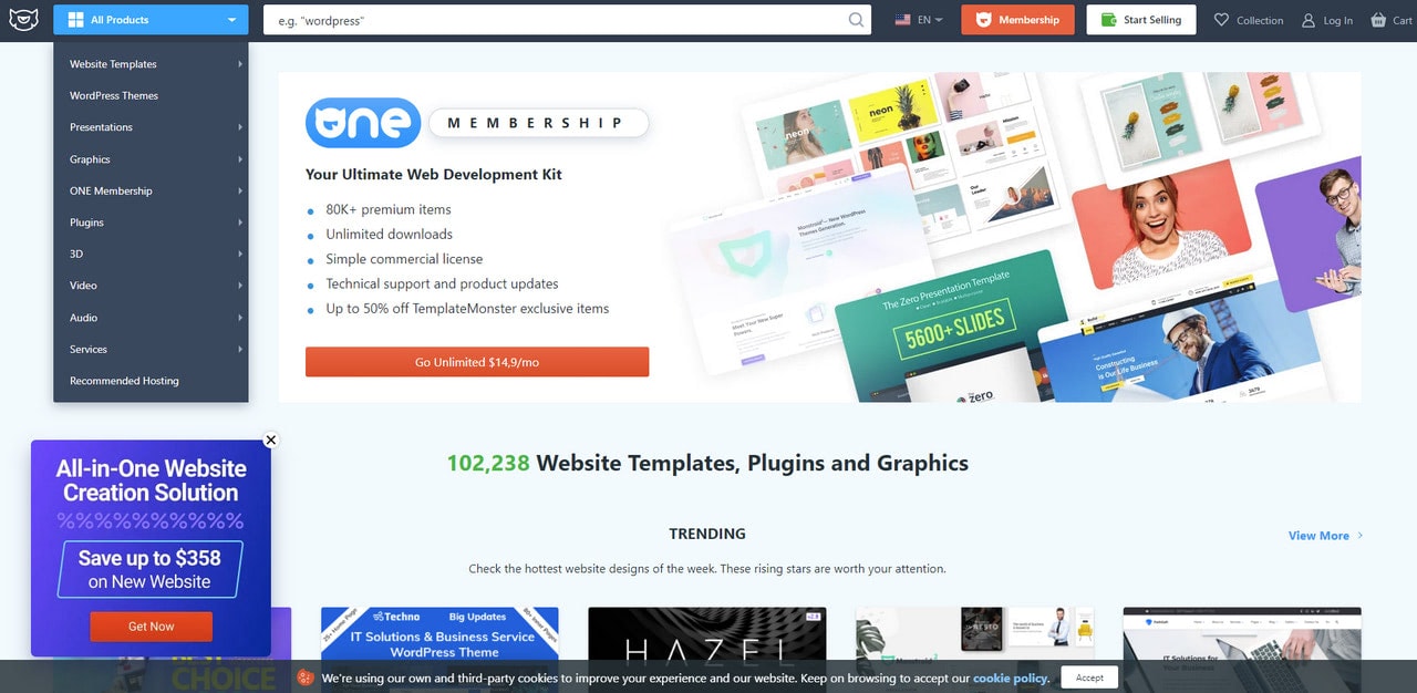
Pros of Using jQuery Notification Message Plugins
Notification messages, by their nature, get priority access to users’ attention. You can hate them or love them, but they are powerful tools that give entrepreneurs a golden opportunity to deliver messages and complete some marketing missions. To exploit their potential, you need a ready-to-use jQuery notification message plugin.
Even though you can build a notification message pop-up from scratch by using HTML, CSS, and JavaScript, however, you do not have to reinvent the wheel when you have a selection of decent choices. Even tech-savvy people (including matured developers) keep coming back to jQuery notification message plugins.
These grab-and-go solutions have many advantages. Consider the most important ones.
- They save time, and ipso facto money since creating everything from scratch is time-consuming and resource-intensive.
- They are easy to implement. It takes minimal effort to get notifications up and running on your site.
- They provide responsive and mobile-friendly solutions and layouts. You do not have to waste a bunch of time adjusting your notification message to look great across all popular screen sizes.
- They are accessible. Some of the recent jQuery notification message plugins are made with accessibility in mind. That means you not only secure users who use assistive technologies to crawl through your website but also have a chance to expand your target market.
- They have been thoroughly tested. Successfully passing the Alpha-test and Beta-test phases, they promise to work correctly and respond correctly to different user actions.
- They have much more reliable support for browsers. The deal is it is customary to validate code and use safe CSS styles to ensure consistent work of the code script across numerous devices. In addition, code validation saves the system from unexpected crushes providing a solid foundation for expanding or updating the solution in the future.
- They are intuitive to use. As a rule, third-party plugins are made for fellow developers and tech-savvy people who want to improve their websites. Therefore, these plugins have thorough documentation and a relatively intuitive mechanism of being put in action. Some of them even have primitive dashboards where you can tune every essential detail of the component.
- They have robust functionality. While some of the jQuery notification plugins are just primitive web pop-up messages with bare content, others boast many features that meet various requirements.
- They have some extra features to improve the marketing side of the project. Some jQuery notification message plugins come with the ability to get feedback from users and insert forms that make it possible to grow subscribers list or escalate click-through rates.
- They have some beautiful designs and styles. Some of them also offer a range of dynamic features that enrich the user experience and make interaction with the website smooth and pleasant.
- They are easily customizable. All you need is to set or edit parameters. If you are familiar with coding, you can even alter well-commented CSS files to create your styles.
- They are extendable. jQuery is famous for its intuitive environment. Scripts made with jQuery make it much easier for developers to tap into Web API’s full potential. If you do not mind coding, you can easily enhance the jQuery notification plugin or add extra features to meet your growing needs.
Last but not least, jQuery has been around a decade with us so far. It has a strong team that follows all the dev world changes to make its product fit the needs of the many. They continually bring about performance improvements and updates. It means that free jQuery notification message plugins are reliable tools with a strong foundation.
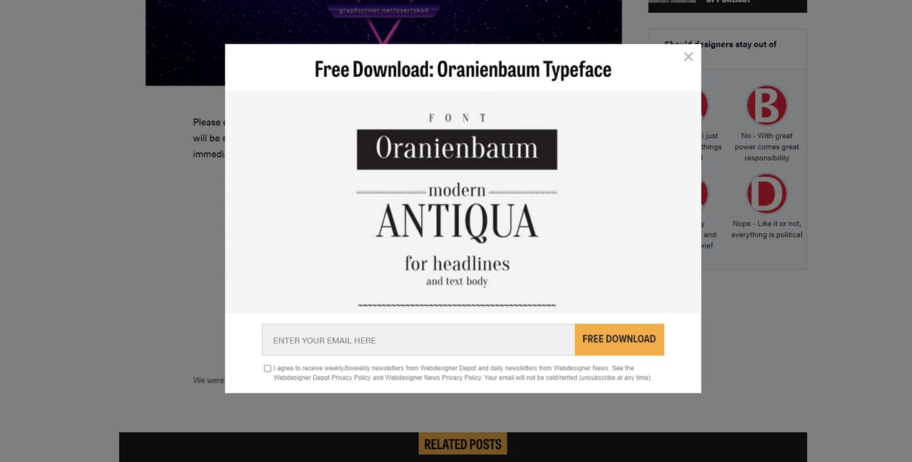
Notification Message in Webdesignerdepot
How to Create Notification Message that Reaches its Goal?
Notification messages have a tarnished reputation. After all, they were a reason pop-up blockers became the norm the previous decade.
The deal is, as a UI component that instantly draws overall attention, making everything about itself, it should be used with caution. When poorly done, it becomes obnoxious, drives visitors away, and ruins the entire user experience. Therefore, creating a right notification message can be a challenge.
However, no obstacle is insurmountable when you know what practices to follow. Let us find out how to create notification messages that leave a good impression, resonate with the audience, and achieve their missions.
Figure out your goals
First and foremost, every notification message should have its own goal. So, ask yourself, what do you want to achieve?
- Do you want to retain users?
- Do you want to reduce cart abandonment?
- Do you want to increase sales?
- Do you want to drive newsletter signups?
- Do you want to raise awareness of the new collection?
The explicit objective will help determine what type of notification to realize, what content to use, what design to implement, what interactive details to add, what marketing tricks to pull and even when and how to show the message in order to drive visitors to complete the goal.
The explicit goal also helps identify when to stop showing the notification message since no one likes redundant pop-ups that are outdated and meaningless.
Create a plan
Much like a clear goal, a plan is imperative. It underlies a solid foundation for achieving marketing missions. Ask yourself these questions:
- When should the notification message appear?
- What is the trigger?
- Where would the notification appear?
- How should a notification message appear? Should it have impressive transition effects to make a dramatic entrance, or should it just slide out?
- What type of feedback are you expecting?
- When to stop showing the notification message?
Draft a concise message
When the goal is set and the plan is ready, the time has come to create a copy. Although you want to say a lot to your audience, nevertheless you should resist this temptation. The selling should be quick and effective. All the details and extra information should have a separate page. The best notification message includes only a relevant, bite-sized piece of information someone can act on quickly and easily.
The basic structure of notification message is
- A headline where the main point is stressed out.
- A short body copy. It can be a purely informative piece that clears things up, or it can be a saucy appeal that lifts a veil to drum up interest or plays psychological tricks like creating a sense of urgency or evoking fear of missing out.
- Call-to-action or form.
- Well-crafted visuals (an image of the product, beautiful illustration, and icons) to support the statement.
When creating a message, remember these three essential things.
- First, deliver a message that is relevant to your visitors and beneficial.
- Second, be straight-to-the-point and use simple words to convey the message.
- Third, personalize copy as much as possible. If you can show a message depending on some kind of subscriber’s segmentation, go for it. The more unique and personal your message sound to your target audience, the more chances you have to win them over and leave everyone happy. Therefore, tailor the content of your pop-up to each person.
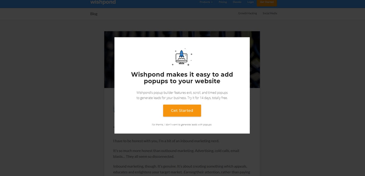
Notification Message in Wishpond
Add a Powerful Call-to-action
Whatever notification message you are up to, you will have one or even two call-to-action buttons in it. Even pure informative pop-ups have at least one call-to-action button masked as a link to the page where users can better acquaint themselves with the situation. Therefore, consider these steps
- First, decide how many CTAs you need. When it comes to accomplishing marketing goals, the best practices suggest sticking to just one. After all, the rule of thumb is one goal – one button and ipso facto one pop up message. However, sometimes your marketing mission may require two buttons. In this case, one of them should be prioritized.
- Second, make the button clear. Use action verbs without being pushy or bossy.
- Third, tell users what they achieve if they click this button.
- Fourth, use styles that separate the button from the background and reading flow. The CTA should be eye-catching and alluring.
- Fifth, stick to conventions. The button should look like a button. Do not confuse your users with extravagant solutions.
- Sixth, choose the right place for the button. As a rule, it finishes off the notification message, occupying the sweet spot at the bottom. However, if you intend to add some more information, for example, you want to inform about exclusions or play some marketing tricks like providing an expiration date, then you may place it right in the middle of the content.
- Finally, make sure your button is reachable and easily tappable on small screens.

Notification message in Nectify
Create a Killing Design
Notification messages always evoke mixed reactions. To make them useful and purposeful rather than annoying, you need to pull out all the stops. It means that everything should be perfect, especially design. Consider these nine tips to create meaningful notification messages without compromising usability:
- Build design around the importance of notification messages. If it is time-sensitive or includes crucial information for your users, it should be significant and prominent. If it has just an appeal to sign up to your subscription list that is just a regular thing, then it should be less aggressive and intrusive.
- Pick the right colors. Much like the previous tip, depending on your message’s importance, you may fall for different color palettes. For example, an alert or error requires harsh tones like red, whereas promo messages can benefit from traditional businesslike tones like blue and green.
- Never hide the copy. A notification message is so called for a reason. It should have a message. Providing users with enough information will help them understand the purpose of web pop up and what needs to be done.
- Use formatting. A well-formatted copy can do magic:
- it makes the copy easily scannable;
- it improves readability and understanding of the message by feeding users bite-sized portions;
- it sets priorities and puts accents without being overwhelming and pushy.
To make it work for you, first, never neglect headlines, paragraphs, text alignment, and spacing. Second, use a principle of the inverted pyramid to structure information in a way that will ignite interest, boost engagement, and at the end, compel uses to click the button.
- Determine placement. To avoid obscuring the interface, notifications should appear at the top or bottom or near the UI corners.
- Use icons and small illustrations to make a point stronger.
- Size wisely. Web pop-up should be relatively small but still effective.
- Always test the appearance of notifications on various viewports.
- Do A/B tests to define an option that resonates with the audience the best.
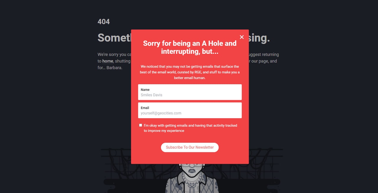
Notification message in Reallygoodemails
Whatever goal you have in mind, whatever target market you want to serve, and whatever loyalty you expect from your brand’s evangelists, notification message should have an option to be dismissed. The “exit” button is imperative.
This tiny element gives a freedom of choice crucial for building strong, healthy, and friendly relationships with your audience. It puts visitors in a driver’s seat that increases trust in the company and avoids a feeling of strings attached.
Therefore, make sure the close button is evident and can be found instantly. Stick to popular conventions. Make it like an “X” sign and place it in the top right corner so that users can quickly locate it and push it to avoid frustration and disappointment.
Create a Series of Notification Messages
Creating a series of notification messages that pursue the same goal is vital.
The deal is, without A/B testing, you will not be managed to define the option that resonates with the customers the best. The chances of your first version being entirely successful are slim.
Therefore, play with the size, placement, trigger, design, and even copy. Create several notification messages and put them in action one by one to collect as much information as possible to define the best option for your target audience, company, and marketing mission.
Last but not least
Please, do bear in mind that if a notification message feels redundant or irrelevant for a particular group of your audience or does not bring expected results, then stop showing it. Do not irritate or annoy your users with redundant, irrelevant, and useless web pop-ups.

Notification message in Lattice
How to Achieve Marketing Goals with Notification Messages
There are several effective ways to use website pop-up to boost engagement, increase conversion and generate leads. Businesses in the e-commerce sector commonly use them. However, with little changes in copy and design, you can adapt them to SaaS, blogs, digital agencies, personal portfolios, and startups.
Let us consider seven types of notification messages that help to achieve popular marketing goals.
Even though discount banners are highly overused solutions nevertheless, they work no matter what. The deal is, we are all deal hunters now; therefore, we all fall for these ads to get a better bargain.
A discount banner helps convert the visitor into a lead, promote your product and simply get a subscriber email address that opens a direct communication channel to realize some other marketing strategies.
It can also be used for threshold offers to provide an incentive to spend more or simply complete the purchase, increasing order size and converting more sales.
Discount banners are banal yet working solutions that can be used by anyone regardless of niche.

Black Friday Best Store Bundle by Julia Orlova
Reciprocity goes a long way. People love free stuff. Whether it is a digital book that can be downloaded instantly or it is a unique gift that comes with a purchase, chances are, your visitors will fall for it.
When done right, not only does this notification message increase sales conversions, but it also reinforces customer relationships with the brand, inspires loyalty, and leaves a favorable long-lasting impression.
Free Shipping Promotions
According to stats, orders with free shipping generate 30% higher order value; and almost everyone agreed that they are more likely to make repeat purchases from a retailer that offers free shipping. Impressive, is not it?
Free shipping promotion is a powerful trick that is widely used in retail. It boosts engagement, builds loyalty, and retains customers. Therefore, if you want to complete some of your marketing goals that imply raking in cash, you need to start with a free shipping promotion realized through an on-time notification message.
Exit Offers
Exit offers provide you with the last chance to keep users within your website, regain interest and even convert the visitors into leads. They are incredibly effective at grabbing attention and making prospects stay for a while.
As a rule, exit offers appear when the user attempts to leave your site, leave the cart, or checkout page. Use them to retain users by presenting them with powerful incentives.
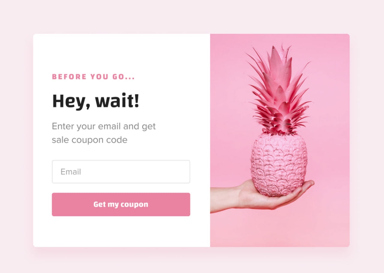
Exit-intent campaign Roman Marusenko
Holiday-themed Promotions
The holiday is an excellent sales opportunity, regardless of the niche you are working in. During the festive period, people are more willing to spend their money, and as a consequence, they are more likely to fall for discounts, offers, and new experiences.
Using some traditional tricks like humor, captivating illustrations, festive images, and of course, personal greetings, messages, and offers, you can increase on-site engagement, escalate conversions, generate sales, and of course build a proper image for your brand, making it closer to the crowd.
If you have a few pages or sections that you need to drive traffic to, you can benefit from navigation pop-ups. Presenting your audience with a choice that will direct them to some exciting destination shortens the user’s path to your goal, raise satisfaction level from your brand and increase click-through rate allowing you to generate some quality leads in the shortest possible time.
Gated Content Promotion
Gated content is a powerful tool for lead generation. The idea behind the concept is to provide prospects with valuable information in exchange for their email address.
Although content without a gate can improve trust with prospects because it removes roadblocks to valuable information; nevertheless, you can balance between these two types to onboard as many subscribers as possible.
Rule of thumb, use gates only at certain points in the marketing funnel and do not overdo.
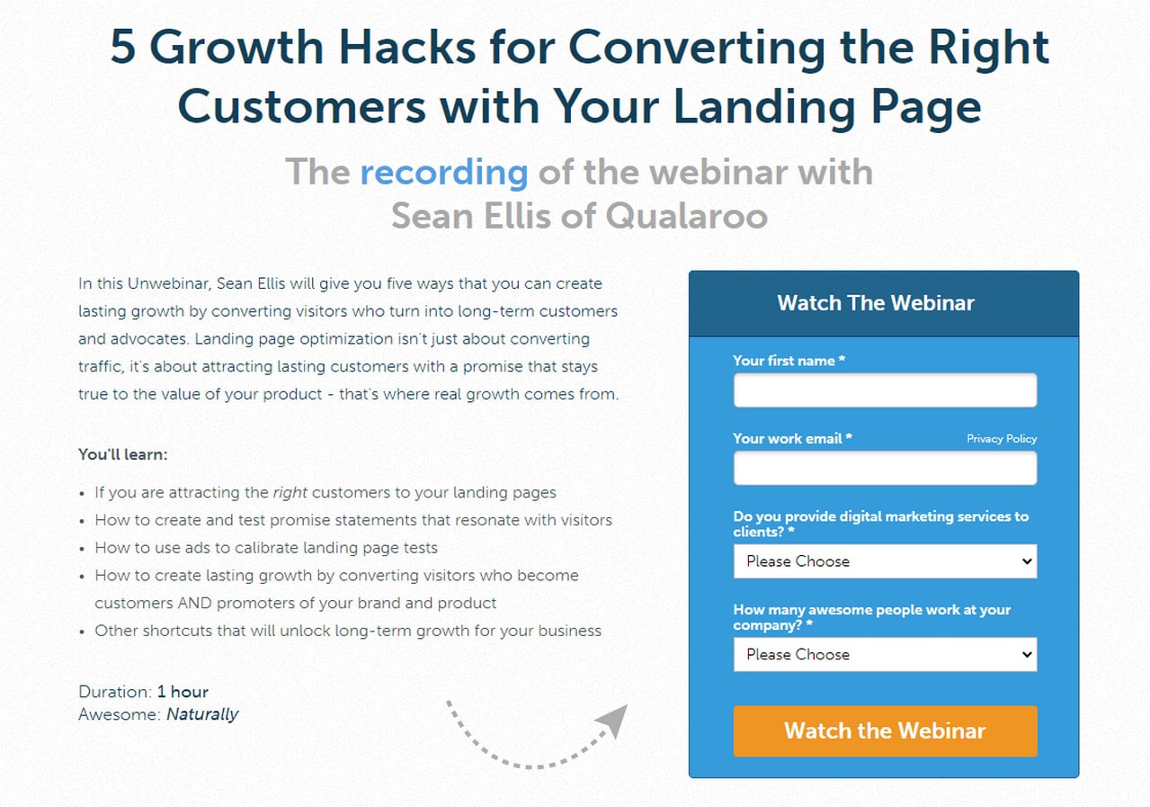
Gated Content Promotion in Unbounce
How to Choose the Right jQuery Notification Script
You need to consider many things when choosing the right jQuery notification message plugin for the website. Depending on your goal, these things may vary. However, still, some essential criteria should be met.
Consider these steps to secure the right free jQuery notification message plugin for your website:
First, write down precisely what you want this plugin to do. Create a checklist with the order of importance.
Second, answer such vital questions as
- Does it have all the essential features such as positioning, dismiss option, time functions?
- Are the features enough to bring to life your ideas and meet all your requirements?
- Is it lightweight?
- How many resources does it consume? Does it slow down the website?
- Does it ruin performance?
- Do you need extra tools to make it run on your website?
- Is it easy to handle? Can non-tech-savvy people manage it?
- Is it easy to implement on your website?
- Does it have good documentation and a guide?
- Does it have a support team? Is there full-time support? How quickly and efficiently can you address issues with a script?
- How secure is a plugin?
- How often is it updated?
Third, check out the plugin’s ratings and reviews.
Collection of Free jQuery Notification Message Plugins for Websites
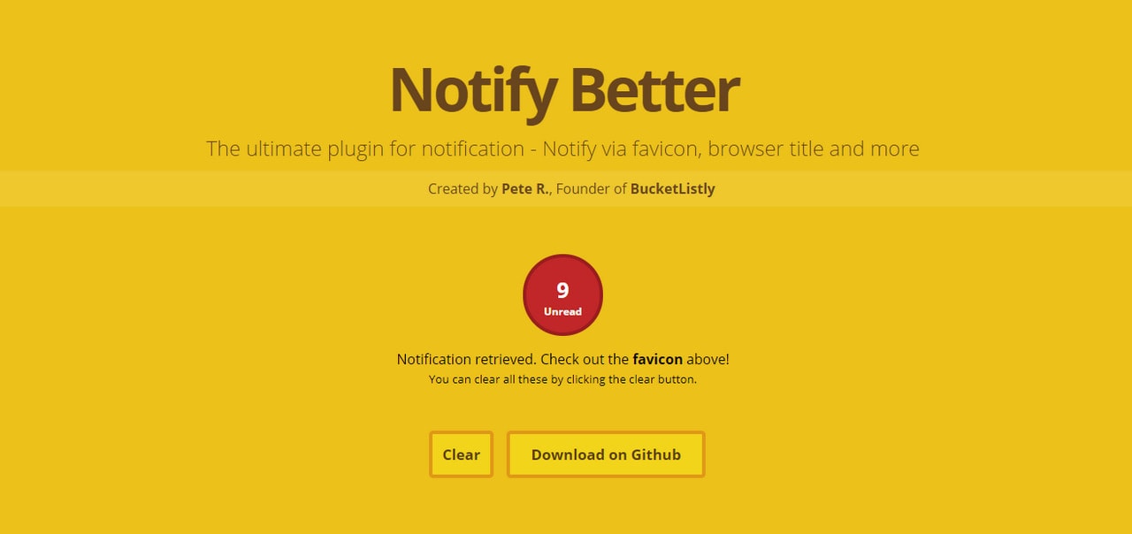
Notify Better is the compact jQuery notification message plugin for websites. It is pretty simple yet functional. It can change the favicon, browser’s title, and other standard elements to reflect new notifications.
No matter which tab your users are at, the great thing is that they will still see the notification from your website. Another benefit is that you can customize how the message is displayed with some little tweaks in code.
As for drawbacks, if you want to modify the favicon, do bear in mind Internet Explorer does not support this feature, so those who use this browser will not see it.
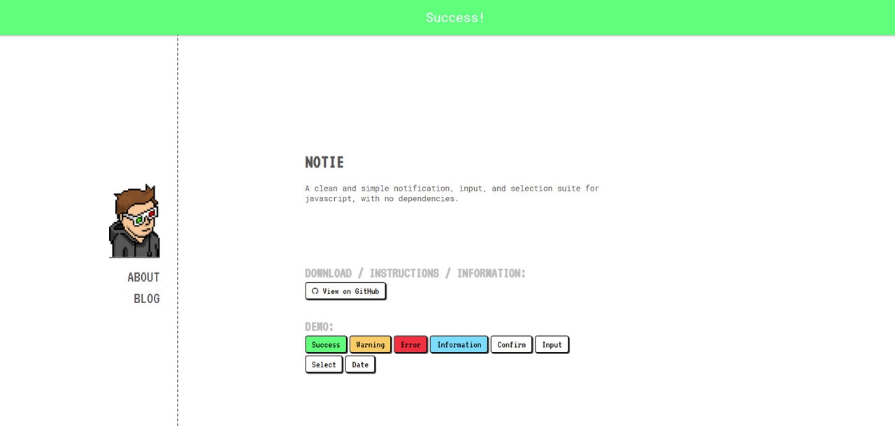
Notie
Notie is a dependency-free jQuery notification message plugin for a website that is incredibly lightweight even though it provides some serious functionality like notification boxes with select and input forms.
Initially, it was created to alert users about important issues. Therefore, it has a design that cannot be missed out. It takes up the browser screen’s entire width and has a formidable height to comfortably house all the information. Though, if you do not like default styles, you can easily modify them in SASS or CSS files.
The plugin comes with eight default options, among which you will find not only standard notifications like “error,” “success,” or “warning” but also some unique ones like web pop-ups with a date or input field.

jToast
jToast is a free jQuery notification message plugin that delivers information through the small yet attention-grabbing box with a sleek and neat progress bar on the bottom. Although, by default, this kind of message should stay on the screen no more than 5-6 seconds, however, you can set any duration you want, thereby prolonging its staying.
The script allows you to customize such features as text, background, color, close icon, progress bar. With some tweaks, you can also change toast’s coordinates on the screen, making it occupy the more favorable position.
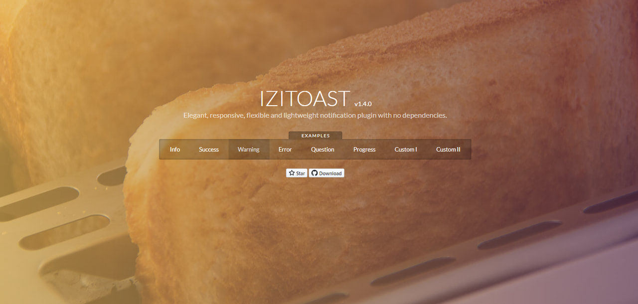
Izitoast
This is another jQuery notification plugin for creating beautiful toast messages. It is fast and lightweight. Thanks to responsive layout, it works well across numerous viewports.
As for customization, the author has added not just a standard pack of options where you can set such parameters as background color, the color of the text, theme, icon, cover image, position, but he also has included animations so that you can make toast notifications appear with dramatic transition effects.
Finally, yet importantly, you can put in action several default options right away.

MessiJS is an updated version of the Messi dialog. This free jQuery notification plugin generates clean and neat web pop-ups. Much like Notie, it also provides a flexible way to get feedback from your users.
It ships with numerous features that let you control such elements as auto close, buttons, modal opacity, position, styles, etc. Also, MessiJS uses some magic from animate.css. Therefore, you can show notification messages with beautiful accompanied effects like bouncing, fading, or sliding.
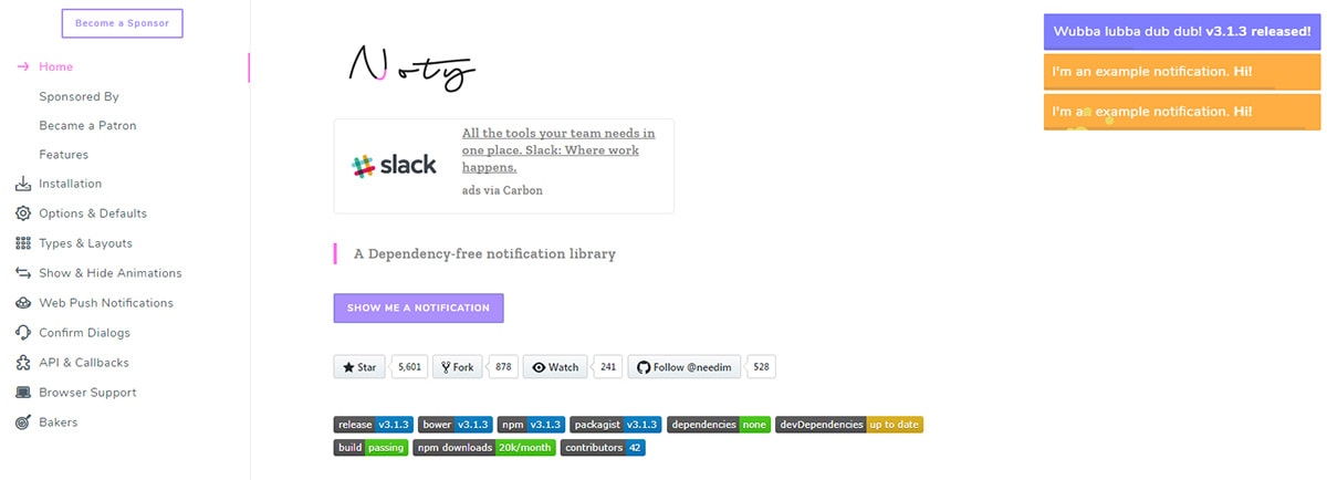
Noty
The Noty plugin uses a bunch of custom animations and beautiful message designs. You have full control over the animation styles and the color choices, but the defaults should work with any site.
Each Noty message slides into view from the corner of the screen and just looks like a small tooltip rectangle. It doesn’t force the user’s attention and it doesn’t block out the main page.
Best of all these messages are fully responsive and designed to fit any screen. Use it for notification errors, warnings, quick updates, anything!
Have a look at the GitHub repo for more info and to dive deeper into Noty’s documentation.
Notify.js

Looking for an even smaller notification box? Check out Notify.js which also runs on jQuery.
This one’s designed for simplicity so the default styles are pretty bland. However you can shape them to fit whatever you need and the plugin comes with a bunch of custom options.
Animation styles, positioning, box size, everything can be altered with a bit of JavaScript. It’s a minimalist plugin but this will require more work to get it looking just the way you want.
Overhang.js
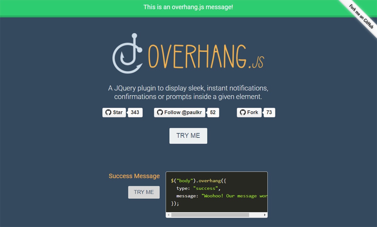
Here’s a unique plugin that lets you run dropdown notifications across the entire top section of the screen. Overhang.js works much like a dropdown bar notification system, maybe something you’d find in mobile apps but rarely on the web.
I think this would be most useful as a marketing tool for promoting new offers, sales, articles, whatever. The dropdown effect is subtle but still grabs attention.
You can define the messages to run on a timer, or to black out the page, or to run on custom user callbacks. Plenty of options to edit making this plugin a unique choice for web designers.
And of course, this plugin works on mobile too so it’s very responsive friendly.
Amaran.js
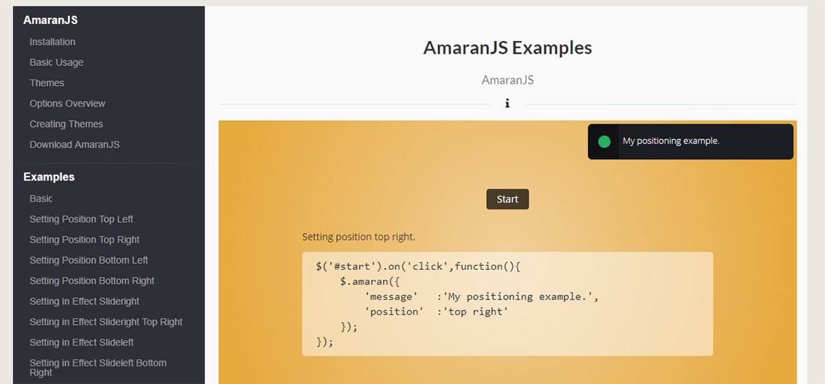
Amaran.js describes itself as a sleek and stylish notification plugin. This is certainly a lesser-known project among the many other choices here, but it works just the same and comes with a lot of pre-built demos.
Have a look at the main page to look over the live examples. I was able to view all the demo pages but I could not get any of the “main” pages to load(404 errors). Thankfully the install & setup info can be found on GitHub too.
Use this plugin as more of a starting point for customizing your own notifications. I don’t think Amaran is perfect straight out of the box.
But it does offer a lot in the way of customization so it’s perfect for devs who like tweaking.
jQuery Growl
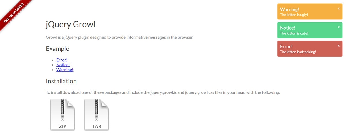
jQuery Growl is one heck of a notifications plugin. This is surprisingly small and it feels much like the OS X Growl system.
This library is small code-wise but it has a large footprint of required files. You’ll need a copy of the jQuery library along with the Growl plugin’s JS + CSS files. Still not too bad considering how quickly you can get this setup(only requires 1 line of code!)
Grab a copy from the GitHub repo and see what you think.
Lobibox
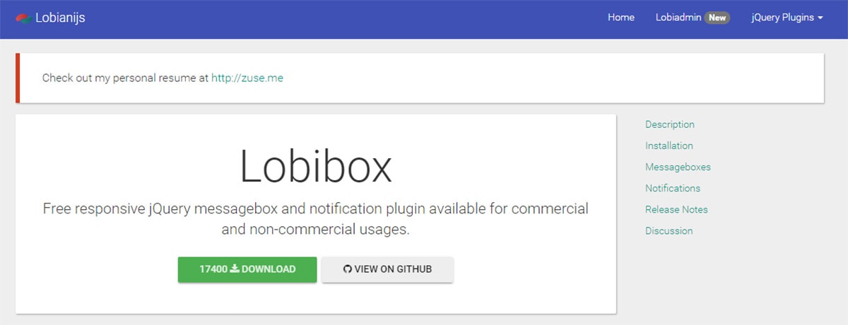
Lobibox is one-part notification plugin and one-part modal window plugin. It’s a very large library but it has everything you’d need for custom notifications on your site.
The documentation is pretty clear but you have to scroll quite a ways down the page to find the live demos. And there’s a lot to go through so be sure to test them all!
You can use this as a replacement for the default alert boxes, or for legal agreement windows, or just for simple corner alert message boxes. Plenty of room to customize.
Toastr
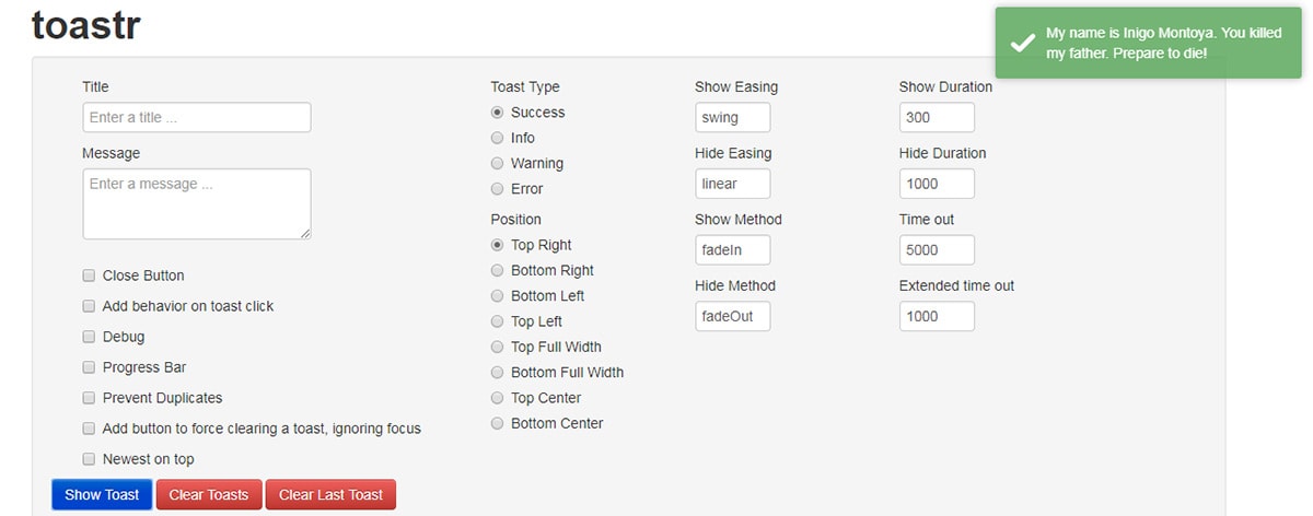
One thing I really like about Toastr is the control over each message’s appearance. This works strictly through JavaScript but you can edit the styles in CSS too.
Actually, this plugin has a full demo page that includes custom editing fields. You can change the message box’s style, animation, position, everything. And you can test it live in your browser before downloading the script.
Plus on the demo page, you’ll get the full code output that you can copy & paste to replace the feature on your own site.
PNotify
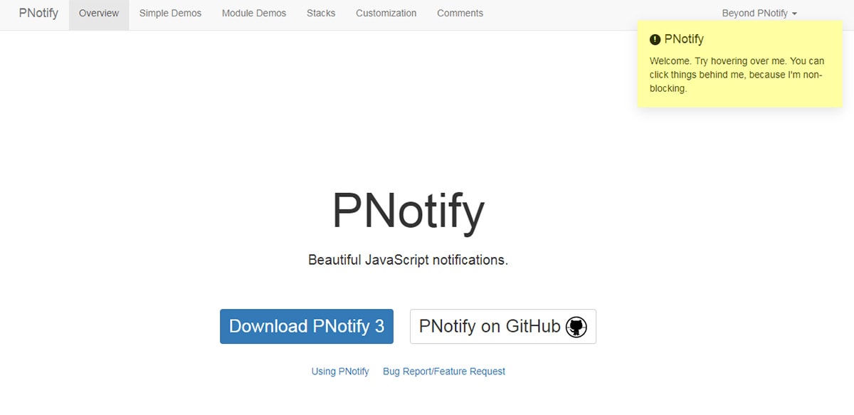
If you need a plugin with lots of features then PNotify is for you.
This comes packaged with dozens of custom themes and animations for notification boxes. Some features include stickied messages, custom backgrounds, and messages with “X” buttons to close at the user’s discretion.
It’s super easy to alter the notification windows switching between error/warning windows and info windows. You can also choose how to stack messages, where they appear, how large they should be… anything you can think of is editable with this plugin.
Notiny
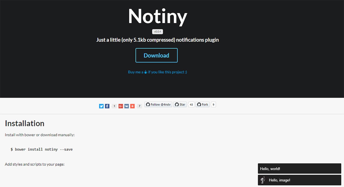
For a super tiny notifications plugin Notiny takes the cake. It measures about 5KB compressed which may seem large, but considering what you get it’s definitely a smaller option than many other plugins.
You can install this with a Gulp/Grunt workflow or pull it directly from GitHub.
All the notifications are pretty simple with clean templates and basic animations. This keeps it lightweight and gives you more control over the message styles.
SweetAlert2
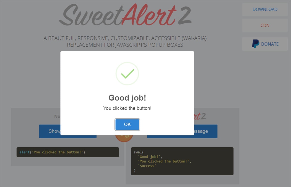
I often recommend the SweetAlert2 plugin for modal windows and alert box replacements. This works a little differently than corner messages because it overtakes the whole screen with a modal block.
However, the design is a lot simpler than you’d expect and it’s really easy to setup.
Keep this in mind as a genuine replacement for native JS alert boxes. Those may grab attention faster but they’re just plain annoying, and nothing can compete with the simplicity of SweetAlert2.
Alertify.js
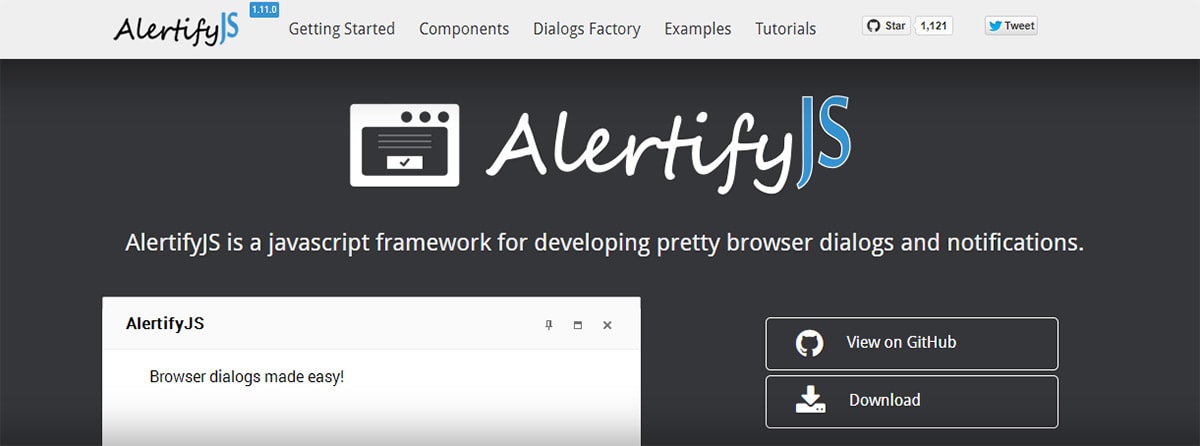
Here’s one other alert window plugin that I think doubles nicely as a notification plugin.
Alertify.js runs on jQuery and doesn’t take up much space. You can use this for modal scripts with a login/signup form, or to embed messages to your visitors.
It also works well for email capture if you’re hoping to build up your newsletter.
Either way, this is just one of many options out there so have a look over this list and see which plugins fit your needs.
Conclusion
Due to a short attention span and constant information overload, the average consumer needs to be engaged to spur action. One of the easiest, time-proven, and surprisingly effective ways to do this is to use a web notification message.
The highly attractive nature of web pop-ups opens vast opportunities to grow your business online. It helps to drive action, collect subscribers, increase conversions, drive traffic, promote offers, build trust in the brand, and simply enhance user experience.
However, with great power comes great responsibility. You cannot just blindly use notification messages on your website because you are risking alienating people and leaving a wrong impression. To play smart, you need a notification message that delivers the information, brings value, speaks directly to the user through personalized message and offer, looks consistent across various viewports, gives control over the situation, and never annoys anyone by staying too long or appearing too often.
To do this, draw up a plan, personalize a message, get straight to the point, create a well-thought-out design and leave the way out open.
Use jQuery notification message plugins for websites that come from trusted sources and provide the functionality that meets your requirements and technical skills.
Finally, always listen to your audience and do A/B testing to find the option that resonates the best.
