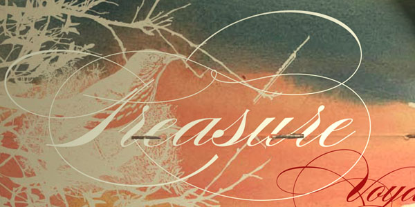
Cursive Fonts: Most Popular Typefaces, Best for Webfonts
Before delving to cursive fonts, it is important to understand where they came from. Cursive fonts is also known as script or joint writing and is a unique form of handwriting in which the language symbols are conjointly written in a flowing style.
The initial purpose of cursive font writing was to create a smoother, faster way to write. Nevertheless, some forms of cursive writing do not actually contain conjoined forms. For example, formal cursive writing uses conjoined styles while casual scriptwriting may contain joints and lifts. In other cultures, particularly Cyrillic and Arabic, the letters tend to be joined at the ends and in certain situations; they look like there is a string of undulating strokes to depict a word or statement.
Export Figma Designs to Live Website – No-Code
Also, cursive does not really mean curves. The term cursive was derived from the French word “cursif” and Medieval Latin “cursivus” which meant “running.”
With Postcards Email Builder you can create and edit email templates online without any coding skills! Includes more than 100 components to help you create custom emails templates faster than ever before.
Free Email BuilderFree Email TemplatesCursive Fonts in Typography
When it comes to cursive fonts, there is a slight difference between script fonts and the prior. Script fonts, technically speaking, are the fonts that offer fluid strokes similar to that of handwriting. The variants of script fonts include the formal types and the casual forms. Formal scripts are often used in invitations and diplomas while the casual scripts are often used for other purposes due to their informal appeal. When it comes to cursive fonts, the style often is un-joined hand writing. The style of a cursive font often depicts brush lettering and often, the small letters are not attached to each other.
Both script and cursive fonts can be calligraphic in form such as a pen drawing, engraving or a formal cursive. These forms are commonly used for works like invitations, diplomas, important documents and even announcements. Both cursive and script fonts may also contain curved styles, swashed details, and highly stylized uppercase letters. These stylized details can make cursive and script forms difficult to read at a glance especially when written in all capital letters. It is advised not to use these fonts when writing in caps to avoid confusion. Also, most of these forms take up considerable space.
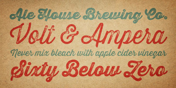
The cursive types became visible around the 1800s when foundries began competing in the commercial print industry. They produced different variations of cursive fonts that are still quite available today. Most of the surviving fonts in this form were created in the 1930s when the cursive font became very popular. in fact, from the 1930s to the 1950s, pen and brush writing as well as excellent penmanship were very important not only for personal letters, but also for advertising purposes, given that the cursive font has a more emotional, personal appeal.
Since the style was very popular, type foundries created a massive array of styles and this also helped those who wanted to adopt this style of writing but they do not have skilled script and cursive lettering experts to do it for them. In a way, these fonts economized the way cursive penmanship is made. An example of the fonts used during the 1930s was the Kaufman Bold, created in 1936 by Max Kaufmann. The family of Kaufmann fonts tends to have delicate and lighter forms that have become the classic look of joined, informal scripts.
Though this is more of a script, it still was an important font of the said era. Another popular form of the cursive form is the Monotype Corsiva which has been designed for the Monotype Corporation by Patricia Saunders. This is an example of an italic cursive type that has been derived from Italian cursives especially that of 16th century penmanship by Ludovico Vicentino degli Arrighi the capital letters of Monotype Corsiva includes swashed details as well as the classic flourishes and were ideally used for initials.
Another type of cursive font is the Berthold Cursive which was created by Gunter Gerhard Lange for Berthold and was released in 1977. Another style created for Berthold in the same year was the Poppl-Residenz Pro and is a beautifully elegant font that was created by Friedrich Poppl who was a professor and designer.
The relevance of cursive fonts
Nowadays, cursive fonts depict a certain part of history when handwriting meant so much. Sadly, after the popularity of more convenient forms of communication, sending letters and creating proses or poems on scented paper seemed too tedious. Nevertheless, the fonts wanted to recreate that drama: the allure that even in world of zeros and ones, there are ways to humanize what we do.
Even with an artifice like a cursive font, we can depict something personal, important, revered and appealing. Before, it mattered to have impressive handwriting skills, but now, it is obsolete. Nevertheless, cursive writing will always keep us grounded that even with advanced technologies; we know that they all came from time honored beginnings such as in handwriting.
With Pulsetic you’ll be instantly notified the moment your website, API, or server becomes unavailable. Monitor uptime from multiple global locations and respond to incidents before your users are affected.
Create beautiful status pages in minutes to keep customers informed during outages and build trust with transparent communication.
Start Monitoring for FreeMost Usable Cursive Fonts
Mission Script

Mission Script is a beautiful calligraphy typeface with lots of charm created by James T. Edmondson. It is marked by subtle brush strokes and is suited to various female projects or UI with delicate traits.
Thirsty Rough
As the nameplate suggests, the typeface is marked by a roughness, and it certainly is. There is even a bit of brutality that is quite unexpected in such kinds of fonts. It has a nature of classic letterpress printing and elegant appeal spiced up with some grunge touches.
Bombshell Pro
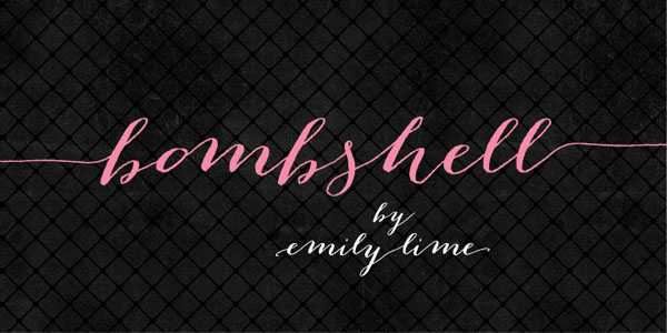
Bombshell Pro looks elegant and female, especially in the pink shade. The key feature of this beautiful calligraphy font is long connections that not only link letters together but also add a lovely twist to characters. Since this is a premium version, here you will find all sorts of glyphs and symbols including even Roman numerals.
Thirsty Script
Thirsty script gets its elegant and subtle appearance from curvy lines, smooth edges and round shapes. In bold weight, it looks particularly good. The author skillfully blends several typefaces to create a harmonious mixture of modernity and retro. The type is available in 6 weights, has a selection of ligatures and of course, supports multiple languages.
Carolyna Pro Black
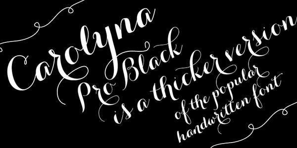
This gorgeous handwritten type has a graceful nature and positive mood. Thanks to long curves and swirls it looks whimsical; however, it is very easy to perceive since the author has taken into account readability. Here you will find more than 1000 characters with plenty of foreign letters and all the glyphs.
Hipster Script Pro
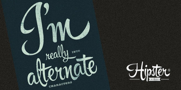
Hipster Script Pro is a perfect example of how to skillfully marry modernity and retro style and reproduce a top-notch handwriting typeface that reflects popular contemporary subculture. It is defined by some capably faked brush strokes that add artistry to each character. The commercial type provides you with all the necessary stuff to decorate headings.
Jacques & Gilles
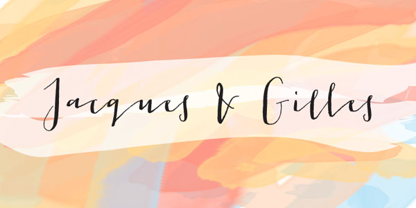
Jacques and Gilles has a certain personality. It looks exceptional both in uppercase and lowercase though as the author claims, in the latter mode it looks even more special. Being slightly curved, it reminds doodles, and at the same time, exudes an image of elegance. The type features more than 300 glyphs covering ordinals, Roman numerals, terminal letters and others.
Belluccia
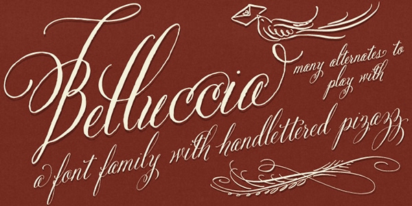
Belluccia has a subtle Italian charisma that gives off taste, grace, and subtlety. It implies two versions: regular slick and smooth bold. It comprises ligatures, contextual alternates, different punctuation marks, swashes, old style figures and stylistic alternates.
Carolyna
Carolina boasts of the same delicate nature as Belluccia font. Being created with readability in mind, it always stays legible and easy to perceive, though there are lots of decorative touches that develop fantastic impression. It is available in the open-type format, covers all the characters to write in other foreign languages and offers two basic licenses.
Burgues Script
Burgues Script was inspired by 19th-century American calligrapher, so that it possesses some gorgeous old-timey traits. It is spruced up with swirls and subtle decorative strokes that incorporate into the type an energetic Spanish soul. Having received important awards and certificates, it has all to become an ideal instrument for your tasks.
Melany Lane
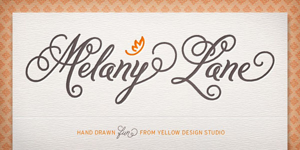
Melany Lane owes its beauty to traditional pressing letterforms. It has a slightly bold weight that helps it stand out from the environment. This flourish hand-drawn typeface features all standard glyphs and even some extra items. What’s more, it also comes with 118 eclectic ornaments and 14 seamless fancy backgrounds that let you finish off any project.
Insolente
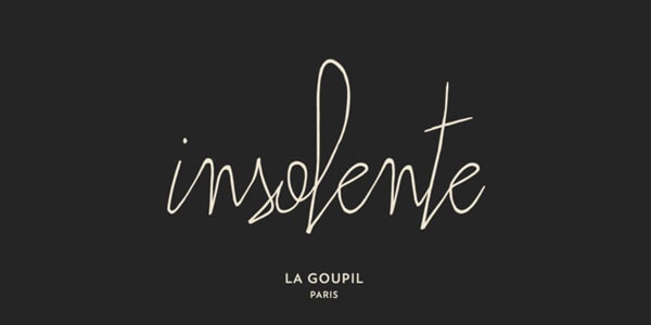
Insolente is an ultra-narrow and extra elegant typeface that requires a proper background. It has a modern French vibe that is full of fashion and versatility. Although glyph coverage leaves much to be desired, yet it has five licensing options that allow you to use it on various devices. Besides, it has a sibling with long and artistic connections that in tandem works wonders.
Peoni Pro
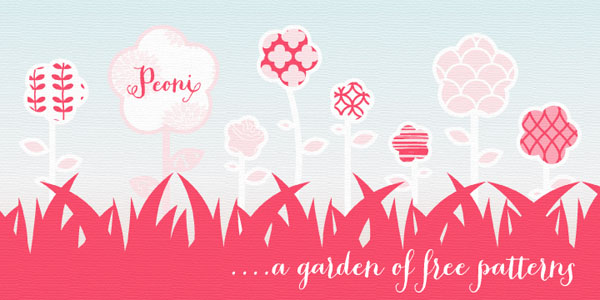
Peoni Pro is the perfect match for any female project where pink coloring plays the first fiddle. It has a delicate and gentle nature and features more than 1200 characters including
- stylistic sets with 6 different Caps styles;
- standard ligatures;
- swashes and contextual swashes;
- tabular numbers;
- old fashioned style numbers;
- and even stylized words such as Roman numerals or ordinals.
Dom Loves Mary
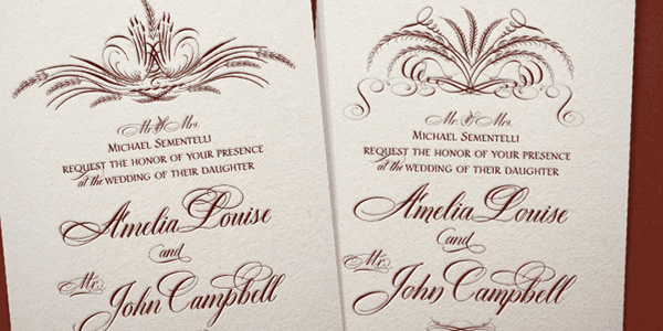
Dom Loves Mary is the typeface that is impregnated with love and charm. It includes lettering forms that naturally complement each other, recreating a harmonious and magical atmosphere. It has a classy vintage feel that goes perfectly well with various stationary projects especially wedding invitations.
Samantha Script
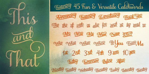
Samantha Script is claimed to have a measured rhythm that is appropriate to various headings and titles. As befits to all cursive fonts, it looks dignified, delicate and refined. Ships with more than one thousand alternates and swash characters, it comes in handy in different tasks. As a bonus, it has 60 ornaments and 46 catchwords, lining numerals and old style numerals so that you are equipped with everything you may need.
Aphrodite Slim
Aphrodite Slim has an appeal of an ancient cultivated beauty that is reproduced with the help of an ultra-narrow lines and almost fragile shapes. Covering 1000 glyphs it has a ton of decorative characters and special ligatures for reproducing phrases and sentences not only in English but also in French, Spanish, and German. In addition, it lets prettify beginning and ending of words.
Gelato Script
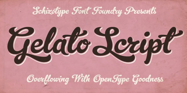
Gelato script is a matchless handwritten font that in bold weight achieves the fantastic effect. Along with elegant and polished appearance, it also looks smooth and eye-catching. It counts more than seven hundred glyphs that make it suitable for writing in various languages, mainly on those that have roots in Latin alphabet.
Funkydori
With Funkydori you are guaranteed to achieve a harmonious vintage appeal. The typeface has a subtle old-timey vibe that thanks to swirls and boldness looks a bit massive, and at the same time, exquisite. Being inspired by 70s, it is charged with groove rhythm. It is available in 5 licensing options and features a bulk of characters.
Feel Script
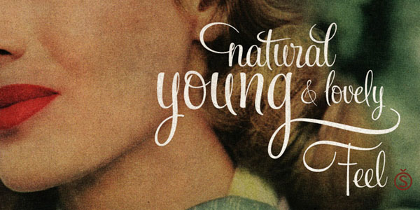
Feel Script is an optimal variant for those of you who need to add to the artwork fashionable and graceful touch. Covering all the possible stylistic, contextual and titling alternates as well as ligatures and swashes, it enhances various multi-language projects without problems.
Sugar Pie

Sugar Pie is an exceptional bold type that owes its stately beauty to elegant nature of calligraphy. It radiates of softness, chic, and delicacy. It successfully reflects the era of 60 spiced up with wide and smooth brush strokes. The set covers various alternates and ligatures and is well-suited to Latin-based alphabets.
Belinda
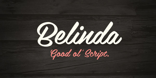
Belinda does not have any decorative touches or extra swirls inherent to uppercase characters. However, it has neat and graceful lines that make it an optimal solution for majority projects that want to maintain readability. Much like the previous example, it is also enriched by brush strokes. As for characters, it has all the popular symbols and even more.
Candy Script
Candy Script has a funky look and is defined by a blend of elegance and playfulness – that is a quite rare combination. The author capably incorporated the spirit of vivid and lively Argentina culture into it. With a gazillion of OpenType alternates, over 600 vigilantly crafted characters and five licensing options, this bold but delicate hand-brushed type will leave its mark in any project.
Conclusion
Although cursive types are most often associated with something slim, delicate and ultra-narrow, yet they also can be bold and a bit rough in order to feel comfortable in the complex compositions with textures and patterns. Not only do they add delicacy and gentility, but they are also capable of reflecting elegance of various eras, giving artists an opportunity to work into projects subtle sense of retro vibe or energetic rhythm, groove, old-timey feeling, hipster appeal, or modernity.