Product and Service Update Emails – Best Practices and Examples
The product update email is a unique type of newsletter. Although it seems that it does not differ from others, it is a collaboration between marketing and product teams. Along with delivering information about the improvements that secure trust in a product, it should keep users engaged, promote new features, and drive traffic to the website. It might seem very much like an onboarding email since the manner of displaying data is what matters.
The product update newsletter is all about brand new features or upgrades of the system. However, no one likes to read boring documentation and bug fixes. Everyone expects a story that is exciting and enlightening. It should reveal important improvements and promote the product or bring customers to landing pages. Therefore, unlike transactional emails, welcome emails or seasonal emails, these newsletters require turning boring things into exciting ones.
To get you started, we are going to explore product update emails from various angles. Let’s consider subject lines, content, general tips, and a list of practical examples for inspiration.
Subject Lines
The first subject line for a product update email that comes to mind is “Product Update,” however, it is boring. We are going to write a story and involve readers in a storytelling experience; therefore, it should be something more inspiring. Consider these examples:
- Your Improved Product is Here
- Summer emails brings Additional Features to Product
- Product: now in fresh new…
- New features have arrived!
- Say Hello to the New Product
- Sneak Peek at our New Future
- Meet New Features
- Together at Last
- It’s official: The New Features are here
- Product is ready for new adventures
- People are loving the new Product
- The New Product. Smart. Sleek. Powerful.
- Introducing the brand-new features
- The home for your products get better
- New apps. New features. Save more
- Shop/Create/Play with new Product
- New from Product: Give your users…
- This is a big change!
- Product just got even better. Take a look
- Hi, join us for a look at upcoming updates to Product
- The most requested feature is Here
- Don’t’ miss our new Product/Feature
- Meet New Version of Product and Love your work again
- A Brand New Product View
- Even more perks
- Welcome to all-new Product

Avocode Email
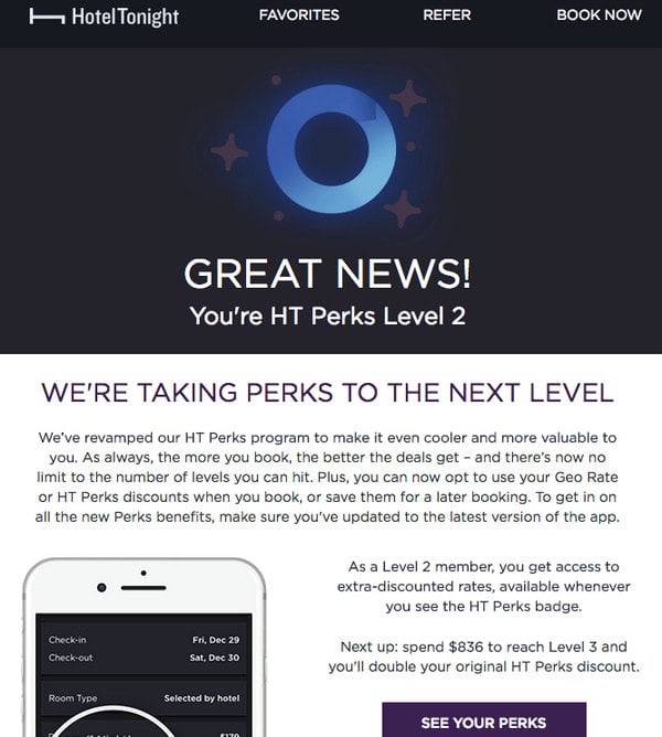
Email from HotelTonight
With Postcards Email Builder you can create and edit email templates online without any coding skills! Includes more than 100 components to help you create custom emails templates faster than ever before.
Free Email BuilderFree Email TemplatesYou can also try some time-proven options:
- What’s new in Product/Company/Community
- December Product and Community Update
- Product: 2020 Update
- Product Monthly: Updates, New Features, New Articles
- A Product Update is available
- Product New Version is Here! All you should know
- We have added 3 new features
- Try these new features
- An important update on
- The new Product is here
- Introducing new features
- New: Impressive Feature is here
- Learn about updates
You can also start your subject line by listing the most impressive features, for example like the team behind Sketch did: “Dark mode in Sketch, magic buttons, and a huge community…” or follow Avocode’s example with a simple yet impressive line “Adobe Illustrator comes to Avocode!”
Tips for Product Update Emails
The product update email is not something that people are eager to open. After all, enhancements become evident with the next product interaction. Therefore, some people consider these newsletters useless. It does not mean that you should stop sending these emails. It is an opportunity to generate user engagement, drive traffic, and even in some cases raise revenue, since along with the update you can tout premium features. So what can you do to improve open rates and click-through rates of product update emails?
- Know your audience. Working with the subscription list is an essential step in every marketing campaign, but it is here where proper segmentation is everything. Depending on changes, you may send different emails about the same updates. Target your audience properly. You may use gender, age, preferences, and, most importantly, what part of the product is used to divide subscribers into groups. Use different content, language, and even style to appeal to specific groups of people.
- Not every update is worth a spot in the newsletter. Do not bombard your contacts with every bug fix. It is your task to figure out what information will bring actual value. If it is something minor, do not bother subscribers; however, if it is something big, then you can create an entire show for that.
- Think about long term relationships. Product update emails were created for this. Constant improvements to the product do tell about your caring for the customers. Therefore, use email to remind your contacts that you appreciate them, and their thoughts and opinions matter.
- Do not include too many cross-selling and up-selling products. If you are planning to use product update emails for promoting goods and increasing ROI, then no one can stop you from that. However, act smart – play some psychological tricks. You can give away a special discount, offer a free trial, and mix in time-sensitivity. However, it should be unobtrusive. Remember, new features are the star of the show; everything else should be a delightful addition.
- Before sending the email, check it and test it. Although it is not something big like BFCM email or Christmas email, nevertheless, it is a valid player with its superpowers in your game of winning over clients.
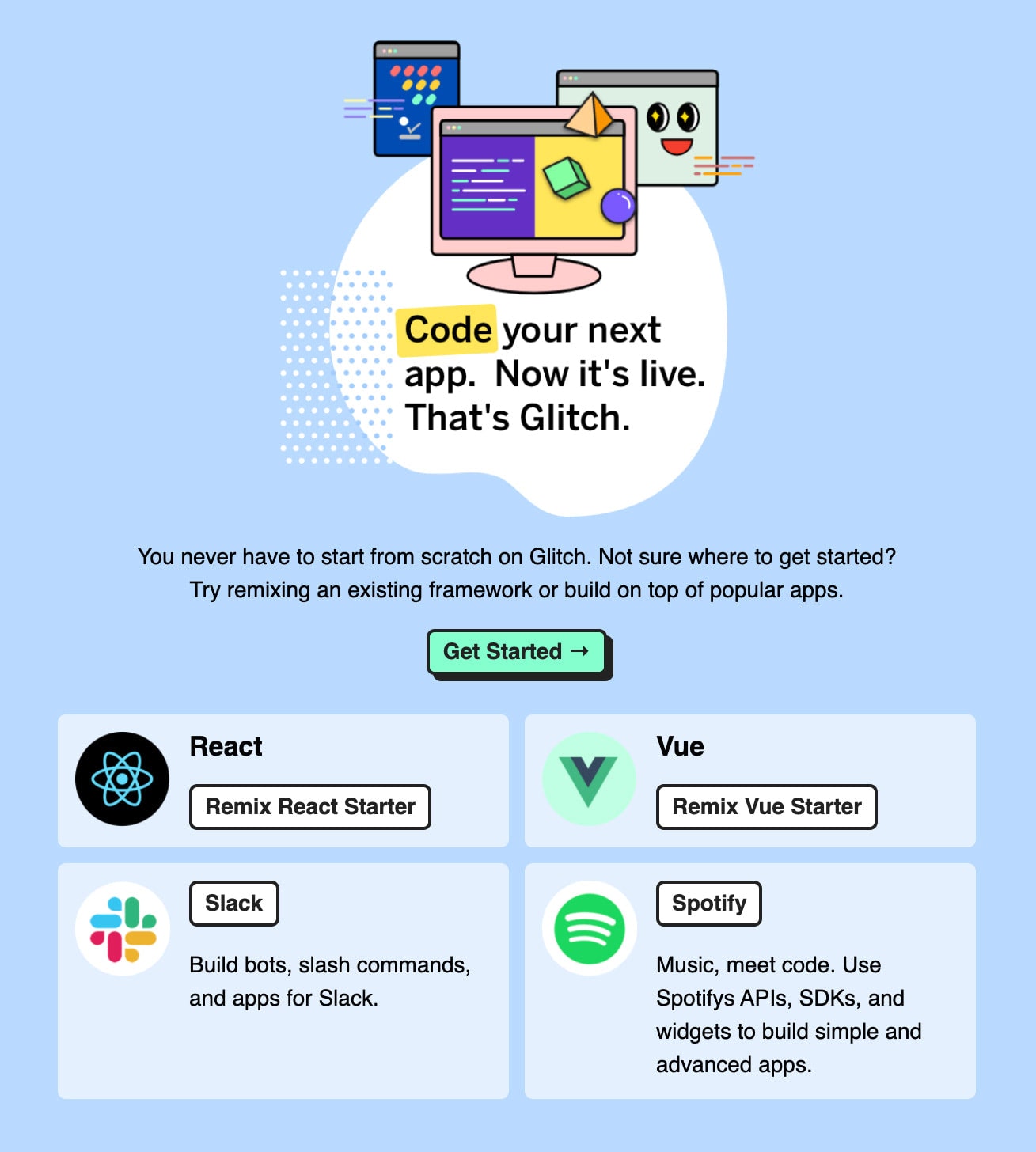
Glitch Email
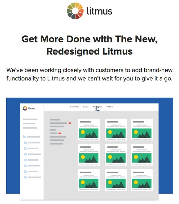
Email from Litmus
Content
What should you include in a product update email? First, determine what your goal is. You can use a product update email for notifying about changes and as an educational and promotional tool. Therefore, you may include such things as:
- Guide how to get the most of the new features
- Welcome message
- Product description
- List of features
- Feedbacks
- Developers’ notes
- Cross-selling, upselling products
- Bonus
- Reasons why an update is important
Do not forget about visual and emotional constituents. Spice things up with pictures, icons, animated gifs, or emojis. You can also add links to video tutorials. (Note, due to current limitations, many popular email readers do not support video). All these extra efforts will help to generate excitement and drive engagement.
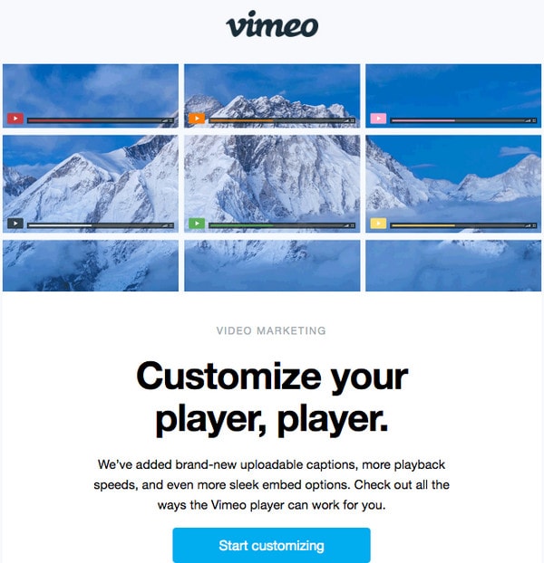
Email from Vimeo
With Pulsetic you’ll be instantly notified the moment your website, API, or server becomes unavailable. Monitor uptime from multiple global locations and respond to incidents before your users are affected.
Create beautiful status pages in minutes to keep customers informed during outages and build trust with transparent communication.
Start Monitoring for FreeDesign a Product Update Email
The design of product update emails is quite conventional. It should include your brand identity, including copyrights, and an unsubscribe link, have an impressive hero area, and display content in a pleasant manner. The simplest way to create an email marketing campaign is with Postcards. As a powerful yet still intuitive HTML email template builder, it has a well-thought-out modular system. Just drag and drop modules and field-tested layouts that you feel fit most. Then easily edit text, insert images, and you are ready to use them in any popular ESP.
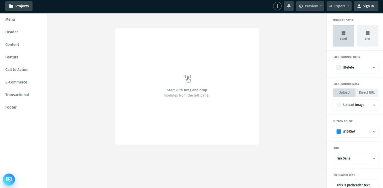
To get some inspiration consider some real-life examples of good product update email newsletters
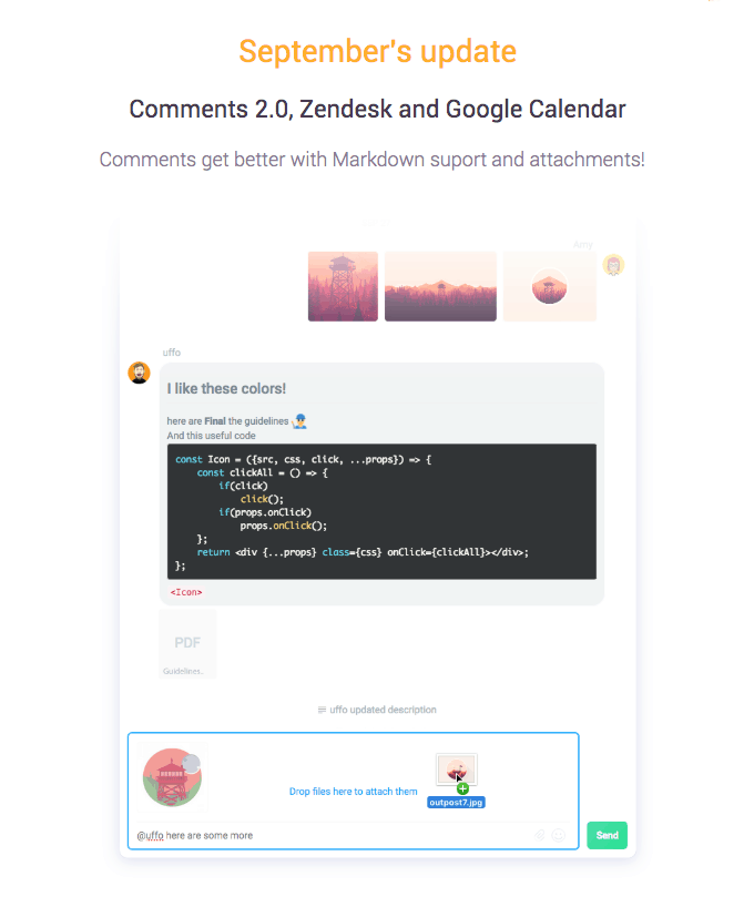
Email Newsletter from Ora
The product update email from Ora tells a story using an illustrative approach. We can see a highly appealing newsletter that instantly lures subscribers in with its charismatic personality and positive vibes. Images, illustrations, and icons create the entire entourage. Here text plays a supportive role since all the information about an update transmitted through visuals.
Note, the team behind Ora sends out this kind of eblast each month. Thanks to this approach, they do not feel tedious, overwhelming, or annoying. They are like pleasant short narrations that tell an exciting story about the product each month.
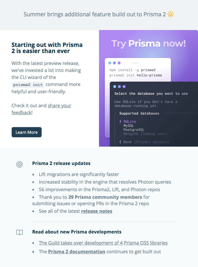
Email from Prisma
Email from Prisma certainly differs from the previous example. This time you will see how the content is in charge.
The newsletter is quite long. There are no lavish illustrations or graphics. The focus is set on lists, text widgets, excerpts from the blog and even event overview.
At some point, this email may remind a compact landing page with bug fixing report. However, the team was managed to breathe some life into it by using coloring and several small pictures. As a result, the piece feels informative and still eye-pleasing. Note there are no promos whatsoever. It is just a pure product update newsletter that wins over customers with its transparency.
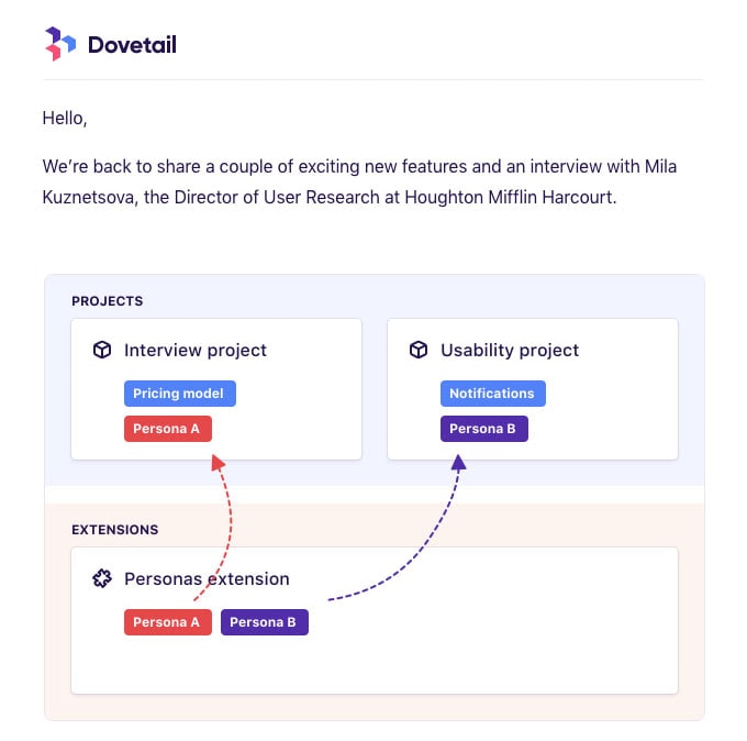
Email Newsletter from Dovetail
Much like the previous example, product update email from Dovetail is centered around the content. The manner of showing information has a blog style with a linear layout with blocks of text, supporting images, and calls to action. The design naturally appeals to the audience since it can be quickly scanned. Large and descriptive images ignite interest. Note, the team has overviewed just three features.
As a result, the email feels unobtrusive, intuitive, and informative. Much like Ora, the team also sends out this kind of eblast each month. They gradually engage subscribers, add to relationships, and prolong a good impression of the brand, thereby preparing the ground for other promo-centric email newsletters.
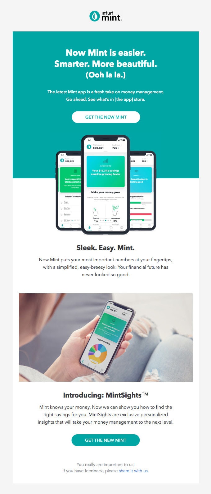
Product update email from Mint
The product update email from Mint gets a bit playful with displaying updates. The eblast feels so positive that it is quite difficult to resist its charm.
Here the headline puts the contacts into a good mood from the get-go. The coloring in tandem with graphical filling skillfully bolsters the theme creating an adorable entourage. Note the email is rather short: there are just several blocks. Nevertheless, it is enough to ignite contact’s interest with brand-new features and leave a strong impression.
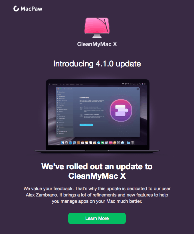
Email from MacPaw
Product update email from MacPaw leans more on the traditional approach of displaying updates. Since it is an iOS application, it comes as no surprise that it embraces Apple’s love for minimalism and echoes with the designs of landing pages. Everything starts with a MacBook mockup that features an app. Although this is a cliché, yet in this context, it works and rocks.
After that, you can see a list of new features that are pleasantly displayed. Although the design looks vibrant, it still has a healthy amount of whitespace hitting harmony. Much like the first example in our collection, the team behind MacPaw has created a small story about the update using an illustrative approach.
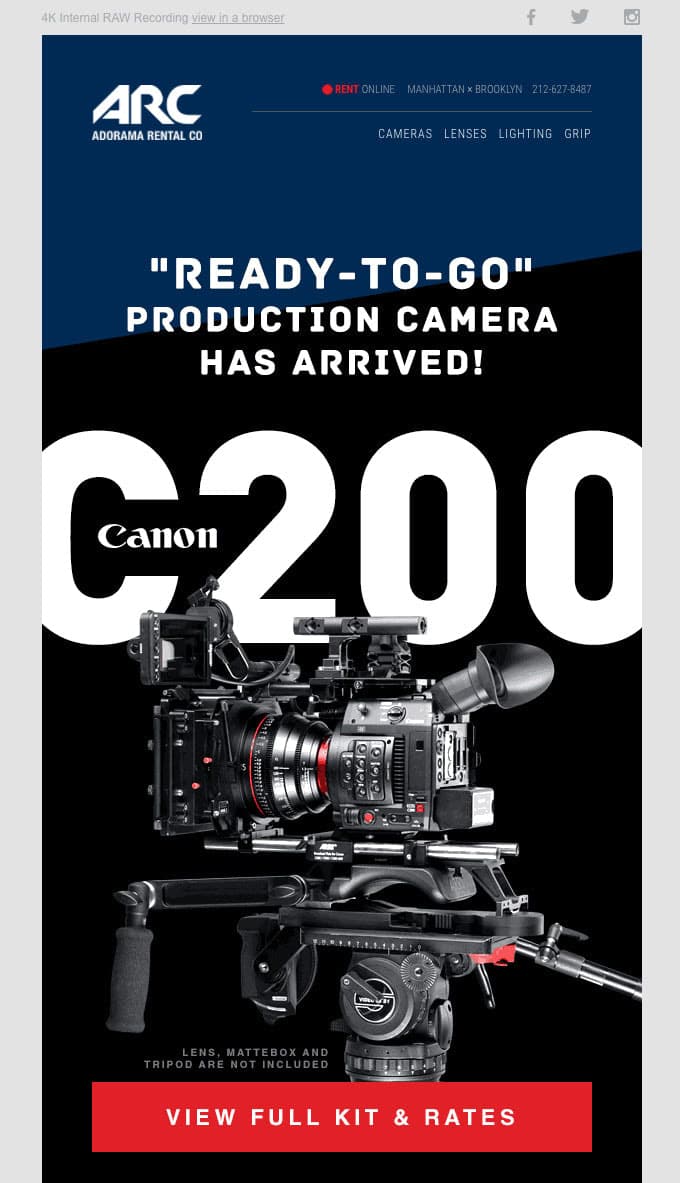
Email from Adorama Rental Company
The product update email from Adorama Rental Company looks like a classic advertising leaflet. It is impressive and inspiring. The team included a full description and a list of key features with impressive images of the selling item. Note several things:
- Formatting makes the reading flow pleasant and the announcement of the product loud.
- Images speak volumes.
- Text nicely balances with visual material: the content is skillfully showed up.
- The overall design is well-thought-out, impressive, and outstanding.
The email newsletter looks like a high-quality product itself.
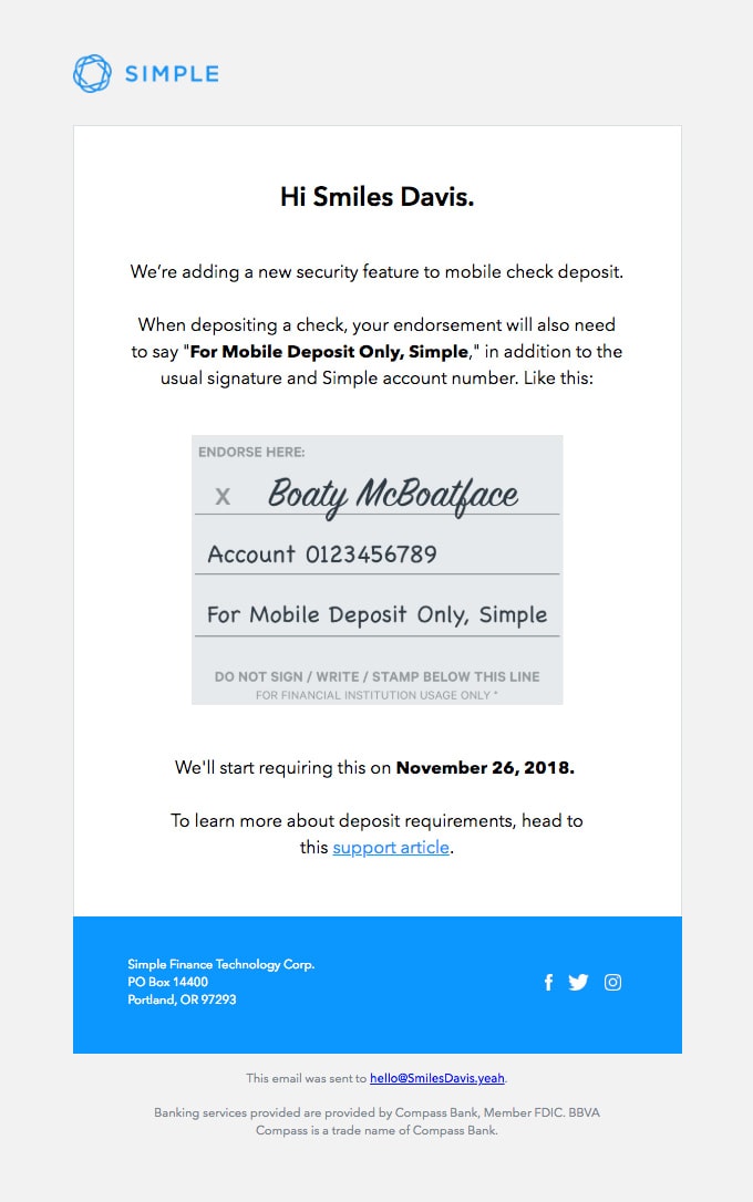
Email from Simple
A product update email from Simple is a perfect example that proves to us that you should not reinvent the wheel to inform the audience about changes. Sometimes, even oversimplified compact newsletter without much visuals can do the trick. Take a closer look at the newsletter.
Although it is not a traditional plain text version, nevertheless compared to the previous listed here, it certainly looks primitive and plain. However, it still works. The key lies in its conciseness. This relatively small notification brings good news into the inbox.
This kind of email contributes to relationships with the contacts.
Conclusion
A good product update email is all about a good story. No one likes reports about changes. What people want is to know how these changes will improve their lives. Remember, people will not read; first, they will scan. Therefore, not only should you focus on providing information that brings value but also creating the design that is easily digestible and attention-grabbing.
Avoid being boring, go for interesting, engaging, and intriguing storytelling experience. Use animated gifs, bright visual material, image backgrounds, interactive details, friendly language, modern email design layouts, and some other tricks to make this type of informative email newsletter effective and converting.
