Welcome Emails – Everything You Must Know [+ Welcome Email Examples]
A first impression counts in almost all situations, and email marketing is no exception. While some may think that this impression is primarily produced by the design and content displayed inside the most viewed part of the email newsletter, this is not entirely true. What about the overall email marketing strategy? What does produce the first impression there? The answer is simple – it is the welcome email newsletter.
The welcome email is the first meeting with a new subscriber. Like in any other relationship, it should live up to standards and be flawless. What’s more, according to surveys, it has a four times higher open and click-through rate; it outperforms every other type of eblast in terms of transaction rate and even revenue. Consumers expect a welcome email for the most part. Therefore, it is one of those rare occasions when you can be sure that contacts will get your message.
If you do not make the most out of this opportunity, you will fail to lay a concrete foundation for relationships with your contacts to say nothing about driving traffic and raising revenue. Let us consider some good welcome email examples to give your email marketing campaign a great start.
What are Welcome Emails?
Welcome emails are an integral part of the email marketing journey, marking the first interaction between a brand and its new subscribers. These emails are not just a formality; they are a powerful tool for building a lasting relationship with your audience.
By sending a warm, engaging, and informative welcome email, you set the tone for future communications, establish trust, and significantly increase the chances of engagement with your brand.
This article delves into the art and science of crafting effective welcome emails, exploring their importance, best practices, and the impact they can have on your email marketing strategy.
With Postcards Email Builder you can create and edit email templates online without any coding skills! Includes more than 100 components to help you create custom emails templates faster than ever before.
Free Email BuilderFree Email TemplatesWhy are Welcome Emails Important?
Welcome emails are more than a courteous introduction; they play a pivotal role in email marketing strategies. Let’s delve into the reasons behind their significance:
- First Impressions Matter: Welcome emails are the first step in your email journey with a subscriber, setting the tone for future interactions.
- High Engagement Rates: Typically, welcome emails enjoy higher open and click-through rates, making them a golden opportunity for engagement.
- Building Relationships: They help establish a connection with new subscribers, fostering loyalty and trust from the outset.
- Boosting Brand Awareness: Welcome emails introduce your brand’s personality, values, and offerings, shaping the subscriber’s perception of your brand.
- Immediate Value Delivery: By offering immediate value, be it through information, discounts, or exclusive content, welcome emails enhance the subscriber’s experience and anticipation of future communications.
Understanding the importance of welcome emails can transform your approach to engaging with new subscribers and pave the way for a successful email marketing journey.
Let’s familiarize ourselves with the types of welcome email newsletters. They include:
- Greeting Email
- Thank you Email
- Finish Signing up Email
- Get to Know Each Other Email
- Onboarding Email
- Get Social Email
- Incentive Email
- Brand STory Email
- Brand Benefit Email
- Product Showcase Email
- Feedback Email
Each brings its value, evokes a specific range of emotions, and pursues a goal. For instance, the Greeting email is used to welcome users, whereas the Onboarding email uncovers vital steps that are required to work with the website efficiently.
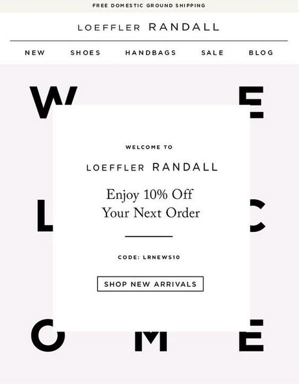
Welcome email newsletter from Loeffler Randall
On top of that, some situations require more than one welcome email. For instance, if, after the Thank you email, you need to explain to customers how to get the most out of the website by using an onboarding email newsletter, or offer a complimentary gift for successful registration, you will run an entire welcome series with at least two pieces.
The number of emails to send depends on the products that you offer, the type of website, and of course, strategy. Therefore, if it is necessary to notify newcomers with a bulk of information, you can divide it into several blocks and send out two or even more welcome email newsletters. Note it is better to send out several interconnected email newsletters that will drum up interest and build anticipation gradually, rather than include all information inside one long letter and expect your contacts to read it from top to bottom and follow your lead.
Finally, before creating an email newsletter, consider its emotional constituent. After all, it is the first-ever email newsletter that you send to contacts. It is here where you can lay a concrete foundation for the friendship as well as build trust. Therefore, use friendly words and inviting language. Do not be pushy and bossy, as well as avoid using too many incentive words, offers, and CTAs. Try to establish a dialogue with contact and position him or her as a friend rather than a client.
With Pulsetic you’ll be instantly notified the moment your website, API, or server becomes unavailable. Monitor uptime from multiple global locations and respond to incidents before your users are affected.
Create beautiful status pages in minutes to keep customers informed during outages and build trust with transparent communication.
Start Monitoring for FreeThe key moments of designing a welcome email newsletter boil down to the general rules of creating a good transactional email newsletter.
- Decide whether you are going to use plain text or an HTML email newsletter.
- Make it responsive and mobile-friendly.
- Use animated gifs to add emotions through motion.
- Choose the proper typography.
- Make sure your images have alts.
- Use fully optimized image backgrounds.
- Add interactive hotspots to engage readers even more, etc.
If in doubt about how to design the welcome email newsletter that meets the current trends read these helpful guides and tutorials:
- Email Design Trends for 2025
- AMP Emails: Create Interactive Newsletters with Examples
- How to Insert and Use Animated GIFs in Email Newsletters
- How to Be a Great Email Designer: Essential Tools
Want to streamline it all? Try Postcards.
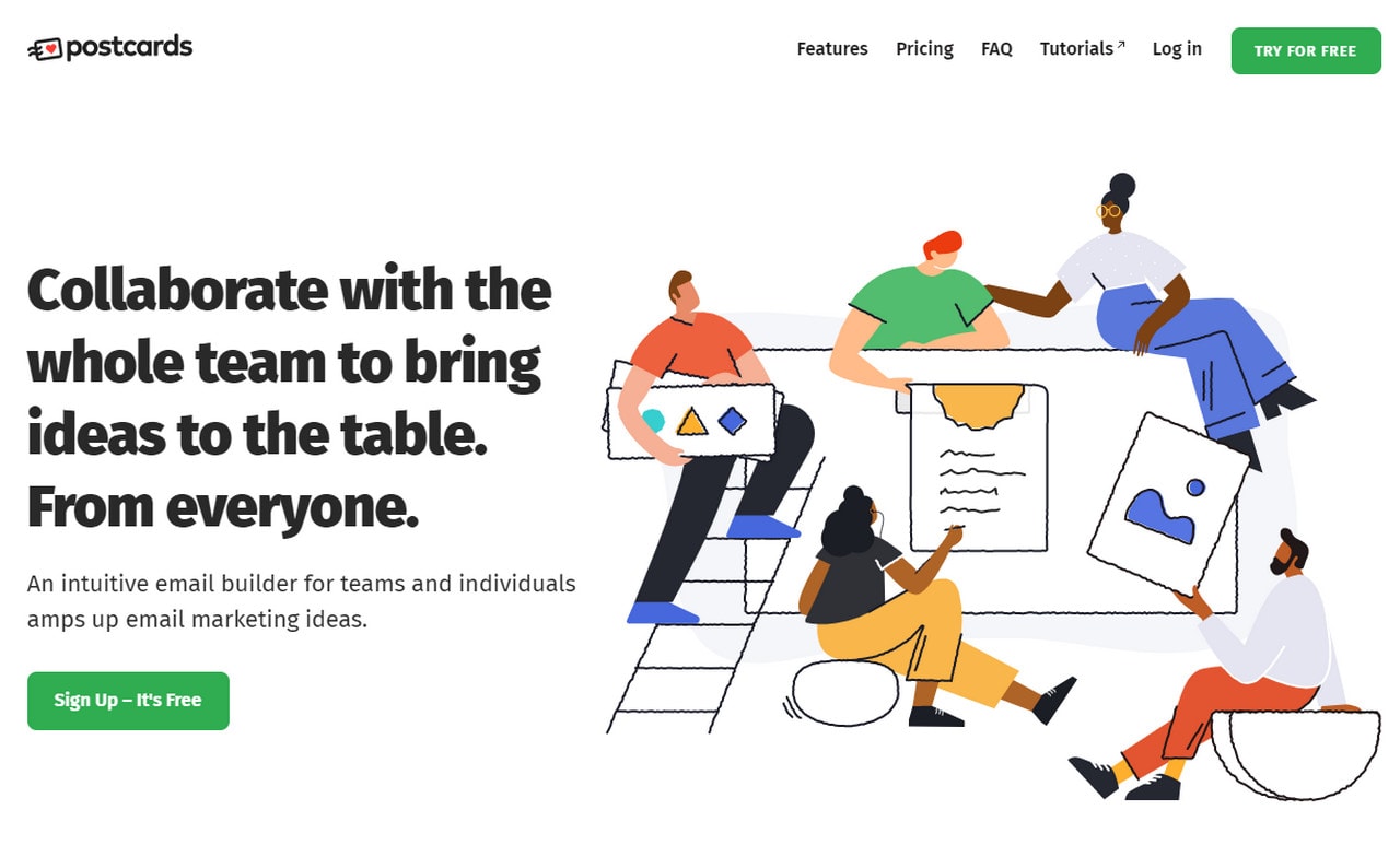
Postcards is an intuitive free HTML email template builder that was made with current trends in mind. It complies with all the modern requirements offering you an opportunity to create a professional, good-looking email newsletter that will work consistently across all popular browsers and email readers.
Collection of Inspiring Welcome Email Examples

Welcome Email from PixelBuddha
The team behind PixelBuddha uses a welcome email newsletter as a medium to introduce themselves. They have enriched a greeting email with benefits of the community, coming up with a pleasant and, at the same time, informative piece.
The first thing that strikes an eye here is the illustration. Not only does it evoke a wave of positive emotions winning over newcomers with its powerful charisma, but it also hints about the quality of products that are waiting on the website. Very smart and creative.
Welcome email from Bando
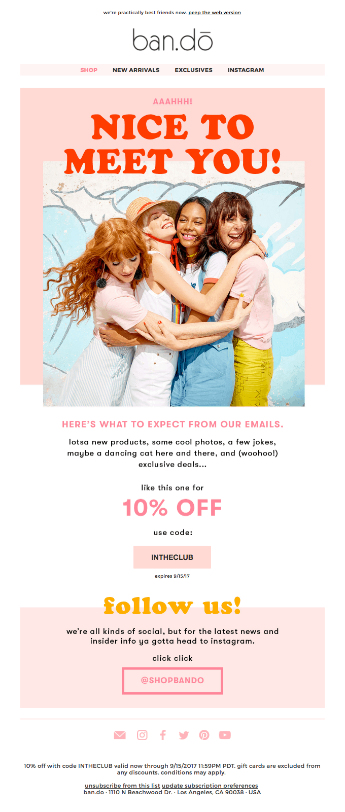
Much like the previous example, the team behind Bando greets newcomers with positive imagery that conveys a warm, welcoming feeling as well as oozes a powerful human touch. “Nice to meet you” is a central theme. However, that is not all.
Such email templates also have a small praising block that ends with an announcement of exclusive deals. The latter sets the expectation pretty high. Also, there is a small yet valuable discount. This small gesture not only feels like a pleasant surprise but also supports a feeling of VIP status. Simple, yet effective.
Email Newsletter from Karen Millen
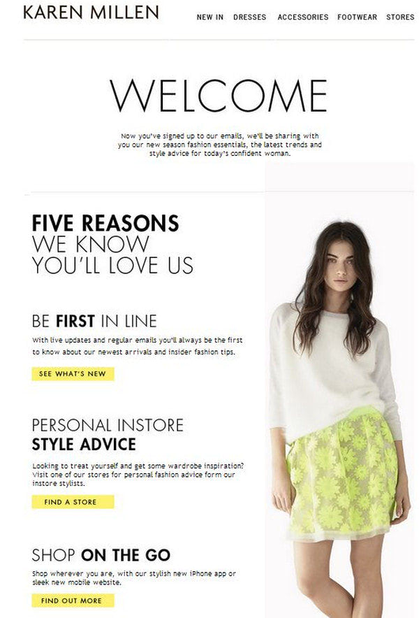
While the previous email newsletter focuses on the welcome message, keeping things friendly and buttering up subscribers with an attractive offer, this one shows how to make an informative welcome email with a serious tone look inviting. The team has included five reasons to choose their brand. Nevertheless, thanks to the smart display of benefits, the team easily brings potential clients to their side.
Note the overall design. It is clean, neat, and spacious: here, the content naturally catches an eye. Thanks to proper formatting, you can easily delineate all the crucial details of the message and get the key aspects from the get-go.
Welcome to Casper
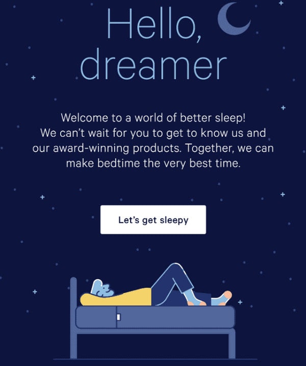
The welcome email from Casper is one of those rare occasions when the team created a long newsletter and still made people read it. TL;DR has nothing to do with them.
They turned an illustrative approach to their advantage. No one can resist the temptation of exploring artwork at least once; therefore, information dished up in such an artistic way is very easy to digest. They have also bolstered the impact by using some thematic puns.
Note several things. First, a call-to-action button is skillfully built in. Second, a generous amount of whitespace creates a balance between the visual and textual parts, making reading pleasant. Finally, an actual image shows the product. It is a well-thought-out and smartly executed work.
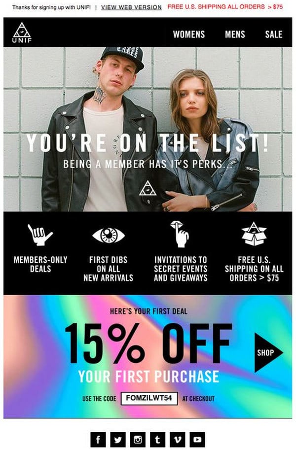
Welcome to Unif
The welcome email newsletter from Unif stands in contrast to the previous example. It is based on an image background and is quite minimal. However, it does not mean that it does not sell the brand to newcomers.
The key to this piece lies in the brand voice that can be heard in every inch. The powerful touch of corporate identity is irresistible, to say nothing about an extra discount. In addition, the welcoming phrase “You are on the list” establishes a sense of one-on-one conversation that certainly adds some extra points to the relationships with the contacts.
The team combines visual identity with shopping incentives, resulting in a powerful email newsletter and, ipso facto, a convincing first impression.
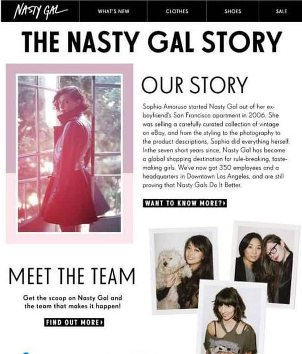
Email Newsletter from Nasty Gal
From a short story to a long one, the email marketing team behind Nasty Gal knows how to write narration and makes it enjoyable. Their welcome newsletter includes a bulk of information. There is a short introduction, meet the team block, snippets from a blog, and complementary images that support each section.
The email is a bit content-heavy. Given the short attention span of regular users, it may lead to a bad interaction. However, this is not a case of Nasty Gal since the team creates an unobtrusive piece that lures in thanks to a well-thought-out structure, proper formatting, and smart support of visual material.
Note there are no offers, but there are several links to the website that may generate engaged traffic. Although this transactional email is purely informative, nevertheless, it certainly stands out.
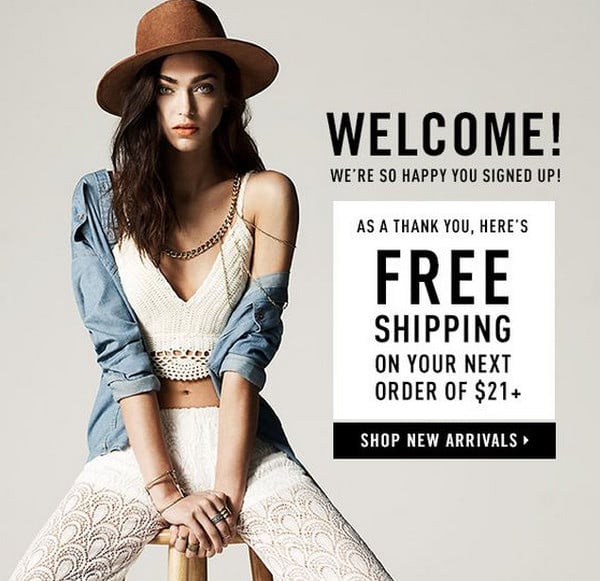
Welcome to Forever21
The welcome email newsletter from Forever21 is proof that a picture is worth a thousand words. It is small, compact, and pretty straightforward and does not have much information; it includes only the vital stuff.
It uses a brand voice to make the design feel empowering and fashionable. There is a short welcoming message and a pleasant surprise of “Free shipping” that appeals to the audience. Note the arrangement of the content. The team follows the popular “F” pattern emphasizing keywords unobtrusively.
The email brings value to the contacts as well as sets the tone for the proper one. Less is more, that is for sure.
Welcome Email Subject Line to Use
The first phrase that comes to mind is “Welcome.” However, sometimes things are not that simple. This area is quite diverse. There are different types of welcome email newsletters. For instance, instead of saying “Hi,” send new subscribers a special discount or some shopping incentive like free shipping, thereby luring them straight away.
Some alternative subject lines are:
- Thanks for signing up! Ready to dive in?
- Company’s GiftGuide: Thanks! You’re all signed up!
- See what you can do with the Company’s Name.
- Congratulations – you’re now a subscriber to Fashion/Sports/Tech News!
- Confirm your Account and Get a 10% Discount
- Welcome + 3 tips for success
- 10% OFF – Because you deserve it!
- You’re in! Welcome to Premium
- You’re subscribed to the Company’s blog
- We’re a Company. Let’s meet up.
- You’re part of the family now
- One of us! One of us!
- You + Company’s Name = Ready for Action/Science/Rock This World
- Ready to meditate/ impress/change your life/make your life better?
- Hi, Contact’s Name, let’s get you started.
- Contact’s Name, let’s get you designing/writing/creating/ in Company’s Name.
- You are in! See what’s next
- Get Started With Company’s Name
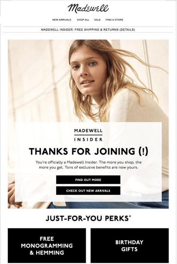
Welcome email newsletter from Madewell
On top of that, use pretext. Coming right after the subject line can give you extra space to express yourself. Although you cannot rely on it entirely, nevertheless, you still can exploit its potential and strengthen the message. Also, do not forget about emojis that can also reinforce the subject line with some emotions.
What’s the Best Time to Send a Welcome Email?
Timing is everything in email marketing, and this is especially true for welcome emails. Sending your welcome email at the right moment can significantly enhance its effectiveness.
Here’s a quick guide on identifying the optimal timing:
- Immediately Post-Subscription: Capitalize on the subscriber’s initial interest by sending the welcome email right after they sign up. This instant response reaffirms their decision to connect with your brand.
- Consider Time Zones: If your audience is global, factor in different time zones to ensure your email lands at a convenient time for the majority.
- Weekday vs. Weekend: Typically, weekdays, especially mid-week, see higher engagement rates compared to weekends.
- Avoid Peak Hours: Steer clear of times when inboxes are usually flooded, like early mornings. Mid-morning to early afternoon can be more effective.
- Test and Tailor: Monitor your email performance and adjust the sending times based on your audience’s engagement patterns.
Remember, the perfect timing can vary depending on your audience and industry. Continuously testing and tweaking your strategy is key to finding that sweet spot for your welcome emails.
Last, But Not Least
Final tips:
- Personalize it. Surveys show that first and last names in email newsletters count. It builds trust from the get-go.
- Make sure your audience speaks the same language. Not only does it mean that you should send out the email newsletter in the contact’s native language, but it also means that you should be careful when choosing the words. Since not everyone can get the sarcasm, humor, or urban slang, you need to stay neutral. Use inviting language that will appeal to all groups of the audience.
- Error-proof the text. Avoid all kinds of mistakes, both grammar and punctuation.
- Choose only appropriate visuals.
- Stay consistent with your brand.
- Use no more than two call-to-action buttons.
- Do not bombard a contact with lots of information. Divide all the data that you want to convey into several emails and create an entire series.
- Do not be pushy or bossy.
- Use clear and clever propositions.
- Make short attention spans work for you: format the content, use a heading, highlight the offer
- Use a storytelling approach to breathe life into the content.
In addition, check out our helpful guides:
- How to Create a Good Transactional Email that Converts
- 7 Principles of Highly Successful Email Marketing
