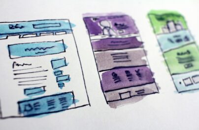
Website Design: The Ultimate Guide with Examples
With modern technologies getting more powerful and widely supported by current browsers, the website has become a designer’s canvas. It is here where artists show off their skills and vivid imagination. We contemplate website designs of all shapes and sizes that sport their gorgeous aesthetics and magnifying vibes in the digital expanses.
Effective website design is not only a beautiful face; it is also an outstanding user experience and excellent performance. Whatever gorgeous design you have, if it is difficult to navigate and retrieve important information, then it is a failure. Website design is a complex organism where all elements, even those that are hidden from the eye, work together to provide a perfect place.
Let’s dive into website design basics and consider such essential aspects as key UI elements, usability, and accessibility.
Goals of Website Design
Designing a website can pursue different goals. However, the most popular one is representing your company. Along with that, it helps to
- Advocate brand
- Express personality
- Build a loyal audience
- Communicate with users
- Play marketing tricks
- Run an advertising campaign
- Promote a product
- Sell goods
- Raise awareness
Depending on the goal, website designs are classified as follows:
- Personal portfolio
- Design Agency website
- Corporate website
- Startup
- e-Commerce
- Magazine
- Blog
- Educational website
- Entertaining website
- Mobile App Website
- SaaS
- Landing Page
- Experimental website
When the goal is clear and the project’s shape is settled, it is time to decide what type of website design you want to create. Will it be a static page, dynamic website, or experimental playground?
With Postcards Email Builder you can create and edit email templates online without any coding skills! Includes more than 100 components to help you create custom emails templates faster than ever before.
Free Email BuilderFree Email Templates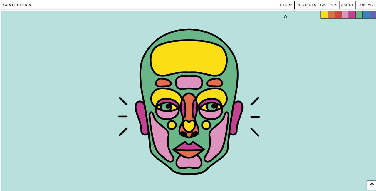
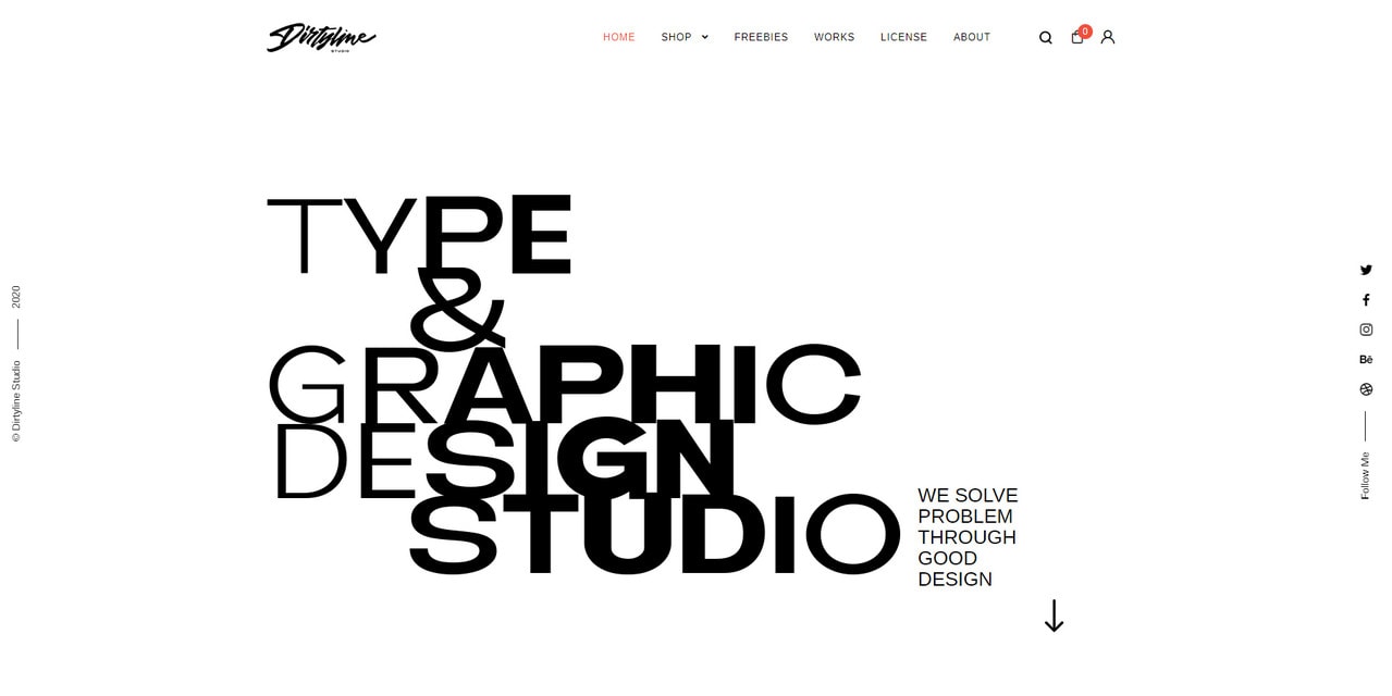
Guste Design – personal portfolio
3 Main Types of Website Designs
To find the best match for accomplishing your mission, you need to decide what type of website design reflects your idea the best and resonates with the audience. Consider three types of website designs to make an informed choice.
Static Website Designs
Static website design is an HTML and CSS template with fixed content. It delivers the same information to every visitor. Although it is deprived of dynamic effects, it is quite a popular option. In a static website design, the content solely holds the rein. Nothing distracts users from their goal.
Therefore, this type of website design carves a niche, occupying a leading position in certain areas. For instance, it is used to bring to life marketing or advertising campaigns quickly. It is also used for personal portfolios or small startups whose teams want to introduce themselves to the online crowd or test the grounds for a new product.
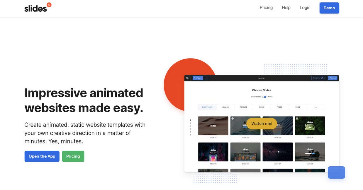
Finally, yet importantly, one of the good reasons why static website designs are popular is that they come with lower development costs. You can create one by yourself with the help of Slides, a popular online generator. And it won’t cost an arm and a leg.
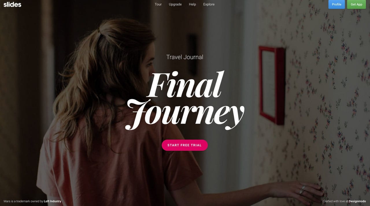
Free Static Page created in Slides
Dynamic Website Designs
To create a more functional, meaningful, and impressive online presentation, you need a dynamic website. Unlike static solutions where everything stays still, here, various micro-interactions support information and ensure a delightful user experience.
Animations, hover effects, parallax, swipeable carousels, mouse trails, morphing hamburger buttons, WebGL, and digitally generated 3D scenes: there are many intriguing and eye-catching solutions.
With Pulsetic you’ll be instantly notified the moment your website, API, or server becomes unavailable. Monitor uptime from multiple global locations and respond to incidents before your users are affected.
Create beautiful status pages in minutes to keep customers informed during outages and build trust with transparent communication.
Start Monitoring for FreeAlthough dynamic websites are filled with various bells and whistles, it does not mean they are challenging to pull off. With proper tools, you can quickly create a stylish, dynamic website without coding and design skills. Much like with static website design, you can use a free website generator, Slides. It comes with a set of beautiful animations that provide the user experience with an appropriate quality level.
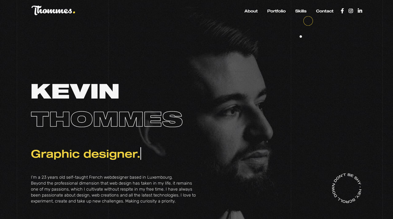
Personal portfolio of Kevin Thommes
Conceptual and Experimental Website Designs
Conceptual and experimental website designs are ones that push the boundaries of modern technologies. They capitalize on advanced features to provide a one-of-a-kind experience. It can be games, digitally generated playgrounds, or virtual reality. Therefore, they are incredibly impressive.
There are two main flaws. The first is low browser compatibility. As a rule, only the latest versions of selected browsers can support all these fantastic extravaganzas. The second flaw is that they require lots of resources to run smoothly: not all users can enjoy the action even with a proper browser version.
Nevertheless, as mind-blowing concepts, they ensure the field’s progress and set new standards that will become a reality one day.
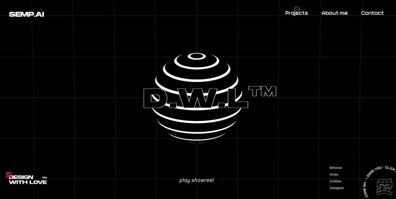
D.W.L. Media
Vital Elements for Designing a Website
Whatever type of website design you are up to, you need to make sure that everything is thought-through. Let’s consider crucial elements of the user interface that require close attention.
Grid
Almost every website design, whatever asymmetrical or chaotic, has a core grid system that does the heavy lifting with the alignment and positioning. Grids underlie the majority of projects. They ensure stability, flexibility, and predictability in behavior.
There is a sheer diversity of pre-fabricated grid systems on the web. There were times when 960.gs ruled; however, more designers choose flexible solutions with various helpful utilities, like Bootstrap.
Depending on the project, you may choose one or another option. Although Bootstrap is widely used across the web, in some cases, you may enjoy the benefits of lesser-known solutions because they are lightweight and hassle-free.
For more information on grids, check out Grid-Based Design Theory and Useful Responsive CSS Grid Frameworks.
Content
Your website is all about feeding users with the information and bringing home the right message. Therefore, the content has a top priority. To let it carry out its mission, follow these essential tips:
- Format everything. Formatting stands between chaos and good readability. It ensures your message is delivered. Therefore, it should be well-thought-out.
- Adjust the writing style to users’ preferences and browsing habits. Use language that is understandable.
- Get straight to the point. Use short and concise phrases.
- Avoid long text blocks. Categorize content. If you have no choice, then add images, headings, and CSS styles to break the uniform flow into digestible chunks.
- Avoid right-aligned and justified text. Stick to the left side.
- Use whitespace to reinforce visual hierarchy.
Call-to-action
Even if you do not pursue a marketing goal, chances are you will still have at least one call-to-action button.
Every website design has a mission. You may want to collect emails to send regular updates, or you may want to communicate with your readers via a form, or you may want to get feedback or comments. There is no way to realize this without a button. They are essential elements for modern user interfaces.
To make them work for you, stick to these basic principles:
- Make them stand out.
- Make them rectangle-shape with rounded corners since it is a convention that people are used to.
- Use action words.
- Use safe colors. Blue, green, and red are popular choices for CTAs.
- Add CSS styles to various states.
- Add space around buttons.
For more, check out our guide to buttons The Ultimate UX Design of the Perfect CTA Button.
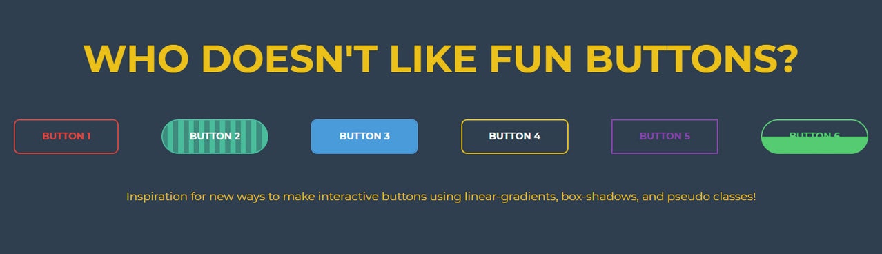
CSS Buttons by Derek Morash
Links
Much like buttons, hyperlinks are essential for user interfaces. They are small getaways that lead to important pages. Therefore, they should be prominent, meaningful, and well-formatted. To make links usable, follow these tips:
- Stick to popular conventions. Everyone knows that links are blue and underlined. So do not confuse visitors.
- Avoid generic instructions and phrases. Make them meaningful. Use action words.
- Make them concise yet straight to the point. Avoid redundancy.
- Open links in the same browser so that users can return via the back button. If a link leads to a PDF file or an accompanying document, open it in the new tab.
- Visually differentiate links and anchors to avoid confusion.
- Use the mouse cursor to add the visual cue.
- Add a hover effect to make the interaction design more intuitive.
Even though navigation is just a well-executed list, it can still have attractive features that contribute to user experience. It can even be a trend initiator. Remember the hamburger button that took the web by storm more than five years ago?
As a matter of fact, these days, six popular types of menus give website design a stylish touch.
- Neat and classy streamlined header navigation
- Sleek slide-out navigation hidden inside hamburger button
- All-embracing multilevel footer navigation
- Hard-to-miss full-screen menu
- Sophisticated ultra-narrow sidebar navigation
- Subtle perimeter navigation spiced up with the vertical rhythm and decorative lines
Along with these types, designers come up with some unique ideas like circle-based navigations or interactive hero areas with hotspots. However, whatever idea you implement, it is important to remember that navigation is a crucial element for user experience. It is a tie-breaker that decides whether the user stays or leaves.
- Make it clean and clear.
- Provide a good contrast.
- Make it consistent throughout the entire website.
- Include no more than 7 items.
- Show only vital links.
- Stick it to the top.
- Always add a link to the homepage.
- Make it responsive and mobile-friendly.
- Ensure it is available from every section throughout the layout.
Color
Everyone is aware of color psychology and what impact each tone has on human behavior. A well-thought color palette can increase the effectiveness of your corporate website. It can set the atmosphere, get everyone in the proper mood, strengthen a message, increase trustworthiness, and even drive conversions. Depending on the shade, some colors may enliven the design or, on the contrary, destroy it completely. Therefore, it requires careful planning.
To nail coloring in your design, ask yourself several important questions.
What should the colors of your brand say about you?
Is your brand active or passive? If you want to appear more active, then you should stick to brighter options.
Do you want to get people excited about something? If yes, then you need to stick to more energetic tones.
Who is your audience? Modern colors are great for startups shooting for the stars. Traditional colors are great for businesses that capitalize on stability and longevity.
Visuals
Can you imagine an online page without images? When it comes to website design, visuals co-exist with text. Therefore, the use of images, illustrations, icons, and videos should be well-thought-out.
Follow these simple practices.
- Use images that have meaning. Even the decorative options used to adorn the hero area should support the brand and strengthen the main message behind the website.
- Use custom and personalized visuals because generic images may turn visitors away.
- Make visuals responsive and mobile-friendly. Make sure they look good across all browsers and screen sizes. On top of that, they should look good on retina screens.
- Images, icons, and even animated gifs should be accessible.
- Remember that images and videos are natural magnets. Therefore, make sure they do not outshine important information.
- Achieve balance between visual aids and text.
Typography
Thanks to the @font-face embedding technique, free Google directory, and some premium yet cost-effective font services like Typekit, designers are spoiled by typeface choice.
There are so many great web-safe typefaces out there that it is a real temptation not to use them all. However, it is here where you need to exercise caution and stay reasonable. The general practice dictates to use of no more than three fonts within one page.
The main reason for this is that the diversity of typefaces in a single page makes things look cluttered and confusing. Each typeface has a personality with a particular mood, tone, and charisma. Mixing fonts is an art. It requires finding a balance between type families to secure optimal readability and create a unified experience.
To play safe, you can use a matching combo of a sans serif font and serif font. As a rule, the sans-serif is used for body text, whereas serif font is used for headlines. Though depending on your project, you may swap them.
If you want to go off the beaten track and use other font families, bear in mind these rules:
- Avoid typefaces of the same classification, especially those that have an overly decorative nature.
- Assign a role for each font to define the typographic hierarchy.
- Provide contrast.
- Create apparent differences in font weights.
- Choose a typeface with highly-readable glyphs.
If in doubt as to what typefaces to mix, stick to just one. You can never go wrong with one font family. All you need to do is to play with size, weight, and style. It will keep things simple, minimalistic, harmonious, and eye-pleasing.
Principles of Good Website Design
The golden rule of every successful venture is the customer’s always right. Website design is no exception. When you create an online platform for promoting a brand or a particular product, you should focus on the target market. Whatever idea you have in mind, if your audience does not get it, then you are screwed up. Catering information for your market and providing the best user experience on all levels – this is the way.
Let’s consider the principles of good website so that you can create a user-centric environment that resonates with the target market, advocate your brand, and bring profit.
- Create a clear structure.
- Maximize on an “F” or “Z” reading pattern. Sequential reading flow doesn’t work on the web. People are accustomed to moving from one section to another rather abruptly. Therefore, place essential elements such as logotype, navigation, call-to-action, images, benefits of the service on the top or left-hand side.
- Simplify the process of perceiving the presented information.
- Use visual clues like size, color, and placement to tell readers what’s most important. For instance, the bigger size, as well as the brighter tone, equal more importance. The smaller size and muted coloring equal less importance. Use it to give structure to the page.
- Highlight essential elements such as headings, buttons, and links.
- Add subtle hints on how to find out more about your brand or service.
- Ensure content has meaning without presentation styles. Use heading levels and unordered lists to make body copy easily digestible.
- Keep it simple. Remember, people are up to information. This rule’s exception is personal portfolios and websites of creative agencies where content and wow factor go hand in hand to win over the customer.
- Provide anchors and focal points to guide users through the content smoothly and efficiently. Since people prefer scanning web pages, these elements will provide an actual value to them.
- Reduce cognitive load. Show users a path to their aim and make it easier to get the idea behind your website.
- Make navigation intuitive. All the critical inner pages should be one-click away. On top of that, each page should have a quick way to get back.
- Put users in the driver’s seat. For instance, if there are pop-up windows, then they should have evident close buttons.
- Never start to play the video by default or on the page load.
- Include elements that are crucial for communication.
- Stick to consistent data presentation throughout the site.
- Stick to conventional design. It ensures confidence, trust, and reliability.
- Create an optimal user experience.
- Prioritize one action. One page – one goal.
- Play marketing tricks: use catchy jingles and slogans, add a touch of personality, and spice everything up with your charisma. However, do not make everything about yourself.
- Require nothing from the user to test your service. Do not force users to give away their email address or other personal data.
- Don’t offer too many choices. Widely known as a Paradox of Choice, the more options users have, the less likely they will make a decision. More so, a client might end up feeling less satisfied with the choice. Therefore, narrow down the number of options. Keep them grouped and organized.
- Test your website design to get crucial insights into significant problems. Check it on all stages and observe it from a fresh perspective.
Order
Usability in Website Design
Content is king, but engagement is queen. Usability is at the core of excellent website design and user experience. It is a thing that entrepreneurs often overlook, although it is responsible for every successful marketing project.
- It creates a comfortable environment where users get what they need.
- It creates an unforgettable user experience that leads to more return customers and greater satisfaction from visiting your project.
- It spoon-feeds users important information.
- It helps realize marketing tricks vital for promoting the product and advocating the brand without feeling pushy and bossy.
Therefore, usability should be of top priority. Consider some useful tips on how to improve it in your website design.
- Make navigation clear.
- Fix broken links.
- Double-check content; correct grammar mistakes and misspellings.
- Ensure performance. Reduce server uptime by choosing a better hosting provider. Make your website fast by improving code and optimizing images.
- Make layout responsive and mobile-friendly.
- Make sure your website works consistently across all browsers.
- Make design accessible by all groups of people.
- Ensure elements of the interface communicate the corresponding meaning. Links should be links; buttons should be buttons.
- Create a guided user experience.
- Improve readability to make all letters look legible and body copy easy scannable. Create an optimal information hierarchy.
- Make it trustworthy. To ensure credibility, add the “About Us” page with your team members.
- Add social media icons to provide various channels to reach you.
- Add a supporting team and chat with a personal assistant to solve all the issues quickly and efficiently.
- Add testimonials or impressive statistics to quantify and qualify your brand.
- Add interactive features to help users get important information quickly and explore the website smoothly.
- Provide a comfortable search. If you have a massive portal like an online store or magazine, you should adopt an advanced search to locate the content visitors are looking for quickly.
- Make content relevant.
Great usability starts with in-depth research, tests, and consistent fine-tuning. Be ready for multiple iterations and trials, and fix errors to yield the best results.
If you feel like implementing usability tips is challenging, you can always address this issue with professional tools. For example, a lot of usability work is done for you by Slides. All the existing blocks not only play nicely together, but they also help to deliver the message, pinpoint the key elements, and provide a comfortable and intuitive user experience.
Accessibility in Website Design
It is a popular misconception that building an inclusive website design is impossible. Thanks to modern assistive technologies, user experience does not suffer. You just need to ensure your website design meets accessibility requirements.
Making website design fully accessible is not that hard. It does not require extra budget or skills. Though you may need to spend time making adjustments to an existing website, nevertheless, it is still easy. Follow these steps to bridge the gap between people with disabilities and your website.
- Stick to well-thought-out semantic markup. Not only does it provide helpful information for assistive technologies and search engines, but it also ensures a future-proof foundation that can be easily repurposed.
- Make sure the HTML structure is evident and meaningful without CSS. It should have a visible hierarchy.
- Do not rely on color.
- Use no more than three typefaces.
- Set the body copy to 16px size and line-height to 22-24px. Also, stick to 18 words or 50-80 characters per line of text.
- Provide enough contrast for elements in the foreground to be easily readable.
- Use shapes, labels, and sizes to communicate complex information.
- Make labels more accessible by adding texture.
- Change the mouse cursor according to the situation to make the experience more intuitive.
- Use various styles for buttons to indicate different states.
- Add styles for hover state to highlight the link more efficiently.
- Add styles for focus states.
- Never remove focus indicators. Links, form fields, widgets, buttons, and menu items – all of them should be focusable.
- Make forms clear. Use labels to explain the purpose of each input.
- Avoid generic phrases in buttons. CTAs should be self-explanatory and straightforward.
- Make button’s area huge enough to be easily tappable.
- Add sliding navigation for elements displayed on mobile screens.
- Make elements reachable through the keyboard.
- Assign ARIA for all the critical elements.
- Add ALT for images. If an image is purely decorative, then omit ALT.
- Avoid redundancy.
- Use headings of various levels.
- Do not use tables as a layout. Use it only for displaying tabular data.
- Think through the order of interactive elements in the website design.
- Support keyboard navigation. The navigation must be logical and intuitive.
- Avoid automatic navigation.
- Avoid videos that start automatically.
- Avoid harmful content.
- Avoid animated GIFs with rapidly flashing lights, moving patterns, or blinking displays since they can give people photosensitive seizures or epilepsy.
For more information on accessibility in website design, check out W3 Web Accessibility and Web Content Accessibility Guidelines (WCAG) Overview.
Trends in Website Design
Website design is famous for exciting trends. Some are small, some of them are big. Some of them come and go, while others stay forever, turning into all-time classics.
Dark Mode
Dark mode is the new black. For a whole year, website designs and mobile designs feature it. Even popular operating systems have been capitalizing on this trend.
Dealing all day long with various monitors (laptops, tablets, cell-phones, smartwatches, TVs, portable consoles), tires users of everything bright and energetic. Dark mode reduces eye strain, thereby providing a comfortable environment where people can enjoy the user interface and get the desired information without tension. It came just in time.
On top of that, it has some other advantages. It plays nicely with popular trends. It helps to create a balance between visuals and text. And it has a powerful sense of sophistication.
Custom Illustrations
Illustrations are a great way to engage visitors, convey a message, and add a human touch. In the digital world, artwork naturally stands out since with a powerful personality and warm vibe. Illustrated approaches often become trendy. This year, this area has delighted us with two outstanding sub-trends.
The first is use of imperfect illustrations. Some are absurd, while others are abstract. All promote tolerance, which is a burning issue. On top of that, they give food for thought that can increase engagement.
The second sub-trend is animated illustrations. Unlike traditional long sequences, these are pretty short. They make a statement, clarify things, show features in action, and make an impression. As a rule, fancy human characters lie in the heart of them, making the design of the website more familiar and friendly to the audience.
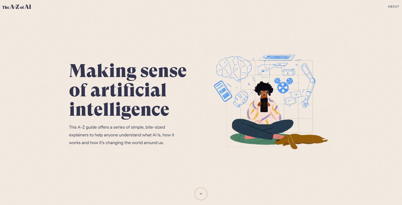
The A to Z of AI
Micro-interactions
Micro-interactions are one of those trends that has become a classic. We can’t imagine a good user experience without a bunch of micro-interactions scattered throughout the entire website. They communicate status, provide feedback, entertain users, strengthen the message, enhance the user experience, and reinforce intuitive exploration.
There are different types of micro-interactions; the most popular are:
- Animations
- Swipe actions
- Hamburger buttons set in motion
- Meaningful hover effects
- Mouse interactions
Consider our article What in the World Are Micro-interactions? to get more helpful information on this matter.
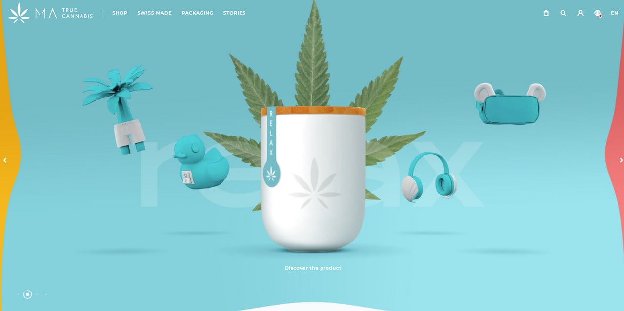
MA True
Collection of Outstanding Website Design Examples
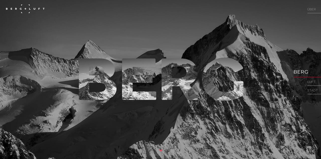
Berg und Luft is a personal portfolio of highly talented Swiss photographer Marcel Dubacher.
To convey his professionalism, the designers’ team has adopted several modern features, including GSAP animations. So, what can you see inside this outstanding website design?
It greets users with a brand-centric custom loader even though the web site’s performance is excellent, and it does not make people wait. It serves as a strong introduction that reinforces the first impression.
Second, there is a gorgeous full-screen image background with a masked centerpiece.
Third, there are beautiful dynamic effects that make the scrolling eye-pleasing.
Fourth, the design is built around black aesthetics that is increasingly popular these days. Besides, it plays nicely with monochromatic photography.
Finally, the fancy mouse interactions contribute to the usability and enhance user experience.
Every detail counts here.
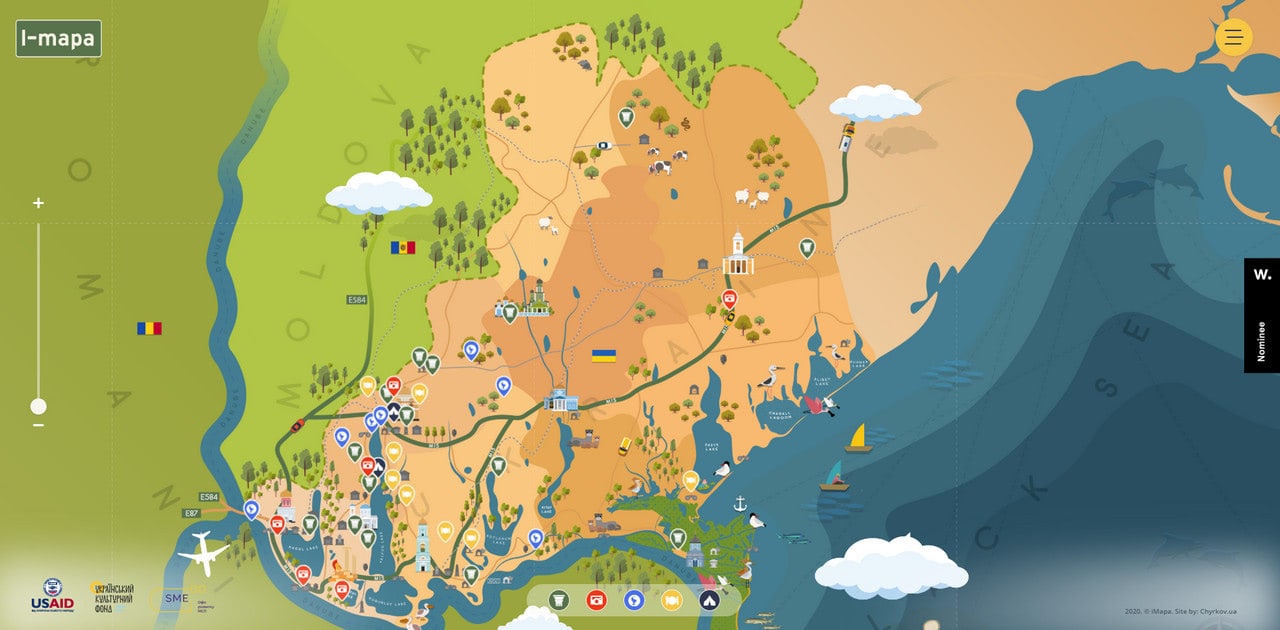
I Mapa
I Mapa is an excellent example of modern, fully interactive website designs.
The project promotes local businesses and stimulates independent regional tourism. Using a cartoonish style and modern technologies, the team quite effectively bridges the gap between companies and people.
Based on a fancy illustrated scene where elements are set in motion, this interactive map feels alive. It gives insights about the western region of Ukraine playfully and entertainingly, leaving quite an impression.
What’s more, apart from investing in an entertaining part, the team has also thought through the dynamic filter that lets users get the required information quickly and efficiently.
Smart.
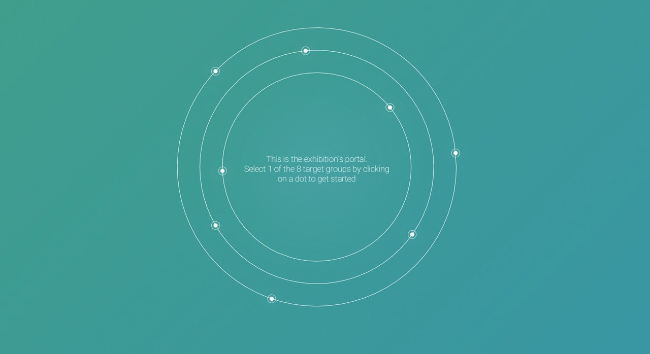
Exhibition 2020: Student Service Design Challenge
If you crave more action, look at this outstanding website design.
It is a virtual exhibition that will impress you with a professional realization and creative idea. Since it is dedicated to Philips Student Service Design Challenge 2020, it could not help but include some fantastic features.
The first thing is the unique circular navigation on the homepage.
Second, it is a guided story filled with videos that deliver information efficiently.
Finally, it is a fully interactive experience that resonates with the visitors and lets them enjoy the event.
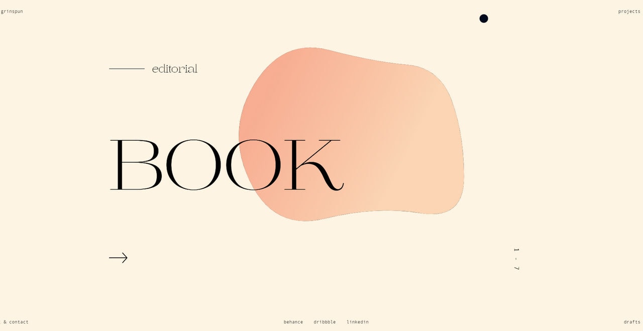
Iara Grinspun
This fantastic website design is a personal portfolio of a talented graphic designer from Argentina, Iara Grinspun. Skillfully capitalizing on abstract approach and dynamic effects, Iara was managed to add soul and personal vibe to the portfolio. As a result, the latter has numerous trendy features like gestures, interaction, GSAP animation, and parallax effect that smarten the interface and instill a sense of professionalism and creativity.
Note, it does not rely on the image to make the first impression. Instead, it bets everything on a moving bubble. The latter is an eye magnet that not only draws attention but also advocates the artistic side of the owner. Clever.
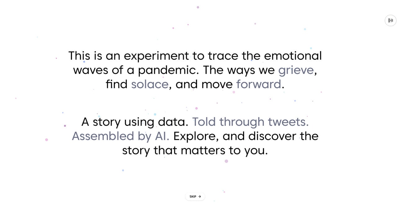
Yesterday, Today, Tomorrow
Creatives adore raising issues and speculating about the current situation expressing their thoughts through website design. Yesterday, Today, Tomorrow is a perfect case in point. It is an entirely experimental project with an immersive user experience that has a non-profit purpose.
So, what does it do? Using current Twitter data and IBM Watson, this amazing website design follows the hardship and hope during the Covid-19 pandemic. It reflects emotions through digital tools and modern techniques that made the story absorbing and exiting through excellent data visualization.
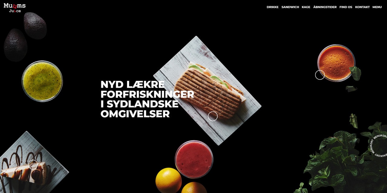
Muums Juice
Trends and high-end technologies are popular tools for presenting individuals, creative agencies, and famous brands. However, that’s not all. They also benefit other businesses, like Muums Juice, the website of a juice bar in Copenhagen.
Thanks to micro-interactions, lovely dynamic effects, beautiful transitions, and parallax, the website design looks incredible. Everything is so yummy. The design team has created a perfect symbiosis between delicious images and fancy dynamic effects. Not only is it a treat for an eye, but it is also a great instrument to give an edge to a visitor’s appetite from the get-go and compel them to visit the establishment.
It is a perfect example of a website design that achieves marketing goals through modern techniques.
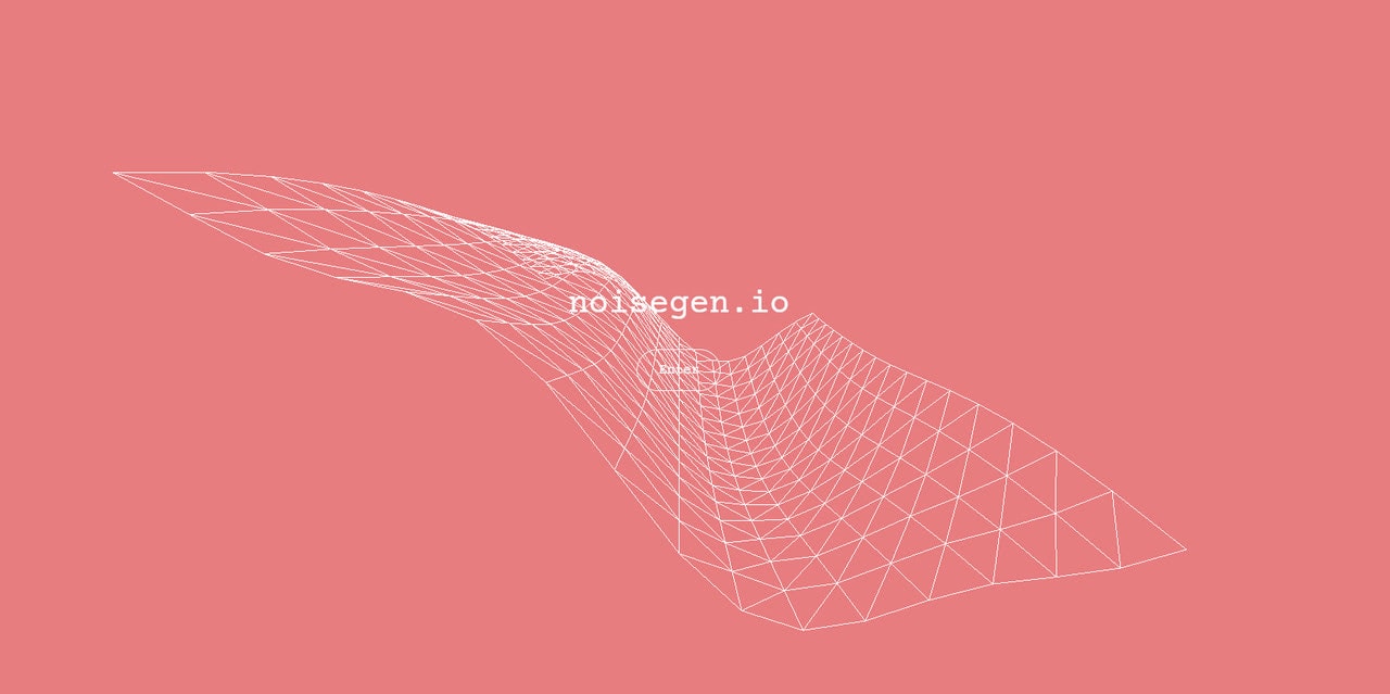
We are going to end our collection with a truly experimental website design. It stands aside from the others with its abstract nature and a strong high-tech vibe. Powered by WebGL, GSAP framework, Three.js, it is just destined to be impressive.
It is a playground where visitors are welcome to create generative 3D art based on different shapes using Perlin Noise. The result can be exported in jpg format on desktop. It works on mobile, too.
The team has thought everything through, translating an exciting idea into reality and providing an enjoyable user experience across various platforms and devices.
Conclusion
Each year, website design is getting more sophisticated. Animations, moving illustrations, mouse trials, Three.js-powered hero areas, capsule games, offbeat navigations, experimental playgrounds, VR – there are all sorts of charming eccentricities. However, there is still room for time-proven and viable solutions like static website designs that can quickly and efficiently solve a number of issues.
Whatever idea you have in mind, remember to invest not only in design but also in user experience and accessibility. Follow our guide to create a website design that represents brand, delivers a message to all groups of people, resonates with the target market, and efficiently reaches your goals.