Free Shopping Cart, Payment, Checkout and Other E-commerce Icons
Do you know that the first impression of your online store largely depends on the design? According to statistics, visitors form an opinion about your brand within a second. During this second, the only thing that they are managed to notice, understand and respond to is web design. That is not all; another study shows that more than 75% of users agree that they make their judgment about the brand’s credibility based on overall aesthetics alone.
Indeed, website design is crucial for the eCommerce sector. People eat with their eyes, but this does not only apply to products. This also implies the general environment. The well-thought-out design engages the audience, keeps interest alive, generates conversions, and rakes in cash. It is an increasingly powerful tool. However, creating a website design that meets all these expectations is not that easy.
The deal is the success of website design revolves around tiny details that entrepreneurs always overlook, focusing on larger things. However, such things as iconography cannot be taken lightly.
Ecommerce icons are increasingly influential despite their petite size. Not only do they make the project look complete, but they also provide quick access to crucial functionality, support the content and take user experience to the next level. Shopping cart icon, payment icon: can you imagine the online store without them? They are buyers’ minions and vendor’s trusted assistants. Let us consider some good reasons why it is important to use eCommerce icons in the digital store.
Why are Ecommerce Icons Important?
So, why are eCommerce icons so crucial for your project? As we have already pointed out, they support content and stand behind a great user experience. However, that is just the tip of the iceberg. Some more good reasons can prove to any retailer that shopping icons are a must-have for a digital store regardless of niche, audience, and scope. Let’s consider them.
- They reinforce the informative part of the project. Explicitly describing the functions, actions, and even benefits of the product, they bring actual value to the prospect.
- They minimize user’s efforts and help them locate crucial information, thereby giving customers what they need right here right now. Not only are they time-savers, but they are also problem-solvers.
- They simplify the communication process and help users understand how they should behave on your website to get the most out of it.
- They clarify things in the simplest and fastest way, meeting accessibility requirements and allowing you to serve information for people with reading disabilities.
- They provide visitors with quick getaways to basic functionality like viewing a shopping cart in one click or choosing the payment method without reading the description. This helps make the customer’s lifecycle in the website productive and shortens the customer’s path to finalizing the deal.
- They are ideal for people with a short attention span, which is a large and fast-growing customer group. Well-thought-out eCommerce icons are far more memorable than text or even images; therefore, chances are, users will remember them in time of need.
- They are ideal for the fast-pacing world since they help process on-page information quickly, easily, and efficiently. As quick informative cues that mainly rely on the visual aspect, they are ideal for people who prefer to scan rather than read or scan a page to understand if it contains something they need in order to decide whether to leave or stay. Shopping icons naturally stand out from the reading flow and provide crucial information for skimmers.
- They are ideal for the mobile world. Ecommerce icons take large amounts of text and convert them into easily digestible bite-size sections, and with all that, they do not “eat” all your online estate. They are perfect for handheld devices like cell phones and tablets. You can add all the vital information and remain within one screen without sacrificing design, brand identity, aesthetics, information hierarchy, and user experience.
- They are great tools to guide users throughout the page. As tiny focal points that instantly catch an eye, eCommerce icons can be used as anchors in a reading experience that lets the vendor focus the user’s attention on the product and its benefits, thereby effectively revealing USP (unique selling proposition).
- They break down the language barrier and bridge the gap between your company and international buyer. This helps to extend the target market, get onboard new prospects and leads and increase the accessibility of the project.
- They help increase satisfaction from your brand by meeting visitors’ needs and streamlining their buying process, making it smooth and pleasant.
- They make the project interactive. Interactivity is one of the secret ingredients that not only leaves a long-lasting impression but, most importantly, keeps users longer on the project. For example, animated shopping icons always catch an eye, draw attention and increase engagement, making visitors stay for a long.
- They make your brand closer to the audience. Ecommerce icons that are in line with the corporate identity help complete the overall picture. In addition, they intensify the company’s personality, reveal its charisma, and say a lot more about the brand. This makes the company look more open and friendly to the customers.
- They increase credibility. High-quality eCommerce icons make the project look expensive, trustworthy, and reliable. These qualities are increasingly vital for the decision-making process since people are suspicious about websites where payment is involved.
- They enrich the entertainment side of the project. Bright and charismatic eCommerce icons can create an enjoyable environment for users. This helps to tug the user’s heartstrings and establish an emotional connection with the brand. Remember, people are more open to suggestions when they feel for your company.
- They improve the reading experience and increase engagement. Without shopping icons, your website will turn into a content-heavy project that is difficult to explore. On top of that, you risk becoming boring that is unacceptable for the selling sector. A proper set of free eCommerce icons enriches the reading experience, adds interest, makes the digital store feel inviting, and increases overall engagement with the company.
- They intensify the harmony. The latter is one of the few psychological factors that influence the decision-making process.
- They are indispensable for such situations as
- On sale items;
- Newly released products;
- Add to cart buttons;
- Add to personal favorites buttons;
- Customer service chat buttons.
The eCommerce sector is one of the toughest ones on the web: competition is cutthroat here. To stay afloat, everything should be perfect, and such a tiny detail like iconography is no exception. It creates an intuitive environment where users feel comfortable. On top of that, when well done, it can help users enjoy a digital store and get the best experience ever, turning prospects into brand evangelists.
With Postcards Email Builder you can create and edit email templates online without any coding skills! Includes more than 100 components to help you create custom emails templates faster than ever before.
Free Email BuilderFree Email TemplatesWhat Ecommerce Icons Are Must-Have for Digital Store?
The digital store dramatically benefits from a well-thought-out set of shopping icons. However, what exactly do you need since these packs include all sorts of stuff. Let’s consider the most essential icons in this area.
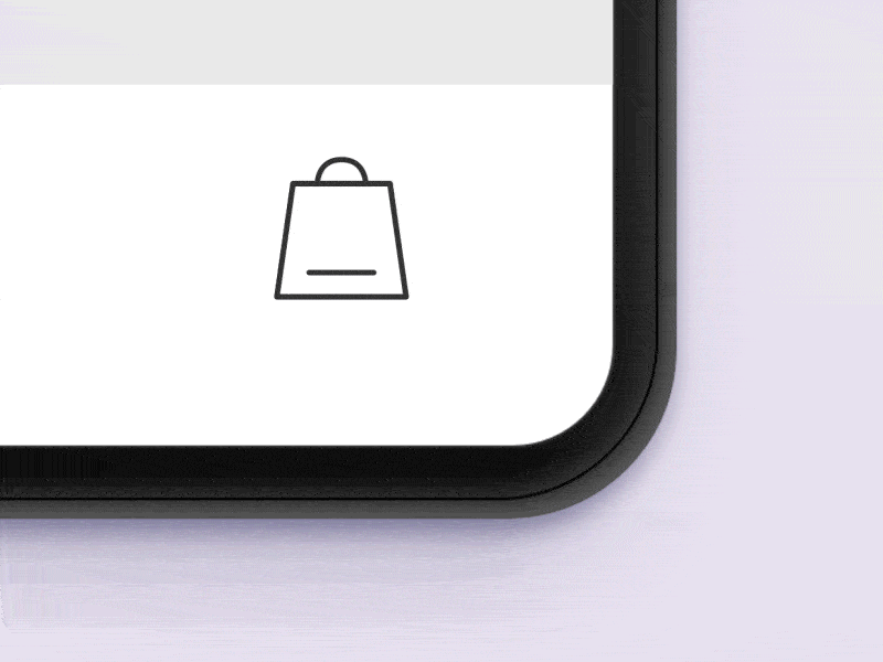
Shopping Cart Icon
There is no digital store without this primitive but increasingly powerful icon.
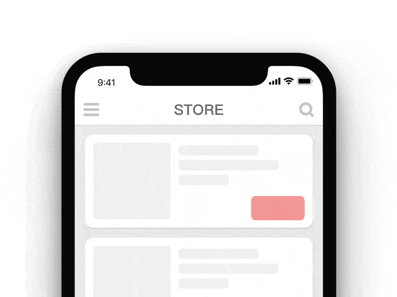
The shopping trolley has become a universal symbol for cart pages within the context of eCommerce. Most users will recognize and understand it instinctively, regardless of its style, color, or design features. Clicking on that icon will open a shopping cart in the modal window or redirect to the shopping cart page where customers can review their selected items and continue to checkout.
As a rule, this icon is placed on the header or sticky top bar so that visitors can quickly locate it.
The shopping cart at least has two primary states:
- The first one is the default state: the shopping cart is empty. As usual, it is just an illustration of a trolley or a trolley accompanied by the number 0.
- The second state is the one that indicates that items were placed inside the shopping cart. Generally, it illustrates a trolley with a digital number that shows an exact number of goods.
Shopping Cart Interaction by Paarth Desai
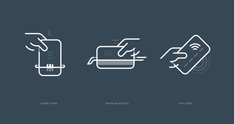
Payment Icon
Much like a shopping cart, a payment icon is a universal symbol that everyone understands. Of course, it is not exclusive to this sector since it can be seen on all sorts of websites; however, it is a logical addition to eCommerce. What’s more, even digital stores without integrated payment systems feature this icon to indicate the page where customers can find out the terms and conditions of purchases.
Unlike a shopping cart icon that is an illustration of a trolley, rarely an image of a shopping bag, the payment icon can be different. The most popular options are:
With Pulsetic you’ll be instantly notified the moment your website, API, or server becomes unavailable. Monitor uptime from multiple global locations and respond to incidents before your users are affected.
Create beautiful status pages in minutes to keep customers informed during outages and build trust with transparent communication.
Start Monitoring for Free- hand with cash;
- hand with a credit card;
- hand with “$” sign;
- cash;
- credit card.
In the last several years, we have seen the new interpretation of the payment icon that blends into today’s realms – it is contactless payment. As a rule, it is an illustration of a handheld device with a dollar sign or wireless sign paired with a dollar sign.
In addition, more digital shops show payment icons with a security sign because this makes the digital store look safe, trustworthy, secure, and reliable. In an era where cyber-attacks have reached a staggering level, these qualities are crucial for the decision-making process.
PayJunction by Eddie Lobanovskiy
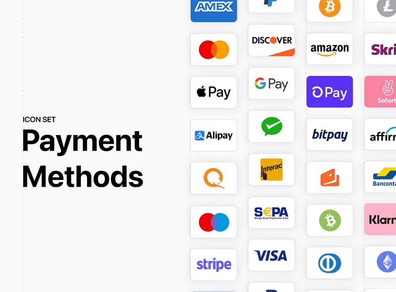
Payment Methods Icons
Along with payment icons, every eCommerce project features payment methods icons. The most popular options are:
- MasterCard,
- Visa,
- Apple Pay,
Some digital shops add support for cryptocurrency, whereas others add payment icons that indicate the type of digital payment specific for their region and, of course, payment icons that indicate local banks.
The first place to find payment methods icons is, of course, the checkout page. However, it is customary to show them also in the footer, product page, and homepage.
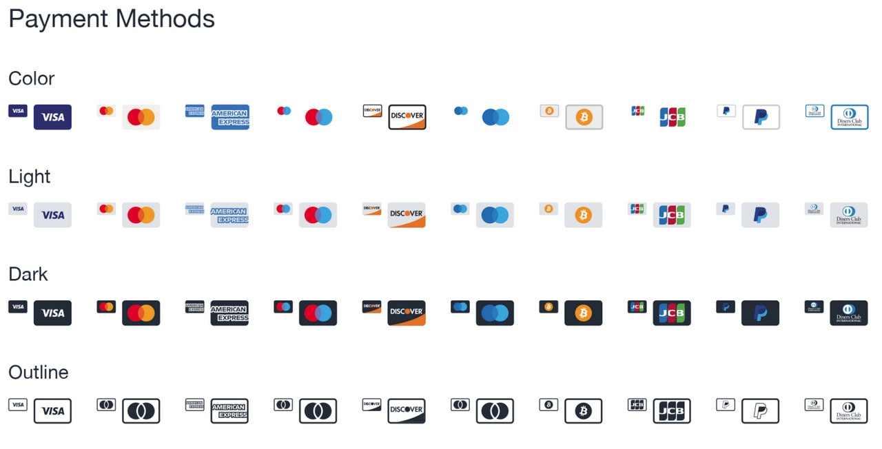
Payment Methods by Ionutz Oroian
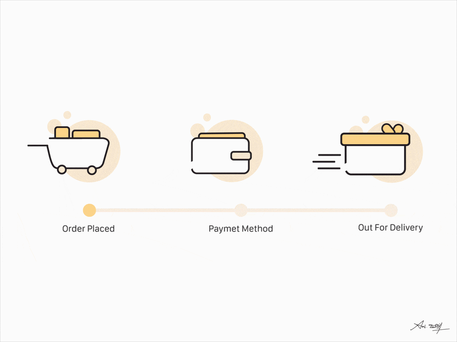
Checkout Icon
The checkout page follows the shopping cart page and is usually accessible through the button; however, sometimes, retailers use a unique checkout icon to minimize the customer’s efforts, simplify the process and shorten the user’s path. It can be seen right near the shopping cart in the header or on the product page.
Quite often checkout icon is presented as a classic supermarket trolley with some additional details like a “check” sign, “$” sign, or credit card sign. This combo indicates that customers will be redirected to the page where they need to pay money.
Checkout Icons from Flaticon
Delivery Icon
The delivery icon is essential for all digital stores that ship physical goods. As a rule, it is found on the product page with some additional information like time and payment.
Unlike the shopping cart icon and payment icon, the delivery icon is not universal, though people instinctively understand it. It can be displayed as
- a traditional delivery van;
- pizza delivery scooter;
- delivery man with a box.
Generally, the delivery icon is used to accompany the shipment details; however, sometimes, it is used as a standalone link to the entire shipping page or a marker of a shipping section on the checkout page.
Delivery Icon Insigniada by Branding Agency
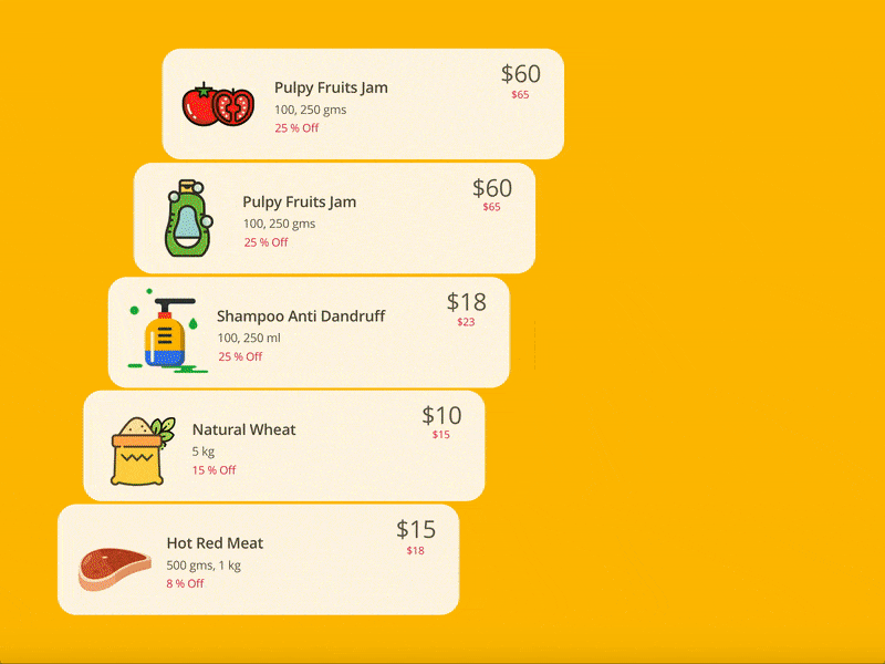
Sale Icon
Whatever digital shop you are running, chances are you will run some marketing campaigns that imply discounts. Sale icons are what you need to make sure your visitors do not miss an opportunity to strike a bargain and increase the level of satisfaction from your brand. More so, people are so acquainted with this strategy that they instinctively search for these icons to find the best deals.
Sale icons come in different styles that people of all ages and genders largely recognize. Among them, you can see:
- Price tag,
- Coupon,
- Sale seal or badge,
- Discount (“%” sign) seal or badge.

Winter Sale Pop-up design by Yana Peiganovich
How to Improve Digital Store with eCommerce Icons?
Whatever fantastic product you have, if your website has an overcomplicated design, it will scare your prospects away and leave a wrong overall impression. User experience plays a crucial role in the decision-making process.
Iconography is one of the main pillars of a good user experience. It is a powerful tool on its own. To unlock its potential, you need to put thought into its selection and usage. Let’s consider some good tips on how to improve the digital store with eCommerce icons.
Decide on Purpose of the eCommerce Icons
When the iconography directly speaks to the audience, it generates a proper gamut of emotions that tug the user’s heartstrings. It also creates a connection that enhances the relationship between the brand and customers. These psychological factors lie at the core of high conversions.
To choose the set of icons that will resonate with the audience, first ask yourself these questions:
- What information do you want to communicate to your users?
- What message do you want to deliver?
Answers to these questions will help to map icons and meanings accordingly and avoid double meaning and misinterpretations.
Second, while answering these questions, it is crucial to focus on your target market because it dictates rules for design and meaning. Note, the meaning of an icon can differ between users. Quite often, misconceptions occur from cultural differences, age, and personal experience.
For example, if you target millennials, you may benefit from the traditional options, whereas the modern take may be closer to the younger audience.
Third, define how icons will be used in your design. For this, make sure they meet people’s expectations: if there is a checkout icon, it should lead to the checkout page, not a contact page.
In addition, it is advisable to make the functionality behind icons on the spot.
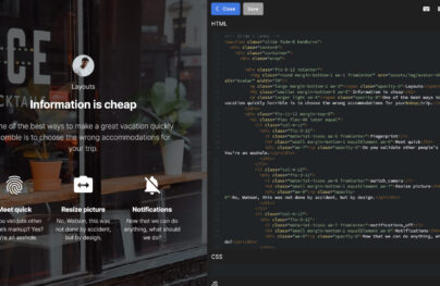
For example, a shopping cart icon is regarded as a way to view goods. One of the best ways to realize this, avoiding confusion, is to show the shopping cart’s content in the modal window that appears on the hover or a click without redirecting users to the shopping cart page. However, bear in mind that this modal window should have a “View Cart” button so that users who want to go to the shopping cart page or proceed with checkout can satisfy their needs.
Add to Cart by Sabartism
Decide on the Position
The position of an icon plays a vital role in creating an intuitive experience. When it comes to eCommerce, the best way is to stick to time-proven options.
For example, people expect to see
- a shopping cart in the header in the right corner,
- payment options on the checkout page,
- a delivery icon on the product page next to the product description,
- and a discount icon or a sale icon above the product image, not only on the product page but also on the list page.
If you want to go off the beaten track, then to avoid confusion, you need to plan the position of eCommerce icons according to the user’s behavior on your website. A heat map may help you in this matter. Also, logic may give you some good hints.
For example, if icons are used to show the variety, they should be positioned right near the product, usually above or below the size or price. If a delivery icon indicates additional costs, it should be next to the price tag since it brings vital information that may drastically influence the decision-making process.
Shopping Cart by Knock Zhou
Use Style that Fits Target Market
Two types of information may help you design iconography that delivers the right message and creates a user experience in which customers feel comfortable.
The first type of information is your target market. It is essential to understand what your audience expects from your brand. Do you need to look professional, daring, bold, or traditional? Ask yourself, whom do you serve your information and sell your products? This answer will help to define design features, style, and color.
For example, if you target a female audience and sell all kinds of “saccharine” things, your audience expects your digital store to be populated with pink details and smooth shapes. In contrast, a store that sells products for barbershops should look masculine and brutal with a grungy feeling and masculine-like features.
The second type of information that gives you hints on what icons will respond the best to the clients is a thorough analysis of your competitors, especially those who are long-established. The deal is, the old players know perfectly well what works the best for their clients. They use time-tested solutions, which you can borrow from them and adapt to your project.
On top of that, it is important to play safe and not get carried away trying to please your audience. The best way to achieve success with your styles is to use information from the stated above sources but still use the rules of good iconography, such as:
- icons should follow the same visual guideline;
- the crucial details of icons should be instantly recognizable;
- icons should be discernable on every screen size;
- icons should be in line with brand identity;
- icons within the set should be consistent.
Sticking to established guidelines lets iconography do its job perfectly and make the overall website and brand look professional and expensive.
Ecommerce Line Icons by Dighital
Use eCommerce Icons to Simplify not Minify Process
One of the most significant advantages of shopping icons is that they offer a way to declutter the design. However, it does not mean you need to replace all chunks of text with them.
Some cases require iconography to support the text, whereas other situations cannot survive without a proper context. It is for you to decide when icons should have context and provide enough meaning on their own.
It is also important to remember that such pages like product pages and checkout pages need to be A/B tested. The deal is, product pages are conversion generators, whereas checkout pages are profit makers. Therefore, shopping icons should be well-thought-out. They should assist the buying experience, clarify things, simplify the process and keep users away from confusion and misunderstanding.
Therefore, do not minify the process for the sake of optimizing. Being explicit is very important. Decide on what strategy to follow, and then test this strategy to see whether it responds to the target market and acts as intended.
Add to cart by Pixians
Double-check Mobile Version
One of the main pitfalls of using iconography in digital stores lies in providing a consistent and productive user experience across mobile devices.
People naively believe that icons will work perfectly on any handheld gadget because they are tiny by default. However, the problem is, small size does not mean comfort in mobile screens and does not mean responsiveness.
Consider a case in point. Small circular icons used for showing color options may feel fine in the desktop version because people use mouse cursors to click on them. However, these tiny circles may become an obstacle for cell phones since it will be challenging to choose the desired option without compromising others.
The “Thumb” web dictates its own rules. To make the user experience comfortable for your mobile clients, follow these best practices:
- Enlarge icons so that they are at least 44px.
- Add extra space between a range of icons so that users won’t touch two options accidentally.
- Define the best position for the icons. Ask yourself where these icons will be most helpful?
- Adjust the position according to device size. For instance, on a cellphone, crucial information should be located on the central part because it is of easy reach; however, on mini iPads or phablets, the vital information should be closer to the sides.
Notifications by Furkan Söyler
How to Choose the Best Free Ecommerce Icons for your Project
Shopping icons come in all shapes and sizes. It can be a true challenge to decide which pack of free eCommerce icons is a match made in heaven for your project. To give you some directions on where to start and what to consider in your selection process, we have compiled a list of helpful tips:
- Know your audience. Everything depends on your target market and its preferences, behavior patterns, needs, and requirements.
- Examine your competitors to create a list of styles and icons that work best for your niche.
- Choose widely accepted and well-known options that serve as popular behavioral cues.
- Ensure the pack includes all the essentials, such as the shopping cart icon, payment icon, checkout icon, and sale icon.
- Ensure icons are scalable without compromising the quality. For this, make sure you choose the appropriate format.
- Ensure details of the icons are discernable on small screens. The mobile web is one of the primary sources of conversions and leads for eCommerce. Therefore, the meaning of the icons needs to be recognizable on handheld devices.
- Ensure icons stand out from the background. For example, if you use icons against a bright, colorful backdrop, choosing line style is not the best decision. Analyze your design and focus on areas where icons will sit. Ask yourself, will they catch the eye of the customers instantly in such surroundings? Will they be focal points in the reading flow?
- Choose simple options. It is tempting to go for highly detailed options; however, the beauty of iconography lies in its simplicity and effectiveness. This is especially true for the eCommerce sector, where the user experience should be clean, transparent, and painless.
- Avoid too complicated concepts in iconography. Although icons can help transcend language, sometimes it is vital to be as explicit as possible.
- Define how deep a collection you will need. Quality over quantity is a golden rule of every successful business. Sometimes, it is better to use a small number of icons that perform their role perfectly rather than clutter your design with all sorts of dubious details.
- Follow the trends. No one likes outdated designs: they feel unreliable and stale. Even if you position yourself as a brand that praises traditional methods, it is still vital to refresh iconography occasionally. Just imagine what your clients will think about your company if they see skeuomorphic-style icons? They will leave and never come back. However, it does not mean you need to get carried away with trends. It is advisable to take baby steps with mainstreams. Your target market should be ready for changes, especially if you focus on elders or baby boomers.
Online Shopping Icons Exploration by Inipagi Studio
Collection of Free eCommerce Icons
The friendlier the interface to targeted audiences, the better chance you will have to increase conversion rates and generate greater profit. Icons play a vital role in creating a comfortable environment for potential customers. They indicate function and unambiguously communicate meaning. Not only do they look coherent across various devices providing consistency in style, but they also add to the aesthetics, making design eye-pleasing, intuitive and modern. They can speed up surfing by offering visitors visual cues.
There are many benefits of putting the effort into choosing icons that are active, meaningful and intentional.
We have gathered 20 free and fresh bundles of e-commerce icons, in several trendy styles. As a rule, each package includes common elements such as shopping carts, bags, credit cards, receipts, currencies, money, baskets, and tags, yet there are some that will surprise you with original items.
Free Ecommerce Icons by Agence Dn’D
Simple, yet neat, clean, and certainly elegant – that is how you can describe this pack of free eCommerce icons. Although they will not surprise you with their colorful nature due to their monochrome line style nevertheless, they certainly have a powerful personality.
As for specifications, there are more than 20 icons inside. Among them, you will find a delivery icon, shopping cart icon, map icon, etc. Each one is based on a 24px grid and available in two formats: Sketch and Figma.
Free Animated eCommerce icons in Lottie Library
Animated icons are a new round in modern iconography. They enhance user experience, reveal the meaning in all its beauty, and set the website apart from the others.
If you want to take user experience to the next level, this fantastic bundle of free eCommerce icons is a perfect place to start. The collection includes all the essentials: delivery icon, shopping cart icon, payment icon, and some others. Customize them in several clicks: change the background, set animation speed, and edit layer colors.
However, before using them in production, it is highly advisable to test them across all browsers, devices, and operating systems that your target market use.
Free eCommerce Icons Set
If you want your digital store to stand out from the crowd but afraid to use animated approaches due to their compatibility, then you need this outstanding set of free eCommerce icons where each unit is a small illustration with a bright appearance and positive vibe.
Inside the set, you will find 50 icons made in a flat style: shopping cart status icons, payment methods icons, delivery icons, shopping category icons, etc. Each one ship in SVG and PNG formats.
Free Ecommerce Icons
This is another bundle of free eCommerce icons made as small illustrations. However, this time there are just six items inside. Nevertheless, they will surprise you and your customers with a detailed approach. Thanks to blue used as a core color, they look trustworthy, reliable, and cheerful. These qualities may quickly improve the overall atmosphere of the digital store and win over clients.
Delivered in relatively big size and scalable and customizable Sketch format, they are a perfect foundation to build on.
Payment Methods by Arthur Chayka
Ecommerce icons are not only about shopping cart icons or delivery icons but also about payment methods. A handy checkout page is critical for the success of your digital store. Therefore, a set of well-made payment methods should be in your toolbox.
If you seek one for your collection, Arthur Chaika will meet your needs with his impressive library of free payment methods icons. Here, you can find almost 40 methods, including some rare options like Klarna, specific for the England market, or Alipay, specific for the biggest China market, Aliexpress.
Responsive E-Commerce Icon Set
![]()
The key feature of the collection is that it is supposed to work with three different device sizes: desktop, tablet and mobile. Thus, in the package you will find icons in three different sizes (16x16px, 32x32px, 64x64px). They vary in appearance with the biggest as the most detailed, while the smallest one is a primitive vector shape.
E-commerce Icon Set
![]()
E-commerce Icon Set includes almost 20 outstanding flat illustrations that look great on any background. They are bright, stylish and visually appealing. You can choose among four available formats (AI, EPS, SVG, PDF).
E-commerce Vector Icons
![]()
The package consists of 40 carefully designed items. You may easily adjust stroke width making symbols look visually weighty or vice versa slimmer and more subtle. There are three default color options (green, purple and mixed) and three formats (AI, EPS, PDF). Use them to make an interface clean and informative.
450 Outline Icons
![]()
The freebie is huge: it includes more than 400 icons that are made in one direction, style and color. The outline shape gives each item a slick and crisp outward. The e-commerce category covers all the essential elements starting from shopping cart and ending with a currency symbol. Designed for iOS, they are available in two sizes (22x22px and 44x44px) and three formats (AI, EPS, PNG).
Icons Free E-commerce
![]()
The artist combines flat and line style resulting in a pretty nifty product. The collection looks slightly offbeat yet eye-catching. A long five o’clock shadow adds charm to the appearance. You can grab 15 circular illustrations in AI, PNG, and SVG formats and use them under the Creative Commons license.
36 E-commerce Icons
![]()
Made with pixel perfection in mind, this set of icons is ideal for any modern project that needs to accommodate various screen sizes. While a rosette-inspired backdrop with default coloring gives each item a retro zest, casual solid shapes make the package more generic.
35 Flat E-commerce Icons
![]()
35 Flat E-commerce Icons feel boxy, rustic and contemporary. Flat style in tandem with a bright color scheme produces a pleasant aesthetic. Among the 35 items, you will find a calculator, credit cards, payment methods, shopping cart, price tags and other stuff.
Shop Icons
![]()
Shop Icons have a feeling of a typical road sign. They are simple, intuitive and eye-pleasing. The circular shape and simple forms make it applicable for different concepts. There are two styles, 17 icons and two file types (SVG and PNG).
Buy Icons by HevnGrafix Creative
![]()
They are tiny, but amusing and refreshing. Each item is detailed and crisp. The set includes eight different takes on a buy button, where each specimen ships with two styles (contour and solid), one size and two formats (AI and EPS).
Shopping and E-commerce Icons
![]()
Shopping and E-commerce Icons are a fusion of line style and flat style that are enhanced with nominal soft pastel coloring. They are fun and friendly. The collection has 21 objects, including wallet, barcode, clothes hanger and others.
Free Shopping Cart Icons
![]()
Free Shopping Cart Icons are well-suited to modern projects with an elegant line style design, clean shapes and a minimum of details. Made with responsiveness in mind, they look sharp in small and big sizes. The collection contains 15 elements.
45 Outline E-commerce Icons
![]()
Unlike the previous example, this set of icons feels relatively big, wide and massive. Using just vital details for each component, the artist crafts a clean, neat and intelligible product. You can change to a 2px stroke, adjust the color and even add extra details with the help of Photoshop or Illustrator.
Apps And Products Features Free Icon Set
![]()
The collection is a mix of graphical material that is suitable for promoting and selling various digital products. Along with classic symbols such as payment or shopping cart, you can find some specific elements such as cloud storage or tablet designs.
Bank and Money Icons
![]()
The assortment of 36 icons includes visual representations of various services and processes inherent to bank sphere. It is not exactly what is needed for all e-commerce projects, however, there are some items that expand functionality, add a twist to your interface and make some functions more evident.
Conclusion
Ecommerce icons are nothing new. However, they are still powerful instruments. When well done, they can easily take user experience to the next level and help your conversion rates reach high marks.
However, despite their vast potential, entrepreneurs quite often overlook them by prioritizing larger things. This faux pas costs businesses around the world millions of dollars since bad iconography ruins everything. Therefore, finding the proper set of free eCommerce icons is crucial for the digital store. Line style still rules the roost. The majority of the free icon packs above are made in this direction. The designers prefer to craft elegant contour graphics that in some cases have an accompanying solid version. Though, to be honest, bright flat tiny illustrations are just as good.
Follow our guide to define what free eCommerce icons your store needs and use our collection to find the best set for your brand and target market.