How to Improve User Experience with Google Analytics 4 Features
Most user experience (UX) problems show up the same way: your users leave a form halfway. They hesitate on the checkout step. Or they bounce after only scrolling a few lines.
Frustrating, right?
You can see that something is wrong. But not why.
That’s what Google Analytics 4 shows. Instead of only counting pageviews, GA4 captures detailed interactions—scroll depth, button clicks, video plays, and form errors (the signals that actually explain user behavior).
In this article, we’ll explore how you can use Google Analytics 4 to improve your user experience.
What Is User Experience (UX)?
User experience is something visitors feel when they interact with your website or application. For example, think about the last time you visited a website:
With Postcards Email Builder you can create and edit email templates online without any coding skills! Includes more than 100 components to help you create custom emails templates faster than ever before.
Free Email BuilderFree Email Templates- Was it easy to find what you needed?
- Did it load quickly?
- Did the design make sense?
All of that adds to the experience.
So, here’s what makes a good UX:
- Your users must get from point A to point B without getting stuck.
- The layout must guide them naturally.
- Everyone, including people with disabilities, should be able to access your website smoothly.
Why UX Is Important?
It only takes 50 milliseconds for visitors to make up their minds about your website. So, if your website feels slow, confusing, or frustrating, visitors will leave.
And once they’re gone, it’s hard to win them back because 88% of visitors don’t come back after having a bad experience with your website.
But when the experience feels easy and enjoyable, people engage more.
They spend extra time on your website, and are more likely to buy something or sign up, and leave with a better impression of your brand.
But, how do you know if your UX is actually good?
You can understand that by tracking metrics like engagement rate, event counts, conversion rates, and many more in Google Analytics 4.
With Pulsetic you’ll be instantly notified the moment your website, API, or server becomes unavailable. Monitor uptime from multiple global locations and respond to incidents before your users are affected.
Create beautiful status pages in minutes to keep customers informed during outages and build trust with transparent communication.
Start Monitoring for FreeTrack Core Google Analytics Metrics For Improving UX
There’s a lot you can track in GA4, but a few key metrics can tell you if visitors are enjoying your website, where they’re running into problems, and what keeps them coming back.
Let’s see what these are.
Users
Users are the people who interact with your website or app. There are four main types of user metrics in GA4:
1. Total users are unique people who visited in a given time period. This shows the size of your audience and if it’s growing or shrinking. To track this metric in GA4, go to Reports > Life cycle > Engagement > Events.
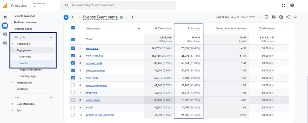
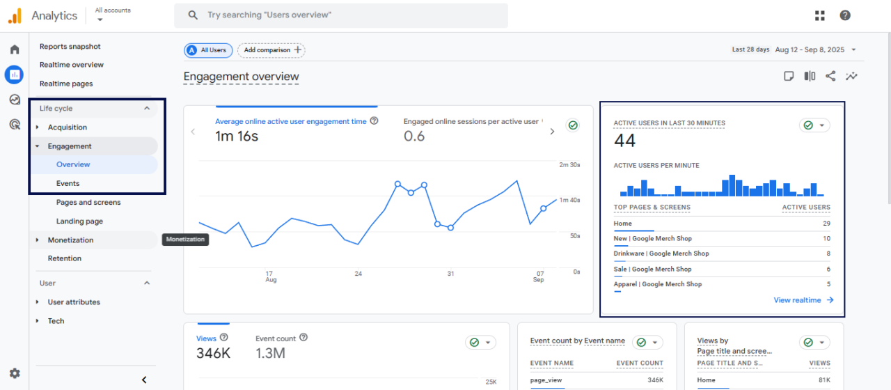
2. Active users are the people who had an engaged session (stayed longer than 10 seconds, viewed more than one page, or triggered a key event). This is often the most important metric because it shows who actually interacted with your website.
To track this metric in GA4, go to Reports > Life cycle > Engagement > Overview.
3. New users are the people visiting your website for the very first time.
4. Returning users are those who’ve already been there and decided to come back (even though they didn’t engage during their first visit).
New users are a good signal of growth and brand awareness. If you’re reaching new audiences through campaigns, partnerships, or email marketing, you’ll want to see this number increase.
Whereas returning users show loyalty. If people keep coming back, it means they see value in your content, products, or enjoy the overall experience.
Suppose you run an online flower shop.
If you notice users dropping after Valentine’s Day, that’s expected seasonality. But if users suddenly dip during peak season, it might signal a UX problem, like a slow homepage or a confusing navigation menu keeping people from exploring your bouquets.
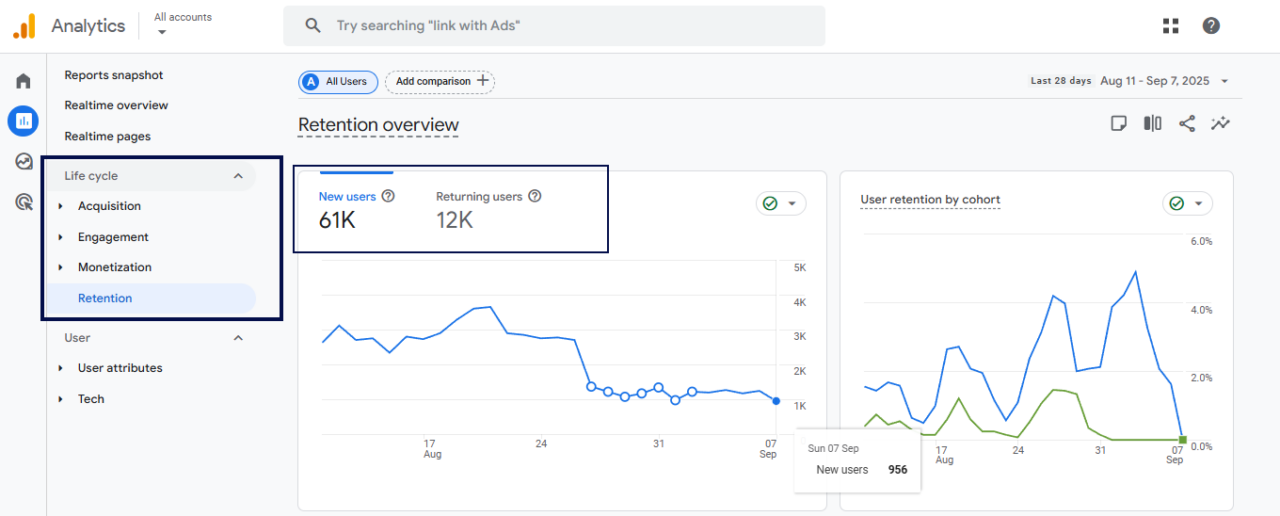
To see a clear ratio of new users vs returning users on your website using GA4, go to Reports > Retention.
Looking at users over time gives you a sense of whether your website is attracting the right audience and satisfying existing ones.
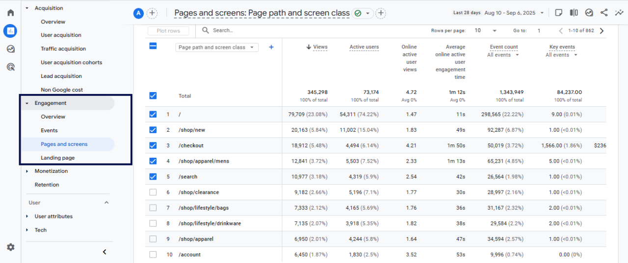
Views
Views tracks the number of times a page (or app screen) was loaded. Every time the page loads, it counts as one view. For example, loading a page once and then refreshing it will count as two views.
On their own, views don’t give you a crystal clear picture of content performance. But when you track them over time and compare them with other metrics like engagement time or conversions, they give you a solid picture of how your content is working.
For example, in your flower shop, high views on the “Roses” page mean shoppers are drawn to that category.
But if those views don’t turn into orders, you might need to check the product layout, descriptions, or mobile design. Maybe the photos are too small or the add-to-cart button is buried.
That’s a direct UX fix.
To track the views in GA4:
- Go to Reports > Life cycle > Engagement> Pages and screens
- Look at the Views on the right side.
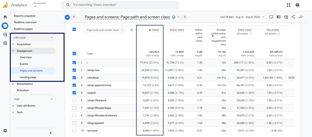
By looking at these numbers, you can identify your most-visited pages.
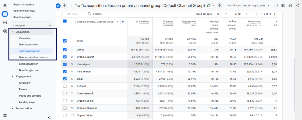
Sessions
A session is a single visit to your website. It starts when someone arrives and ends when they leave. One session can include multiple views and events.
In GA4, sessions are tracked a little differently than before. Unlike Universal Analytics (UA), a new session doesn’t start only because the clock hits midnight or the traffic source changes.
This makes the data more accurate and easier to trust.
Sessions measure overall traffic and spot trends in user behavior. That shows how many visits you get and how many are meaningful.
For example, a strong session might include browsing “Roses,” adding a bouquet to the cart, and checking out.
But if most sessions end after only one or two clicks, something’s off. Maybe the checkout process is too long, or the shipping costs appear too late.
You can monitor where people give up by tracking sessions. This would help you streamline the experience.
So, to track these sessions:
- Go to Reports > Life cycle > Acquisition > Traffic acquisition
- Look at the Sessions column to see the number of visits.
Engagement Rate
GA4 replaced bounce rate with engagement rate. Instead of tracking who leaves, engagement rate shows the percentage of sessions where users actually did something.
Google defines an engaged session as one that does at least one of these:
- Lasts longer than 10 seconds
- Triggers a key event (like a click or form fill)
- Includes 2 or more page or screen views
That’s a much more helpful way to look at user behavior. So, here’s how to check the engagement rate for your whole website or for individual pages using GA4:
For site-wide data: Go to Reports > Acquisition > Traffic acquisition. You’ll see engagement rate listed next to sessions and users.
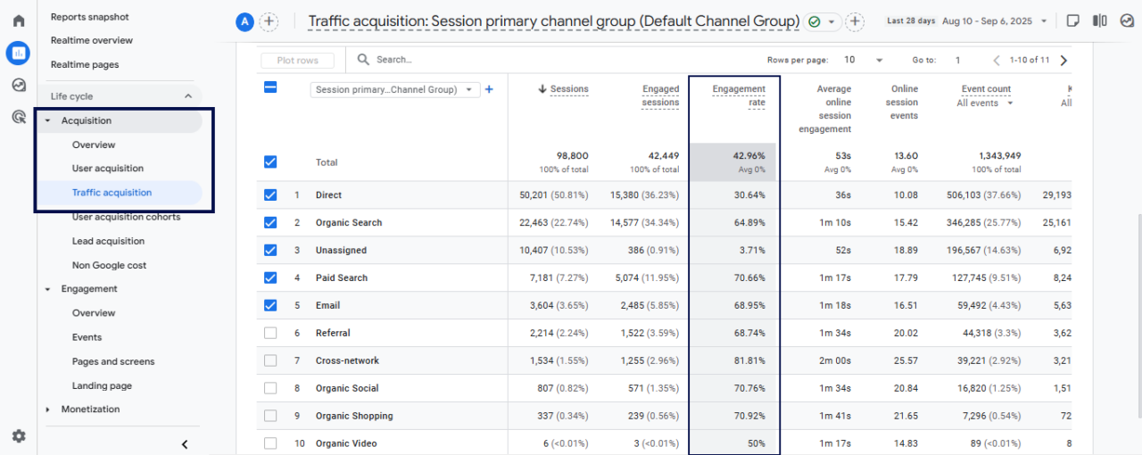
For page-level data: Go to Reports > Engagement > Pages and screens.
And now you can compare engagement across traffic sources or pages.
Suppose your flower shop’s “Wedding Bouquets” page has thousands of views but a low engagement rate. That means shoppers come but don’t scroll, click, or explore.
Maybe it’s because the page loads too slowly. Or the text is overwhelming. Or the images don’t inspire action. By testing a simpler layout, faster images, or a clearer call-to-action, you can turn that around and keep people engaged.
Average Engagement Time Per Session
This metric shows how long people are actually paying attention to your website—not only leaving a tab open in the background, but actively scrolling, clicking, or reading.
In GA4, average engagement time is calculated as the total engagement duration divided by the number of active users. You can track this in GA4 by going to Reports > Life cycle > Engagement> Overview.
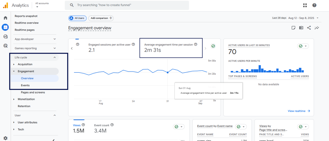
It shows if visitors are enjoying your content.
If the average time is short, it means visitors didn’t find anything interesting or valuable. The longer they stay, the more they see the value of what they want.
That’s why it’s also worth looking at this metric across different timeframes or traffic sources.
For example, if visitors from an email campaign spend less time than organic search visitors, that could be a sign that the landing page doesn’t provide a seamless experience to the readers, maybe because it doesn’t connect well with the email message.
To improve average engagement time, make your pages easier to scan, fix any performance issues, and get straight to the value so people have a reason to stick around.
Pages/Screens Per Session
This shows how many pages, on average, people view in a single visit. This gives an idea of how much people explore your website.
A higher number means they’re moving around and checking things out. A lower number means they didn’t find a clear next step.
Look at it together with engagement time.
If someone only visits one page but spends several minutes there, they might still be really engaged. But if they click through several pages in a few seconds, that means they’re looking for something they can’t find.
If you want to improve this, make sure your pages guide visitors naturally with clear menus, links to related content, or a simple next step.
Unlike Universal Analytics (UA), GA4 doesn’t show pages per session directly in the standard reports. You have to build a quick custom report in Exploration.
Here’s how:
- Go to your GA4 account, click Explore in the left menu, and hit the + button to create a new exploration.
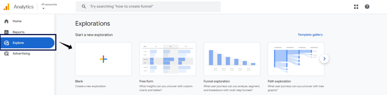
- Give it a name like “Pages Per Session.”
- On the left panel, click on the + sign of the dimension column. And search for these dimensions and select them, and click on the confirm to add:
- Page path + query string
- Page path and screen class
- Session medium
- Similarly, add the metric: search for Views per session and import it.
- Now, drag Page and screen class and Session medium into Rows, then move Views per session into Values.
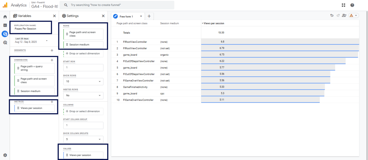
- And now you can track how many pages, on average, people visit in a single session.
Event Counts
This shows how many times people interact with elements on your website, like clicks, form submissions, video plays, or scrolls.
GA4 tracks everything as an event, so you can see exactly which actions people take most frequently.
To track the event counts in GA4:
- Go to Reports > Engagement > Events.
- The Event count column shows how many times each action happened.
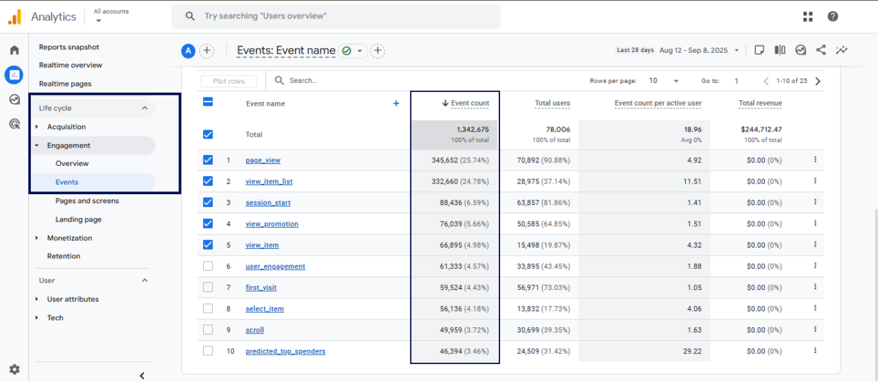
This will exactly tell you what’s getting attention and what’s being ignored. If an important button or form has low event counts, it might be hard to notice or not clear enough.
To improve this, make key actions prominent, simplify the design, or adjust the wording so people know what to do.
Conversions
In GA4, Conversions (also called key events) track the number of important actions people complete on your website. It could be anything that turns a visitor into a customer, such as:
- Making a purchase
- Signing up for a newsletter
- Filling out a form
- Downloading a file
Note: Your conversion rates can boost if you have a well-designed UX.
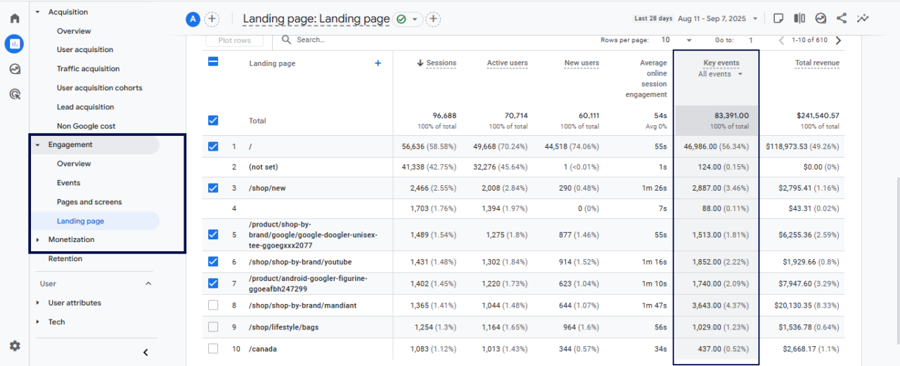
To see the conversions (key events) in GA4:
- Go to Reports > Life cycle > Engagement > Landing page
- You’ll see a list of your key events tracked as conversions, with counts.
Start Tracking Your Own UX Today
You don’t need a complete redesign to make progress with user experience. Open GA4 and track the metrics.
If you spot something suspicious, make one small change this week. It could be shortening a form, fixing a slow page, or adding a clear link to the next step. Even these simple tweaks can have a big impact over time.
When you’re ready to take it further, try setting up a custom report in GA4. It’s the easiest way to keep an eye on the actions that matter most for your business and catch UX issues before they become real problems.
FAQs
How Often Should I Review GA4 Data for UX Purposes?
You should regularly check after every minor or major change, such as a design update or adding new features. This helps spot immediate issues. However, monthly check-ins are also ideal for identifying trends, measuring changes, and planning the next steps to improve the user experience.
How Does GA4 Support Personalization for Better UX?
By segmenting users based on behavior, you can create personalized content, offers, or navigation paths.
You may also want to see:
Best Privacy-Focused Alternatives to Google Analytics for 2025