Unlock the Potential of Subscription Confirmation Emails
Everyone is aware that email marketing plays a massive role in a company’s success. According to recent stats, almost 60% of B2B marketers claim it to be their top channel for revenue generation.
When it comes to directly communicating with your target market, email marketing works wonders. It compels users to visit your website, keeps their interest alive, makes them loyal to your brand, and simply converts customers into leads and leads into money. However, it will not be possible without one small detail – a subscription confirmation email.
A subscription confirmation newsletter is more than meets the eye. It is a real deal-breaker. When done right it turns a regular visitor into a loyal subscriber, starting relationships on a good note and securing the right attitude towards your brand. When done wrong, it fails the entire mission. Let us break it down into essentials and get some useful insights as to how to unlock the potential of this unremarkable transactional newsletter that is a dark horse of email marketing.
What Are Subscription Confirmation Emails?
A subscription confirmation newsletter is a particular type of transactional email. It is sent automatically to users who express a desire to become a part of your subscriber list and get regular updates and newsletters from your brand by willingly entering their email addresses.
A confirmation email goes hand in hand with a subscription form. It is an integral element of the double-opt-in subscription process.
Double opt-in email marketing implies two steps. The first is to get an email address from the user. The second is to confirm the user’s desire to proceed with your company. It means that you need to send an extra verification email to those who have already left their addresses and still ask them to confirm their decision by clicking on the provided link.
With Postcards Email Builder you can create and edit email templates online without any coding skills! Includes more than 100 components to help you create custom emails templates faster than ever before.
Free Email BuilderFree Email TemplatesWith double opt-ins, only contacts who confirm their subscription become a member of your email list.
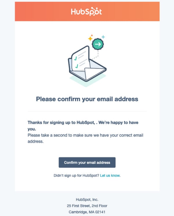
Subscription Confirmation Newsletter from Hubspot
What Should Be in the Subscription Confirmation Email?
Although a subscription confirmation newsletter is not a place to promote products or start long discussions nevertheless, it does not mean it should be just a straight link without any “Hi.” A subscription confirmation email should include a link for verification and the following:
- Look exceptional
- Get attention
- Maintain the brand’s family feeling
- Leave a positive impression
- Sound friendly and reassuring
Therefore, at minimum, each subscription confirmation newsletter should have such essential details:
- Request to confirm the subscription with a direct link that verifies email without extra steps.
- Confirmation message. Tell your users what they get once they verify their email addresses. Inform them how often they are going to hear from you. If you want to ask your future subscribers about something important, such as adding your email address to the contact list or “Safe Senders” so that your newsletters avoid the spam folder, it is a good time to do this.
- The short welcome message. Re-introduce yourself and remind subscribers about your company once again. Here you can add your website’s URL, company name, and a brief description of what you do.
- Thank You Note. Showing appreciation to customers establishes your company as a friendly and reliable partner. As a rule, big companies send an entire Thank You email that follows the subscription confirmation email and comes before the Welcome Email. However, if you do not intend to send such types of newsletters, you may use a subscription confirmation newsletter to show your gratitude.
- Reassuring message. Remind your subscribers that they can quickly opt-out from your subscription list any time they want.
- Instructions in case the user received this email by mistake to avoid being flagged as spam. Simply ask a user to delete this message.
- Teasing message. Give users some hints on what they may expect from your company, giving them an extra nudge to confirm their email and proceed with your brand.
- A link to the browser version and plain text version to provide your user with alternative ways to read your newsletter.
- Link to the Help Center or Instant Chat in case your users have questions.
- Name of the subscriber or any other personal information. Based on subscriber’s engagement with your email funnel, personalize your message as much as possible.

Finally, yet importantly, make a statement.
The truth about subscription confirmation newsletters is they all look the same. Entrepreneurs do not give them a proper thought, and they do not want to invest their time and money into a newsletter that will never repeat.
However, as we have already said, they miss a huge opportunity since it is the first-ever acquaintance with the company. As we all know, you never get a second chance to make the first impression. Many factors can help to make the first impression count, and one of them is to create strong content.
Brands that provide a warm welcome to subscribers and manage to make a statement revealing their company’s personality and charisma secure stronger and healthier relationships with the clients.
With Pulsetic you’ll be instantly notified the moment your website, API, or server becomes unavailable. Monitor uptime from multiple global locations and respond to incidents before your users are affected.
Create beautiful status pages in minutes to keep customers informed during outages and build trust with transparent communication.
Start Monitoring for FreeTherefore, give a thought to what you are going to say to your newcomers. Show your brand voice. For example, if you are a young and ambitious company, you can be a little bit bold and whimsical in your welcome message. Make people smile; make them remember your brand by your voice, message, and attitude to customers.
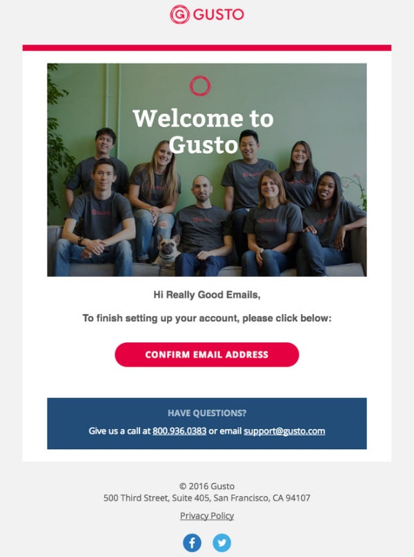
Subscription Confirmation Newsletter from Gusto
Although the double opt-in subscription process may increase the risks of churn due to its longevity and requirement of taking extra moves from the user’s side, that can be annoying and irritating, especially when the visitor is one step away from finishing checkout. However, it is crucial for several good reasons that outweigh this risk.
- It protects you from spammers.
- It protects you from bots.
- It protects you from fake emails that increase your email software fees.
- It ensures your subscription list’s quality and health by onboarding only those interested in your brand.
- It saves you from a bad sender reputation and chances to get into blacklists because of decreasing spam complaints.
- It guarantees a high deliverability rate since a healthy subscription list sees the lowest bounce rate.
- It sees high open rates and even click-through rates.
- It helps to reassure your subscribers that you have acknowledged them.
- It helps build strong relationships with your prospects.
- It helps to reinforce your brand’s value proposition and get subscribers to engage with your brand on a deeper level.
- It can even make the first steps in promoting your current offers and generate some extra traffic to landing pages.
Although you might risk losing contacts who do not confirm their email addresses (it is almost 20% of initial subscribers according to recent studies), and there is a chance that your subscription confirmation newsletter might get overlooked or accidentally deleted, still it pays off in the long run. It benefits your brand in so many ways, providing your company with a safe foundation for running successful email marketing campaigns.
More so, a subscription confirmation email is very easy to create. For example, with Postcards, it takes just several minutes. The result will look modern, stylish, and impressive.
Missed Opportunity of Subscription Confirmation Emails
A subscription confirmation newsletter is crucial for maintaining a healthy subscription list that brings numerous advantages for the brand. However, that is not all. It also has excellent marketing potential.
As the first email ever sent to your future subscribers, it holds a unique opportunity.
You can get a brilliant start in your relationships with clientele as well as ensure a strong first impression.
It helps to increase engagement with your brand.
It may generate extra traffic.
Finally, it can be used for playing some marketing tricks like cross-selling.
Let us break down the best practices for a subscription confirmation email to give you insights and hints on how to make the most out of them.
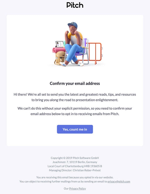
Subscription Confirmation Newsletter Pitch
How to Make a Successful Subscription Confirmation Email
The success of a subscription confirmation newsletter depends on many factors, both internal and external. Let us consider some good practices that help to face all the obstacles and reach your goals.
Overcome Basic Problems
Subscription confirmation newsletters stumble upon several significant issues that stop them from reaching goals.
An unreliable ESP or server provider can cause delays in sending verification emails or not sending them at all. If you experience such issues, you need to find a better service and make sure future customers get subscription confirmation emails on time.
The second problem is the possibility of the email being caught by spam filters. This issue is solved with a proper subject line and constant improvement of your karma, aka sender reputation and IP reputation. High deliverability is key to success. Check out our Guide to Email Deliverability: Best Practices and Tools to Avoid Spam Folders to know what to do to improve your rates and ensure your email sees through all the barriers and reaches the inbox folder.
The third problem is the possibility of the email being lost in an overcrowded user’s inbox. You can solve this issue in two stages. The first demands perfect timing from you. The subscription confirmation email should be generated immediately. Again, make sure your server and ESP can promise you this. The second stage demands from you a strong, preferably personalized subject line to make your newsletter stand out from the crowd. In case this solution does not bring intended results, you can always send a follow-up email.
The fourth problem is an incorrect display of the newsletter. Broken emails mean lost subscribers. Remember, people are accustomed to checking out their mailboxes and signing up for newsletters through cell phones, phablets, and tablets. Therefore, it is imperative to ensure your newsletter works consistently across all email readers, devices, and all sorts of screens. The newsletter should be fully responsive and, most importantly, mobile-friendly. Please, bear in mind that these two characteristics are different things.
What’s more, it is half of the problem. Another pitfall lies in the incorrect display of email readers. Believe it or not, but in 2021 there is still no consensus among them. Email readers may interpret CSS styles in different ways or even do not support them at all. Therefore, make sure the newsletter is well tested across all the email readers.
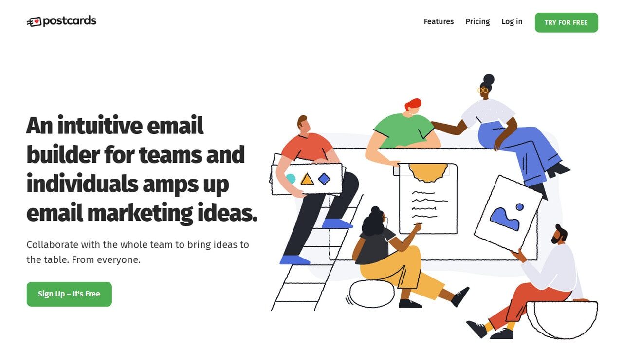
Hint: To save yourself from troubles, use Postcards. It is a professional HTML email newsletter builder with field-tested blocks made of safe CSS styles that look and work consistently across all devices, browsers, and email readers.
The final trouble spot is inaccessibility. The entrepreneurs always overlook this aspect of the newsletter. Much like responsiveness and mobile-friendliness, accessibility is must-have for every email regardless of its size and importance. To make your subscription confirmation newsletter accessible, please check our guide to Email Design Accessibility: Why It Is Important to Improve It. It will give you some good advice on catering to all groups of people out there and not miss an opportunity to extend your market.
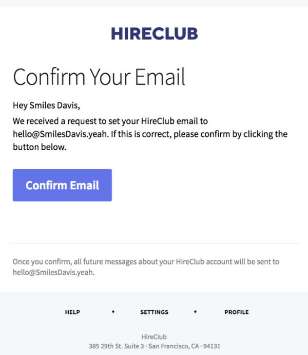
Subscription Confirmation Newsletter from Hireclub
Create a Strong Subject Line
There is a lot to be said about the importance of a strong subject line. Whether you are running a holiday email campaign or creating a series of re-engagement emails, the subject line should be perfect.
While the majority of marketing campaigns give you room for breath, letting your imagination run riot, subscription confirmation newsletters are a bit limited. The deal is, at this point of your relationships, you do not have much information about the user to make a powerful personal subject line; therefore, you need to stick to the best practices, such as
- Make it concise.
- Get straight-to-the-point.
- Address the subscriber by the name, if it is possible.
- Add your company’s name to re-state your brand.
- Add friendly emoji.
Check out these examples to get some hints on how it is done in real-life projects.
- Events await! Please confirm your account
- Confirm your email address to start riding for work
- Hey, It’s Chipotle – Please Confirm Your Subscription
- Pssst… just one final click!
- Confetti – Confirm Your Email
- Confirm your Depop account, [User’s Name]
- Confirm your email on Headspace
- Please confirm your HireClub email
- Welcome to Gusto – Start here
- Thanks for joining us. Just one more step
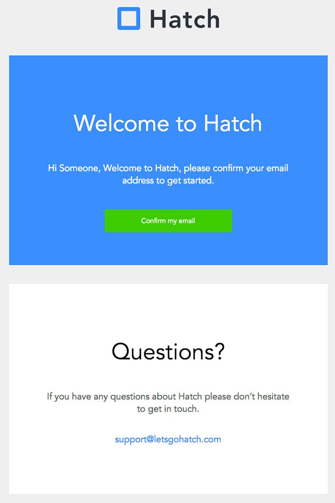
Subscription Confirmation Newsletter from Hatch
Think Through the Information Structure
The ideal subscription confirmation newsletter is streamlined and straightforward; it brings value and addresses the user’s issue right off the bat. Remember, it is the first-ever email that your users receive from you, so do not disappoint them. It should make a strong impression.
Therefore, make sure you include all the crucial details that we have featured above and you have thought through the information structure so that even those who prefer to scan rather than read can quickly get the message. For this, follow these tips:
- Place your appeal to confirm the subscription into the heading. It should be set on top and instantly catch an eye. Give it space.
- Use formatting to break text into digestible portions.
- Use paragraphs to structure your body copy.
- If you plan to use a bare link instead of a button, make sure it stands out from the reading flow or even occupies its sweet spot.
- Highlight links, email addresses, and other vital details.
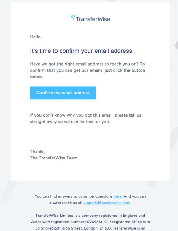
Subscription Confirmation Newsletter from TransferWise
The verification link is the heart and soul of every subscription confirmation email. Its presence is beyond question. However, one of the reasons your users may not respond to your email is that they could not find it in the copy.
Sometimes, entrepreneurs forget about good formatting rules and make the link blend into the environment completely. The main reason for that is that they use default templates offered by their ESPs that do not have proper styling. To avoid such a drastic outcome, it is highly recommended not just to use professional HTML email template builders, like Postcards, that make any link stand out from the crowd but turn your confirmation link into a button.
That is not all. Along with using button-shaped links instead of text-based ones, it is also customary to follow the best practices for call-to-actions, such as:
- Create a prominent design. It should be big and solid. It should have a bold color that strikes an eye immediately.
- Use action words. A range of verbs may push your users to confirm your email more effectively. In addition, such buttons should remind users what is going to happen. Stay away from primitive “Confirm.” What should they confirm? It does not make clear what the reader’s action means. Everything should be explicit. For example, you can go for such titles for your button as “Click here to confirm your subscription in [Brand Name],” “Subscribe me to [Brand Name] list,” etc.
- Occupy the upper part of the newsletter. If you cannot place it in the hero area, make sure it stays in your design’s most viewed area.
- Make the button mobile-friendly, so it is tappable across all small screens, and it is accessible so that prospects who use assistive technologies may quickly locate it and click it.
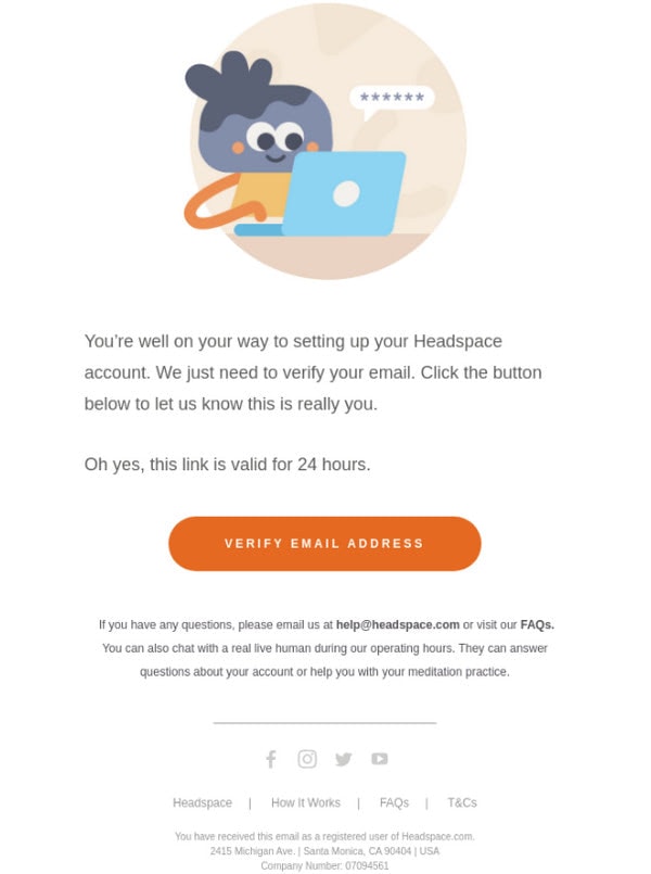
Subscription Confirmation Newsletter Headspace
Be on Brand
Every newsletter should stay in line with the brand; a subscription confirmation newsletter is no exception. More so, it is the first-ever email from your company. Therefore, it is obligatory to include a piece of brand identity into your design.
Brand elements are things that can make subscription confirmation email even more useful for several reasons:
- It separates the newsletter from the competition.
- It is a visual reminder of your company.
- It cultivates trust and increases credibility.
- It produces a favorable impression of the company.
How to integrate elements of brand identity? The simplest and the most effective way to do this is to use logotype on the top. If you want to take this approach slightly further, you can create the entire hero area where brand identity elements occupy the leading position.
Make Impressive Email Design
Email design plays a crucial role in conveying a message, even when all you need to deliver is just a link.
As we have already said, it is important to include in your subscription confirmation newsletter not only necessary information but also such vital things as brand identity and call-to-action. Therefore, you simply cannot make it without a good HTML email template. This is a good practice that ensures success. Other useful tips for designing effective subscription confirmation email are:
- Make it compact. Do not include a wealth of information. Your primary goal is to compel users to verify their email. Of course, you can use some marketing tricks like teasing users with visually appetizing information; nevertheless, it should not be massive.
- Make it clean and straightforward.
- Stick to a traditional one-column layout where information is absorbed line by line. This way, you will be able to set priorities and give your verification link a dominant position.
- Add hero area where your brand identity, illustration, or image establish a proper atmosphere and effectively convey your company’s personality.
- Use no more than three hues in your color palette.
- Hit the optimal contrast.
- Choose typography whose letterforms look legible on all devices.
- Format text.
- Use the inverted pyramid principle.
If you need a helping hand here, use Postcards. With this professional newsletter template builder, you will be able to create a subscription confirmation newsletter by simply dragging and dropping elements into a playground. The best thing is, you do not have to worry about such crucial factors as responsiveness, mobile-friendliness, and integration with your beloved ESP. Everything is already taken into account. You can create an HTML newsletter template and use it right away.
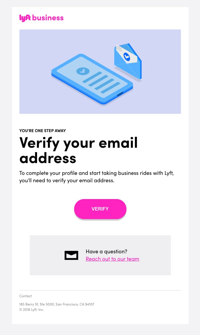
Subscription Confirmation Newsletter from Lyft
Tease Future Subscribers with Saucy Information
As the first interaction with your business, the subscription confirmation email may include more information than just a verification link. You can add a block that advocates your brand or promotes your products or services. Let us consider some good ideas.
- Expose your features. To give your users a deeper understanding of what you have to offer, you can list your prominent features.
- Show your community. To heighten the sense of belonging to something special, you can show your community. Share with your newcomers some fresh news on recent gatherings, exhibit some photos or simply quantify your brand through impressive numbers.
- Show your partners. Displaying a range of your partners’ logos will help you to qualify your brand and make it more desirable. This gives an extra nudge to the user to finish the double opt-in registration.
- Add social media icons with some saucy data snippets. You can show the network through images as well.
- Draw attention to current offers. For example, you may notify your future subscribers about the current discounts, shopping incentives, or referral programs where they can get some extra cash or perks.
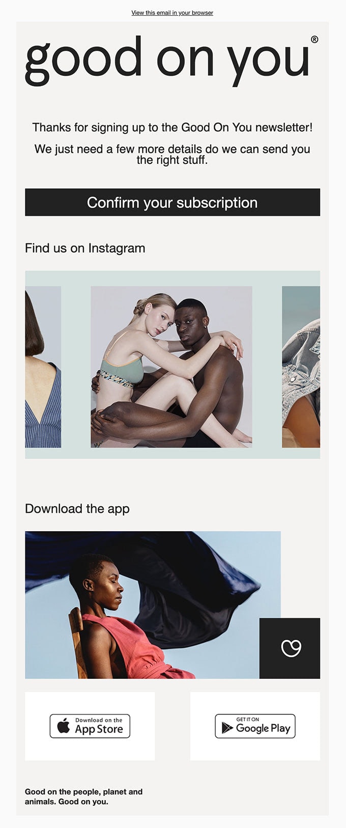
Subscription Confirmation Newsletter from Good on You
Say Thank You
Generally, subscription confirmation emails do not imply thank you note. As a rule, Thank you email comes after finalizing registration. However, with personalization becoming a more demanding feature that sets the brand apart from the competition and directly affects conversion and sales rates, more and more brands tend to add a thank you note.
Being grateful to users who picked you and chose to receive regular updates from your company is a huge step forward in relationships. Even the simple phrase “Thank You” could make all the difference.
So what can you do? You can just say thank you in an email signature or say thank you right at the top, or even add a quick note from the CEO. Whatever you prefer to choose, keep it short and sweet to make sure subscribers feel welcome and excited rather than irritating by lots of content to digest.
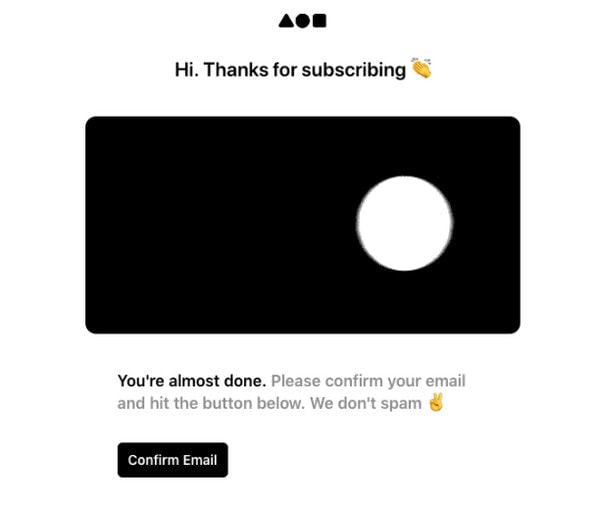
Subscription Confirmation Newsletter from Dekks
Remind About Yourself
Depending on the customer journey, you may encounter users who opened the email but did not verify their address or users who received your email but did not open it, or emails that did not reach the inbox. In this case, you may benefit from follow-up emails designed to remind your potential subscribers that you are still waiting for their confirmation. This can be a simple reminder with an active link to confirm the action or even a lead nurturing email.
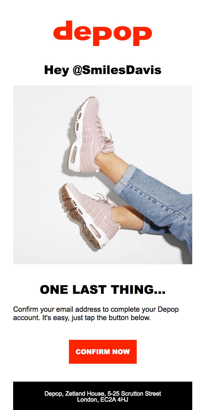
Subscription Confirmation Newsletter from Depop
Collection of Inspiring Subscription Confirmation Email Examples
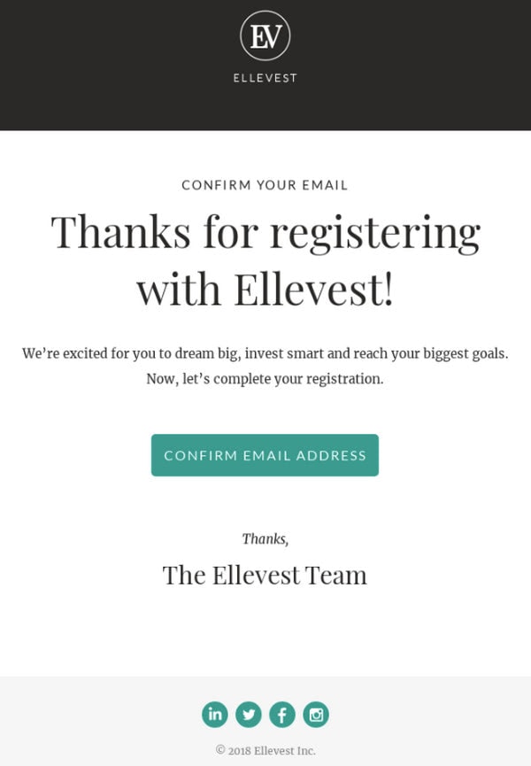
Subscription Confirmation Newsletter Example from Ellevest
The newsletter from Ellevest is one of those subscription confirmation email examples made with the best practices in mind. It is clean and simple, it only takes a second to read, but it still makes an impression. And what an impression it is. You want to become a part of this company right away since the team was managed to include essential information and integrate a piece of the company’s soul.
Note, the design is not fancy or vibrant. On the contrary, it is modest and businesslike. It perfectly reflects the personality of the company.
What can we see here that we should adopt in our subscription confirmation newsletter?
- The logo of the company is set on the top along with prime brand color.
- Thank You note that is magic right away. It is skillfully highlighted with the help of a first-level heading.
- There is a welcome statement. It is just one sentence, but it feels reassuring.
- The link is made as a button that follows all the best practices. Therefore, it pops off the screen immediately.
- The traditional one-column layout with header and footer that structures the content effectively.
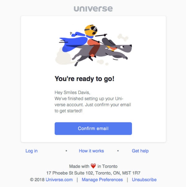
Subscription Confirmation Email Example from Universe
“Events Await!” – What a great subject line. It certainly sees through all obstacles and reaches its destination, ensuring high open rates.
However, what about the content inside? It is also one of a kind. The newsletter is not one of those typical and banal subscription confirmation email examples; it certainly rocks.
So, what can you see here?
- First, there is a hilarious illustration in the header. It conveys the mood and personality of the company making users feel excited about their next step.
- Second, it is compact, clean, and straightforward. This good practice helps to make the content king.
- Third, it includes the name of the user; therefore, it is even partially personalized.
- Fourth, the verification link is also made as a button that instantly catches an eye. It has a traditional blue color and features action words.
- Finally, the newsletter has all the vital information: brand identity, links where users can get help, physical address, and an important unsubscribe option.
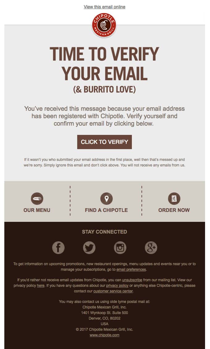
Subscription Confirmation Newsletter Example from Chipotle
The subscription confirmation email examples are rich in some unique specimens. The newsletter that Chipotle’s future users receive is one of them. It is more like a traditional promotional email rather than a boring verification one. It works pretty well here. Let us break it down into pieces.
- Everything starts with a huge logotype sitting right at the top and separating the brand from the others.
- The hero area is reserved for important information. Here, you can see the appeal set in the first level heading that is hard to miss, a short block that enlightens the email’s goal, and a pretty solid and eye-catching CTA.
- The central part of the newsletter exposes the company’s most favorable features.
- The mega footer includes all the required information: social media icons, legal information, physical address, website URL, link to the Privacy policy, link to a page where you can manage your preferences, and of course, unsubscribe option.
Note two things.
The design is marvelous. Even though brown (the least likable color of all age groups according to color psychology studies) is the primary color here, it still works.
Second, the message. The phrase “& Burrito Love” tugs the user’s heartstrings.
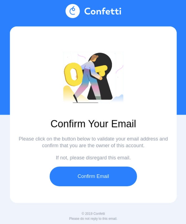
Subscription Confirmation Email Example from Confetti
Much like Universe, the team behind Confetti features an artistic member of the subscription confirmation email examples family. The newsletter looks and feels amazing. It gets its beauty mainly from the illustration featured on the top. Although it does not bear the company’s personality, nevertheless it was created to illustrate the action that the user should take.
Apart from the artistic side that gives the brand advantage over others, it also has some other good takeaways.
- It is made with the inverted pyramid principle in mind.
- The call-to-action button is massive and clicky.
- The newsletter is simple, straightforward, and gets straight to the point.
- The logotype and brand colors are perfectly ingrained into the design.
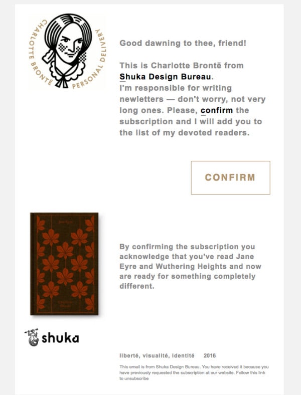
Subscription Confirmation Newsletter Example from Shuka Design Bureau
Shuka Design Bureau presents one of the unusual subscription confirmation email examples. Much like the brand, it is a bit quirky and whimsical. Its key feature lies in its approach to communicating with the newcomers. The newsletter feels incredibly personal, even though it does not include the user’s name.
The deal is, it is made as a letter from one of the team members who start a dialogue with the user. The design is simple, yet with some twists. Made in an unusual two-column layout where imbalance plays a critical role, it perfectly accommodates all the text and graphics. For example, CTA made like a ghost button still grabs attention thanks to the email’s unique structure.
The newsletter has lots of charisma, and it certainly reaches its goal.
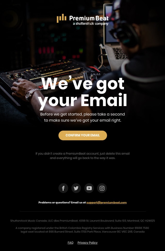
Subscription Confirmation Email Example from PremiumBeat
PremiumBeat wins over its future users with one of those subscription confirmation email examples that use the overall atmosphere and specific vibes to reassure the users and give them an extra nudge.
The newsletter is built above beautiful image background that creates the ambiance. The message is set in white color; it is well-formatted so that even those who do not have much time can quickly get essential information by scanning the newsletter. Again, we can see a principle of the inverted pyramid that makes the message strong and the CTA button a natural finishing point. There are also social media icons, links to get support, FAQ, and Privacy Policy.
Overall, it is a compact newsletter; however, thanks to design solutions, it looks fantastic. You just want to finish double opt-in registration without questions asked.
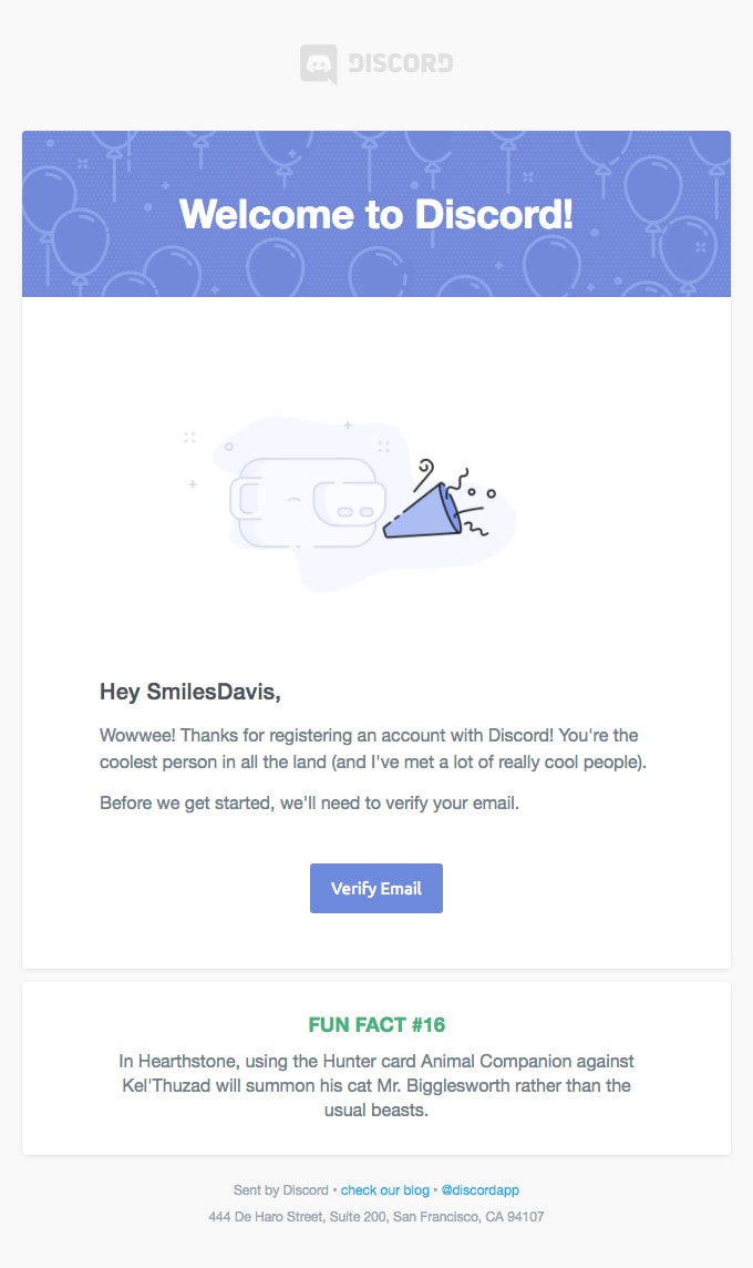
Subscription Confirmation Newsletter from Discord
We will end our collection of subscription confirmation email examples with an informative and funny newsletter. The team has included a block with the fun fact to advocate the brand in a positive and friendly way.
As for the rest, the email sticks to all the basic principles of successful digital newsletters.
- It is on-brand, featuring logotype on the top and using the company’s corporate colors.
- It addresses users by name.
- It has a button-styled verification link.
- It includes a welcome statement and a beautiful illustration to raise the mood.
Conclusion
A subscription confirmation email is a regular transactional email that almost every business has in its arsenal. There is nothing special in it: it is compact without fancy features or promo codes. However, it holds a great opportunity. Being the first-ever newsletter sent to your subscriber, it sees not only one of the highest open rates but also click-through rates.
If you play your cards right, you can easily unlock its potential and make it benefit your company in several important ways.
First, you can produce a strong first impression.
Second, you can promote your company and increase engagement with your brand.
Third, you can turn users into brand evangelists whom you can easily push through other marketing tunnels.
Finally, you can ensure the healthiness and cleanness of the subscription list that plays a vital role in your reputation and ability to rake in cash in the future.
