Jake Rocheleau
Jake is a writer covering topics about UI design & web development. His work can be found all over the web and on his personal portfolio.
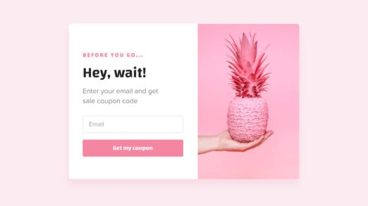
JQuery notification message plugins for websites hold a unique opportunity for entrepreneurs all around the World. Although sometimes they carry a negative connotation, since when poorly done, they can be obnoxious and annoying; nevertheless, they are the ones that effectively …
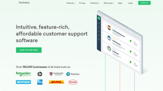
One huge concept that many designers overlook on their landing pages is social proof. This can come in the form of user reviews, testimonials, or bigger companies vouching for your website. You can accomplish this in many ways but one web …
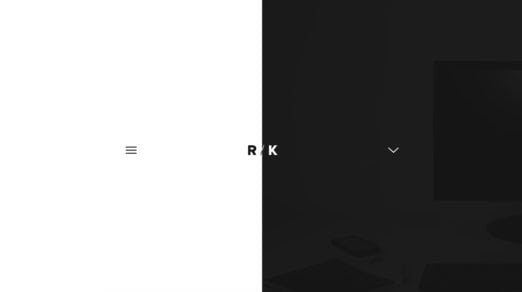
Designing a navigation takes some careful planning. You need to think about what your users might look for and what type of nav would fit best in your layout. Some designers prefer smaller navigation bars while others like huge mega-menu designs. …
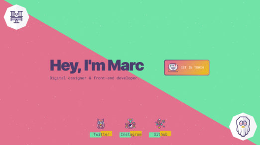
The goal of any portfolio site is to showcase your work. That’s a given. But you also want to sell your work in a way that grabs attention. You can do this with visuals, or by focusing just on content. Or by …
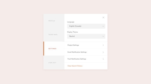
Certain layouts work really well with tabs. You can show/hide content on the page like Q&A sections or to load dynamic content via Ajax. The trouble is adding tabs into a page that work well and are easy to setup. …
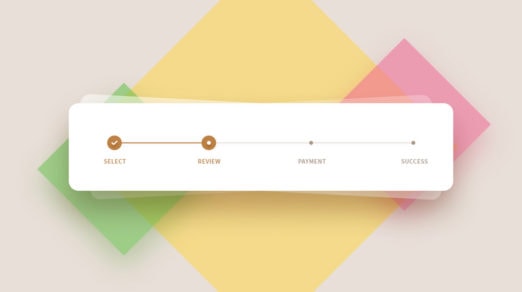
Progress steps are great for user experience. You typically find these on signup pages and checkout forms where the user needs to enter data across multiple steps. Breadcrumbs can also use this progress UI since they flow in a natural hierarchical …
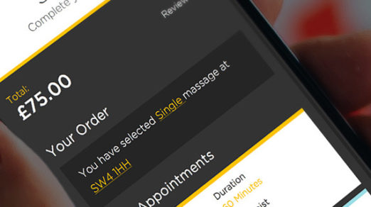
Designing your site for a better conversion rate is a guaranteed way to increase sales. But you also need to consider general UX principles for your online shop, and this goes double for mobile users. The majority of Internet traffic is now …
Basic HTML is pretty simple to learn. It’s also the cornerstone of all websites and it’s a necessity for web developers of all styles. But modern preprocessors let developers write shorthand HTML to save time. One of my favorites is the Haml language …
If you search in Google you’ll find dozens of handy tools for improving your website’s performance. And there’s so much you can do from optimizing images to setting up your own CDN. But here’s one thing few designers think about: optimizing your …
If you’re trying to learn front-end development then JavaScript is one of the primary languages you need to learn. It’s also one of the most complex languages to pick up, especially if you’ve only work with basic HTML & CSS. But fret …
The design world moves fast and there’s always new tools coming out. To stay ahead of the game requires an ear to the ground at all times. I’ve been keeping an eye on the design space this year and put …
Design freebies can save you time recreating assets from scratch. If you search hard enough you can find everything from icon sets to UI kits and free stock photos too. Over the years freebie sites have come & gone. The best have …
The best design software can be used for creating both websites and icons. If you search around you’ll find plenty of icon tuts for Illustrator, Photoshop and for Sketch too. But written guides aren’t always enough when it comes to visual design. I often …
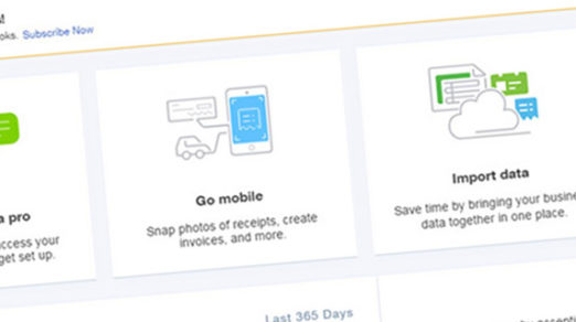
Designing a SaaS product for the web is no easy task. It requires not just an idea, but a clear plan of how it’ll work and which features you’ll support. This also means a lot of UX planning from the early wireframing …
We’ve all seen mega navigations and fullscreen dropdowns online. They’re common across the web and especially useful on sites with tons of links. But designing a mega nav that works can be a real pain. There are no strict guidelines …

Portfolio design articles usually focus on creating portfolios for visual designers. But web developers & programmers need portfolio sites too! Custom developers portfolios typically have varying trends for showcasing their work. It’s tough knowing where to start a new website …

Every modern website should use a responsive layout. This makes it easier to browse on any device but it makes the page trickier to design. The beloved search field is one example of a tricky page element. With responsive layouts on …

It seems like exit intent modals are the norm with every major blog, SaaS product, and digital ecommerce shop or ecommerce email. These exit intents are modal windows that appear on top of the page once your mouse cursor leaves the website. …

Smart designers know it’s a waste of time to reinvent the wheel. And with so many free resources online it’s easier than ever to find tools that’ll save you time. Color selection is a big process and often requires a …

The gradient trend started with web 2.0 and has advanced quite a ways since then. Modern gradients can be designed purely in CSS3 so it’s easier to build them into buttons, backgrounds, and even typography. Let’s delve into this trend of …

The design world is abuzz with the rise of online magazines. But the vast majority of these sites run on blogging platforms like WordPress, and they operate almost exactly like traditional weblogs. So where does someone draw the line between a …
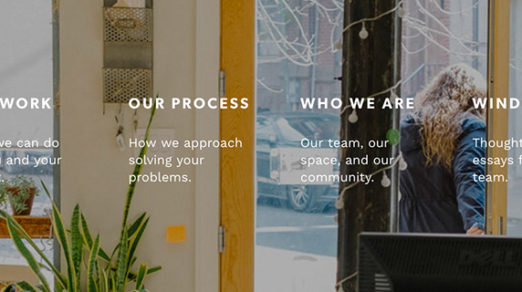
There’s tremendous value in consistency of digital interfaces. People browsing the web encounter dozens of websites that all have different styles, yet most feature very similar page elements. Most designers don’t even think about these features. Page headers, navigation menus, …
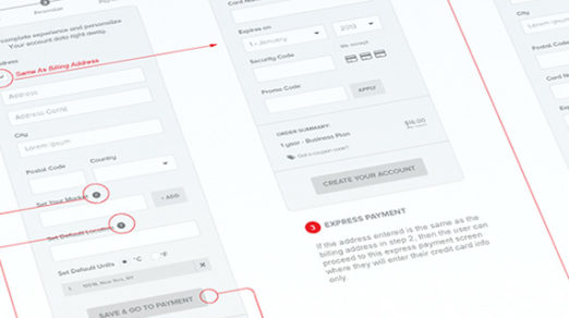
Each ecommerce site has its own checkout flow moving the user from a shopping cart to the final purchase. This differs based on what the user is buying and their intentions, but finalizing payment is always the toughest part. Your billing fields …
Adblock plugins are on the rise as more Internet users shy away from obtrusive ads. Unfortunately this mostly hurts publishers who rely on advertising to keep their websites online. Thankfully there are solutions to detect adblock users and encourage them …