Guide to Confirmation Emails: Examples and Best Practices
Transactional emails are one of the most prominent types of email marketing. Whatever action a customer takes, this email is designed to provide a proper response. Since users perform all sorts of actions, there is plenty of diversity. However, it does not mean that you should use all of them. Some are purely optional, though, there is one type that is critical for every business — the confirmation email.
A confirmation email is crucial for every business sector. As a simple verification of a completed action, it reaches clients at a vital stage in their journey. It provides instant feedback that is indispensable for building trust in your brand and creating a comfortable environment. Hotels, restaurants, SaaS, blogs, online magazines, and e-commerce all depend on this type of email to thrive. Like it or not, it should be an integral element of your email marketing strategy.
Let us delve deeper into the basics of confirmation emails, consider some useful tips and examples to make the most out of this key transactional newsletter.
What are Confirmation Emails?
Confirmation newsletters are traditional transactional emails created for customer reassurance. Not only do they affirm that an action was successful, but they also express gratitude, provide instructions for the next step, and set proper expectations and anticipation for something to come.
Although confirmation emails are automatic responses, they should not be generic and “cold.” Much like seasonal emails, they should have heart and soul to be able to get through to clients and successfully achieve various goals.
Goals of Confirmation Emails
Confirmation newsletters play a crucial role in a post-purchase email sequence. They serve different goals. The most popular are:
With Postcards Email Builder you can create and edit email templates online without any coding skills! Includes more than 100 components to help you create custom emails templates faster than ever before.
Free Email BuilderFree Email Templates- Avoid uncertainty and confusion, especially when it comes to event registration
- Ease user concerns
- Clear blur and reduce the post-order anxiety
- Keep users updated on progress
- Save users from feeling scammed
- Protect users from giving the wrong information about shipping info or a purchase
- Clear confusion and remorse that can come with online shopping
- Confirm shipping address and delivery method
- Confirm subscription
- Provide an instant connection between the consumer and your business
- Enhance relationships with clients
- Maintain trust and engagement
- Move the relationship forward
- Set expectations
On top of that, they fulfill the marketing goals as well:
- Improve conversion rates
- Promote upselling goods
- Advertise reward program
- Advocate brand
- Drive traffic
- Generate extra sales
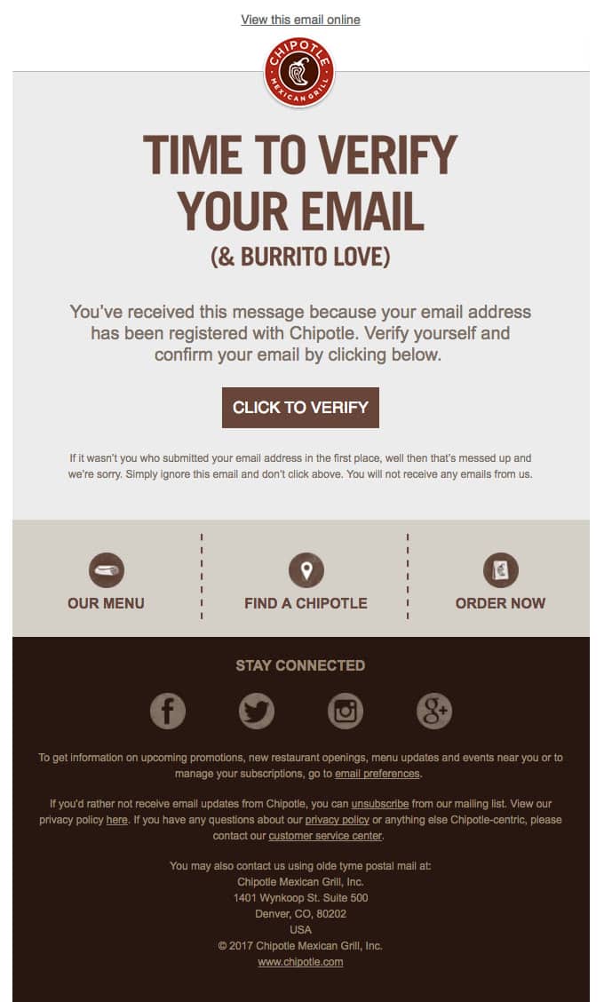
Confirmation Email Example from Chipotle
Confirmation newsletters are a large group. Different triggers activate them:
- Placing an order
- Subscribing to a list
- Booking tickets
- Registering for an event
- Signing up to a platform
- Requesting content
- Booking an appointment
- Completing shipping arrangements
- Changing the Privacy Policy
- Updating profile information
Based on these triggers, email marketers allocate several popular types of confirmation emails.
- Order or Purchase Confirmation Email
- Subscription Confirmation Email
- Registration Confirmation Email
- Booking Confirmation Email
- Payment Confirmation Email
Each type of confirmation newsletter implies its own rules to yield the best results. For instance, order confirmation emails should be sent immediately and cover such information as:
- Order details
- Billing details
- Shipping arrangements
- Customer address
- Pictures of products
- Links to helpful resources such as return policy, support team, and FAQ
A registration confirmation email is an invite to the entire welcome series and onboarding series. As a rule, it also includes the last part for the double opt-in sign-up process.
The booking confirmation newsletter provides all the necessary information about the dates and timing. It should include directions, contact information, and a direct link to a personal assistant.
How to Write the Best Subject Line for a Confirmation Email
Much like Welcome emails, confirmation newsletters are a bit limited when it comes to creating a subject line. Still, you can create something eye-catching. Follow these tips to make it stand out.
With Startup App and Slides App you can build unlimited websites using the online website editor which includes ready-made designed and coded elements, templates and themes.
Try Startup App Try Slides AppOther Products- Express gratitude. Use something like,” Thank you for your order.” This gesture may quickly put a smile on the customer’s face and win him or her over.
- Provide details and get straight to the point. Use the subject line in tandem with the preheader to hint about the most vital information.
- Assure the user that you receive the order. You can start with something like “Order Received.”
- Specify the company by using a brand name. Chances are your customers have multiple orders; the company name will help to cut through the noise.
- Add a bit of positivity to the email using polite words or even popular phrases and puns.
- Be personal. Use the customer name to address the email precisely to the user.
- Add emojis to capitalize on emotions. These tiny but powerful characters can set the audience to a good mood, convey a festive atmosphere, and even establish a sense of urgency or exclusivity.
Consider some good subject line examples for confirmation emails taken from famous brands:
- Great news! We’ve got your order
- Your Airbnb gift confirmation
- Good News – Your Food52 order (#650050) has shipped!
- Your Tens order is confirmed! ☀️ 😎
- Hooray, your Blue Bottle order is confirmed!
- Reservation confirmed for San Francisco.
- It’s official! Your Fitbit order has been placed.
- You just backed Stool Nº1.
- Welcome! Let’s get you started
- Did you just contact us?
- Welcome! Thank you for signing up
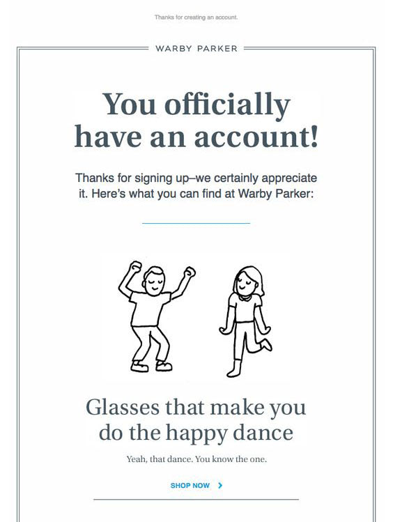
Confirmation Email Example from Warby Paker
Creating a confirmation email is not rocket science. Some entrepreneurs do not even bother about them opting in favor of generic insipid responses provided by ESP. However, it is here where they miss a golden opportunity for their businesses.
To make a confirmation newsletter reach its goals, and bring actual benefits to the business, follow these best practices:
- Reassure the customer that everything is fine with his or her transaction.
- Summarize essential details. Include information that is vital for the action that triggers a confirmation email. Display important dates and times, billing information, shipping information, etc. Your task is to provide all data that can help people to feel fully prepped.
- Build excitement around the event. Make it a happy place. Delight them with the content and set the right expectations to encourage them to open the follow-up email or fall for your marketing tricks.
- Show gratitude. Every order, whether it is a purchase or event registration, should be accompanied with a thankful note. You may even transform the confirmation newsletter into a sterling Thank You email. Making the subscriber feel special and acknowledging this at constant intervals helps to build a long term relationship.
- Reduce the number of clicks to help customers get to their destination quickly. Make this destination personalized with parameters based on customer’s preferences.
- Provide means to continue the customer journey. Include information on what to expect. This will help to build trust and earn loyalty.
- Educate them about the product to reduce the number of future rejects.
- Remind your customer of the reasons why they bought from you or why they choose the premium plan.
- Provide answers to common questions. You can add an FAQ block or a link to its online version.
- Add a human touch. Even though confirmation emails are automated responses still to drive home the right message, they should speak to the audience and provide a friendly environment with a warm amiable atmosphere. Giving a direct emotional connection encourages customers to return to your company and spend more.
- Add links to the support team to solve all the issues that may occur with order or registration. The opportunity to contact both the business owner and the support team with a touch of a button increases trust.
- Include all the contact information: physical address, telephone, and email address.
- Include links to unsubscribe and manage preferences.
Define the best timing for your target market or a specific segment of subscribers. As a rule of thumb, send a confirmation email right away. People are waiting for them. If you plan to send an entire series of confirmation newsletters and follow-ups, then you need to create a schedule and do A/B tests to define the best strategy.
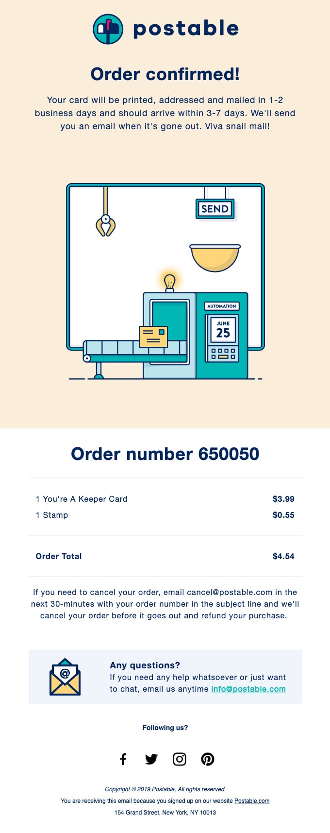
Confirmation Email Example from Postable
How to Generate Sales with Confirmation Emails
Much like the majority of transactional emails, confirmation newsletters have a strategic advantage for your brand. They have excellent deliverability and high open and click-through rates. It means that it is a hidden opportunity for cross-promotional marketing. You can use them to generate traffic, promote goods, and generate extra revenue.
Although you should not use them as a direct promotion with aggressive selling techniques, you can still play some marketing tricks to make this situation work for you. After all, the loyalty stage comes after the sale. If the satisfaction level of the customer is high, then your marketing tricks will undoubtedly do their job.
So, what can you do to capitalize on the post-purchase excitement and generate extra sales with confirmation newsletters?
- Promote top sellers. Include some of your store’s best-selling products and use social proof to make your point strong. You may qualify or quantify an offer with impressive statistics or positive reviews and testimonials from actual clients. Do not shower the user with too many options. It is safe to add three to five additional buying choices.
- Play the “Complete the look” trick to promote new collection with cross-sell block.
- Include personalized recommendations. Mix them with a sense of urgency.
- Invite clients to opt-in to reward program by showing the benefits of becoming a member. A sense of exclusivity can do magic.
- Offer a discount or loyalty points for the next purchase.
- Reward new subscribers. Give them an offer or discount.
- Encourage referrals after purchase. Word of mouth goes a long way and always brings benefits. Offer a bribe in the shape of a small shopping incentive for referring your brand to the user’s friends.
- Give customers a reason to share in social media. This reason can be a discount or even a gift. Reciprocity is another potent trick in the marketing arsenal that helps to increase conversions and bring people back.
- Ask them to leave a review in exchange for a coupon. On the one hand, you will get a real testimonial that can hook other clients in the future. On the other hand, a customer will have a say and get a pleasant bonus that is a motivation to get a better deal next time.
- Add the possibility to alter or cancel an order. It may drive conversions since people may add more products in their cart. Even though it is a possibility to cancel the order, still in this case, you will be able to avoid expenses on returns. Therefore, either way is beneficial for the company. On top of that, this freedom of choice contributes to the relationships with clients and builds the right brand image.
- Create the entire series of confirmation emails and send post-delivery order confirmation email templates for several days in a row.

It is important to note that a confirmation email is an upsell and cross-selling opportunity. To get the most out of it, you need to use the customer’s purchase and browsing history. This will help to choose relevant content that brings true value.
To send lead nurturing information without ruining everything, you need to be tactful. First and foremost, make the user happy by providing helpful information and only then play tricks.
Also, remember not to overdo it. People expect confirmation newsletters to be purely informative. Aggressive marketing tricks may quickly reduce trust in your brand and even turn customers away.

Confirmation Email Example from MeUndies
Design of Confirmation Emails: Tips
Confirmation newsletters do not have strict rules when it comes to design. They offer freedom to email marketers: you can literally let your imagination run riot. To get loose and come up with something impressive and high converting, bear in mind these best practices for email newsletter designs.
- First of all, make it match the brand identity. Always add a logotype to identify the company instantly. Use colors and make it a continuation of the website and pages on social media platforms.
- Second, use animated gifs. Although interactive features may easily ruin confirmation emails, still no one stops you from making it dynamic and engaging with the help of hover effects and gifs.
- Third, use graphical assets to make things engaging and eye-pleasing. Illustrations, image backgrounds, and some bright icons can transform the confirmation newsletter into a real storytelling experience.
- Fourth, make buttons detailed and actionable. Use contrast colors to set them apart from the reading flow. You can also add a hover effect to spice things up.
- Fifth, start by providing the necessary transactional information. Only then introduce marketing tricks and shopping incentives. Build the layout and design centered around the valuable content.
- Sixth, like any other digital newsletter, confirmation emails should be
- Fully responsive
- Mobile-friendly
- Browser-compatible
- Email reader compatible
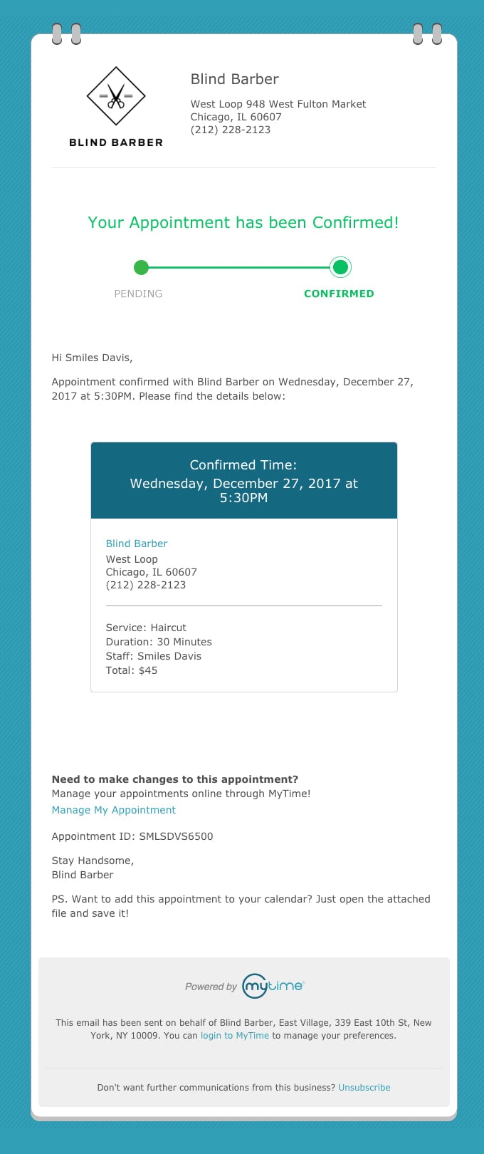
Confirmation Email Example from Blind Barber
Although confirmation newsletters are automatically sent, they should not be generic and bland. If you want to use them for driving conversions and generating leads, they should use to your brand design.
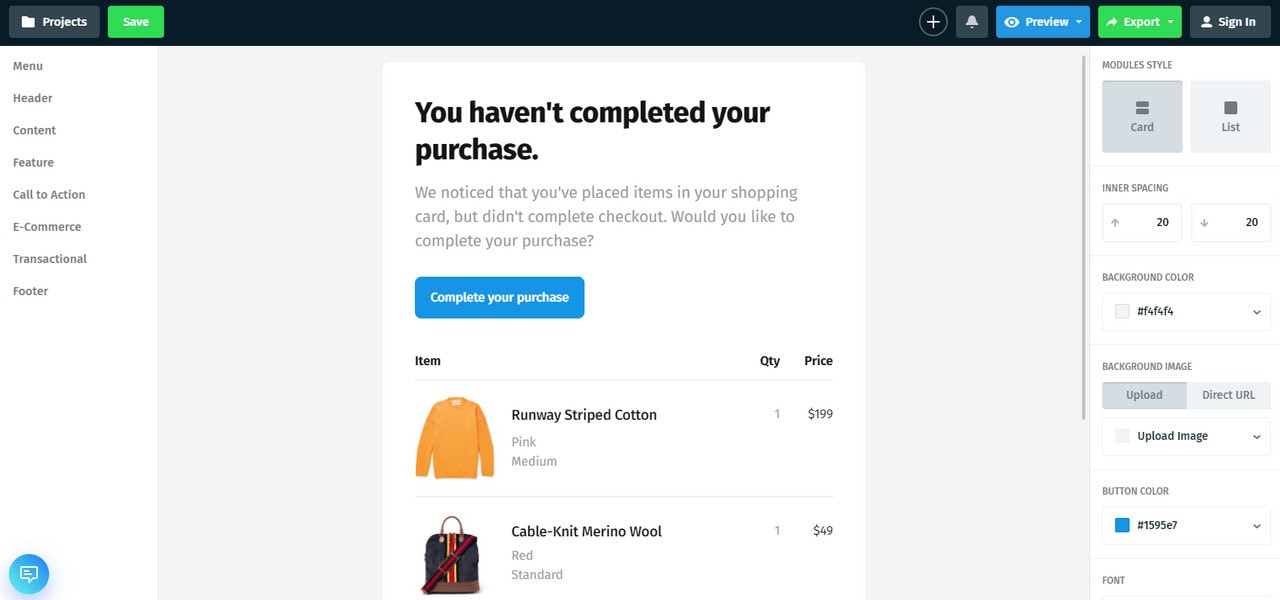
To create a fully customized email newsletter without any coding and design skills, you can use Postcards, a popular free HTML email template builder. With more than 100 handcrafted modules and an intuitive customization panel, it allows you greater flexibility in the look and feel. You can create a unique confirmation email that will advocate the brand and speak to the audience without hassle.
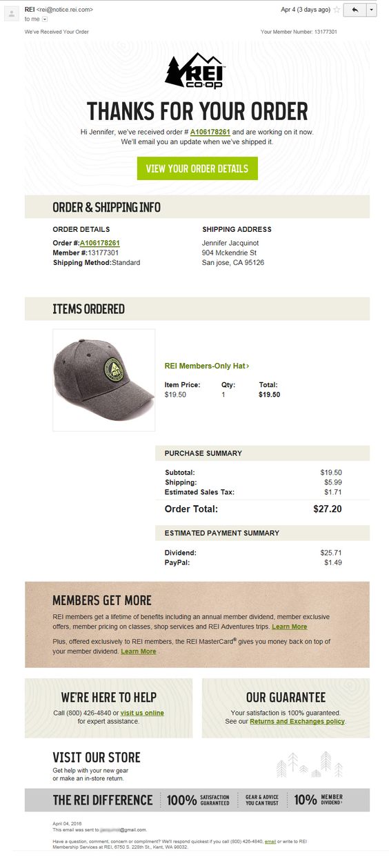
The marketing team from REI Co-op packed a lot of information and value into a single confirmation newsletter and still managed to bring a fantastic result.
Confirmation Email Example from REI Co-op
This is a classic order confirmation email that includes products with images and prices, and order shipping details. Along with this standard info, the newsletter also has some tricks.
For instance, two blocks – “We are here to help ” and ” Our guarantee” – help to ease the tension of the post-purchase process and build loyalty towards the brand.
Second, there is an announcement of a reward program for being a member that encourages customers to become a part of the community.
Finally, at the bottom, you will find a block that promotes the company and reminds the customer why the brand is the best choice for them.
Confirmation Newsletter Example from Boden
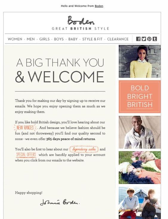
A confirmation email example from Boden is based on a welcome email. It expresses gratitude and includes a message that breaks the ice and sets the relationship between client and company to the right path. Note the message here.
It is in the shape of a letter that feels incredibly personal. A signature from the CEO at the end enhances this feeling even more. The email uses a beautiful font style and red color in context to put accents on links and establish a positive mood.
Finally, along with the message, you will find navigation with helpful links and some visuals that represent the company in the best light. Very smart.
Subscription Confirmation Email
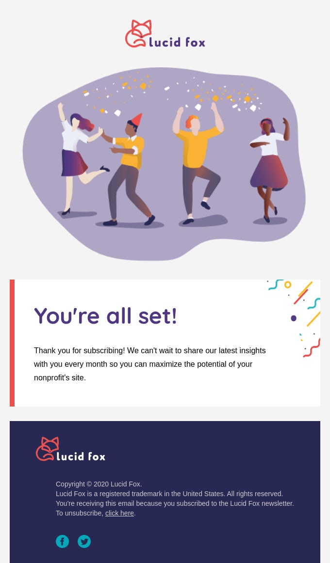
This confirmation newsletter example from Lucid Fox gives customers a reason to get excited about their current subscription with newsletter design filled with cheer and joy. The team leverages outstanding illustration for hero area that speaks volumes.
This increasingly compact and straightforward design is managed to serve two purposes. First, it ensures the user that everything is fine with their previous action. Second, it lightens the mood and makes the company look friendly and approachable.
Order Confirmation Email Example from Etsy
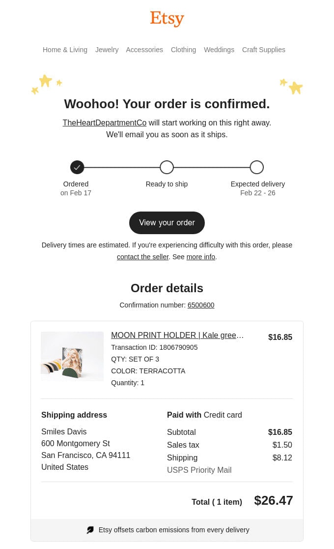
The team behind Etsy capitalizes on the entire confirmation newsletter series with interconnected pieces. It includes several newsletters that accompany users from the moment the order was placed until it gets to the user’s door. This way, the team eliminates all the confusion and makes people feel comfortable during the post-purchase period.
Note several essential things.
- There is a graphical timeline that visualizes the path of the parcel and shows the current status of an order. Brilliant.
- There are order details with pictures and pricing along with a direct link to the order page.
- There is a massive block with information about the company, taxes, returns, and exchanges. So to say, it is a concise but straight-to-the-point FAQ block.
- There is a block with recommended items that were formed according to the customer’s preferences.
- There is a classic shopping incentive like an offer of free shipping.
The email is very long; however, it includes valuable content for the customer presented in an artistic way worthy of Etsy. Therefore, it certainly does its job perfectly.
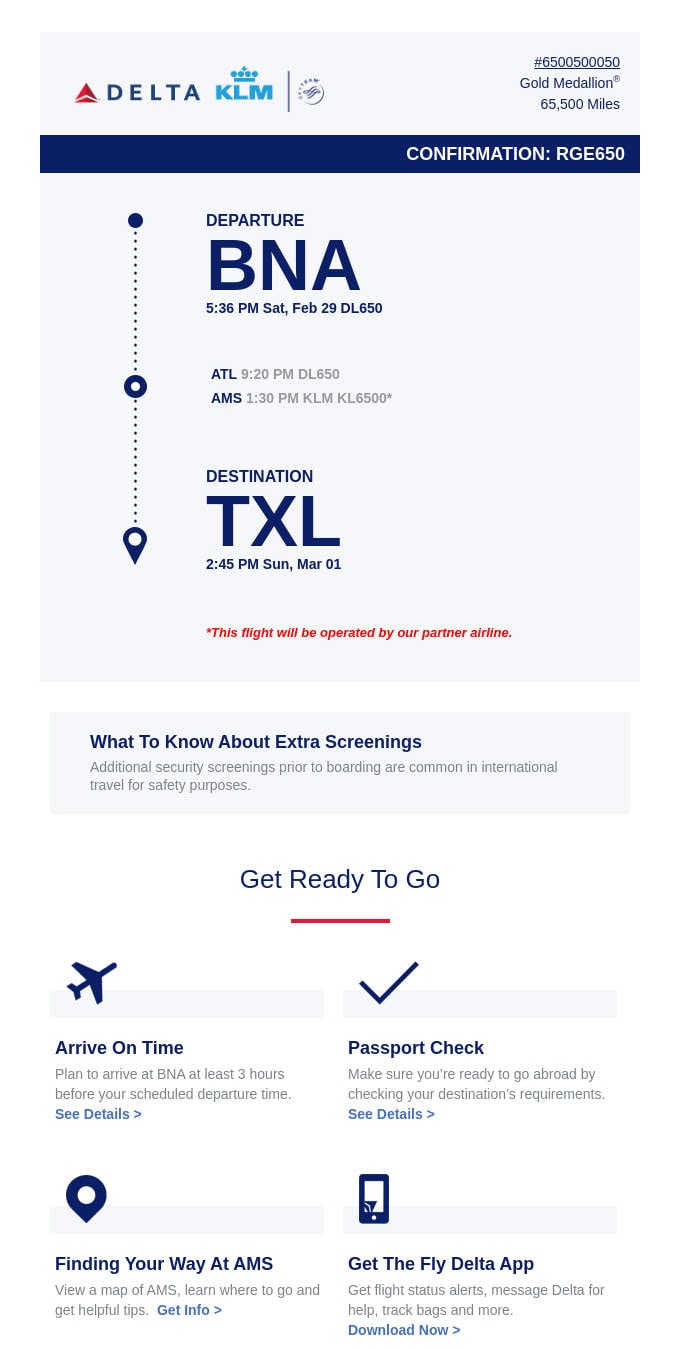
Confirmation Email Example from Delta
The confirmation newsletter example from Delta focuses on trip details. Since the company is a major airline of the United States, it comes as no surprise that the email marketing team uses this transactional email as a digital ticket to cover all the essential information about the flight.
It is much more than just a ticket. Not only does the newsletter include flight details, but it also provides some extra information that can be of much help to all sorts of passengers. For instance, there is a large block that educates clients about rules of the airport, giving tips on how to be ready for a flight.
On top of that, the team tries to determine whether this kind of email is valuable for the customer. They get helpful insight for improving the marketing strategy and win over clients by prioritizing their opinion. Smart.
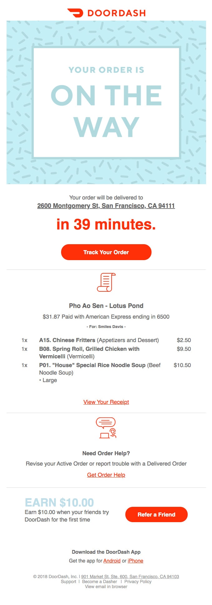
Confirmation Newsletter Example from Doordash
The thirst thing that strikes your eye in this confirmation email example is a massive banner with an announcement that your order is on the way. That is great since the client gets what they need right from the get-go. Everything is fine with your order; what else do you need?
Well, maybe order details and the exact delivery time. And they are right here. The newsletter brings actual value to the client without a doubt.
That is not all. After warming things up, the email marketing team incentivizes their customers to refer the brand to their friends with an offer of “$10 off.” Just in time. Brilliant.
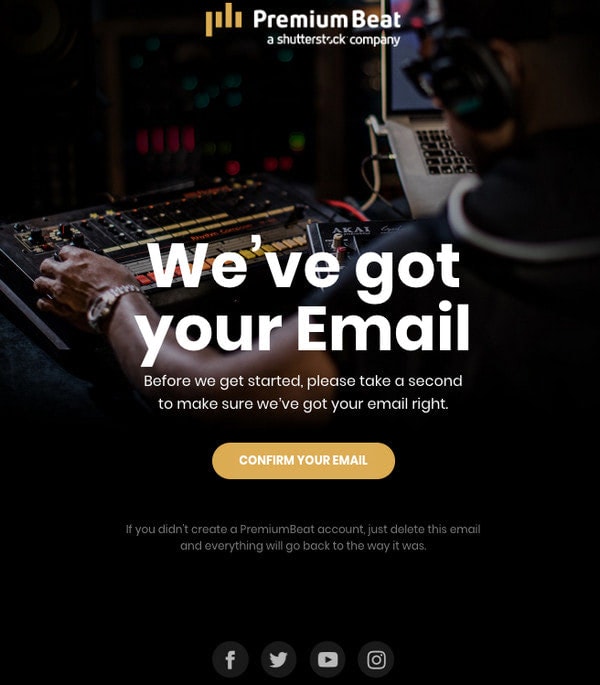
Confirmation Email Example from Premium Beat
The team has skillfully embraced minimalism. This confirmation newsletter example is increasingly compact yet straight to the point. It is used for double opt-in registration to onboard only those users who are interested in the company.
The design of the confirmation newsletter feels like a digital poster with a strong professional vibe, artistic touch, and undeniable musical atmosphere. Exactly what is needed for the brand.
Note it does not have any marketing tricks. Its task is to keep the subscription list healthy and enhance the relationships between the client and the company, making them strong from the first acquaintance.
Want to create something like this in no time? Use our free HTML newsletter template that has the same structure. Alternatively, build the same design in Postcards and customize it within minutes without any coding skills.
Conclusion
Confirmation emails are crucial for a business to function properly. As auto-responses, they are often overlooked. Many entrepreneurs miss an excellent opportunity to take their relationships with clients to the next level by sending generic and uninformative pieces.
Do not make this mistake. Much like holiday emails and promotional emails, confirmation newsletters have vast potential. Follow our guide and adopt the best practices to make the most of this tool.
