Dark Mode Emails: How to Create One & Best Examples
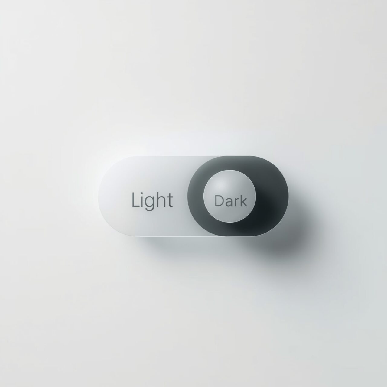
Almost everything on our phones and laptops has a dark mode option.
That’s why 81.9% of people now prefer to use smartphones in dark mode.
This shows most people don’t want to be hit with a bright white screen when checking emails.
That means for email marketers and designers, it’s a must-do to make sure your emails look great in dark mode too. If you don’t, your message may not get the right amount of attention, and that’s not the experience you want to give your subscribers. Right?
In this guide, we’ll explain what dark mode means for email, why it’s so popular now, and how major email clients like Apple Mail, Gmail, and Outlook display your messages in dark mode.
What Is a Dark Mode Email?
79% of users say that dark mode helped them reduce eye strain. But if an email design isn’t set up for it, text and colors might not show up the way you expect, which can make it harder to read.
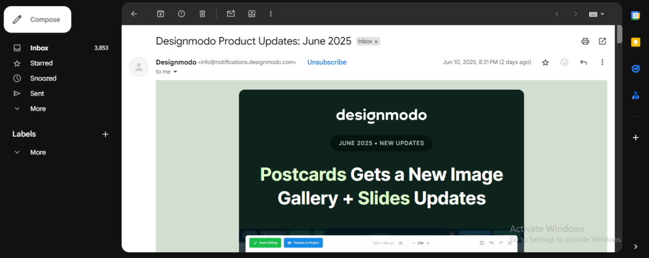
With Postcards Email Builder you can create and edit email templates online without any coding skills! Includes more than 100 components to help you create custom emails templates faster than ever before.
Free Email BuilderFree Email TemplatesThat’s why it’s worth designing emails that look great in both dark and light mode. It helps make sure everyone gets a clear, easy-to-read message.
Why People Prefer Dark Mode?
Dark mode caught attention in 2018 when Apple added it to macOS. But now it’s everywhere.
Here’s why people prefer this over light mode:
- Dark mode reduces screen glare and blue light, which makes the screen easier to read in dim environments, like late at night or early in the morning.
- It saves battery on OLED screens (a type of display that lights up each pixel individually).
- People find it visually appealing and less fatiguing to the eyes after long periods of screen time.
How Dark Mode Renders in Email Clients: The Three Modes
Not all email clients treat dark mode the same way. Depending on the app, your email may look the same as you designed it or completely different. Here are three ways email clients handle dark mode:
No Change
As the name suggests, your email appears exactly as designed in this mode. If you turn on the dark mode, you’ll see everything black except the email.
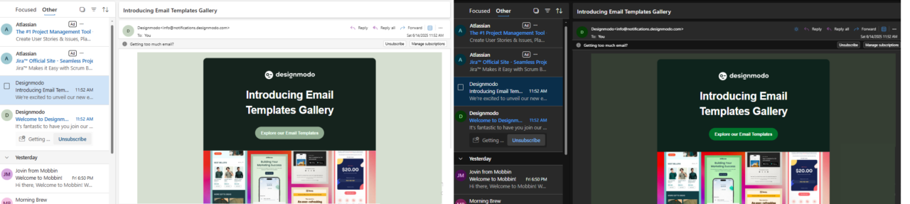
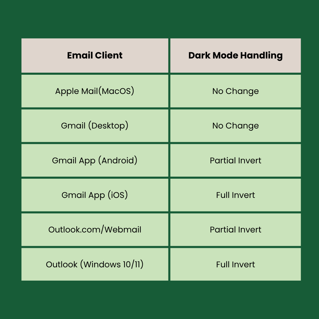
This mode is available in Apple Mail (iOS/macOS) and Gmail Desktop.
Here you can see the snippet from Gmail desktop:
Everything around the email is dark, and the email itself didn’t change. Isn’t this gorgeous?
With Pulsetic you’ll be instantly notified the moment your website, API, or server becomes unavailable. Monitor uptime from multiple global locations and respond to incidents before your users are affected.
Create beautiful status pages in minutes to keep customers informed during outages and build trust with transparent communication.
Start Monitoring for FreePartial Invert
This means that some parts of your email change, and some don’t. For example, the light backgrounds turn dark, and dark text becomes light, while your existing dark elements will stay unchanged.
This is available in the Gmail app (Android) and various Outlook versions like Outlook.com.
Here is the snippet from Outlook.com:
You can see that as the app switches to dark mode, the light parts of the email background turn dark automatically, while the dark parts (like the main content block) stay the same.
Full Invert
In this mode, everything changes.
Light becomes dark, and dark becomes light. Even if you designed your email to already be dark, this mode may flip it anyway.
It can happen in the Gmail app on iOS and Outlook on Windows.
Here you can see the snippets from Gmail iOS.
Light mode:
Dark mode:
You can see that the light turns dark in the dark mode.
Quick Summary Table: Email Clients That Support Dark Mode
Here’s the list of email clients and how they handle dark mode:
How to Design Emails For Dark Mode
Let’s see how you can design emails that support dark mode using Postcards by Designmodo.
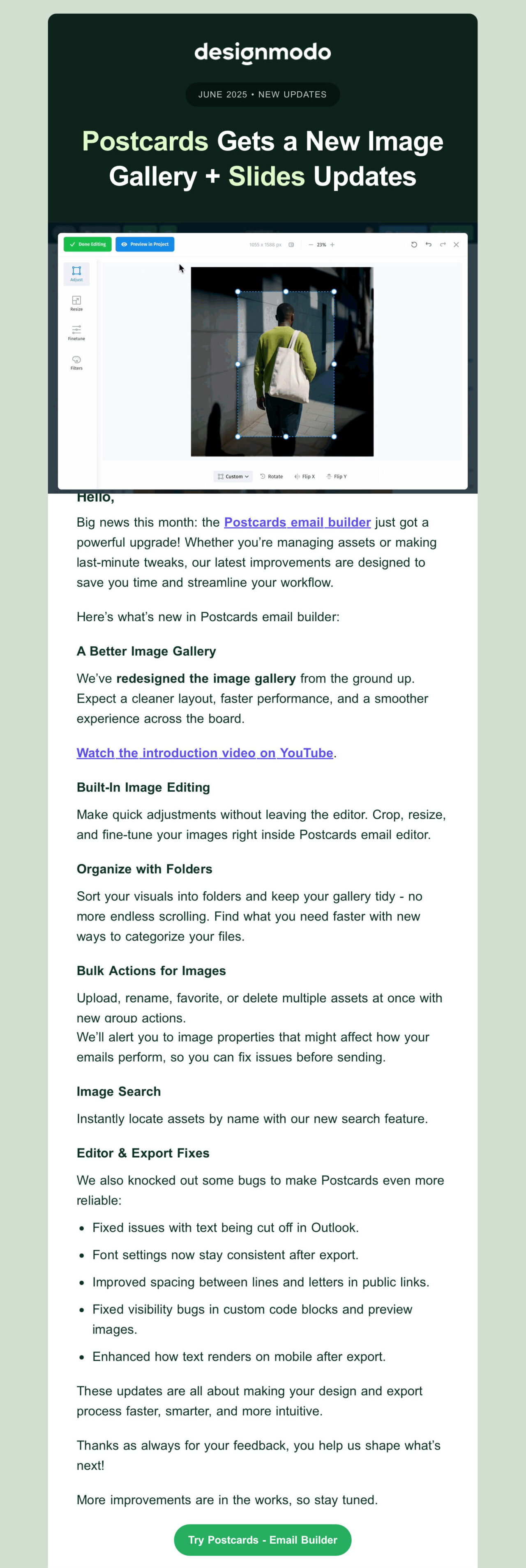
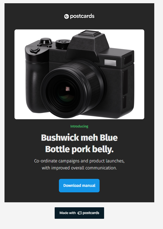
1. Prepare Your Email Template
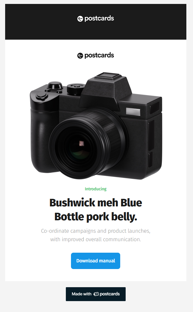
Select one of the ready-made email templates in Postcard’s library that includes a Menu 1 and a Header 5 section.
Next:
- Click the Export button at the top right.
- Select Download ZIP.
- Make sure Host images online is enabled so your images are hosted and you don’t need to manage them manually.
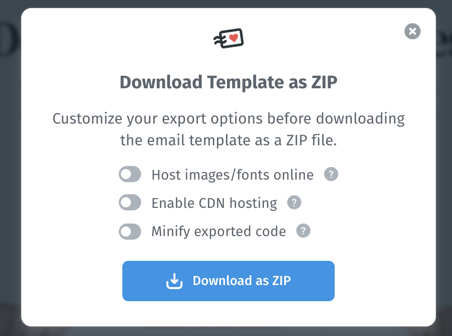
- Once the zip file is downloaded, unzip it.
Right-click on the unzipped file and open it with Notepad. You’ll see the HTML code of the email. Inside the code:
- Press Ctrl + F and search for <!– BEGIN MODULE: Menu 1 –>.
- Copy all the image src links and save them in another Notepad.
- Delete everything between <!– BEGIN MODULE –> and <!– END MODULE –> for Menu 1.
When you refresh the email, the menu will be gone.
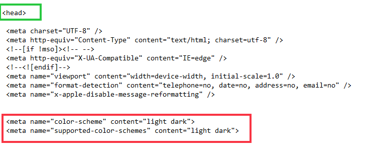
To indicate to email clients that your template supports both light and dark modes, head over to the <head> section of your HTML and add these lines:
- <meta name=”color-scheme” content=”light dark”>
- <meta name=”supported-color-schemes” content=”light dark”>
4. Add CSS for Color Scheme
To help email clients apply the right color scheme, go to the <style> section and add:
:root{
color-scheme: light dark;
supported-color-schemes: light dark;
}
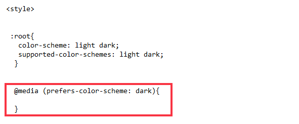
5. Create a Dark Mode Media Query
Now, to define the styles that activate when a user has dark mode enabled, add this to your CSS:
@media (prefers-color-scheme: dark) {
/* Dark mode styles will go here */ (we’ll see in later steps)
}
6. Change the Background
To change the background color:
- Right-click on the email in the browser > inspect.
- Select the background to find its class and copy it.
- Now search for that class in the Notepad code, then add a class dark-background to this element.

Next, scroll up to the styles section and add this inside @media (prefers-color-scheme: dark):
.dark-background {
background-color: #262626 !important;
}
[data-ogsc] .dark-background {
background-color: #262626 !important;
}
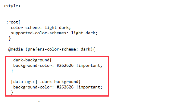
This applies a dark background in dark mode. Now, refresh the page and you’ll see the background image is set to dark.
7. Update the Logo for Dark Mode
In your HTML:
- Duplicate the logo <img> tag so you have one version for light mode and one for dark mode.
- In the duplicated <img> tag, change the logo-dark.png to logo-white.png. And in the original tag, write class=”light-logo” before src.
- And paste the following code between the original and duplicated <img> tag (as highlighted in red):
“<!--[if !mso]><! --><div class="dark-logo" style= "display:none; overflow:hidden; float:left; width:0px; max-height:0px; max-width:0px; line- height:0px; visibility:hidden; " align="center">”
“ </div><!--<![endif]-->”
- Now, scroll up again and update the @meta with this code:
.light-logo {

      display: none !important;

     }

      [data-ogsc] .light-logo {

      display: none !important;

      }

      .dark-logo{

        display:block !important;

overflow:visible !important;

float:none !important;

width:auto !important;

max-height:inherit !important;

  max-width:inherit !important;

line-height:auto !important;

visibility:inherit !important;

magin-top:0px !important

        }

[data-ogsc]

      .dark-logo{

           display:block !important;

   overflow:visible !important;

   float:none !important;

   width:auto !important;

   max-height:inherit !important;

           max-width:inherit !important;

   line-height:auto !important;

   visibility:inherit !important;

   magin-top:0px !important

        }

   }
Refresh and you’ll see the logo in dark mode.
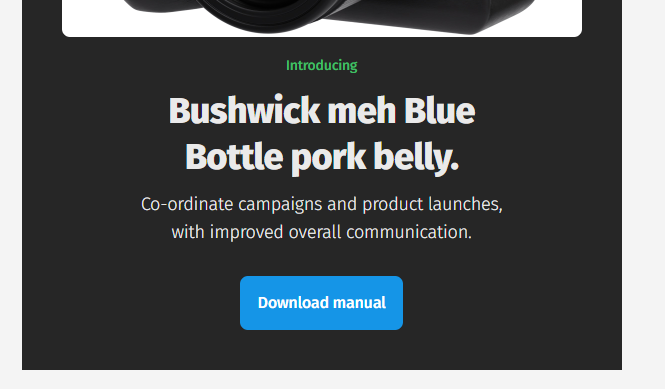
8. Update Title and Subtitle Colors
Now let’s adjust the title as well.
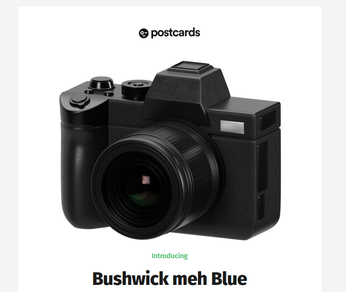
The title says “Bushwick meh Blue Bottle pork belly.” To find it in the code, press Ctrl + F and paste the title. Once you see it, do the following:
- Add a class dark-title like this:
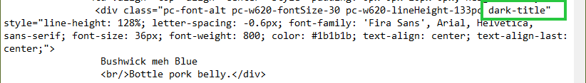
- Now add this to the @meta section:
.dark-title{

color: #eaeaea !important;

    }

     [data-ogsc] .dark-title{

color: #eaeaea !important;

    }
Save the file and refresh the page. Do the same for the subtitle, using a class like dark-subtitle
Step 9: Test Your Email Email Template
Once you’ve made your updates:
- Open the email in a browser or email client that supports dark mode.
- Switch between light and dark modes in your system or browser settings.
- Make sure your background, logo, icons, and text change as expected.
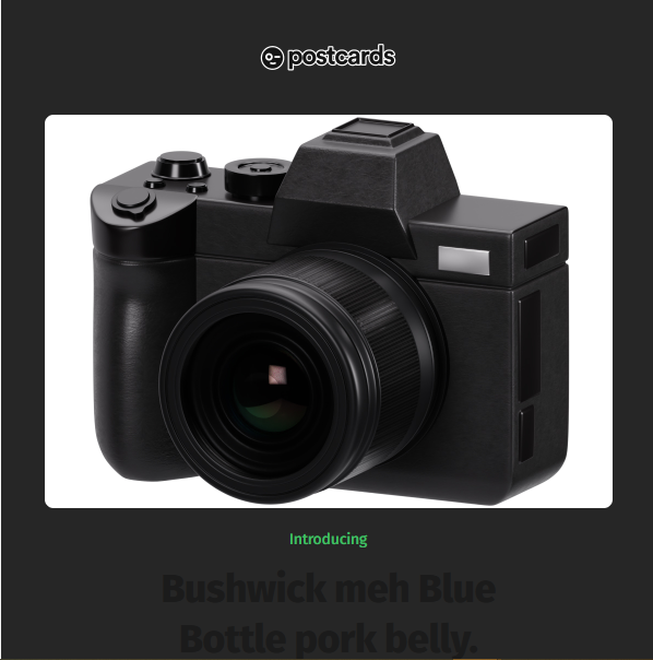
If you do everything as explained above, this is how your final email will look in dark mode.
Best Practices For Dark Mode Emails
Here are some best practices that you should follow when working with dark modes.
Handle Images and Logos Properly
Images can be a little tricky in dark mode if they have white backgrounds or dark text. And you don’t want your logo to suddenly disappear against a dark background.
For example, take a look at the Hustle example mail in Outlook.
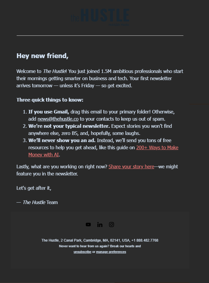
You probably didn’t notice the logo on the first go.
That’s because it is not properly designed. The logo has vanished and is hard to read.
To avoid this, here’s what you should do:
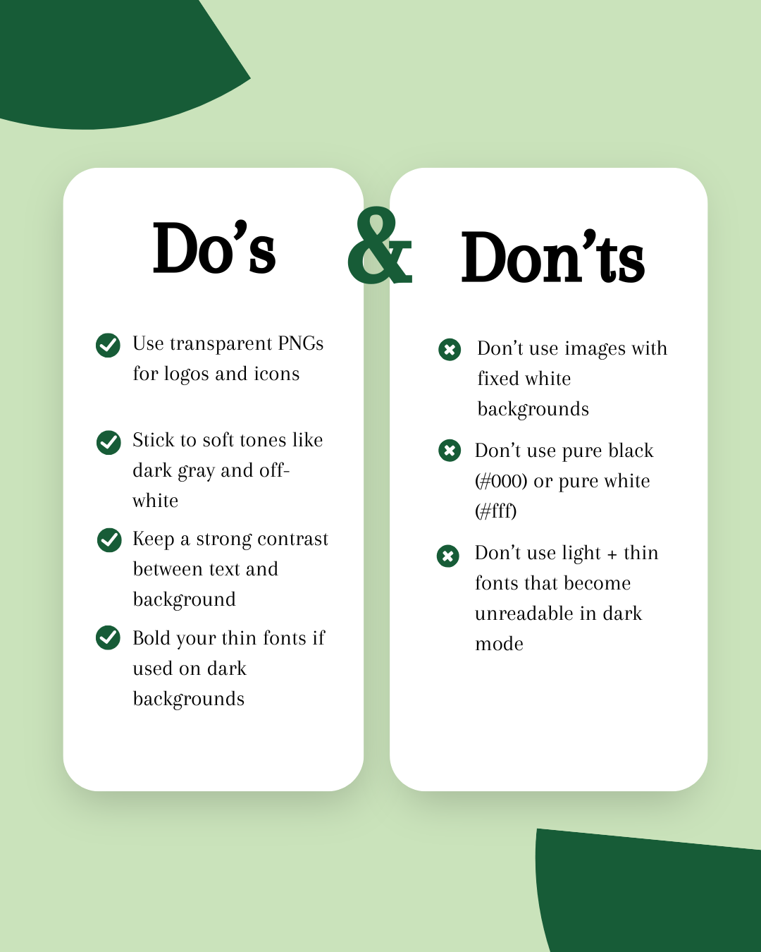
- Use transparent PNGs so your images blend with any background.
- Create two versions of important images: one for light mode and one for dark mode.
Use Accessible Color Schemes
Don’t use pure black or pure white because they can be too harsh and don’t always look good on all screens. We recommend dark grays and soft off-whites. They’re easier on the eyes and more consistent across clients.
Also, make sure your text has enough contrast with the background. You can quickly check your contrast levels with tools like the WCAG Contrast Checker.
Now, if your icons have black outlines, place them on a white background; otherwise, they may disappear in dark mode. And if you’re using solid black icons, you’ve two options:
- Add a white outline around them (this is usually the cleanest fix)
- Put them on a white background.
Test Before Sending
Before you send the email, always test it.
Why?
Because even with perfect code, things can still look off in specific inboxes. Here’s what you should do:
- Use tools like Designmodo Postcards to preview emails in different clients.
- Send test emails to your own accounts—Gmail, Outlook, Apple Mail, whatever you can.
- Preview with a few real subscribers (like your team or test group) to make sure everything looks good.
Do’s and Don’ts for Dark Mode Email Design
Make sure you review this do’s and don’ts for the dark mode email design checklist before pushing out your final design.
Example of a Perfect Dark Mode Email (What Works vs. What Doesn’t)
Let’s look at a sample example:
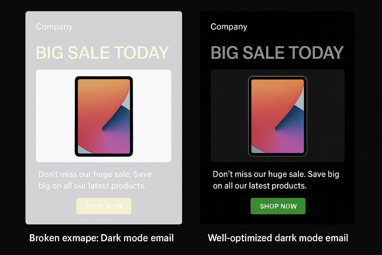
In this example, you can see the email on the left shows what can go wrong in dark mode. The background is light, and the text and button are also light, which makes it hard to read. The CTA “Shop Now” button doesn’t stand out, and the logo is hard to see.
On the right, the email is designed well for dark mode. The dark background makes the white text and logo easy to see. The green button stands out and is easy to click.
Everything is clear and easy to read, even in dark mode.
Inspiring Dark Mode Email Examples
Let’s see some real examples of how brands are designing emails that look great in dark mode.
Examples below are from emails viewed in Outlook, so they appear in partial inverted mode.
1. theSkimm
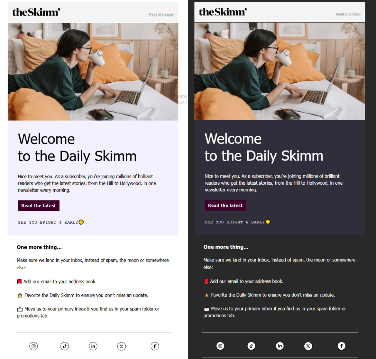
Here’s why this is a perfect dark mode email:
- The logo stays sharp because of its transparent background.
- The CTA button stands out with deep purple and white text.
- The text switches to a soft off-white color which doesn’t strain the eyes.
- The dark gray background feels smooth and balanced, not harsh.
- Overall, this email is clean and easy to read in dark mode.
2. Mobbins
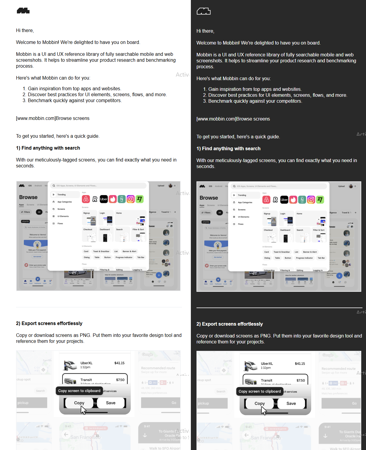
Now look at this Mobbin email in dark mode. They did everything right.
Here’s how:
- The logo has a clean white outline around the black icon, which keeps it clear and sharp on the dark background.
- The text is easy to read.
- The images are clear.
3. Morning Brew
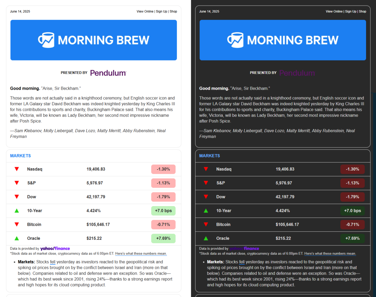
Look at the Morning Brew dark mode. Here’s why it looks perfect:
- The logo is clear with a solid blue background.
- The CTA links and text remain readable even in the dark background.
- The data table with market figures is also super clear and understandable.
Start Making Your Emails Dark Mode-Friendly with Designmodo
If you’re ready to design emails that look great in dark mode (and light mode, too), give Designmodo a try. Our editor makes it easy to create beautiful, easy-to-read emails without you having to code a single line.
You can see exactly how your design will work in both modes, so your message always comes through clearly. So why not try it and see what you can create?
FAQs
Can Dark Mode Affect Email Deliverability?
Dark mode doesn’t directly impact deliverability, but poor dark mode design can hurt engagement. If your email looks bad in dark mode, subscribers may delete or ignore it, which lowers your sender reputation and deliverability over time.
Is It Necessary to Design Separate Emails for Dark Mode?
No, with smart CSS and design choices, one email can look good in both light and dark modes.
Is It Okay to Use Black Text in Dark Mode Emails?
No. Never use black because it will disappear on dark backgrounds. Always use light text colors for dark themes.


![Best Transactional Email Services: Email API and SMTP Providers Compared [2026]](https://designmodo.com/wp-content/uploads/2026/05/transactional-email-templates-3-404x263.jpg)