
Latest Articles
-
What is a Static Website and How to Make One
Static websites are becoming popular among businesses, creators, and developers who seek fast, secure, and …
-
14 Professional Free and Paid CSS and HTML Editors
CSS or Cascading Style Sheets is a type of web language that is used to …
-
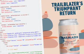
HTML and CSS in Emails: What Works in 2026?
Designing emails with HTML and CSS allows for professional, branded, and visually appealing content. However, …
-

The Best Ways to Embed Images in HTML Email
We have all heard that a picture is worth a thousand words. When it comes …
-
10 Best AI Tools for Web Developers
AI-powered tools have significantly evolved over the past few years. They have applications in almost …
-
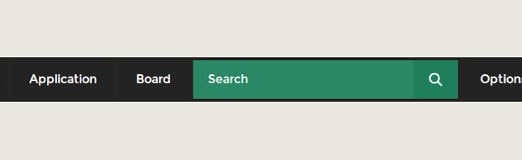
Create a Dropdown Menu with Search Bar in CSS3 and HTML
Topic: CSS3 Difficulty: Intermediate Estimated Completion Time: 45 min In this tutorial, we will be …
-
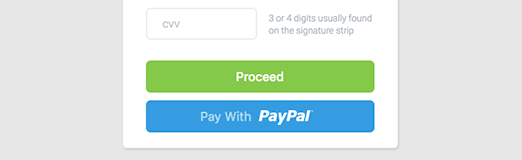
How to Create a Credit Card UI using HTML and CSS3
Topic: HTML / CSS3 Difficulty: Intermediate Estimated Completion Time: 30 minutes In this tutorial, we …
-
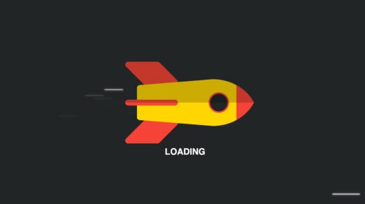
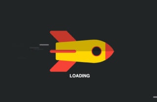
Collection of Free Preloaders and Loading Animated Spinners
Waiting is an annoying thing, whether it happens on a website, mobile application, or in …
-

Create a Product Page with Interactive Colors in HTML, CSS3 & jQuery
Topic: HTML / CSS3 / jQuery Difficulty: Intermediate Estimated Completion Time: 30 minutes In this …
-
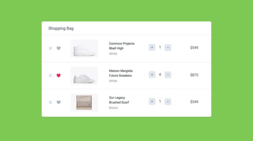
How to Create a Shopping Cart UI using CSS & JavaScript
Topic: HTML / CSS3 / JavaScript Difficulty: Intermediate Estimated Completion Time: 30 minutes In this …
-

Create a Full-Screen Navigation Menu in CSS3 & jQuery
Topic: HTML / CSS3 / jQuery Difficulty: Intermediate Estimated Completion Time: 30 minutes In this …
-

How to Create Checkout Form Using HTML, CSS3 and jQuery
Topic: HTML / CSS3 / jQuery Difficulty: Intermediate Estimated Completion Time: 30 minutes Hello, everyone! …
-
Create a Statistics UI Panel Using HTML & CSS3
Topic: HTML / CSS3 Difficulty: Intermediate Estimated Completion Time: 45 minutes In this tutorial, we …
-

Create an Apple TV Poster Parallax Effect in CSS3 & jQuery
Have you seen the new Apple TV parallax effect? It is awesome! We have decided …
-
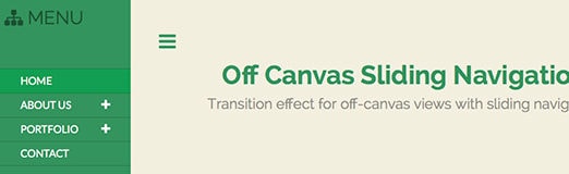
How to Create Off-Canvas Sliding Navigation Menu in HTML, CSS, JS
Off-Canvas Navigation has been on the web for quite some time and is widely used …
-
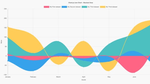
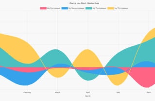
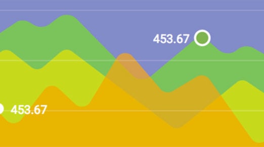
20 Useful CSS Graph and Chart Tutorials and Techniques
Usually, Graphs and Charts are mainly used for representing and organizing a set of numerical …
-

Animating SVG Gradients
SVG gradients are so handy. We can fill complex shapes and create depth and character …
-

How to Create a CSS3 Mega Menu
Topic: CSS3 Difficulty: Intermediate Estimated Completion Time: 1 hour In this tutorial I will teach …
-

How to Create an Upload Form using jQuery, CSS3, HTML5 and PHP
Topic: jQuery / CSS3 Difficulty: Advanced Estimated Completion Time: 1 hour In this tutorial we …
-
How to Create a Responsive Image Slider in jQuery and CSS3
Topic: jQuery (flexslider) / CSS3 Difficulty: Intermediate Estimated Completion Time: 30 mins Today we will …
-
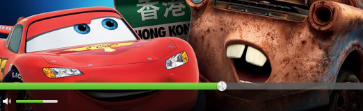
How to Create an Video Player in jQuery, HTML5 & CSS3
Topic: jQuery / CSS3 Difficulty: Intermediate / Advanced Estimated Completion Time: 45 mins In this …
-

How to Create CSS3 Pricing Tables
In this tutorial, we’ll learn how to code and style CSS3 pricing tables from the …
-
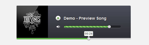
How to Create an Audio Player in jQuery, HTML5 & CSS3
Topic: jQuery / CSS3 Difficulty: Intermediate / Advanced Estimated Completion Time: 30 mins Today’s tutorial …
-

Create an SVG Animation using CSS and JavaScript
SVG, or Scalable Vector Graphics, is an application of XML to provide vector graphical information …