Best Examples of Web Application Interface Designs
We can safely call this decade a decade of startups. Small and big, local and international, teams of every size and scale pop up each day, offering products to benefit the community. Some of them come and go, while others stay with us forever. Due to this tendency, we can witness a rich diversity of web application вуышпт examples.
Indeed the web is teeming with websites that introduce services to the World. Although coming up with the product that will cardinally improve the life or work of people is a top priority, nevertheless, creating good web application design is also important. It is a crucial link between you and the outside world that ensures the success of the venture. Therefore, it should be flawless.
Export Figma Designs to Live Website – No-Code
Let us dive into the basics of web application interface design, focus on its critical elements, consider modern web design trends, and examine outstanding web design application examples to create a robust platform for promoting your product.
With Postcards Email Builder you can create and edit email templates online without any coding skills! Includes more than 100 components to help you create custom emails templates faster than ever before.
Free Email BuilderFree Email TemplatesWeb App Design Basics
Web app design is a crucial aspect of creating a successful online platform, as it directly impacts the user experience and overall usability. This guide outlines the essential steps and best practices for designing an effective web app.
- Define your goals and target audience:
Before you begin designing your web app, it’s essential to define the purpose of the app and the audience you’re targeting. This information will serve as a foundation for all design decisions, ensuring a cohesive and goal-oriented final product.
- Create user personas:
User personas are fictional representations of your target audience, based on real data and user research. By creating user personas, you can better understand the needs, preferences, and behavior patterns of your audience, which will help guide your design decisions.
- Plan the user flow:
User flow is the sequence of steps a user takes to complete a task or achieve a specific goal within your app. By mapping out the user flow, you can identify potential roadblocks, optimize the overall experience, and create a more intuitive and user-friendly interface.
- Sketch wireframes:
Wireframes are basic, low-fidelity representations of your app’s layout, showing the arrangement of elements on each screen. Sketching wireframes helps you visualize the structure of your app, identify potential usability issues, and ensure that all important elements are included.
- Develop a style guide:
A style guide is a set of guidelines that define your app’s visual identity, including typography, colors, icons, and other design elements. Establishing a style guide ensures consistency throughout the app, enhances branding, and improves the overall aesthetics.
- Design high-fidelity prototypes:
Once you’ve settled on the layout and visual identity of your app, it’s time to create high-fidelity prototypes. These are detailed, polished representations of your app, complete with interactions and animations. High-fidelity prototypes allow you to test the usability and functionality of your app before moving on to development.
- Conduct usability testing:
Usability testing involves gathering feedback from real users as they interact with your app. This process helps identify areas of confusion, frustration, or inefficiency and provides valuable insights for refining the design.
With Pulsetic you’ll be instantly notified the moment your website, API, or server becomes unavailable. Monitor uptime from multiple global locations and respond to incidents before your users are affected.
Create beautiful status pages in minutes to keep customers informed during outages and build trust with transparent communication.
Start Monitoring for Free- Iterate and refine:
Based on the feedback gathered during usability testing, make necessary adjustments to your design. This iterative process helps you create a more polished, user-friendly web app.
- Collaborate with developers:
As you finalize your design, work closely with the development team to ensure a smooth transition from design to implementation. Clear communication and collaboration are vital to achieving a successful, cohesive final product.
- Continuously evaluate and improve:
Even after your web app is launched, continue to gather feedback and analyze user behavior. This will help you identify areas for improvement, and make ongoing refinements to ensure the app remains relevant and effective.
Basic Elements of Web Application Designs
In substance, the web application design does not cardinally differ from the other types of website designs. They have many things in common such as navigation, header, hero area, footer. They have even similar inner structure, including such pages as “about us” or “contacts.”
However, some user interface units are essential for every homepage that promotes web application. While they are not obligatory, they are still highly recommended to have on your page to meet expectations of the targeted crowd, provide comfortable user experience, and put marketing tricks into play. Let us consider them:
Contact form
As a rule, the contact form occupies the lower part of the interface preceding the footer. Its main goal is to let users request a quote or clarify some points. For a long time, it was a must-have. However, the situation is changing these days. The traditional contact form is outliving its utility because of more modern and progressive ways of communicating with the clients.
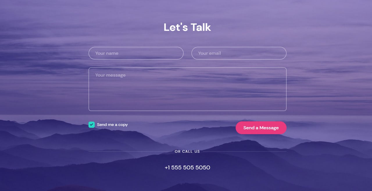
There are a dozen alternative ways: social media, instant messaging, video chats, international video calls that do not cost a fortune, and even regular telephone calls. However, contact form is still recommended to have since there is a large proportion of people who prefer using them.
Chat
The chat is one of the most sought-after elements on user interfaces these days. It is particularly significant in web application designs that are up to providing instant communication with the clients.
There are two types of chats. The first one involves the real person. This is a popular option among various businesses, whether it is a huge e-store or small startup.
On the one hand, this solution is increasingly beneficial since it provides a personal approach. Besides, the virtual assistant is more likely to solve customer’s problems whatever complicated.
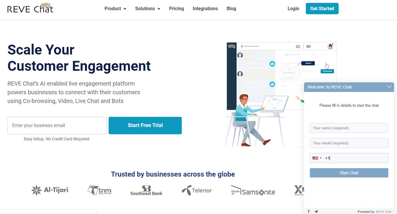
On the other hand, it has a big flaw since it is time-sensitive. If you are running a small company, then chances are your virtual assistant will not be available during the night shift and evening hours. For some people, it is not a big deal; however, if you want to cover a large crowd, then it can be an issue.
The second way implies the utilization of a bot, aka AI-based virtual assistant. Its main task is to answer popular questions by efficiently narrowing the problem and finding possible solutions. It works regardless of the time of the day. However, it is limited to the range of answers.
Whatever option you prefer, the chat is a must-have these days.
Calls
With the rise of telecommunications applications and the growing popularity of video chats, calling has become a part of daily life. Thanks to progressive technologies, these calls are relatively inexpensive. Therefore, every entrepreneur can afford a call or a video chat via Skype or any other program alike.
On top of that, virtual PBX, aka smart telephony, offers budget plans allowing small and mid-sized businesses to create call centers for sales departments without spending a fortune.
Testimonials
Nothing can replace feedbacks from real clients. A testimonial is your tool to build trust in your prospects with the help of your current customers.
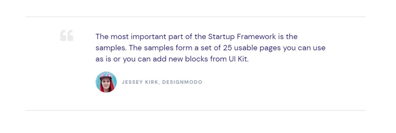
However, it is here where you need to exercise caution since overpopulating your website with feedbacks could have ricocheted. The rule of thumb is to add four-six reviews vigilantly organized into digestible blocks.
Pricing Table
This component is a bit controversial since not everyone is ready to reveal the pricing policy. However, it is crucial.
There is no point in hiding it. First, it is an unnecessary obstacle for your users, and secondly, your potential clients will eventually find out the pricing. You are just buying some time for you and wasting the precious time of the others – this is a bad practice. Therefore, make the pricing plan evident and clear.
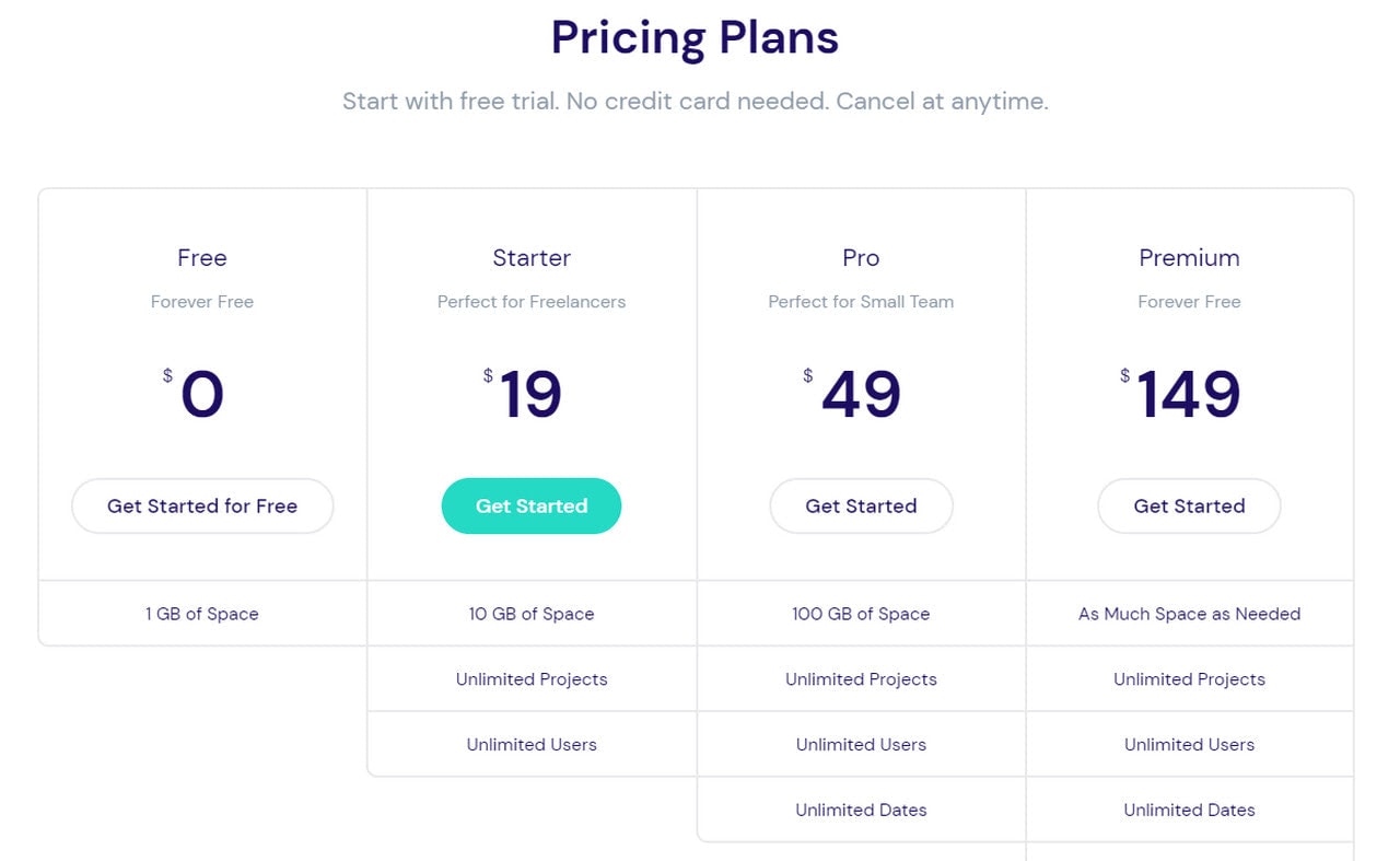
Use tables since they can easily compare and contrast the benefits of each package. As a rule, it occupies the middle of the reading flow. Use it to show prices as well as play some marketing tricks by highlighting the best offer or showing the discount.
Service Section
The service section is the heart and soul of every web application design. It is used to boast about your product. There are numerous ways to show your product in the best light. You can
- list advantages,
- describe it in simple words so that your target audience instantly gets the message,
- use promotional videos,
- employ illustrations and much more.
Along with the hero area, the service section makes an impression, promotes the application and turns traffic into the leads.
Like it or not, but the client’s privacy is a burning issue nowadays. It is not only about meeting the GDPR compliance; it is about establishing a health community on the web and respecting the rights of the others. Therefore, whatever business you have, a small pop-up notification about using cookies is obligatory.
There are some more important things to note about the essential filling of web application designs.
First, with AI-powered bots and live chats, such fundamental elements of the user interface like FAQ is gradually becoming outdated and irrelevant.
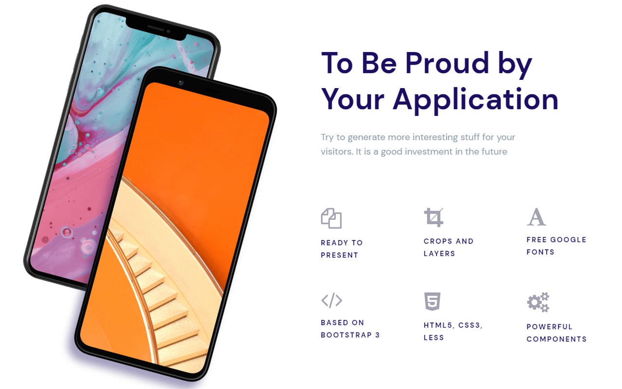
Second, the hero area is still one of the most important elements in UI since it is responsible for making the first impression. The deal is you never get a second chance to make a first impression. Therefore, it should be flawless. Check out our collection of web application examples to follow the mainstream and produce quite an impression on the visitors.
Third, call-to-actions should be one of your top priorities. Use color psychology as well as motivational language to create natural magnets in the interface that will compel your prospects to make a purchase.
Fourth, if you create an application that is available in different markets, you should include quick ways to access them. It means buttons like “App Store” or “Google Play” should take their proper places in the interface.
Finally, such elements as footer and navigation should be banal. The deal is the simpler these two, the more valuable they will be for the users. If you want to show off your creativity, then use the hero area for that. As for footer and navigation, they should be plain, straightforward, and useful.
Key Elements of Web Application Designs
There are five key elements of web application design: user interface, usability, content, creativity, and accessibility. Each one plays its essential role in your path to creating a successful website where users will not just familiarize themselves with the product but also get a real value. Let’s consider them.
User interface
Starting from the teeny-tiny icon and ending with a full-screen image background, the user interface includes everything that can be found on the web page.
Depending on the project, it may require different elements. However, there are still some good tips that help to create a web application design that rocks. Here are some of them:
- Keep it simple. Whatever grandiose idea you have in mind, leave it. When it comes to the web application sphere, things should be straightforward. Remember, all fancy ideas will “eat” your performance, to say nothing about creating possible issues with unobstructed interaction with the interface.
- Eliminate all the compatibility issues. This is a big one. Your interface should look, work, and feel the same on all devices regardless of the screen size, operating system, browser, etc.
- Make navigation flawless. As we have said earlier, keep things simple, especially with the navigation. Users should navigate between products and functionality without a hitch. It is the heart and soul of every good successful website out there. No handy navigation – no good user experience.
- Aim at a high performance. Your website should not keep your users waiting. All components should run like clockwork. Optimize all the elements. Your goal is to create quick access to all sections of the page. The faster the website, the better. What’s more, properly optimized websites with a high-speed rank better in Google, so you can win some points there as well.
- Focus on delivering messages. Avoid busy UI. The web application design should clearly explain the purpose of the product. Structure everything using such time-proven components as tables, grids, carousels, etc.
- Stick to cleaner interface with expressive fonts and supportive visual graphics. Create a beautiful look and feel. Cluttered solutions do not solve the issue. The design should be pleasant to use.
The user interface is the first layer of your presentation that potential customers deal with. Therefore, everything should be impeccable; otherwise, users will leave even without reaching their destination, aka your product.
Usability
According to the world leaders in research-based user experience, usability is based on several important components:
- learnability (is it easy for newcomers to accomplish the task),
- efficiency (how quickly can users perform their tasks),
- memorability (how easily returned users can reestablish proficiency in working with your interface),
- errors (how easily can users recover from the mistakes made while interacting with the interface),
- satisfaction (is your website pleasant to work with),
- utility (does your website provide services that your users need).
These essential quality components help to make your site useful for your prospects.
You should not only follow the best practices in user experience but also test the interface to improve the usability of your web application design. Go beyond alpha testing. Let regular users work with your website. Observe their actions, analyze errors of your interface, run many small tests to find out the weak spots. Ask five non-tech-savvy people to conduct the experiments.
What’s more, these tests should be done on all stages of website creation. This way, you will eliminate all issues, gradually laying out a solid foundation.
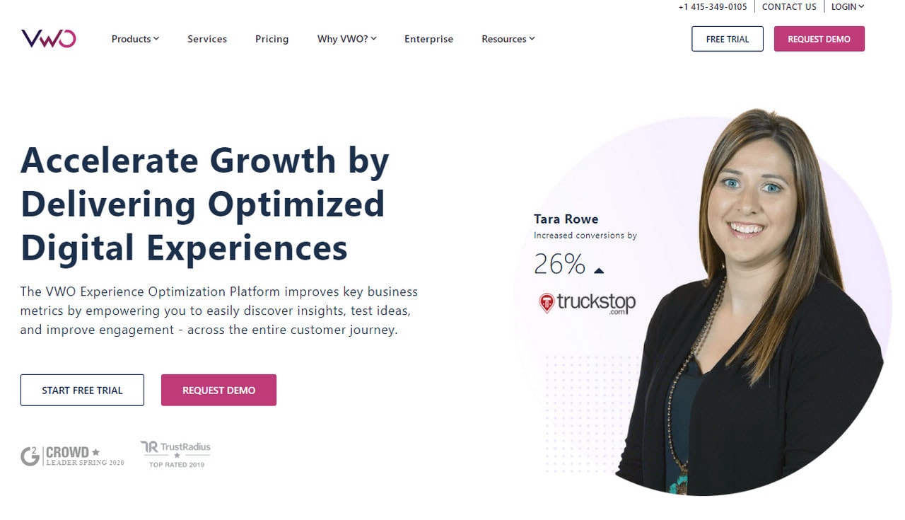
VWO
Content
Content is always a king. You may have impeccable design and user experience; however, if your website does not answer users’ key questions, they will leave straight away. Therefore, the content should always be a top priority. First and foremost, it should bring value and meet the user’s needs. Make it informative, entertaining, and engaging.
It is here where you need to think through the informational hierarchy. You should lead your visitors from the start to the end. Therefore, your content should reveal a story about your product and brand. Engage visitors with facts and benefits, but still, remember about its value.
Choose a language appropriate to your crowd. A rule of thumb, do not use professional terminology: it will scare users away. Keep things simple and casual. Everyone should understand the meaning of the content.
Finally, yet importantly, remember proper formatting. If the information is hard to read due to bad format, then users will leave.
Creativity
Although we have already said that you should leave all your extravagant ideas, nevertheless, it does not mean that your web application design should be plain and boring.
Creativity is an essential quality of every promo page. It stands behind such vital things as a first impression and general feeling. Packaging sells – no one can argue with that. Therefore, be creative with your presentation.
Avoid bizarre ideas or high-end solutions that may confuse your regular customers; however, breathe some artistry in your interface by serving the same dish under the spicy sauce. Use marvelous illustrations, spectacular images, intricate graphics, beautiful typography, eye-pleasing animations to deliver your message with taste and style. This will help to support your brand, strengthen the message, and, most importantly, set you apart from the competition.

Vold
Accessibility
Regardless of your target market, your website should be equally accessible to all groups of people.
Contrary to popular belief, making your website accessible does not only mean to comply with the needs of people with disabilities. It is a broad term that covers people with various problems. For example, people with a slow internet connection also fall into this category.
When you treat everyone the same, all people have a chance to explore your website, familiarize yourself with your product and even purchase it or at least recommend it to their friends or colleagues.
Besides, accessibility improves your SEO ranking and even let you work legally in some countries since it is a law in some places.
Improving the accessibility of your web application design includes many things to do. Where to start? Well, start with mobile-friendliness, browser compatibility, overall optimization, and of course, ATs (assistive technologies). Enhance these aspects to make the website accessible to a large crowd.
Trends in Web Application Designs
Some say trends come and go, so what is the point of following them? Well, there is a good reason to stick to the current mainstream. The deal is people eat with their eyes. It is in our nature to estimate the value of the offer relying on the general impression, at least at first.
Therefore, the packaging should be “delicious.” It is here where trends come in handy, playing the role of condiments that transform the boring dish into a delicious masterpiece.
Yes, trends require you to stay on top of things and continuously introduce changes to the interface to look and feel modern. However, it is worth it. Let us find out what condiments you may use to spice up the web application design today.
Human Illustrations
Human illustrations are a huge trend. Numerous web application examples are based on them. The great thing is you are not limited to the stylistic options. Human illustrations are favored in all shapes and sizes.
On top of that, along with traditional static illustrations, many web application examples feature dynamic solutions. Consider HyperSonix whose team has skillfully managed to combine both approaches within one page.
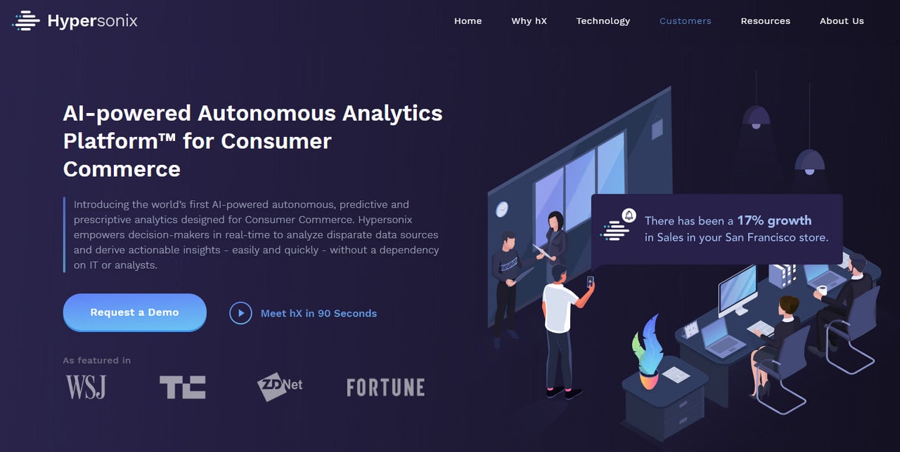
The hero area welcomes the online audience with a small yet convincing animation based on human illustrations. Following the same theme, the team has created a series of small drawings where humans play the first fiddle in clarifying things about the product—smart, compelling, and just brilliant.
Animations
Animations are another huge trend that affects not only web application designs but also the entire website sphere. We live in an era when everything static is boring. Therefore, even the small animation may win you some points.
It is a large area to explore. There is a rich diversity of solutions. You may create traditional cartoonish animation or fancy digitally generated one. You may even partially set the scene in motion, and this will do the trick. Thanks to creative vibes, positive emotions, and user-friendly nature, whatever animation you have, it will easily win over the clients. Consider KDAN Mobile.
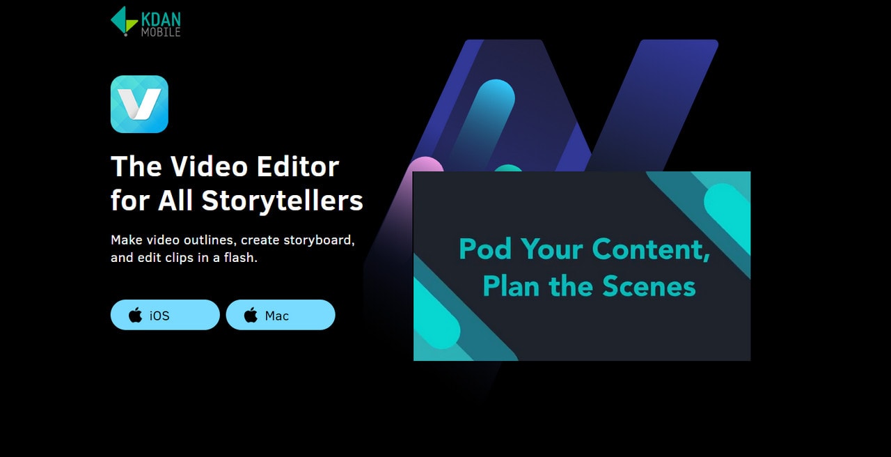
It is one of the web application examples where the team uses animations in portions. They do not overwhelm visitors with an incredible idea; they just use small pieces to support the content and make the presentation of the product brighter and more efficient.
Storytelling
With such significant trends as illustrations and animations, it comes as no surprise that the storytelling approach is still a top choice when it comes to creating a contemporary web application design.
Storytelling experience is a mixture of idea, creativity, design, and realization. Sometimes it is a static story powered by a scrolling effect; sometimes, it is the epic drama that includes all the pioneering tricks. Look at Rested.
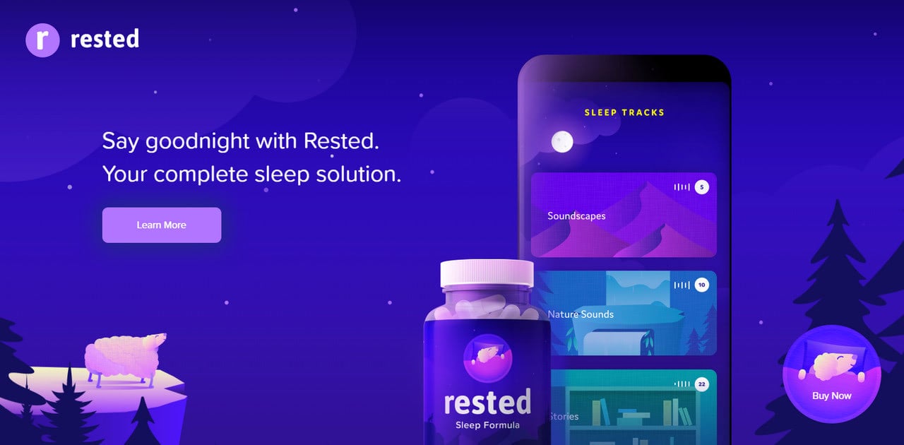
Rested is a small startup that promotes remedy for sleeping disorders. The team has created a fantastic storytelling experience that complies with the theme and establishes the proper atmosphere thanks to skillfully realized storytelling experience. It has gorgeous coloring, beautiful illustrations, and even small animations that all together naturally engages users.
App Interaction
Showing your product in action is one of the best ways to prove your target market that it is worth their attention. It is an excellent material for the hero area to make the latter speak volume.
Some teams prefer to use short gifs while others employ the long animations and even videos to show the product in all its glory. Consider Fonts Ninja.
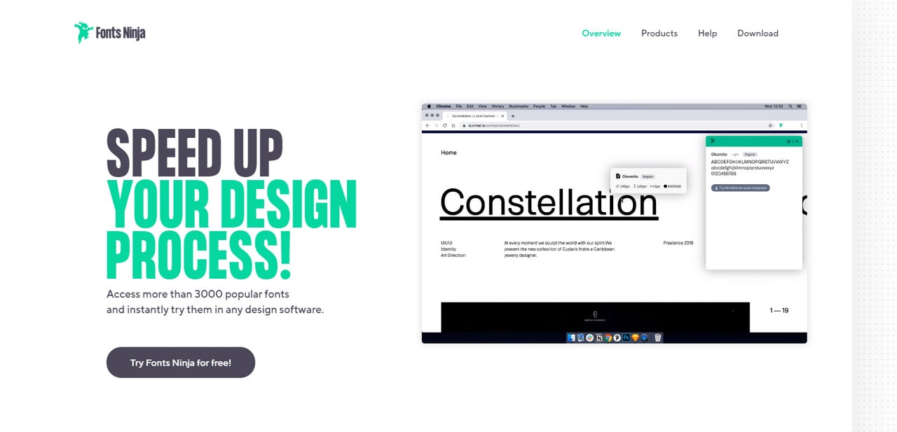
Fonts Ninjas is a small project that promotes an application for working with fonts along with a vast library of typefaces. It is a small startup; however, its landing page produces a big impression that gains the trust from the get-go.
Many things are involved and small animation in the hero area that shows how to use the application is one of them. It efficiently introduces the product to the audience and proves everyone that it is easy to use. Clever.
Collection of Web Application Design Examples
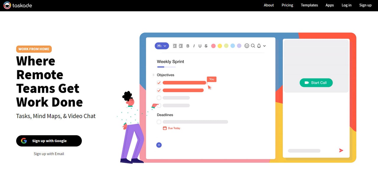
Taskade is a small startup whose product aims to solve big problems. It helps to organize workflow and teams to create flawless remote collaboration where all tasks are done in time. To introduce the product to the crowd, the team has opted in favor of beautiful design with handy user experience spiced up with some trendy features.
Here you can see beautiful human illustrations set in motion, the vast video player that features the product in action, some handy UI components like tabs where the features of the product are skillfully dished up, bright coloring that nicely contrasts with a generous amount of whitespace, fancy buttons that instantly catch an eye. Last but not least, at the end of the page, you will see a download section where you can find a version of the product appropriate to your device.
Taskade is one of those web application examples where the team has created a true symbiosis of design, usability, content, and creativity.
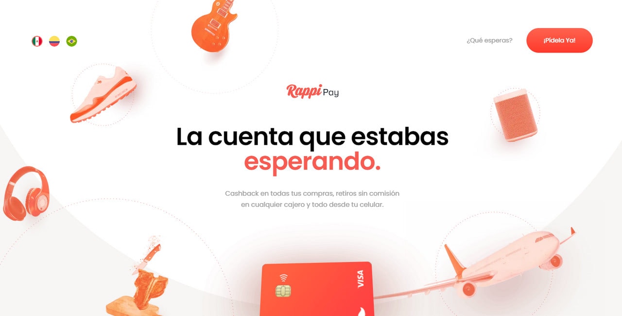
RappiPay is a representative web application example that demonstrates how storytelling experience can turn boring things into interesting and engaging ones.
The product is a regular electronic payment facilitator. While, in essence, there is nothing unusual in it, what catches an eye is the way it is presented to the market. The team has created an immersive story where the new payment application is the main protagonist.
They have used a multilayered solution to recreate lovely 3D scenes, short yet effective animations, and beautiful graphics. The content perfectly blends into the entire entourage uncovering the value of the product.
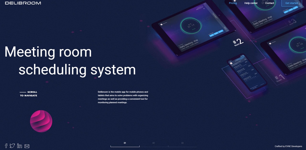
Delibroom has recreated a marvelous technology-inspired atmosphere. Not only does it help the product to stand out from the crowd, but it also supports its primary designation and strengthens the message behind the project.
Note you will not find in here long pages. Everything is compact and straightforward, even though it seems that the web application design is tricked-out. The user interface is clean. The content is perfectly laid out. You will not miss a thing here since everything is well thought out.
Using the full-screen image slider in the hero area, the team has uncovered the best features of the product. In addition, some other sliders effectively serve additional information. Smooth tiny dynamic effects enrich the interaction with the interface.
The design is not busy nor cluttered; it is very comfortable to work with. You can get answers to crucial questions quickly. The website is creative, informative, useful, and handy.
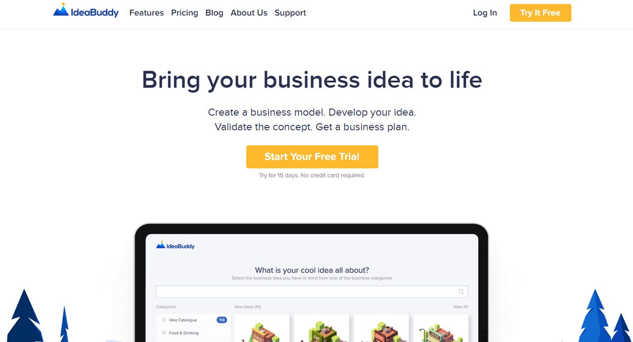
IdeaBuddy is one of those web application examples that you can call classic. Although at first glance, it feels up-to-date thanks to trendy human illustrations and some other tricks; however, the deal is when it comes to structure, it sticks to the traditional path.
For instance, the landing page greets an online audience with the carousel that is enclosed into an iPad-styled frame. This is one of the oldest tricks that instantly defines the field of application. In addition, you will see such components as card style carousel with features, listicles, and alternate stripe layout for handling content.
Of course, this is not a bad thing, since users feel comfortable there. They know what they should do to get the necessary information. Besides, the design is refreshing. Therefore, the website provides a comfortable experience within modern aesthetics.
All in all, each of these app design examples reflects different types of requirements and purposes for which they’ve been created. You need to analyze all of them separately in minute details and find out which of the elements can be best utilized in your own product. This process may take a bit of time. But don’t hesitate. The time is really worth it. You cannot afford to leave any stone unturned if you want to achieve your goal.
Conclusion
Good web application design is defined by numerous factors: user interface, usability, content, creativity, accessibility. You cannot focus on only one thing. All these aspects should be thought-through to make your website successful in introducing and promoting the design product.
Remember, show only vital information, choose a design that treats the content in the best way, make interaction easy and comfortable, bring value, leave a good impression and cover all groups of people. We hope our collection of excellent web application examples will give you some real hints on how to do this.