20 Best Figma Fonts to Try This Year
Figma fonts are not just design elements but a critical component that dictates your project’s readability, impact, and overall aesthetic.
When it comes to projects in Figam, make typography a top priority. It’s a non-negotiable for excellent customer satisfaction.
Export Figma Designs to Live Website – No-Code
No-Code Website Builder – Siter.io
In this article, I talk about the 20 best Figma fonts, why choosing the right font matters, how to choose the right one, and more.
With Postcards Email Builder you can create and edit email templates online without any coding skills! Includes more than 100 components to help you create custom emails templates faster than ever before.
Free Email BuilderFree Email Templates20 Best Fonts for Figma Designers
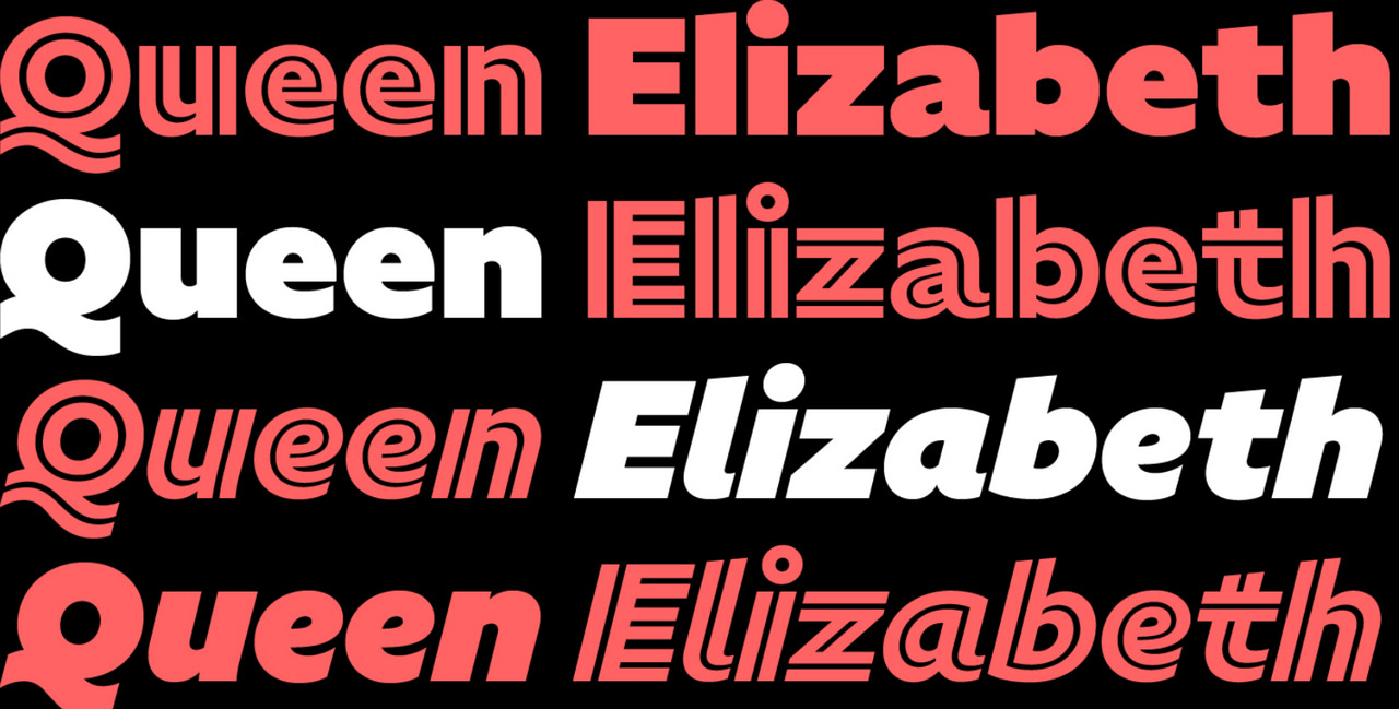
Roboto
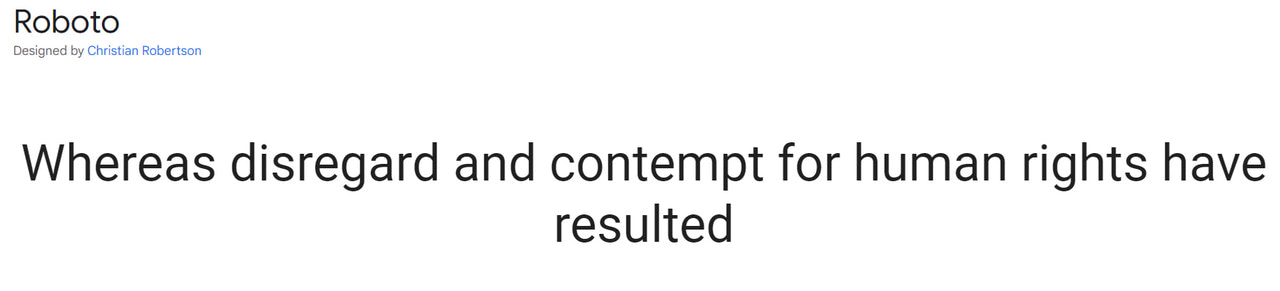
We will start our collection with the most popular type font in the Google collection. It has been a top choice for Figma designers since its development. Featured in over 610 billion websites, it is certainly worth your attention.
Roboto has a long story and cannot be called new. Nevertheless, it still feels trendy. It is a classy classic that gives any Figma project a sophisticated feel. Thanks to a mechanical skeleton and relatively large geometric forms with slight grotesque traits, letterforms can be used for numerous purposes: long paragraphs, headlines, logotypes, etc.
With its extensive set, the typeface supports over 300 languages. It also includes all sorts of punctuation, currency symbols, and marks, serving as a perfect option for multiple Figma projects.
Poppins
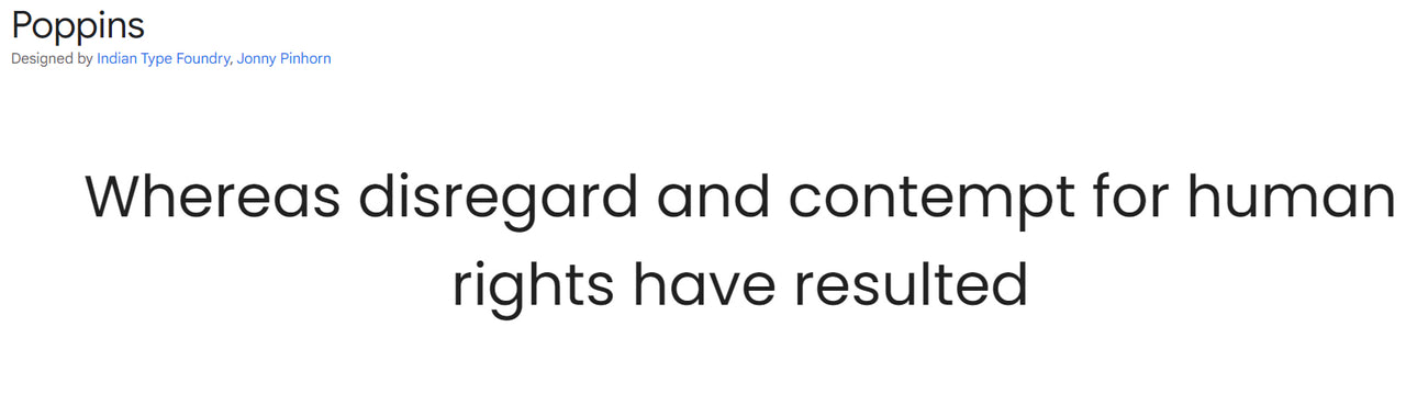
If Roboto seems to you a bit overrated, consider Poppins. It is another well-established representative of Geometric sans serif typefaces.
The font prides itself on its perfect monolinear and thin letterforms that exude elegance on all fronts. They work great for short sentences and slogans. If you want to use it for long paragraphs, stick to the light version or higher.
The set is diverse and supports 244 languages, including Cyrillic-based and Devanagari. You may find all essential punctuation, the most popular currency symbols, and marks.
With Pulsetic you’ll be instantly notified the moment your website, API, or server becomes unavailable. Monitor uptime from multiple global locations and respond to incidents before your users are affected.
Create beautiful status pages in minutes to keep customers informed during outages and build trust with transparent communication.
Start Monitoring for FreeLora
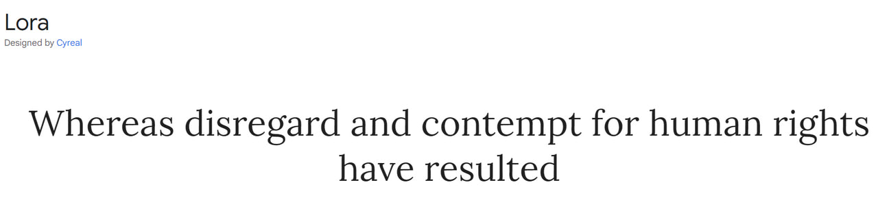
Elegant and sophisticated, Lora is the first serif-type family in our collection. Smooth shapes, brushed curves, and driving serifs make it appealing, eye-catching, and modern.
Lora may not be the best option for large body copy due to decorative touches, but it works great for headlines, making them look subtle and refined.
Like Roboto, it efficiently handles 311 languages, including Latin and Cyrillic families. It also comes with all necessary punctuation and currency symbols.
REM
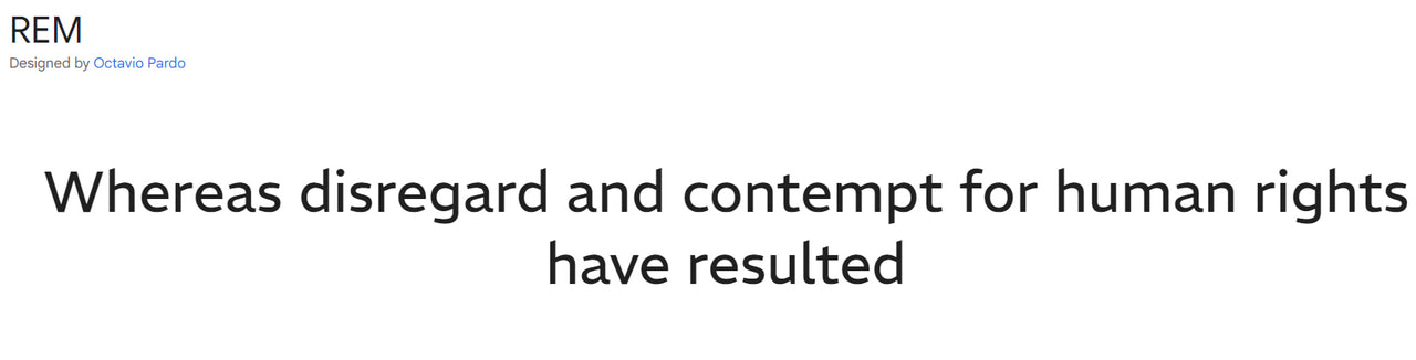
REM is one of the newest typefaces in the Google directory. Featured on less than 600 websites, it has just embarked on its journey in the digital world. However, Google Fonts API served the typeface over 800 thousand times last week – this is certainly a promising start.
The REM font family comes from a sans-serif category. It has smooth forms and edges, making it perfect for large body copies in Figma designs. However, exercise caution with it on a small screens since it may become blocky due to low contrast. Stick to the extra light version to hit the middle ground.
The set is not as diverse as the previous option. It has only 960 glyphs covering mostly Latin-based languages. Nevertheless, you may also find currency symbols, four sets of figures, small caps, and alternate glyphs.
Quicksand
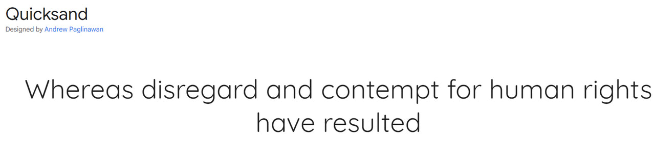
Serving over 1 million websites, Quicksand is a serious bid to become one of the most prominent players in the niche. Like Poppins, it is also a sans serif typeface with pronounced geometric features that perfectly meet current web design trends.
The typeface creates a natural reading rhythm and works great for large body copies. Do not use a light version for that; it may impair readability on small screens.
The glyphs cover only Latin-based languages, yet they do it efficiently. Numbers, punctuation, and currency symbols are all there.
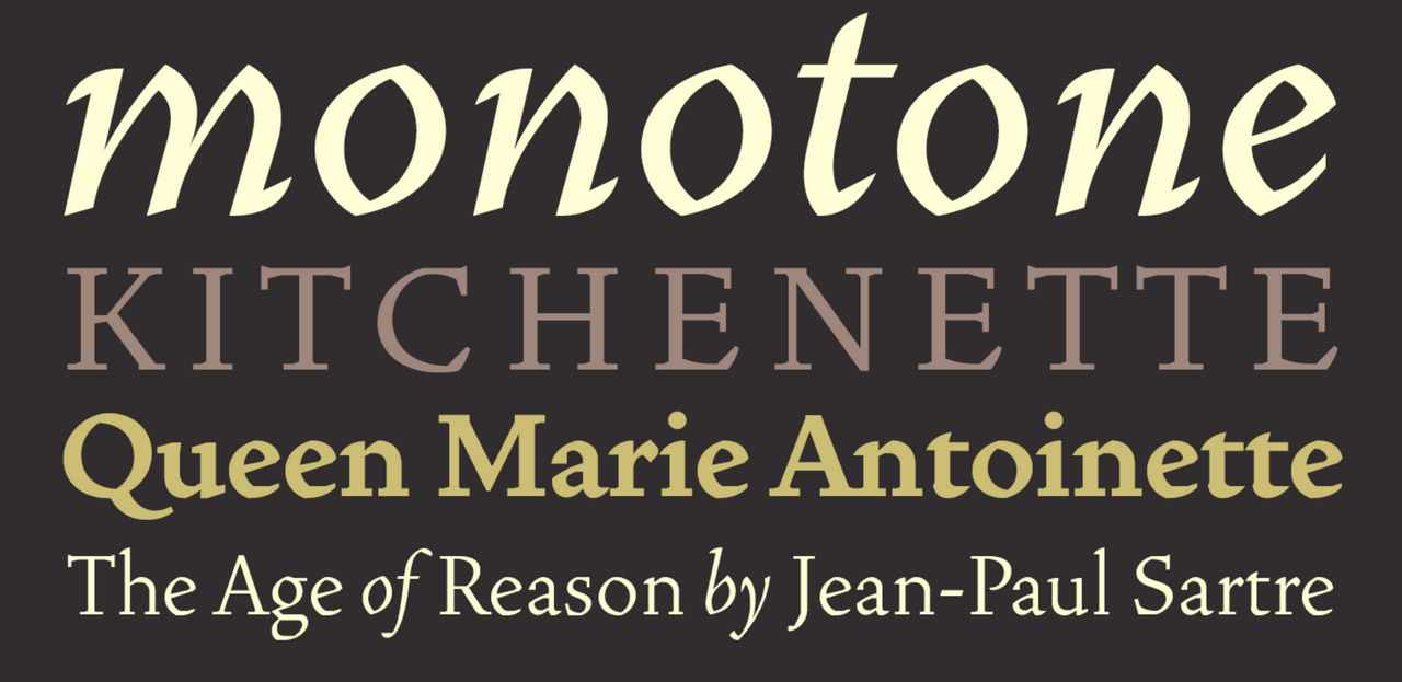
Miller
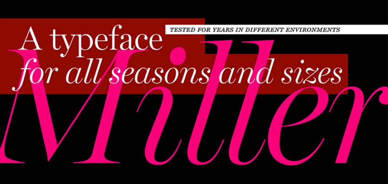
Miller
Miller is the first font in our list from an extensive, regularly updated Adobe library. It is a serif high-contrast type family with multiple variations and styles. You may play with it to create much-needed diversity in the design. Depending on the font weight and style, it may easily display a large body copy or stress out the headline.
The set of letters allows for serving content in Latin-based languages with all crucial punctuation.
Input Serif
Input Serif
Input Serif is a high-quality Adobe font crafted to perform. It prides itself on leveling up headlines, call-to-action buttons, logotypes, banners, and links with an undeniable imprint of early computer consoles. Thanks to its optimal contrast and smooth letterforms, it may also work for blocks of text.
The set comes in a dozen styles and supports numerous languages, including Cyrillic-based.
Specter
Specter
Specter is a perfect choice for adding a particular spice to Figma projects. Coming in two variants: one for displaying long paragraphs and another for highlighting headlines, it easily creates harmonious designs with visual diversity and carefully set accents.
The typeface falls into the sans serif directory with low contrast; therefore, expect it to catch an eye with its elegant design and smooth letterforms. It ships in all traditional styles: light, regular, medium, bold, black, and inline. As for the set of glyphs, it primarily caters to Latin-based language needs.
Vendetta
Vendetta
Geometric proportions, intersecting arcs, and angled facets underlie this marvelous serif typeface. Created as a digital homage to the iconic Roman type family Vendetta naturally accentuates the terseness of the characters. With such a flashy personality, it is no surprise that it works only for small chunks of text or headlines.
Vendetta comprises only five fonts, yet it goes perfectly well with other font options, for instance, Noto Sans.
As for the set of glyphs, it is pretty basic: you may find upper and lowercase Latin letters, numerals, and traditional punctuation.
Factoria
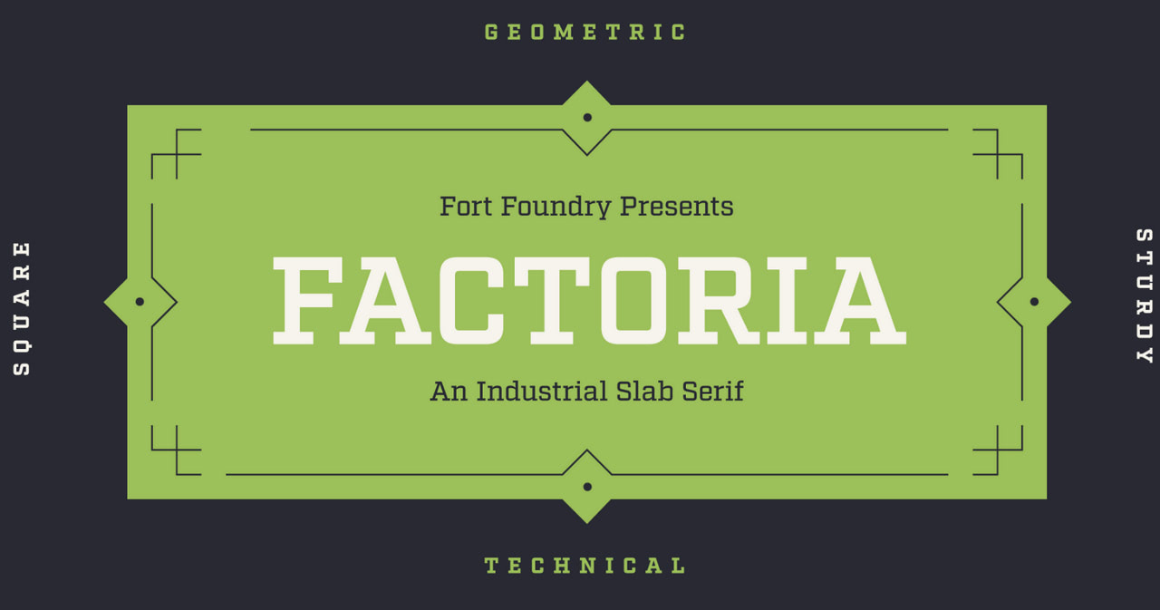
Factoria
Factoria is a fantastic take on slab serif type. It is original, vibrant, and loud, enhancing the visual presence from the first seconds. It is something that you usually see on banners and advertisements. However, it also works great for websites and web applications created in Figma.
The bigger and bolder it is, the more impressive it looks. In lighter versions, Factoria may efficiently serve as a display font for chunks of text, though do not overdo it: long paragraphs may look clumsy.
The set of glyphs allows the display of only Latin-based languages, numerals, and basic punctuation.
Tilt Prism
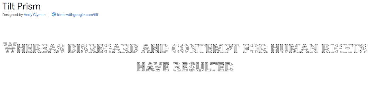
If Factoria’s unique charisma and bold appearance are insufficient to grab your user’s attention, you should try Tilt Prism. Daring, audacious, and highly appealing, this fantastic geometric sans-serif type will do this job easily. Inspired by Futura and Avant Garde, it makes the most out of dimensional lettering.
Tilt Prism comprises three related variable font styles that perfectly collaborate. Use them with caution since they may easily overwhelm viewers when put together. Each is destined to level up headlines and stress out key links, words, and buttons.
The set supports a whooping number of languages (over 400), covers all basic punctuation, and has a range of currency symbols and marks.
Handjet
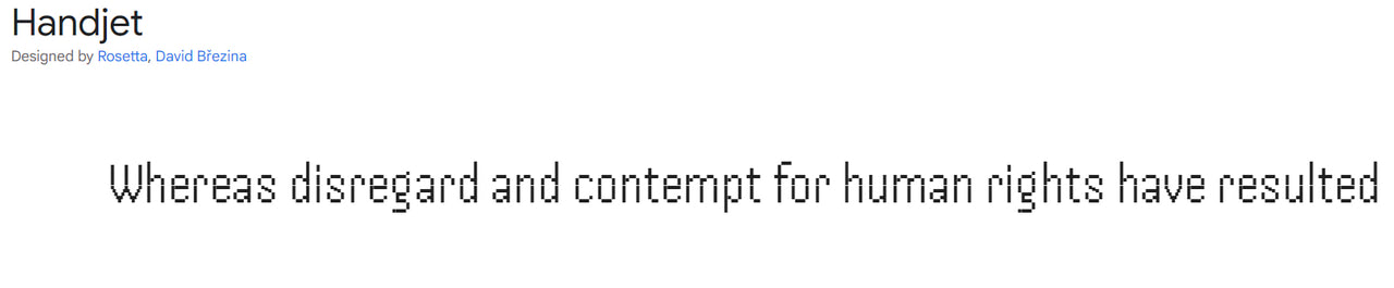
Handjet is a modular pixel font that captures the old console vibe. Strobing strokes, the missing sections, and the dots harmoniously shape the overall picture. It is an excellent option for giving your design a contemporary, techno vibe.
It is important to note that its unique appearance makes it a bit limited and brings about an unusual appearance due to aberrations and visual artifacts. Nevertheless, it could be optimized for small chunks of text and more extensive display settings. Check out its regular and medium style options for that.
The good news is that the font supports Latin, Arabic, Armenian, Cyrillic, Greek, and Hebrew.
Bely
Bely
Rounded, grungy, and quirky with bold geometric accents, Bely is undoubtedly one of a kind in our collection. Despite its flashy charisma, it may efficiently work for body copy and headlines – just use the right style. It is also perfect for quotes when set in italics.
This is an excellent all-rounder for Figma web design projects with five different styles, all primary characters to display the majority of Latin-based languages, numbers, and punctuation marks. The only thing to consider is the readability level on small screens since the type has a high contrast that may ruin it slightly.
Roletta
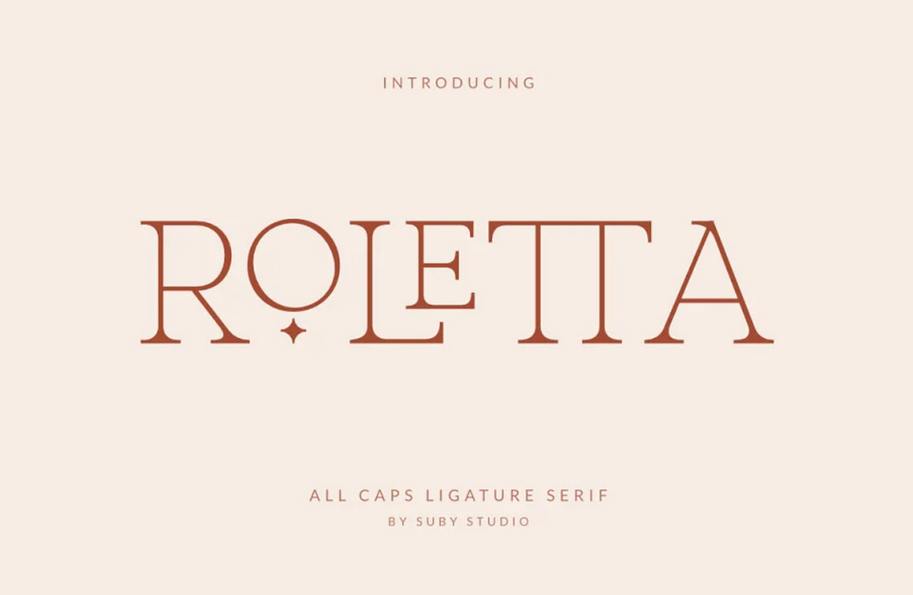
Roletta
We could not help but feature type families from marketplaces because they certainly have something to show for. Roletta is the first premium font in our collection that comes with some aces in the sleeve.
It has an elegant and classy vibe with a modern twist, and it is an all-caps serif ligature well-suited for various use-case scenarios such as logos, headlines, captions, and text overlays. It also has a responsive team that provides quick support and is regularly updated.
The set of glyphs includes characters to cater to the Latin languages, 19 ligatures, alternates, numerals, and punctuation.
Nalieta
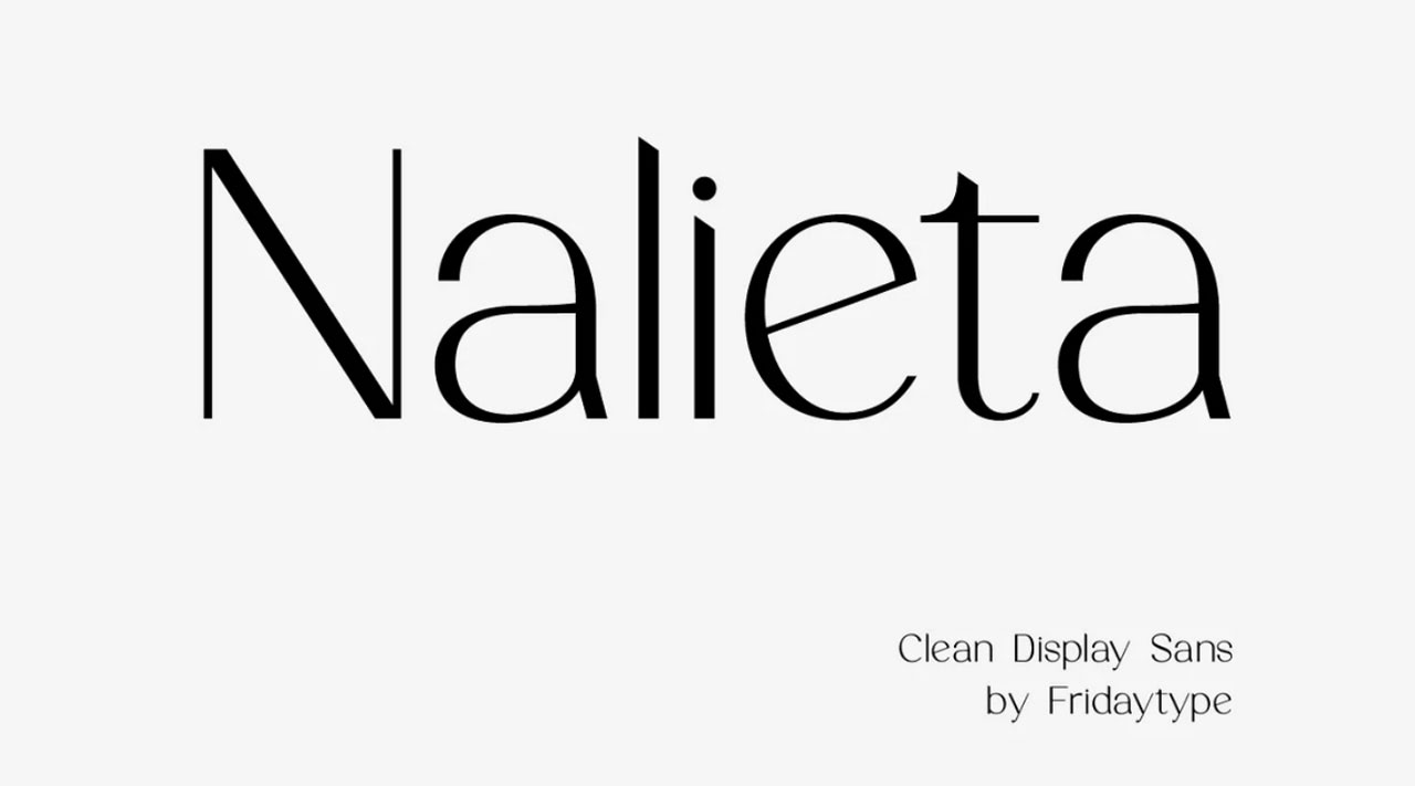
Nalieta Clean Display Sans
Nalieta is an elegant premium sans serif font with a classy touch designed to meet various needs. It is well-balanced, legible, and easy to read on different screen sizes. It has pixel-perfect letterforms with ultra-thin lines ideal for clean Figma web app designs.
The typeface ships in several weights and styles provided with normal spacing crucial for legibility. The set includes a range of ligatures, numerals, punctuation, and characters in lowercase and uppercase to display different languages.
Magalie
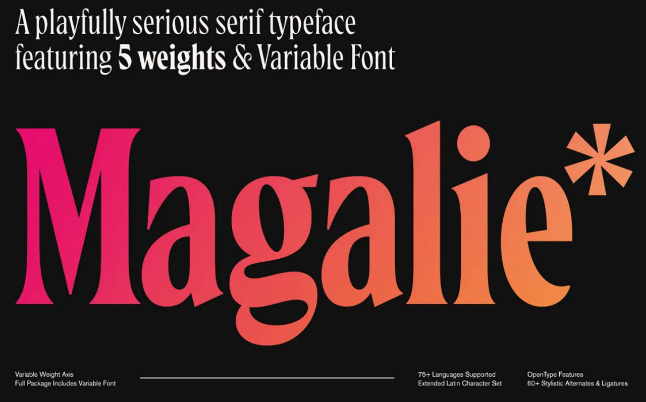
Magalie Typeface
If you are looking for a Figma font that has a playful nature with optimal readability, Magalie is the best way to go this year. It is new, refreshing, and fun-loving. It is also blocky and curly, catching an eye without much effort and providing a strong focus on the text. Coming in 5 different styles, it can be used for headlines, small chunks of text, and even long paragraphs.
The font has 30 ligatures, selected swash capitals, stylistic alternates, old-style figures, and an extended Latin character set to support over 75 languages. Basic punctuation and symbols are included as well.
Beautiful Freak
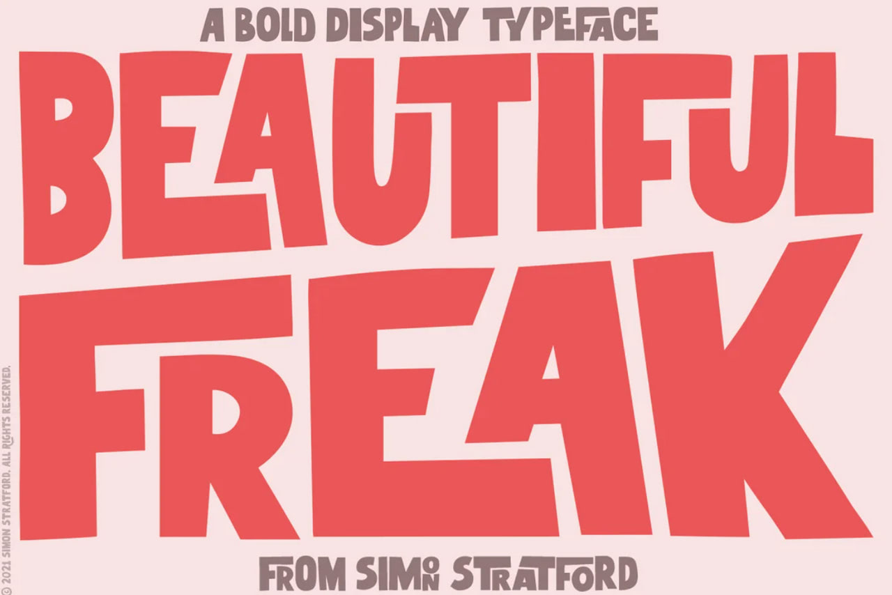
Beautiful Freak
Beautiful Freak is an excellent option for many Figma design projects, especially those that need to stand out immediately. Here letterforms are far from standard. They are bold, geometric, quirky, and bizarre with a particular street vibe, but they perfectly play together, creating a pleasant reading experience. However, do not use them for long text blocks because they are geared toward headlines, slogans, and logotypes.
The font contains an extended set of Latin symbols with at least three alternatives for each character to support Central, Western, and South-Eastern European languages. On top of that, it has 87 ligatures, punctuation, symbols, and numbers.
Meticula
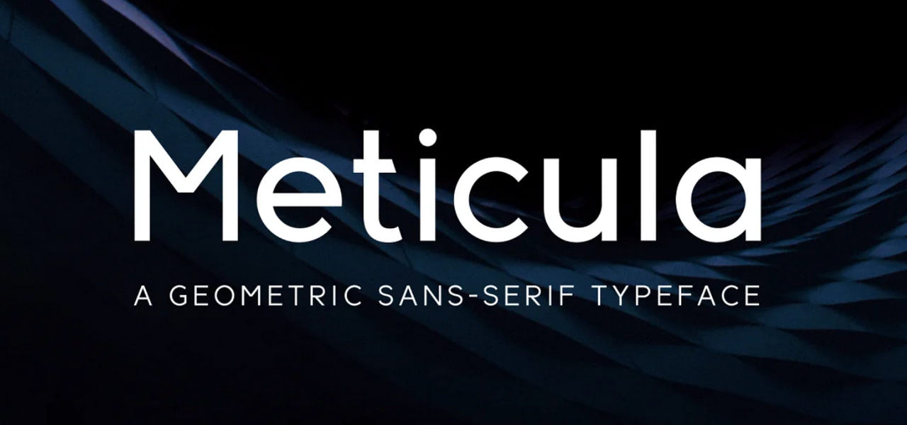
Meticula
Meticula is a modern geometric sans serif typeface that excels in various settings, including body text, headings, and logos. Subtle curves with slightly angled cuts stand behind its beauty, providing a pleasant reading experience.
The font is presented in 18 styles, from thin to bold italic to outline. This opens vast possibilities for artists, allowing them to cater to all typography purposes. They may easily create a stylistic diversity maintaining coherency in design.
As for specs, Meticula offers extended Latin support with all basic punctuation and numerals.
Kablammo
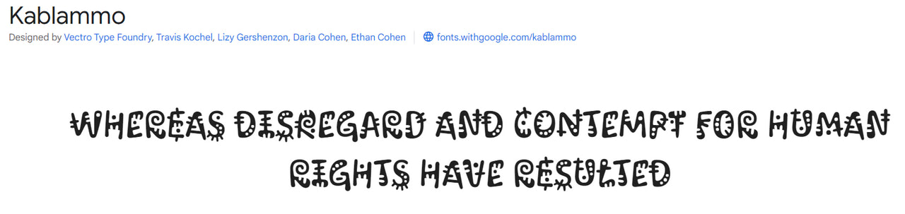
Kablammo is an energetic and expressive custom-made script font with a quirky nature and fun-loving qualities. This successful experiment brought to life the beauty of 90s cartoons. It is ideal for product designs, logotypes, watermarks, special events, and headlines in websites and app UIs.
There is more. The typeface has a certain dancing rhythm, lending itself particularly well to animations. The best part is it supports both Latin and Cyrillic languages providing all the essentials to create international projects.
Moirai One
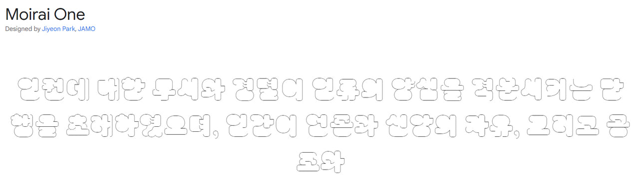
Our collection of the best Figma fonts will not be complete without this strange and unique blocky typeface. It is even more quirky than Kablammo. Again, it cannot be used for body copy. It even requires particular attention when used for headlines. Nevertheless, when well done, it does magic. It instantly draws attention and leaves a long-lasting impression.
Moirai is an experimental typeface that gets its beauty from different stroke movements. Each letterform plays with visibility and legibility.
The set of glyphs is pretty diverse. It has Latin characters, Hangul syllables, numbers, arrows, math operators, misc symbols, and punctuation.
Now, let’s consider the importance of choosing the right typeface and the basic steps to do that.
Why Choosing the Right Figma Font Matters
Font selection is extremely important in terms of understanding content. It creates a solid foundation for everything, including marketing efforts. Consider several fundamental reasons why choosing the right typeface for your Figma project matters.
Whatever impressive images you have, content is still king. It is the primary source of information that provides crucial knowledge to make the right decision. Even though preferences of the market constantly shift, prospects and customers still come for the content and value it brings. A legible typeface meets these needs.
A typeface significantly impacts readability, which improves customer experience and establishes clear communication. According to recent studies by Zendesk, 70% of customers spend more with companies with seamless and meaningful customer experiences. This means typography directly influences users’ engagement, sales, and revenue.
A correctly chosen typeface balances graphics and text. Modern websites have images, illustrations, and a bunch of flashy components, causing visual overload and fatigue. Proper typeface harmonizes this visual madness and creates a well-balanced Figma project where viewers are not tired of the website’s extravaganza.
Creates hierarchy using type. Categorizing text, highlighting essential headlines and links, differentiating blocks, and pointing out what the owner wants the reader to see first are vital to creating a natural path for the viewer’s eye to follow through the design. It leads customers through all crucial points right down the funnel.
The choice of typeface determines how the content is understood emotionally. Every font generates a specific gamut of emotions. If the typeface and content are not coordinated, the overall message will fail. Whereas the synergy between font and content amplifies the message.
A typeface can attract and hold attention. This quality is crucial to win over customers with a golden fish attention span.
Finally, typefaces support brand recognition. As an integral element of brand identity, the typeface plays a vital role in building and raising brand awareness. It creates a rhythm that echoes with other touchpoints scattered across communication channels. This creates a cohesive and unified space, adds value to the brand, serves as an identification for the viewers, and ipso facto makes the company more recognizable.
Image taken from The Role of Typography in Web Design from Nuelium
How to Choose the Best Figma Font for Your Next Project
Figma is an increasingly powerful instrument with numerous helpful features (plugins, components, UI kits). It may assist you in multiple tasks; however, when it comes to displaying the content according to your standards and brand identity requirements, it fails.
It cannot decide on its own what typeface perfectly blends into your theme and meets all crucial criteria to provide your target audience with the best user experience. It might not even have the font that is right for you. Let’s consider the basic steps of finding the best option for your project.
Before jumping into the routine, it is crucial to understand the main qualities that your perfect font face should have. They are:
- It should be clean and easily discernable.
- It should have consistent design characteristics throughout the entire character set.
- It should have optimal letterspacing, known as sidebearings, allowing for optically even spacing between glyph pairs.
- It should have even kerning.
- It should have legible letterforms that can be easily distinguished on small screens.
- It should have even colors and textures.
- It should naturally balance all of the negative spaces.
- It shouldn’t be too small and crummy.
5 Steps to Secure the Best Figma Font
Like many of its alternatives, Figma spoils designers with choice. Google, Adobe, hand-made and custom-made, the platform allows you to work with any font you need. This freedom is both a blessing and a curse since it is easy to go wrong with the typeface. Take these steps to avoid drama and secure the best Figma font for your next project:
Step 1 – Get the basics right
Understand the main differences among the main type classifications, such as serif, sans serif, slab serif, monospace, and script. Each style of type thrives in its particular environment.
For instance, serifs are better for large blocks of text because they provide a more legible reading experience, whereas sans serifs are widely used for short promotional slogans and headings where they naturally command attention.
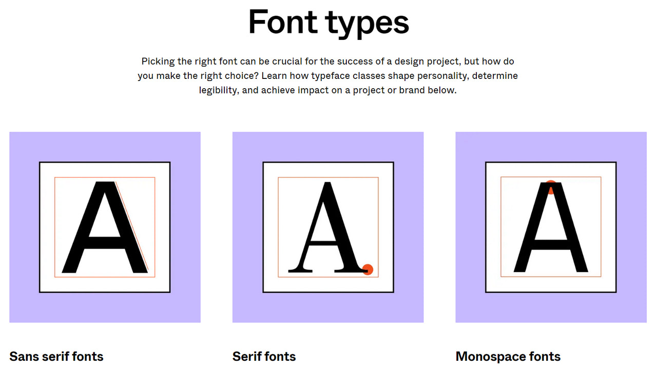
Check out Font Types by Figma – it is a small interactive guide that reveals crucial insights on when and how to use different font families.
Step 2 – Understand typeface personalities
When choosing a suitable typeface, it is crucial to understand the emotional side of your project. Reflect on personality, tone, and branding. Carefully consider the purpose of your storefront. Ask yourself what your audience expects to see from you. The emotional side of the typeface is vital in setting the right tone, establishing a proper atmosphere, supporting the central message, and amplifying brand identity.
Step 3 – Decide on the contrast
The variation between thick and thin strokes in each letterform plays a massive role in legibility and readability. Very high-contrast fonts may almost disappear, whereas very low-contrast fonts may lose definition and become blocky when scaled down too much. Therefore, choosing the typeface with the right level of contrast is crucial.
Step 4 – Perfect font pairing
Although most professional typefaces include features like italics, extended, bold, and condensed, providing ample font variations for different purposes, this can still be insufficient to create diversity in some projects. It is here where font pairing comes into play. After deciding on the primary font, you need to find the secondary and sometimes even tertiary fonts that support each other.
Check out the font pairing guide for Figma. Although it centers around Google fonts, this can be enough to understand how to pair different type families to achieve synergy. The guide includes type pairing palettes available to use instantly in Figma, saving you lots of precious time.
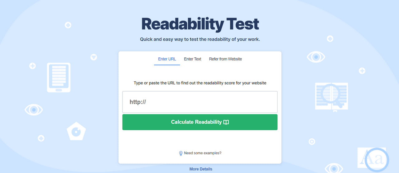
Step 5 – Test clarity, readability, and user experience across all screen sizes
Since some typefaces are deemed more readable than others, ensuring the optimal readability and clarity of your top font choice is vital. Use online font testing tools to assess these aspects. Preview large chunks of text and short headlines on various screen sizes, resolutions, and operating systems to spot inconsistencies.
Tools to Make the Most of Figma Fonts
Before moving to our collection, consider these helpful plugins created to make the most out of typography in Figma projects.
Figma to Siter

If you wonder how to convert your project from a Figma design into a working HTML/CSS website, saving all your precious styles, assets, and, most importantly, fonts, we have an answer – Figma to Siter plugin.
Siter is a professional website builder that occupies the top position in its niche. It provides a comfortable environment for non-tech-savvy users to create and publish entire websites without coding.
The best part is it integrates with Figma. In particular, it allows artists to transport their projects into real HTML/CSS-based websites without losing their styles and typefaces. Check out their tutorial on exporting the Figma project into Siter within minutes.
Better Font Picker
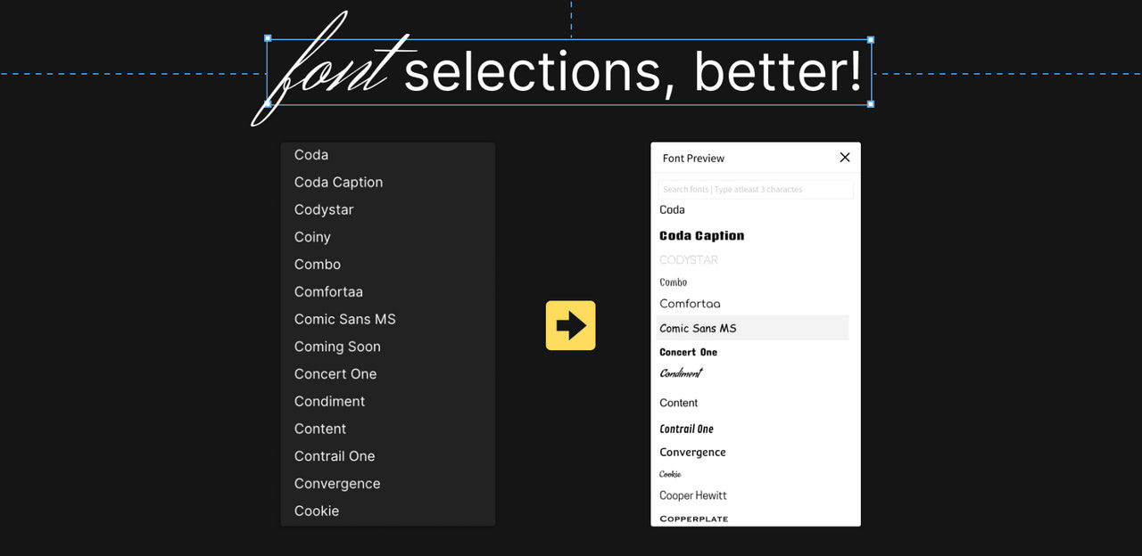
Better Font Picker is one of the most popular and in-demand plugins among Figma community members. Over 300,000 artists use it daily, streamlining the workflow and making the most of typography.
The plugin lets Figma users select fonts with a quick preview of how they look in real projects to make an informative decision. It works only with the list of installed fonts in your system; therefore, make sure to add the necessary fonts beforehand.
Font Replacer
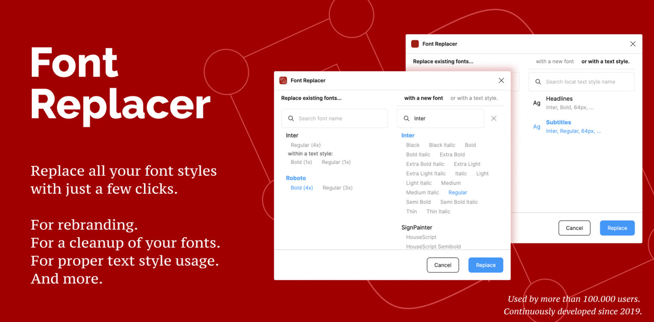
Font Replacer is another popular Figma plugin that helps users maximize the work with the typeface inside the project. It allows artists to replace all selected font styles with just one click, drastically speeding up the process. Just point out the text layers you need and choose which of the existing font families or styles you want to replace. Click the button and enjoy the result.
Alternatively, Font Replacer may locate text layers with a specific font, replace missing fonts, and handle edges.
It is important to note that this plugin is premium. However, it allows five free replacements per Figma file if you want to see it in action.
Font Fascia
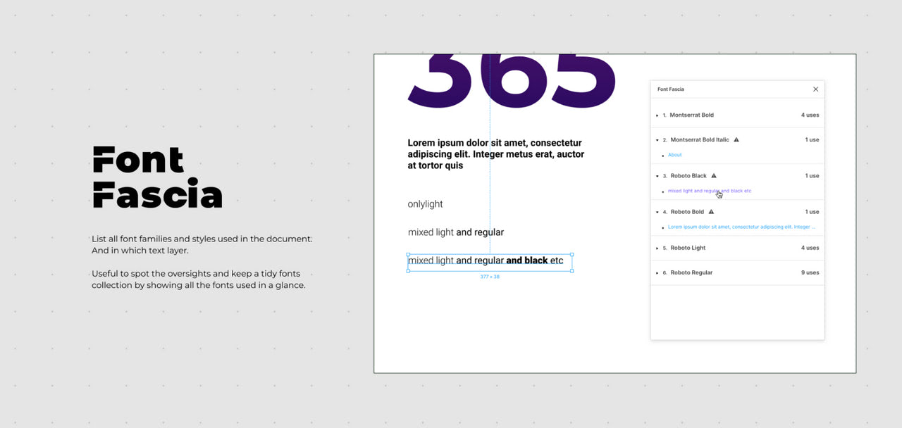
Every Figma project may get messy, but there is a way to create order out of chaos. Use Font Fascia. It was developed to instill organizational structure in projects without much effort or technical skills.
It lists all font families and styles used in the document specifying each text layer. You can use it to organize styles and layers and create a tidy font collection necessary for documentation.
Google Fonts
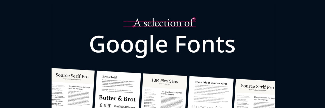
Do you want to jump into the Figma project right away? Then this selection of hand-picked Google fonts should be at your fingertips. Created with modern trends in mind, this collection includes the most iconic and popular font families available in the Google directory.
Each font has a specimen that shows a type in different scenarios and uncovers its unique style, informational hierarchy, and emotional range.
There is more. Check out Google Fonts: Pairings – a meticulously designed guide for perfecting the pairing of Google fonts.
Text Color Contrast Checker
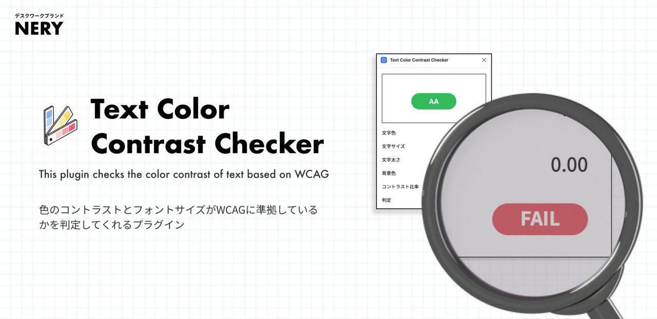
Evaluating the contrast of text is crucial to ensure legibility and readability. The good news is Figma fans may do this right inside the platform using this fantastic plugin.
Although it is not as multifunctional and all-embracing as professional platforms on the web, it is still enough to check the vital contrast ratio. The plugin analyzes the contrast between the color of the text and the background using WCAG standards. It considers font qualities such as size, color, and weight to provide an accurate result.
How to Add Figma Font to Your Project
Figma allows you to import and use a variety of fonts in projects, regardless of origin. Check out these small instructions to make them available in Figma’s font list.
Use custom fonts in desktop-based Figma
To see custom fonts in your Figma projects done in a desktop application, install them on your computer. This way, the platform will access them directly, showing them in the Font list and making them available for the project.
Locate the downloaded file, right-click it, and select “Install” to make it a part of your system.
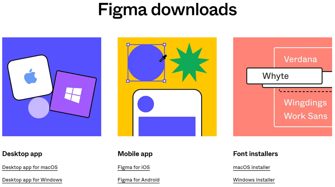
Use custom fonts in Figma online
When using Figma online, you must install the Figma font service plugin that allows you to work with fonts on your computer. Visit Figma Downloads to find the right service for your operating system. Follow the on-screen instructions and ensure the fonts on your computer are located by these paths /Library/Fonts for macOS and C:\Windows\Fonts for Windows.
After successful installation, the fonts will be available in the font picker.
Import fonts from Google
Figma offers native integration with Google Fonts. This does not mean it will feature all of them in your project right away. It just allows importing fonts ditching all the hustle and bustle of downloading and installing them into your computer.
Open the Text Tool inside Figma and click on the font dropdown menu. Find the option “Add more from Google Fonts…” It should be at the bottom. Locate the necessary font in the appeared window. Click “Add to project” to use it right away.
Conclusion
Offering several ways to use custom fonts in projects and many helpful plugins to make the most out of them, Figma proves once again that it is worth the hype. However, finding a suitable typeface that will provide an optimal readability level, create a pleasant reading experience, set the tone, and support the marketing side of the project is still your obligation.
With thousands of options to choose from, things can get overcomplicated. Start with our collection of 20 hand-picked Figma fonts to help level up your UI and UX design. They will give you a solid foundation to build your way up to the perfect typeface for a project.
We have featured 20 fantastic Figma fonts that are the perfect starting point. Some are great for displaying long texts, while others thrive in headlines. Some have a dual nature that makes them perfect for both jobs. Remember that whatever choice you make, it is crucial to ensure a high readability level across all screen sizes.