

Latest Articles
-
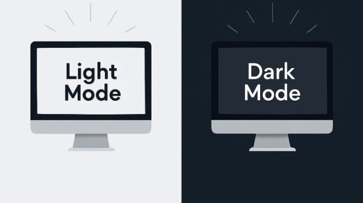
Dark Mode Websites: Web Design Tips, Examples & Best Practices
You open your laptop at night. The screen blasts white light into your face. Your …
-

How to Make an Animated Website That Stands Out: Step-by-Step Guide
You click on a new website. The page loads, but nothing appears to move. No …
-
11 Necessary Website Pages To Include In Your Website
Designing a website without a clear structure is like building a house without a floor …
-
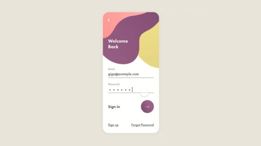
Beautiful Examples of Login Forms for Websites and Apps
Login forms are one of the most important user interface elements in mobile applications and …
-
30+ Examples of HTML5 Websites
Creating a website that effectively represents your company, engages potential customers, and fosters conversions requires …
-

Seasonal Icons: Winter Inspiration and Free Packages
It is hard to argue that winter is a marvelous and magical season. Being a …
-
Examples of CSS Website Designs for Inspiration
The expansion of modern technologies like WebGL or Three.js has opened numerous doors to the …
-
Beautiful Examples of Sliders in Website Design
Sliders in web design are one of the most controversial user interface units. Some people …
-
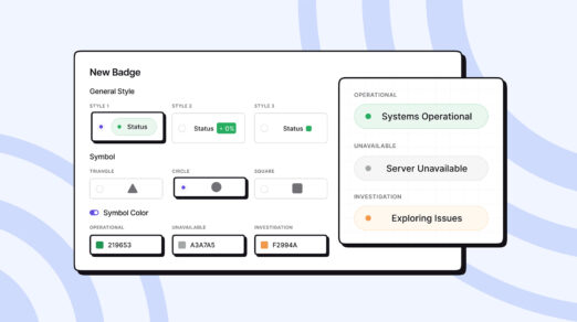
Best Status Website Badge Examples: How to Customize the Design
Do you know that visibility of system status is one of Jakob Nielsen’s 10 heuristics …
-
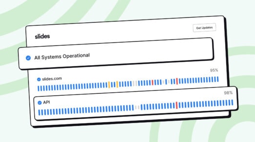
Best Status Page Examples: Advanced Customization, Design, and Incident Reports
Expect companies to embrace transparency in platforms to reinforce relationships with the digital crowd and …
-

Best Landing Page Examples You Need for Inspiration
The landing page has become a surefire way to reach out to customers these days. …
-
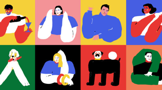
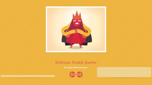
Examples of How to Use People Illustrations on Websites
In the bland world of typical user interfaces, fully illustrated projects with artistic charisma and …
-
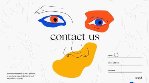
Examples of Creative Contact and Web Form Designs
Good contact form design means big things for your business. According to statistics, 74% of …
-
Best Examples of Websites That Use Slides App
By now, you’ve probably heard about Slides website builder, an easy-to-use website builder that helps …
-

Best Website Examples that Use Startup App
This article is a case study in websites built using Startup app. We have compiled …
-

4 Step Process for Testing New Product Ideas with Landing Pages
Using landing pages to test new product ideas is a smart strategy. And, it’s not …
-
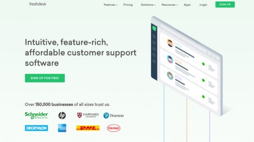
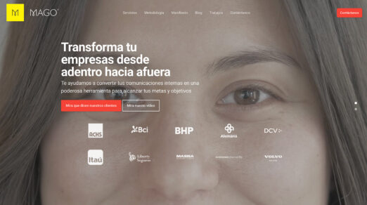
Adding Social Proof to Your Website with Client Logos & Press Mentions
One huge concept that many designers overlook on their landing pages is social proof. This can …
-

Tiny Trend: Mouse Interactions
Micro-interactions were one of the biggest trends in 2017. Like a Bitcoin, it was the …
-
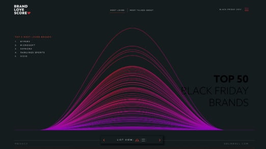
10 Websites with Data Visualization Driving User Experience
As an instrument for enriching user experience in website design, infographics have come into our …
-
Playful Physics – Liquid in Web Design
Physics explains things around us. Whether it is a natural phenomenon or a device created …
-

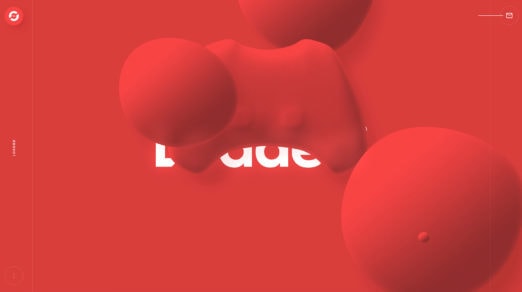
Globes and Spheres – 3D Circles in Web Design
Last year we saw a passion for using plain geometric shapes in interfaces: rectangles, triangles, …
-
Modern Take on Patterned Backgrounds in Web Design
First, brutal designs then, gradients and now there is another trend from the past that …
-
10 Distinctive Features of Japanese-Style Web Design
Many of Japan’s distinctive features can also be found in websites from that country, including …
-
10 Original Ways to Slide Out a Menu in Web Design
The slide out menu came to life right with as a popular option for mobile …