Examples of How to Use People Illustrations on Websites
In the bland world of typical user interfaces, fully illustrated projects with artistic charisma and a personal touch feel like a fresh breath of air. Users guzzle creativity. Therefore, websites using people illustrations produce a profound impact on human minds, naturally transforming them into fans of your brand.
Illustrations in web design are an effective visual device that establishes a one-on-one communication with the audience. Giving imagination a concrete shape and company a solid foundation, they do precisely what is needed for your business to thrive: clarify a concept, deliver a message, promote a brand, appeal to an audience, and leave a long-lasting impression. Let us take an in-depth look at people illustrations to see how you can benefit from this powerful mechanism.
Types of Illustrations
Since illustrations come in all shapes and sizes, it is vital to categorize everything as part of a bigger picture.
Generally speaking, there are two types of illustrations: Traditional ones that include hand-drawn artwork and modern styles that include pieces created in digital software like Photoshop, Illustrator, Sketch, 3Ds Max, etc. Both types come in diverse forms.
The most popular traditional forms are:
With Postcards Email Builder you can create and edit email templates online without any coding skills! Includes more than 100 components to help you create custom emails templates faster than ever before.
Free Email BuilderFree Email Templates- Charcoal illustration
- Lithography illustration
- Watercolor illustration
- Acrylic illustration
The most popular modern forms are:
- Flat illustration
- Outline illustrations
- Doodle illustration, including both pencil and sketchy illustrations
- Skeuomorphic illustration
- Low-Poly
- Pixel art
- 3D illustration
Each type has merits. Pen and ink illustrations are noted for precision and detailing; watercolor illustrations are famous for the depth and beautiful mixtures of overlapping colors; hand-drawn artworks ooze fineness that instills a sense of sophistication and doodle illustrations feel fun and easy-going.
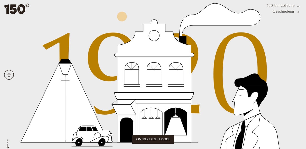
Current technology allows you to reproduce, or to be more precise fake, any of the traditional forms, granting you a vast toolkit to shape your idea and message effectively.
De Bijenkorf 150 Jaar
Different Genres
Although it is almost impossible to capture the diversity of artistic techniques, nevertheless, Illustrations can also be divided into groups according to a specific genre. For instance,
- Concept art
- Fantasy illustrations
- Gaming illustrations
- Fine Illustrations
- Children’s art
- Comic books
- Editorial illustrations, those that are seen in books, magazines, printed media
- Advertising illustration and some others
Whatever genre you are falling for, if it features people, it will undoubtedly draw attention since human-centric artworks catch an eye in the cold, faceless digital habitat.
Use of People Illustrations in Web Design
Much like in real life, illustration in the digital world is a form of graphics used for visually explaining a concept. And when people illustrations are involved, this explanation transforms into an enjoyable, eye-pleasing, and refreshing experience.
When done right, web design using people illustrations does such things as
With Pulsetic you’ll be instantly notified the moment your website, API, or server becomes unavailable. Monitor uptime from multiple global locations and respond to incidents before your users are affected.
Create beautiful status pages in minutes to keep customers informed during outages and build trust with transparent communication.
Start Monitoring for Free- Create an extension of your business
- Tell a story about your brand
- Connect with customers on a personal level
- Dispel negative misconceptions
- Deliver the idea in the visually-stimulating shape
- Clarify important points
- Create an emotional message
- Strengthen the overall message
- Develop a theme
- Set the mood
- Add artistic flair
- Reinforce personality
- Hint on creativity
- Bring about long-lasting impression
- Make a site memorable
People illustrations are widely used for various projects. One thing you can say for sure, they are a mainstay of personal portfolios, landing pages, SaaS websites, and storytelling experiences.
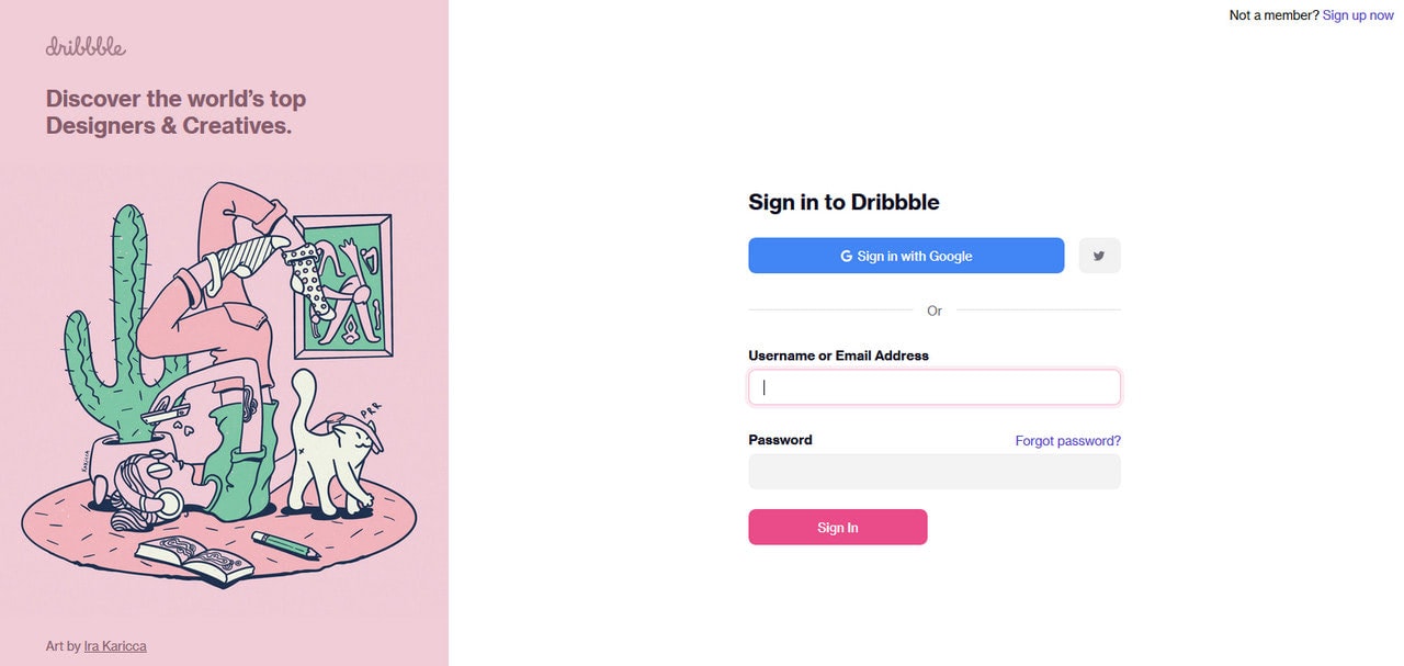
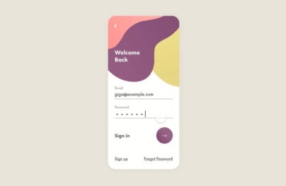
Dribbble Sign In Page
How to Use People Illustrations on Websites: Tips
There is no single formula. However, certain recommendations may help capitalize on the effect produced by people illustrations in web design, exploit its full potential, and not make everything about the visuals.
- Do not add an illustration just to fancy up your website. It is a powerful visual device and can easily outshine other content. Therefore, use it only when it is necessary.
- Content is king, always. Either make it a star of the show or skillfully mesh with the artwork.
- Pay attention to color. Dark tones may evoke gloom, too many light hues may create a relaxed atmosphere, and too much red may scare people away. Choose tints and shades that produce a positive impact on human brains like green and blue. Alternatively, you can place your brand colors in the heart of the coloring and create a complementary palette.
- Size matters. Illustrations can be overwhelming, especially when they occupy the entire screen. Ask yourself if it is necessary to use a drawing as a background? Maybe a mid-sized or even small piece will do the same thing.
- Use typography. When you have illustrations on board, it is vital to think through all the details. Typography is one of those elements of a user interface that can serve as a visual device as well. It should not contradict with the art pieces. Therefore, it should be picked thoroughly. Remember, too many decorative details may ruin everything.
- Focus on readability. Choose a neutral font face for text and another for headlines.
- Whitespace is of huge importance. Airy and spacious designs are handier to use than the tightly packed. Use whitespace to create balance and harmony.
- Do not overlook accessibility. Illustrations are mere pictures. Therefore, first, make sure that people with poor vision may perceive them without much trouble. Equip all figures with alt information for assistive technologies.
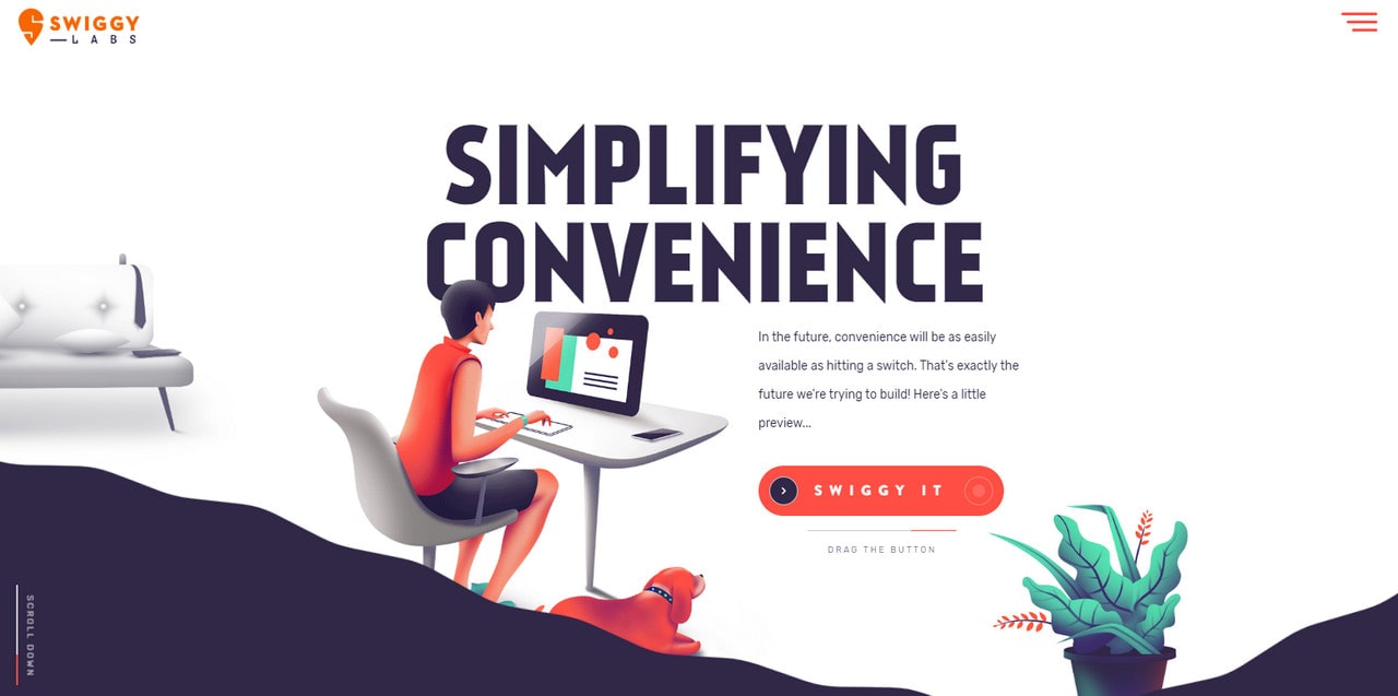
Swiggy Labs
Free People Illustrations
If you do not have design skills or time to create everything from scratch, you can easily try a free pack of people illustrations. We have picked some of the best for you. Surf web if you need more.
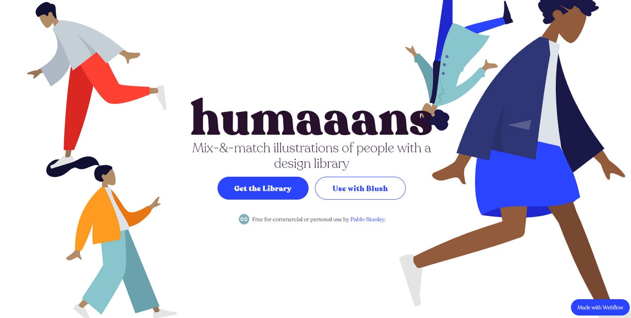
Humaaans
The first in our list of free packs of people illustrations is Humaaans.
Humaaans is a library created by talented Pablo Stanley, where all works are available free for personal and commercial projects. Its key feature is that you can easily mix and match elements to create your characters and even scenes. You can select hairdos, tops, bottoms, standing poses, and sitting poses, as well as background scenes. Rotate, position, and color them to shape your message according to your needs.
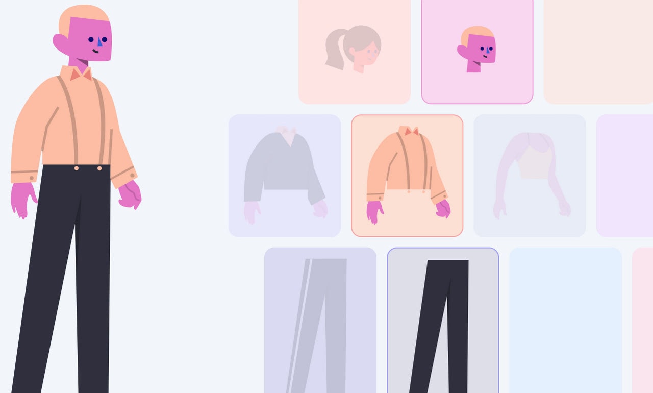
While the previous source is a library of characters and their parts, this one is a sterling generator with a handy interface to frame your idea. It uses cute people illustrations created by Craftwork.
By default, it comes with 25 characters and 50 background objects. However, by mixing such details as head, body, bottom, and color, you can create as many unique personalities and scenes as you want. On top of that, you can introduce even more changes using Sketch and Figma.
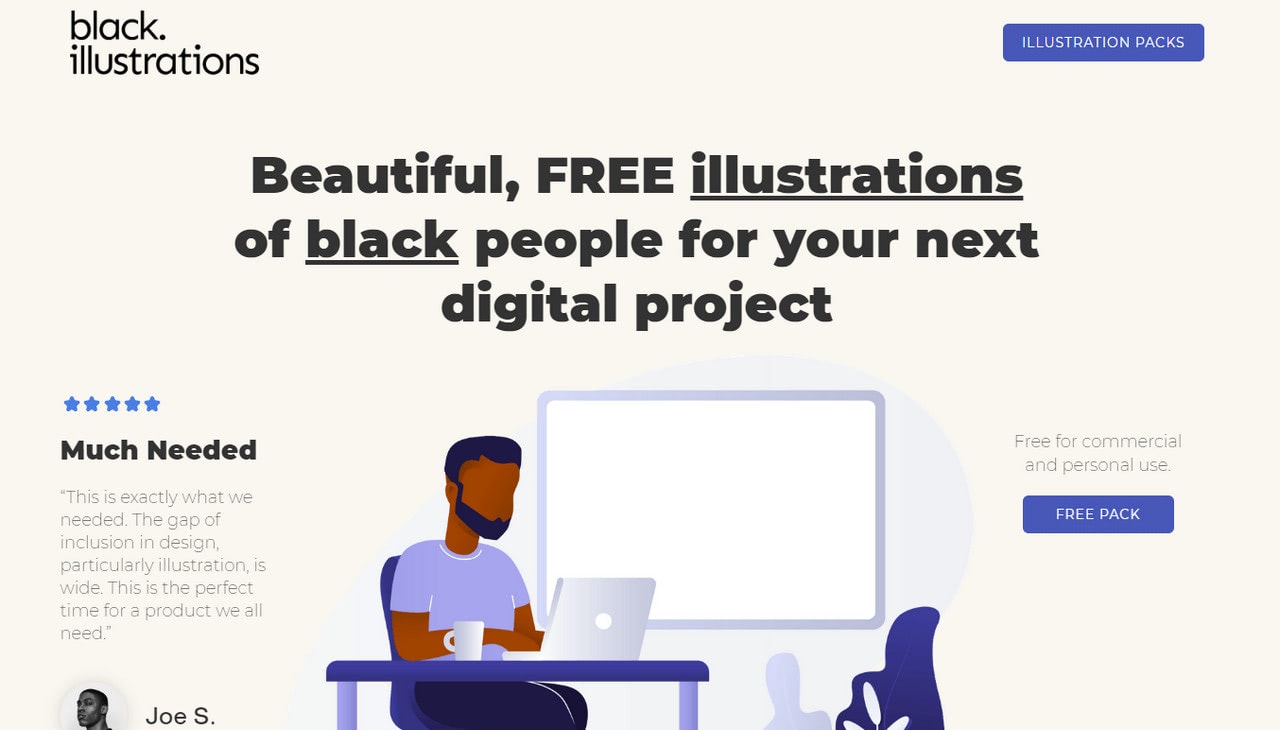
With BLM getting more attention, we could not help but include a resource that offers free illustrations of black people. Even if you want to stay neutral, diversity never hurts. The library includes more than 40 images in all popular formats such as Illustrator, Photoshop, and Sketch. Although it is not as flexible as the previous one, nevertheless, it is enough to add diversity to the projects.
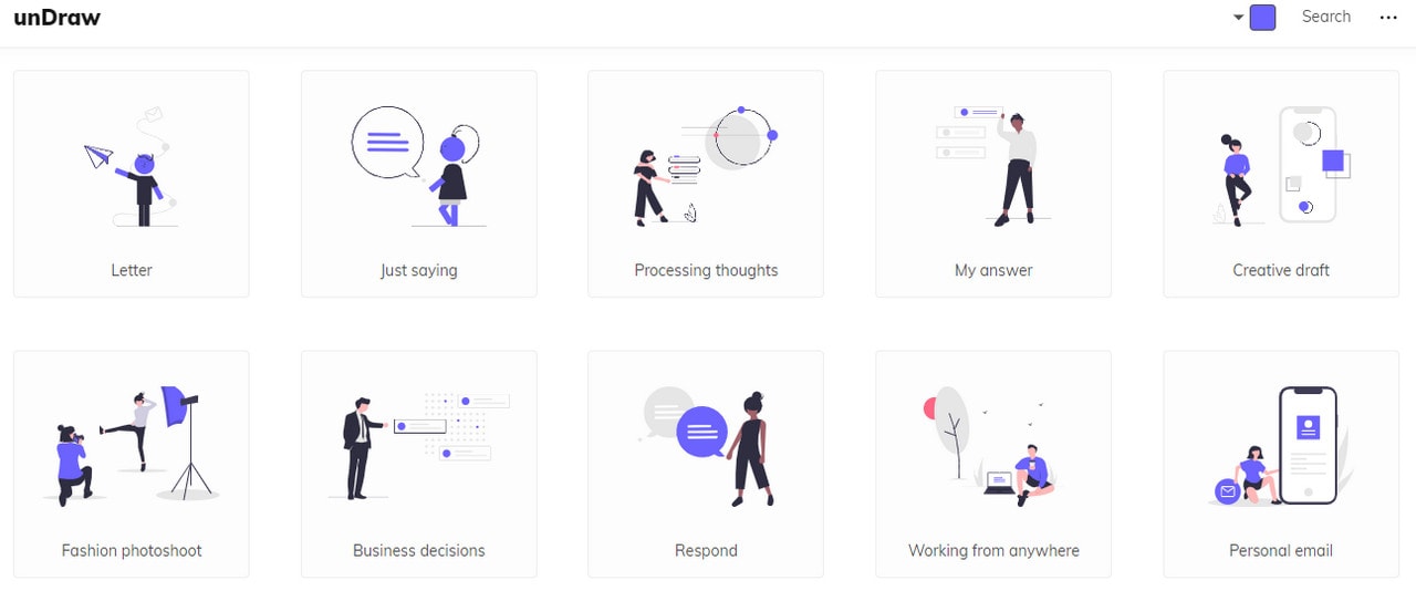
unDraw
unDraw is a growing collection of vector images where you can get lost in the creativity and artistry. Here, human illustrations occupy the central position. They represent different concepts that fit numerous businesses, from personal projects to digital stores. For instance, you can find artworks that depict fashion photoshoots, freelancing, customization, thinking, and much more.
All the pictures are available free of charge for personal and commercial projects. Play with the online editor where you can set the primary color to find the best match for you.
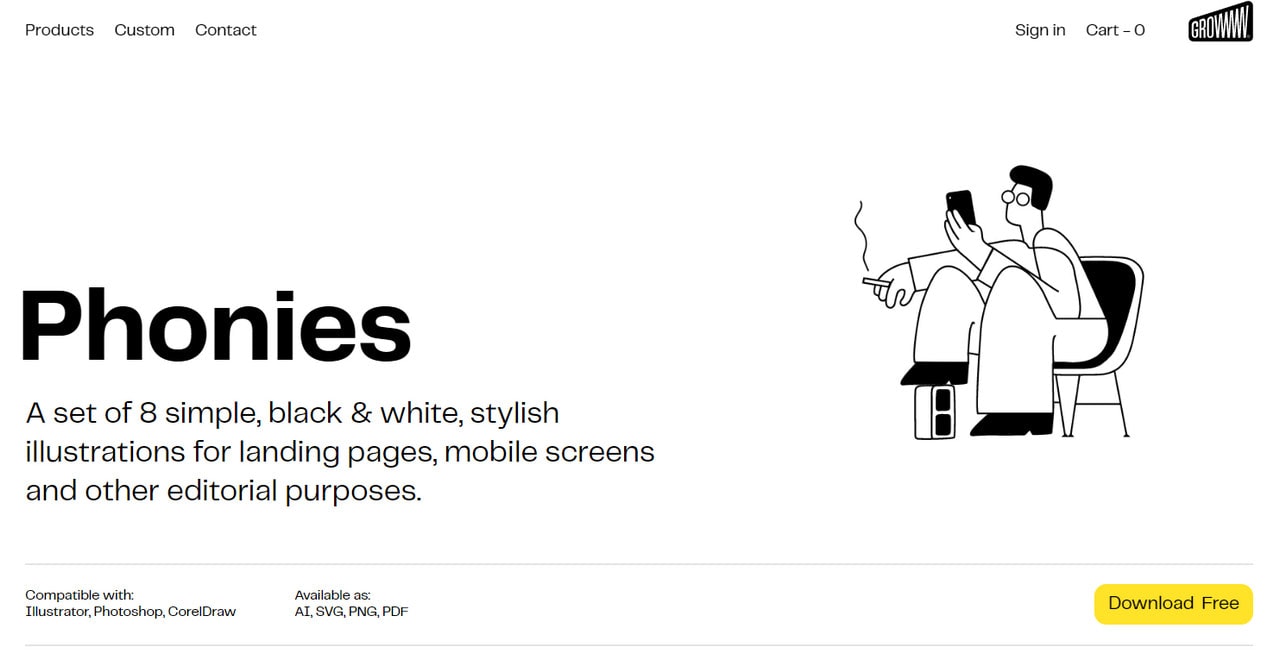
Phonies
This free pack of people illustrations created by Bbbrick includes just eight black and white pieces. Quality over quantity. The idea behind this package is relevant to the current mobile-obsessed target market.
As the nameplate states, you will find illustrations of people who are using cellphones. Each piece clarifies the concept: some of them can be used to show multitasking or problem solving, while others may come in handy when you need to portray a relaxed atmosphere.
Each item is compatible with Photoshop, Illustrator, and CorelDraw.

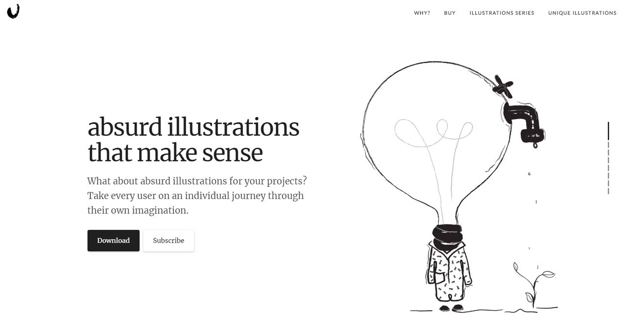
Absurd design is a unique collection of abstract illustrations that not just give your users food for thought but also encourage their imagination to run wild. There is no accurate depiction of reality. Each piece carries more than one meaning. This makes it a perfect visual material for those who want to capitalize on creativity, add artistic flair to the project, and save a website from feeling too serious and boring.
There is a free pack that includes 15 images in PNG format that are available for personal and commercial projects. If you need more, you may enjoy a premium bundle that opens the door to more artistic and prolific approaches for producing unique and memorable impressions with the interfaces.
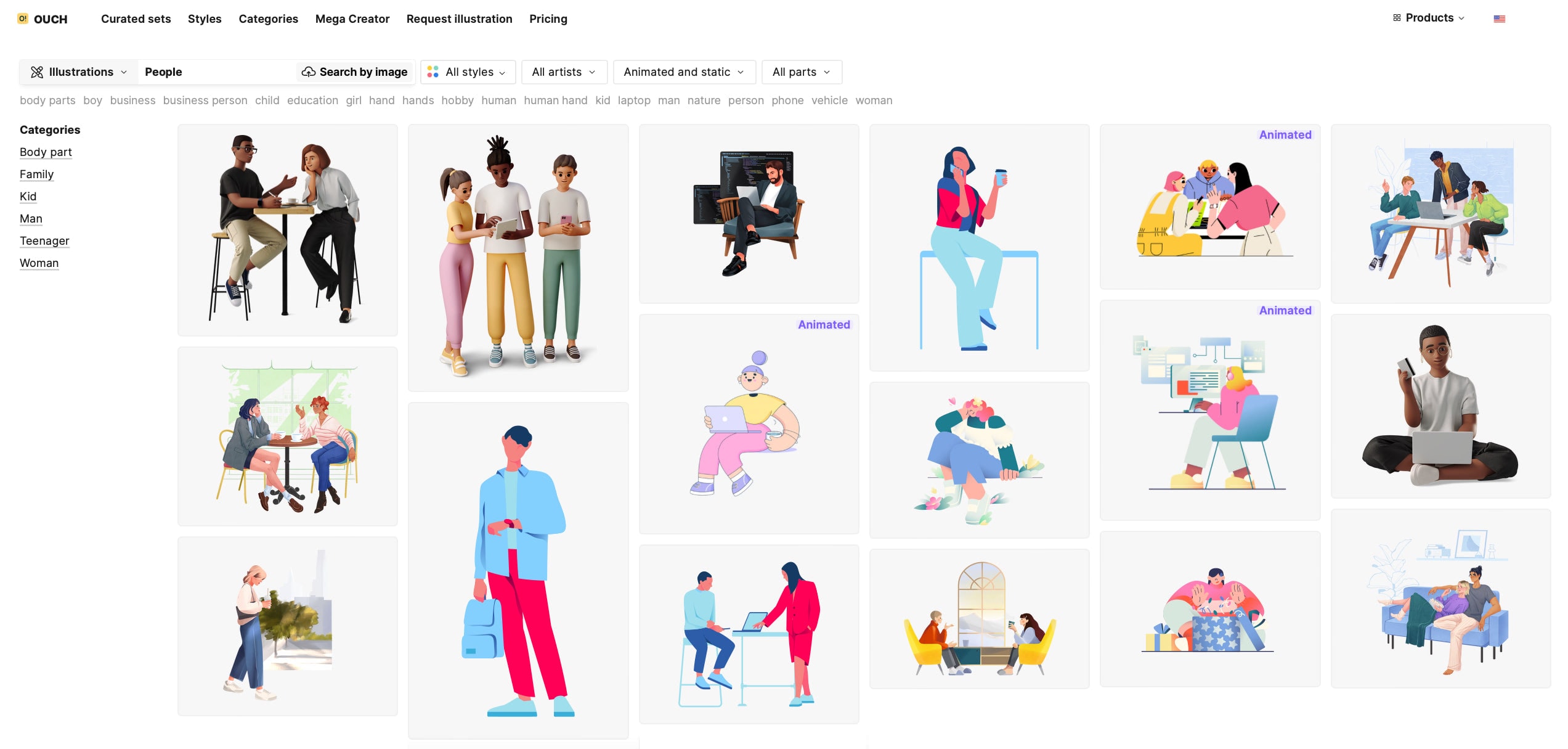
Ouch
Ouch is the ultimate library of high-quality vector, 3D, and animated illustrations, featuring a vast collection of people illustrations in over 140 styles. Whether you need images of office workers, friends, or family, Ouch has them all. Each illustration is crafted with meticulous attention to detail and is available in a variety of formats, making integration into any creative project a breeze.
Examples of Websites Using People Illustrations
The web is rich in examples of design using people illustrations. The trend evolves. Let us dive into a collection of modern websites using people illustrations to draw inspiration and see how to do it appropriately.
The first is Gamer Moms, where simple illustrations prove that you do not need to be bright or highly detailed to deliver messages to the audience and leave quite an impression.
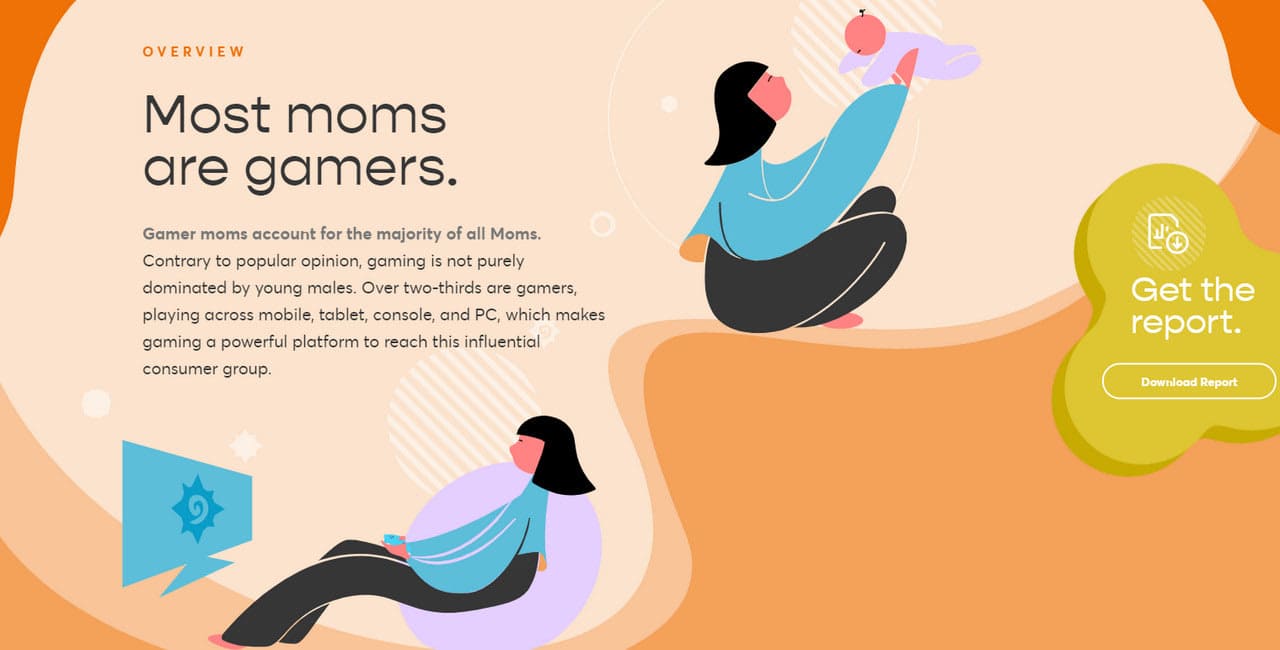
Gamer Moms
Simple illustrations work – actually, the simpler, the better. With straightforward artwork, you can easily bring home the proper message, and be sure that people will understand you correctly.
Gamer Mom’s user interface is simplicity at its best. Here each piece is a small yet effective visual device that stands for itself. It accompanies every key aspect of the project.
Note several things. The human illustration is an obvious choice; nevertheless, it is still able to surprise. The entire website has an illustrated environment that turns the project with statistics into a memorable storytelling experience that easily digests. Finally, some of the pieces are set in motion to bring energy and pull users deeper into the World.
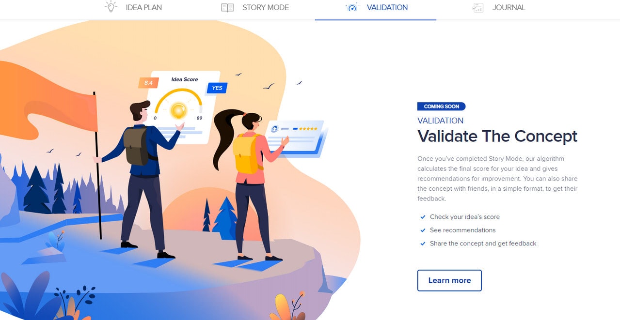
The team behind ideaBuddy continues a long trend of semi-flat art but adds a more realistic perspective to it. They have skillfully played with overlapping techniques, grainy textures, subtle gradients, and airy and lighter shades to fake a sense of beautiful depth. As a result, we – the online audience – can witness a cleaner web design layout on the one hand, and sophisticated entourage, on the other hand.
Each human illustration perfectly grasps the idea, and effortlessly communicates the brand message. It looks like it has been turned into a canvas that underlies the entire project.
Note two things. First, color. It is just mesmerizing. Here, blue is at the core. Digital entrepreneurs favor this tone for its ability to create a sense of stability, reliability, and trustworthiness. Therefore, pictures evoke positive emotions.
Second, smooth shapes. There are no acute angles or broken lines: everything is soft and gentle. The illustration is flowing. It is incredibly pleasing to the eye.
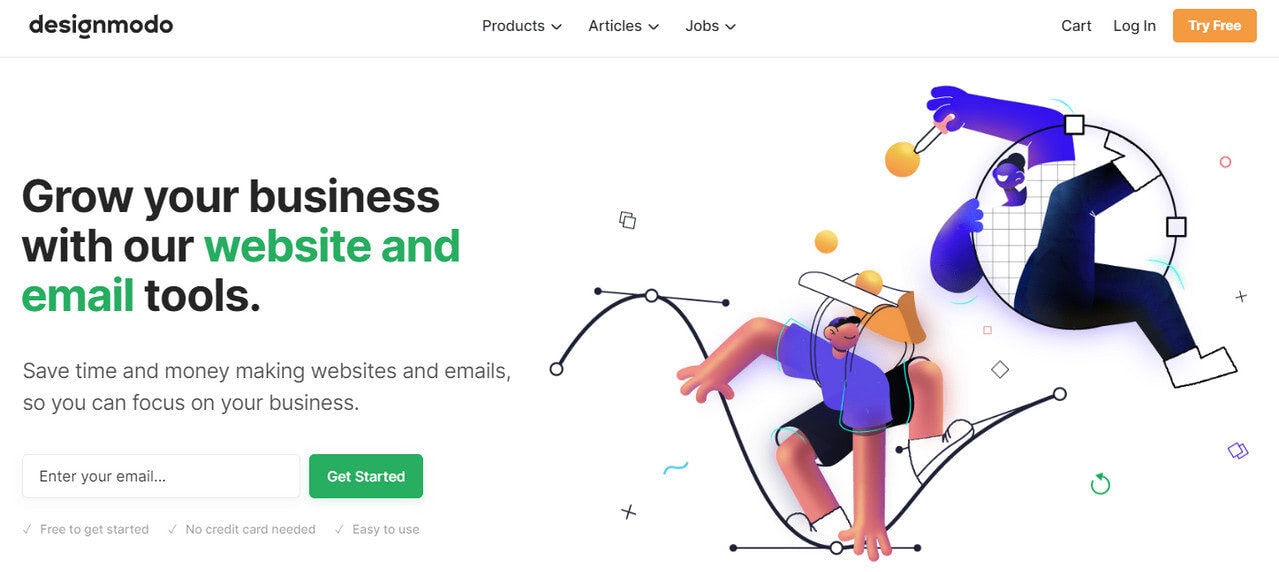
The creatives behind Designmodo have opted in favor of a narrative kind of people illustration to represent text content. It supports the introduction in the hero area and “Team” block right near the footer. It opens and closes the story providing a high level of clarity to the visitor and communicating the artistic nature and high degree of team’s expertise in design.
Note several things. First, the illustrations have a 3D feeling that stands in contrast to the almost flat website. The characters seem to jump out at you. Second, the personalities are so playful that they instantly establish a friendly atmosphere. Finally, illustration coloring nicely complements the primary palette with green, orange, and blue setting focal points. The team has done a delicate work to create this unique kind of harmony in the project.
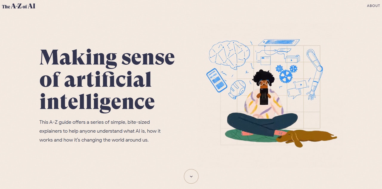
The A to Z of AI
Conveying complex ideas through imagery that hooks user’s memories is what this user interface is all about. There are no lavish artworks like those that are made with watercolors: everything is clean and neat, though still detailed.
Unlike the previous example, where people illustrations occupy the central position, here they are used only when necessary. Nevertheless, it is enough to add a warm human touch to such a cold theme, like artificial intelligence. Also, they play perfectly well with other artworks scattered throughout the entire project. We can enjoy a fantastic, consistent, and most importantly, unobtrusive storytelling experience.
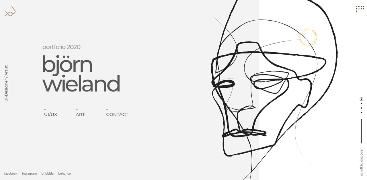
Personal Portfolio of Bjorn Wieland
It is something you do not see every day. The hero area features an incredible hand-drawn human illustration that instantly engages with its peculiar look. Thanks to the pen style, everything feels airy, subtle, and sophisticated. It is a unique symphony of lines. Even though the piece is minimal, it still oozes lots of creativity. And it certainly effortlessly blends into a clean and neat interface.
The line style illustration perfectly echoes with ultra-thin elements of the interface like hamburger button, slider pagination, and dots. The artist goes for vertical orientation for some components that add to the peculiar side of the project. The coloring, typography, and logotype are in sync with the artwork creating a common space.
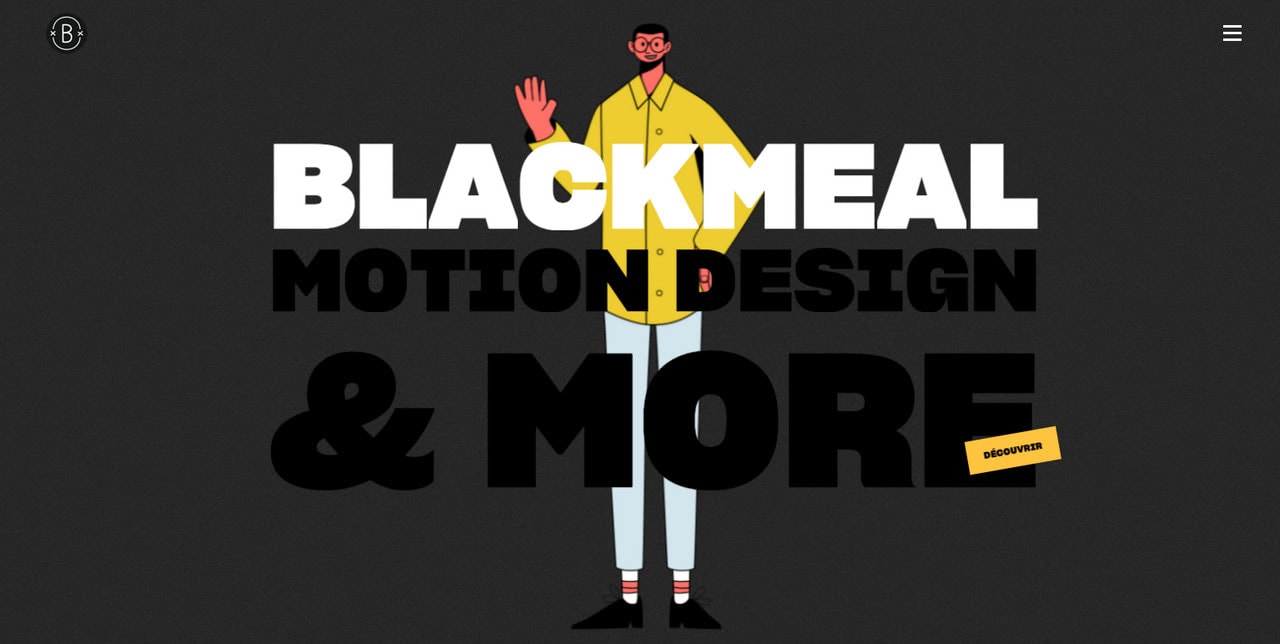
Blackmeal is a smart symbiosis of storytelling experience and a traditional corporate website where human illustrations convey a cohesive visual identity. The theme is skillfully woven into the design. While the content is dished up in an organized and structured manner, the hero area and team section are used to reveal the creative side of the agency.
People illustrations are incredible, especially for the “Info” page. However, they do not steal the spotlight, giving way to more important content. Very smart.
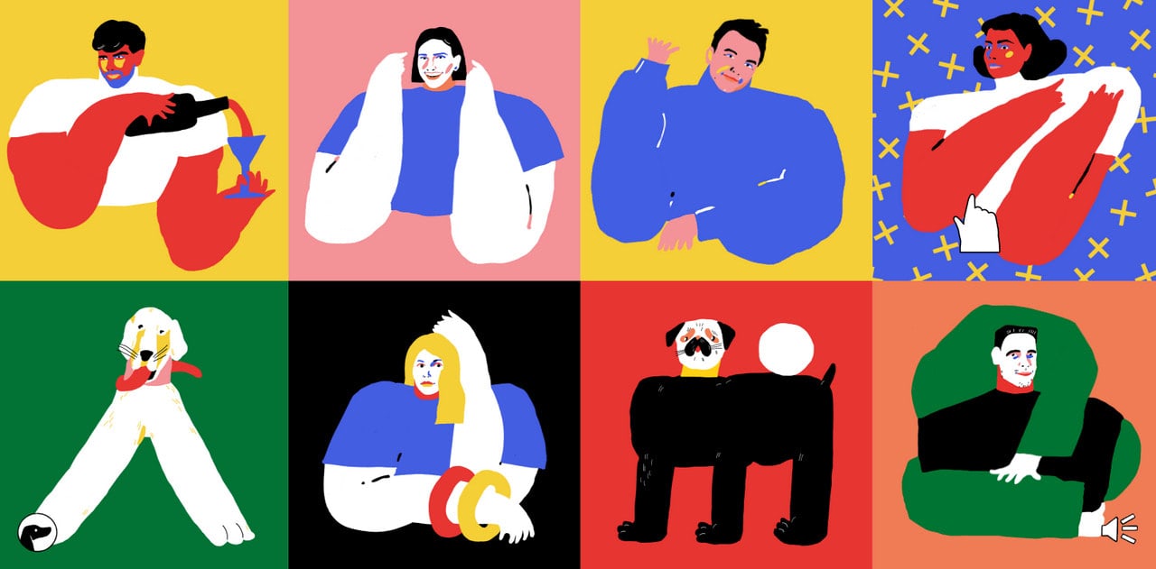
Tubik Family is a single page dedicated to agency members. Here you will find only staff skillfully introduced to the online crowd. Each person has its cartoonish version that was made with his or her charisma in mind. In addition, each piece is charged with motion that makes the message behind each individual clear.
This unusual approach creates a unique mood that is hard to beat and undoubtedly hard to resist. You feel like creative juices flow right from the screen. It is one of those rare cases when the website is rich in numerous personalities; however, it does not feel messy nor chaotic. On the contrary, all the souls sing in unison, creating harmony.
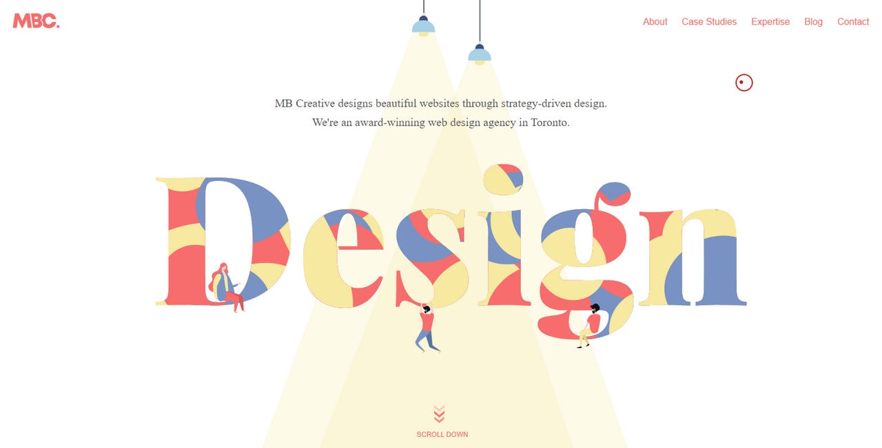
MB Creative
Little people add to the charisma and unique approach of the official website of MB Creative. Much like in the previous example, people illustrations are also set in motion. This time they are almost alive: they jump, run, and fool around. In a word, they draw attention. However, thanks to their tiny size, they do not distract attention from important things such as content. On the contrary, they unobtrusively point out vitals.
Note the team has used the same theme for all design elements, including people illustrations. They have skillfully interwoven photos and fancy drawings, bringing about unique collages with an artistic vibe and bright nature.
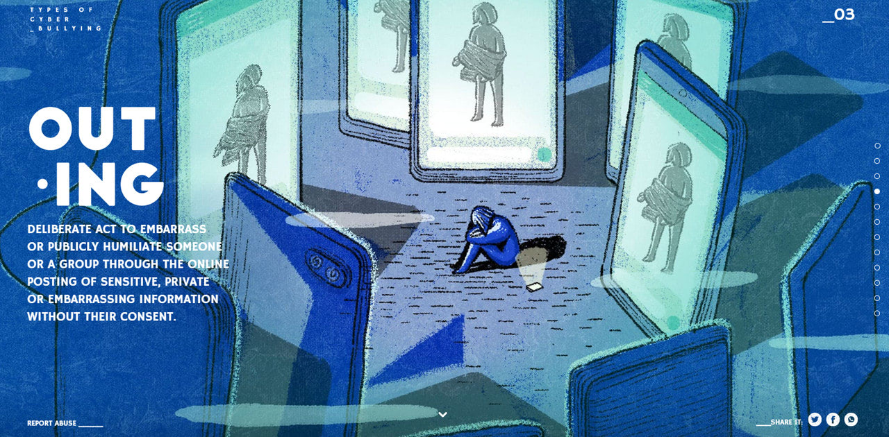
This social project has relit the torch on a classic style. Gorgeous coloring, grainy textures, pen and chalk touches – this kind of people illustrations is noted for its detailing and depth.
Here, we can witness how art bridges the gap between people and terms. Not only does the team visually describe the concepts, but they also establish a mood and atmosphere to make a more significant impact. At some point, these artworks remind works of gifted Marie Cardouat, who stands behind one of the most popular card game Dixit. They are as meaningful and dreamlike as hers.
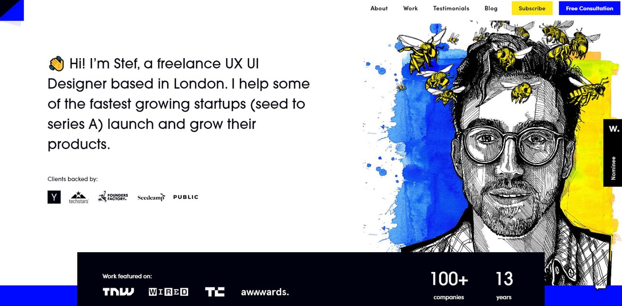
Personal portfolio of Stef Ivanov
One of the obvious places to find people illustrations is, of course, personal portfolios. Self-portraits are increasingly popular among artists. After all, your face is your brand.
The personal portfolio of Stef Ivanov is a case in point. It features a beautiful self-portrait made in ink and pen. When hand drawing is involved, it always feels like the art has a soul. Indeed, the portrait has a warm personal touch that instantly appeals to the audience. It seems like it is staring at you. With such eye contact, resistance is futile.
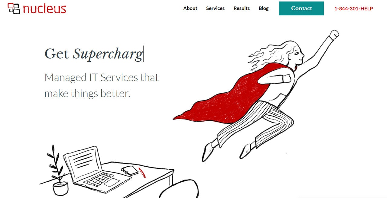
As we have said, illustrations are famous for their diversity. Different genres find their rightful places in online projects, and the superhero theme with comic book inspired form is no exception. Nucleus gives us a perfect example of web design using people illustrations with superhero motifs.
The crew has skillfully exploited a concept of humans with extraordinary abilities to make their company look reliable and establish themselves as true problem-solvers. Hand-drawn realization gives the project a powerful personal appeal. It feels warm, artistic, friendly, and trustworthy.
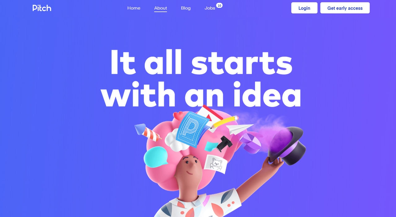
When it comes to illustrations in web design, there are no undisputed leaders. Even though flat design dominates the web, the world of art still has its own rules and preferences. Pitch is one of those examples that proves everyone that 3D characters have their niche.
The team used beautiful 3D illustrations that win over the audience with bright colors and cute cartoonish flair. Each scene is rich in details that you want to explore immediately.
This prject does not pursue a goal of faking reality: people illustrations have a powerful artificial vibe. This approach works perfectly here since it reinforces the brand image and instills a sense of sophistication.
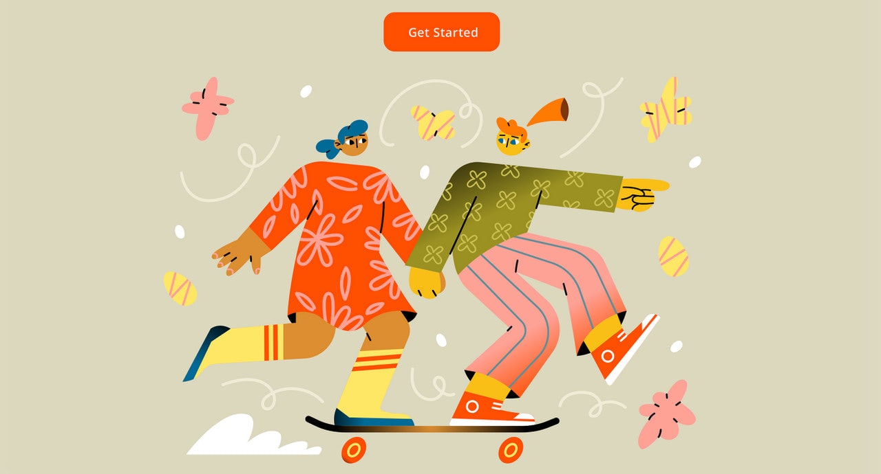
Jose Illustration by Ksu Angeltseva
Here, the use of people illustrations clearly plays a primary role in creating overall entourage, setting the mood, and establishing atmosphere. The hero area is centered around this fancy illustration with strong autumn vibes. However, thanks to the soft earthy color palette and monotone background, the content has a solid base.
The great thing about this artwork is that the author has abstracted from flawless silhouettes unveiling the charisma of characters with the help of imperfect forms. It is just what the doctor ordered for the World that is fighting against stereotypes.
Conclusion
Visual communication is a powerful mechanism. Web design using people illustrations is vivid proof of that. Illustrations interpret complex terms, clarify tangled situations, and portray problem-solving approaches without boring users to death.
Among the whole diversity, human illustrations are those that most appeal to the audience. They feel familiar and friendly. We can read them without extra effort. Therefore, they are perfect tools for bridging the gap between the interface and online audience, creating a one-on-one connection, and leaving a memorable impression.
