As we wave goodbye to 2015, it’s a good time to look back on some of the great design this year has had to offer. Many of the trends of 2015 showed up in the best website designs (and redesigns) …
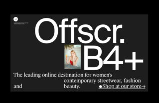
In terms of color psychology, black is associated with mystery, aggression, evil, authority, elegance and strength. It can convey a broad range of feelings and emotions, covering both bad and good, and producing a high effect. It is widely used …
As Google stated, the material design icon is an integral part of visual language used in web and app UIs; icons must be clear to all. To speak to any user, these tiny illustrations not only should be intuitive and …
Loop is a Boolean attribute of the video tag in HTML5 that is supported by the latest versions of modern browsers, including IE 9.0. It specifies a series of short movie clips that start over and over again. This feature …
Using After Effects for user interface animation prototypes is a huge trend among designers. Dynamic gifs that vividly reveal workflow of upcoming apps has taken the community by the storm. Whether you showcase a primary navigation center that should slide …
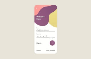
Some say that with three-tone coloring it is quite difficult to go wrong. This number of colors is considered to be the golden mean creates beautiful and eye-pleasing aesthetics while staying vibrant and vivid. This rule can be safely applied …
It is quite difficult to break away from a standard grid structure, with a system of well-organized columns and rows placed at regular intervals to provide a stable and responsive framework for multimedia and content. Sometimes the foundation is entirely …
Creatives of world’s smallest continent have never suffered from a lack of stimulation, just take a glance at the best Australian website designs to see it yourself. Being inspired by mind-blowing indigenous aboriginal masterpieces, and at the same time, having …
Who would have thought that a popular approach for mobile app developers would come in handy with iconography? Designers are eager to apply this trick even to the tiniest things — user unterface icons. To be completely honest, keeping icons …
With highly popular flat and solid icons, line style glyphs rule the roost this year. They have found their place not only in traditional control centers, navigation bars, social media widgets or pagination but also in an inner structure such …
Apple Watch is one of the hottest products of the year. Designers are going wild with their concepts for watch apps and mockups. Behance and Dribbble are filled with incredible, sophisticated and pioneering UI designs for the Apple Watch. If …
Rigorous attention to detail is what converts a simple design into a real masterpiece. Although it seems that regular users will not notice the difference, however, as practice shows they not just feel but also see it. It is like …
Meant to be really simple, functional, intuitive and memorable like any “road sign,” the hamburger menu icon stole the show last year and became an integral element of any modern website and mobile app design, though it has been with …
Used mainly in online stores in order to increase conversion rates, progress indicators make users pass the required procedures which are necessary to complete the purchase. Along with a shopping cart, it is the basis of quality and thought-out site. …
As with any integral detail of a user interface, menu design is changing with current trends. Some metamorphoses bring about positive results that refine user experience, but others can destroy favorable impressions. Following trends, especially when it comes to navigation, …
No one can argue with the fact that United States is a unique country, where numerous ethnic groups, races, nationalities, as well as different cultures and religions coexist; just as our list of the best USA website designs fascinates online …
Sketch App has a great number of fans who take delight in giving stuff to their colleagues. Sharing is caring and the community tirelessly follows this ideology. Regardless of your level of knowledge, skills or experience, you can achieve great …
When it comes to using of maps in website design, the unwritten rule is that regular contact pages are populated with Google maps to display location of a company/agency/shop/hotel etc. With just a little imagination and powerful helping hand provided …
An atmosphere of harmony, integrity and serenity is highly prevalent in Japanese-based website designs. Even if the project gets its flawless appearance from extravagant visuals or is driven by ultra-modern features or dynamic effects that should add some chaos and …
While the team at the Bohemian Coding continues improving its leading product, constantly revamping and reinforcing list of features, the designer/developer community does not just sit around, it also makes its significant contribution. Some give away pre-made graphic stuff that …
Easy and effective navigation menus effectively contribute to the user experience and improve search. Today, we are going to examine some interesting, original and even pioneering navigation solutions that are truly attention-grabbing and memorable. Some of which will be more …
“Keep Calm and … Design” is one of many variations of the original slogan “Keep Calm and Carry On,” a motto dating to 1939. Recent it has become quite popular around the globe again but also stimulates the creative crowd of …
France is considered to be the citadel of fashion and a cradle of numerous art directions and movements. Web artists, who live in such a fertile and inspirational environment, are destined to come up with original ideas, exquisite designs and …
Use of a Navicon is a web design trend that forces us to take a look at navigation menus, their place in design and role in user experience. Although the concept does not diminish its significance and importance of navigation, …