Beautiful Examples of Login Forms for Websites and Apps
Login forms are one of the most important user interface elements in mobile applications and websites login page with a members-only area.
Why are they so important? They are the doors to the world that you have created. People are always a flight risk when they try to fill in a login form page. Even the tiniest detail can scare them away. And there isn’t an alternative, you cannot remove the login form and just let everyone in.
Export Figma Designs to Live Website – No-Code
A well-designed login page should be intuitive to use, visually appealing, and safe for user information.
With Postcards Email Builder you can create and edit email templates online without any coding skills! Includes more than 100 components to help you create custom emails templates faster than ever before.
Free Email BuilderFree Email TemplatesIt’s crucial to think about the layout and color palette while creating a login page design. Make sure to speak in plain, short terms and to clearly display the login form. Users should have little trouble entering their login information, and the website should give clear feedback if there are any mistakes.
It is also essential to include security safeguards like SSL encryption and two-factor authentication. These precautions aid in preventing theft or unauthorized access to user sensitive information.
Let us get to the basics of login forms, consider good UX tips, get clues from beautiful login form examples to find out how to create a pleasurable experience, and eliminate user obstacles.
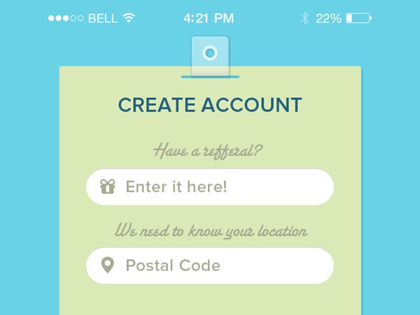
Login Form Design Page Essentials
Unlike other types of user interface forms, login forms do not come in all shapes and sizes. They are limited to the number of fields that are used. The reason for such a minimal and capsule approach is trivial: people do not like to fill in forms. You cannot be pushy by asking for too much information. These forms should be simple, familiar, and straight to the point.
As a rule, the login form includes two inputs, links to alternative scenarios, and a submit button. Even though you have to be concise, still there is plenty to choose from:
- Username field
- Email field
- Telephone number field
- Password field
- Alternative login options (Facebook, Twitter, Amazon, Adobe, Apple, etc.)
- Forgot password link
- Submit button
- Show password option
- Keep me logged in option
- Registration link
As a rule, developers prefer to use these fields:
- Email field
- Password field
- Alternative login options
- Forgot password link
- Submit button
Depending on the purpose of your login form, you may choose one or another field or extend this default pack with other options.
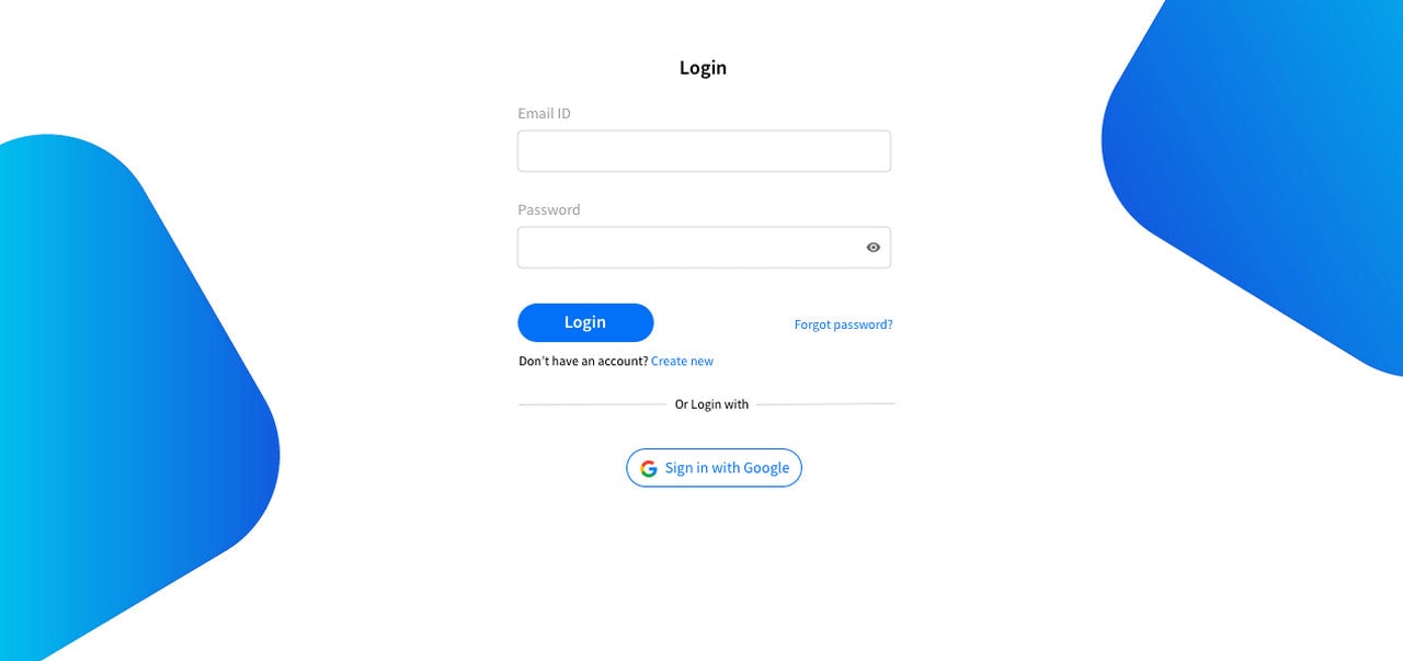
Sign In App UI
With Pulsetic you’ll be instantly notified the moment your website, API, or server becomes unavailable. Monitor uptime from multiple global locations and respond to incidents before your users are affected.
Create beautiful status pages in minutes to keep customers informed during outages and build trust with transparent communication.
Start Monitoring for FreeHave you minutely ever followed the login page that appears when you sign up for a particular website? The first page that comes up whenever you are logging in is the first impression of a website. The design of the login form will itself define the nature of the website and hence it should carry pertinence with the website it is leading to.
Truly, login or signup forms are one of the most important elements that a web page contains and hence designing these online forms is one of the most significant features when it comes to designing the website. A successfully created sign up form also encourages as well as allows the visitors to become a member, a subscriber or a customer for a particular business. A sober-looking, creative as well as visually attractive signup form will surely encourage a fruitful rate of conversion of a visitor if all the other features are properly coordinated.
Designing an effective as well as clean login/signup form asks for a lot of creativity from the designer as it is important for a website to have an appealing & outstanding form for the sake of its success and efficacy.
Some highly effective and attractive login form designs
There are some registration forms which consist of basic contact forms that are created with the help of some elementary web designing concepts. Apart from these elementary ones, there are few which may look a bit different o some extent. However, there are some others which are extremely impressive as well as creative that categorically lures the visitor to enter the website.
Some of these forms have an option of entering the personal contact information in details and they include the name, e-mail, contact number and other things. The styles of these forms go much beyond ordinary, and some of them even have come up with an option of handwritten calligraphy.
Few login pages come up with various innovative input style of text beside some highly innovative option or select menus. These types of forms really ask for a high level of creativity from the designers, especially when it comes to designing the space in between various layers, creating texts that are large and easily readable, and creating the sidebar links that connect to their e-mails directly.
A specific type of form provides a dramatic insight into a new data input field. The users have the leverage of getting to the login link from the homepage itself and call up a login box powered by jQuery. This particular type of form comes up with an Ajax that it uses to direct an external script of PHP. It evaluates the information that a user has used in logging in and once processed, it either grants the permission to the user or denies it.
A number of login form designs that we see these days are indeed extremely dynamic and consist of some of the very latest designs. One of these new-age designs provides a wonderful insight into the various data input fields. Users can easily go to the homepage and can click the link on the login page to call up a dynamic login box powered by jQuery. This particular login form comes up with the option of linking an external PHP script that helps in evaluation of various login information and depending upon the outcome of the result; it either allows entry of the user or denies it.
Future of Login Forms
One of the practices that we see on e-commerce websites is that instead of using username field or email field as the first option, platforms employ telephone number.
After you submit it, you get a unique code on your telephone that you need to enter into the next field. That is all. You do not have to remember a username or recall a password.
This solution is straightforward, quick, painless, and hassle-free, and it certainly leaves a positive impression. Yes, it demands your telephone number; some people may find it unacceptable. Chances are you will share your telephone number with the platform eventually. Second, with cellphones becoming more secure, this tension may disappear.
As the mobile phone industry evolves, we are starting to see other options as well, such as login forms examples where all you need is to use your finger to enter the website. This is just a beginning, but it is hard not to notice the potential of TouchID and face recognition. Therefore, it is highly recommended to keep these two approaches in mind.
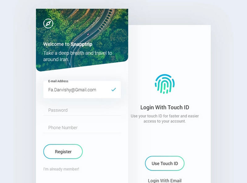
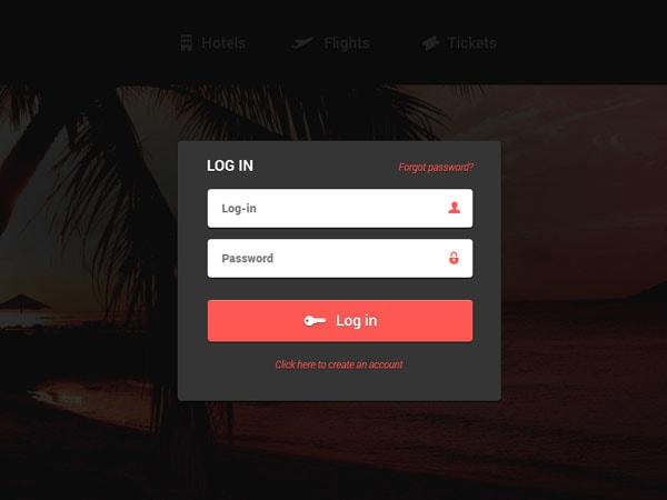
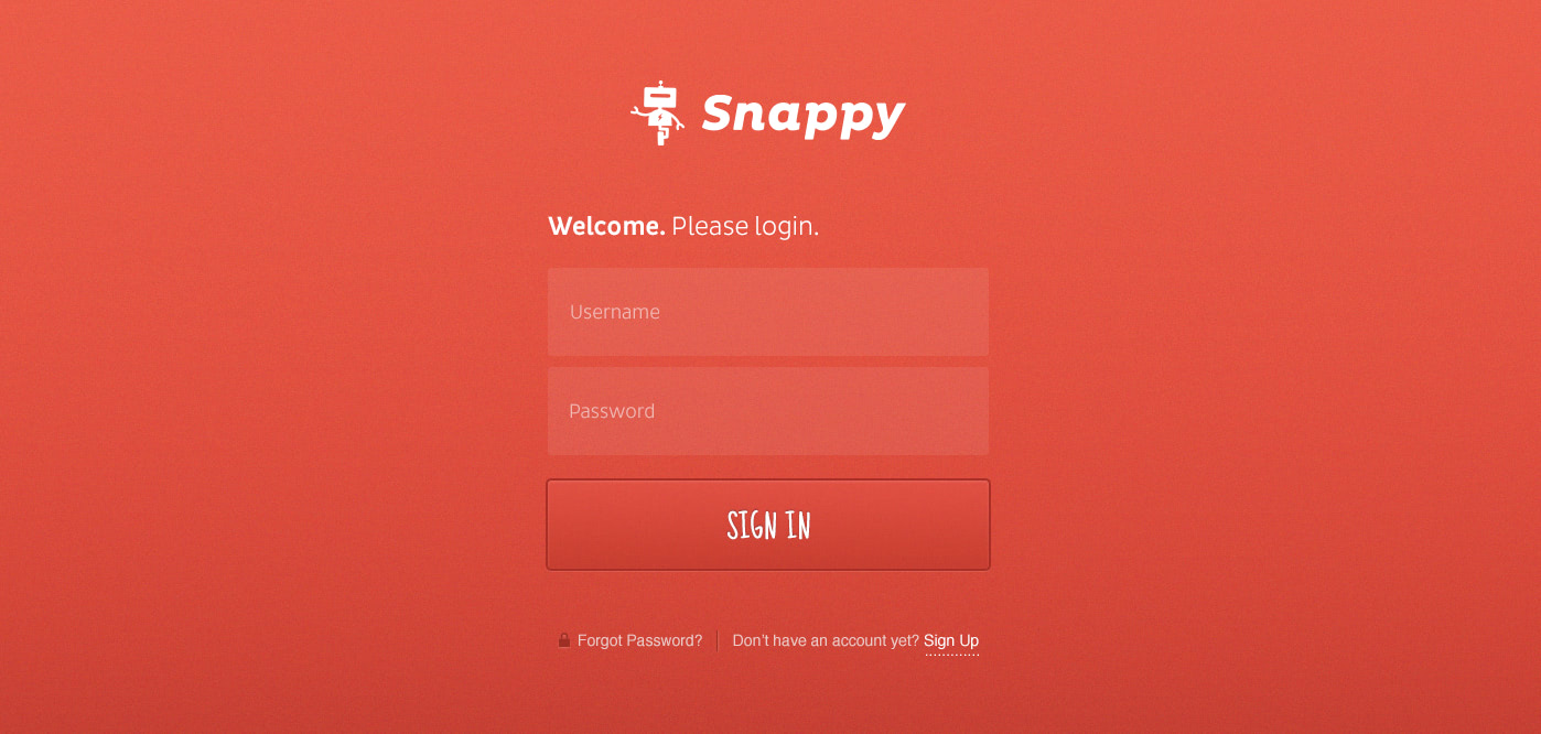
Snapptrip
Purpose of Login Page Design in Projects
Before jumping into exploring UX tips for creating the best design for your login form, ask yourself “what is the purpose of the login form in your project?”
Read also: 33 Examples of Login Form Designs for your Inspiration
What input fields should you include to make the experience with the login form comfortable and pleasant? Do you want to let all potential clients in immediately? Or do you want to filter? Do you want to meet the expectations and behavior patterns of your target audience? Or do you want to make the experience standard?
Also, ask yourself questions concerning the purpose of the design. Do you want to use the login form solely for this purpose? Or do you want to make it a part of your brand identity? Do you want to make it a part of the reading flow or marketing campaign?
Decide on the purpose of the login form, and then move to the design.
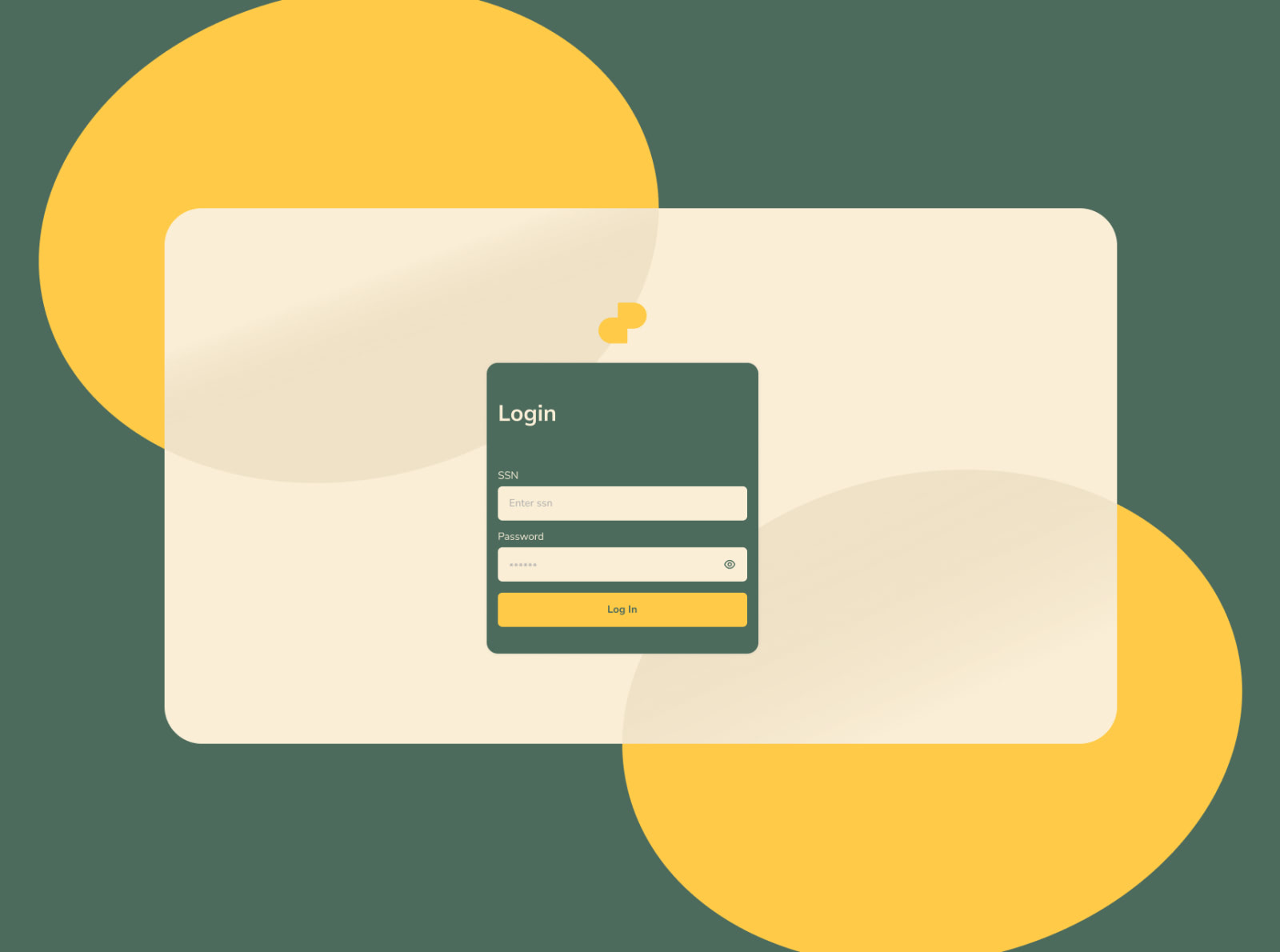
Login Page Screen
Best UX Tips to Build Login Forms That Rock
In website design, user experience is everything; and the login form is no exception. If you want to avoid creating login walls, interaction with the form should be flawless. There are a dozen best practices that help to build login forms that rock.
- Make a link to login form stand out. Do not hide it.
- If your website cannot properly function without immediate entering, then show login form in the hero area.
- Use a “Registration” link instead “Sign Up” in the menu since the latter can be easily confused with “Sign In.”
- Never use “Sign Up” in the login form markup, only “Registration.”
- Do not use two forms side by side. The best practice is to create an individual page for each form.
- Do not use small corner pop-up modals for login forms.
- Include only vital input fields. Two inputs are typically enough.
- Use the email field or telephone number field instead of the username field.
- Automatically keep users logged in, though leave them an option to undo this.
- Immediately validate fields. Tell users what is wrong right away. Do not wait until the submit button is pushed.
- Do not use many security rules.
- If caps lock is on, immediately notify the user.
- Make an error message that is eye-catching but not intrusive.
- Auto-focus on a field that should be filled in. Therefore, it comes without saying that the first field should have an auto-focus by default.
- Use placeholders or labels so that users can instantly see what information they should put inside the field.
- Always add the “Forgot Password” link. You do not have to make it an eye-catcher. However, it should be evident. What’s more, remember people forget their passwords all the time. Therefore, you should think through this flow.
- Allow users to see what they type in a password field. This way, you will avoid the annoyance of mistyping passwords.
- Do not lock the account after two failed attempts. First, notify the user about this situation, then let them try again, at least 4-5 times.
- Add alternative options for logging into the website using social media profiles or other popular platforms. For example, if you have a regular website, then allow clients to use their Facebook, Google, or Twitter account to enter. If your website can be related to other services like Pinterest, LinkedIn, Instagram, Adobe, Apple, etc. then you can add them as well.
- On a related note, if you decide to add multiple options for logging in, it is better not to overdo. The more choices users have, the harder the decision-making process will be. Therefore, stick to 2-3 options to avoid confusion.
The list is big, but these tips are not difficult to implement, though they require some time. Remember, if you follow these best practices, you will undoubtedly take your login form to the next level.
Login by Poonam
How to Create Login Forms: Basic Steps
Creating a working login form is a challenging task. Unlike contact forms that can exist on their own, login forms are the part of the User Authentication Mechanism that has a database in its core and requires a registration system. This requires several steps:
- Create a valid HTML5 markup. Choose the proper type for input fields, set data attributes. Add necessary elements like links to the “Forgot Password” flow or “Keep Me Logged In” option.
- Create browser validation.
- Style forms with CSS3. Test the design on cellphones, tablets, and desktops to make it look perfect across devices and browsers.
- Create a PHP script to get data from the form, send a query to the database, get the response, and initiate corresponding protocol.
While the first three steps require essential knowledge of HTML5, CSS3, and JavaScript, the last step is the one where you need to master your skills in PHP and MySQL. It may be difficult; however, with good tools and guides, everything can be done. Check out these helpful tutorials to get started:
- How to Create a CSS3 Login Form
- How to Create Login Form with CSS3 and jQuery
- How To Create A Login System In PHP For Beginners
- PHP MySQL Login System
How to Design Login Form: Tips and Tricks
Designing a good-looking, intuitive, and handy login form is not as simple as it may seem at first. Although it may have just two fields and a button, you can still ruin everything by overlooking vital things like responsiveness, mobile-friendliness, optimal readability, good contrast, accessibility, and more. There are many things to pay attention to. We have compiled a list of helpful tips so that you take into account even the tiniest details.
- Less is more. You cannot afford to be overwhelming.
- Use styles and time-tested design solutions. Do not confuse users with extravagant ideas.
- Do not rely on modern tricks or animations. They may not work consistently across various devices.
- Use vertical login forms instead of horizontal ones so you will not have to change the behavior for small screens.
- Keep a healthy distance between fields and elements of the form. The login form should be compact, but the elements inside should not be tightly packed.
- Use red for errors. As a long-standing convention, it is highly effective.
- Do not distract attention with vibrant full-screen image backgrounds, videos, or dynamic solutions. Keep it simple.
- You can use accompanying illustrations or graphics, but they should support rather than distract attention from the prime task.
- Do not clutter the login form with information. If you want to say something, this is not a time. First, let people in, and then say whatever you want.
- Never use text-based submit buttons. Buttons should be evident, prominent, and pushy. Do not make them blend in; make them pop off of the page.
- If you have more than one button, use a different style for each one. For example, make the submit button blue, whereas the registration button is grey.
- Provide all vital components with a sharp contrast to ensure readability.
- Be cautious with font size for cellphones. By default, iOS uses 16px that can ruin aesthetics. Sometimes it is better to use a pop-up message instead of trying to fit everything in a 320px width screen. (Not everyone has an iPhone with a big screen.) You have to take into account all the variants.
- Accessibility is a real issue. Always provide fields with data areas for reading devices. Make the contour of fields as bright as possible so that people with impaired vision can delineate inputs from the background.
- According to WCAG 2.0 guidelines, a minimum touch target size should be 9mm by 9mm. Keep this in mind when you set height and width for your controls.
- Make the input size bigger for cellphones. Remember, people will use their fingers to focus the input field, therefore make this interaction hassle-free.
- Keyboard interaction shall be provided.
- Test your login form across various screen sizes, devices, and browsers.
Login And Register by Max Gorokhov
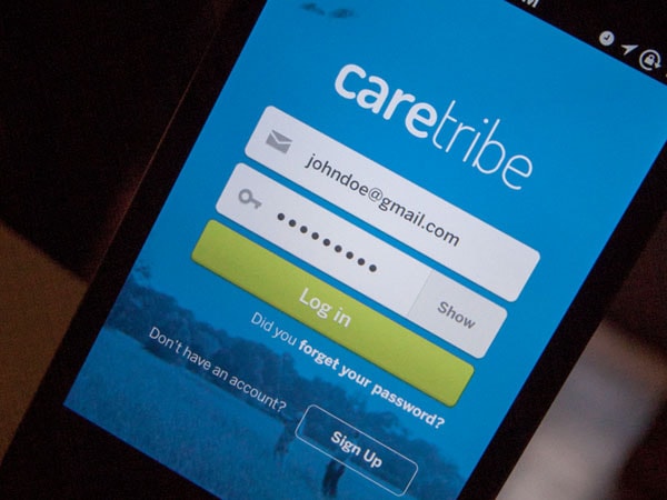
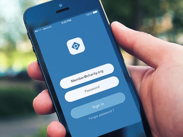
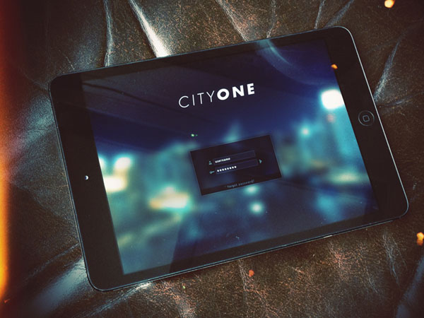
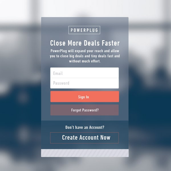
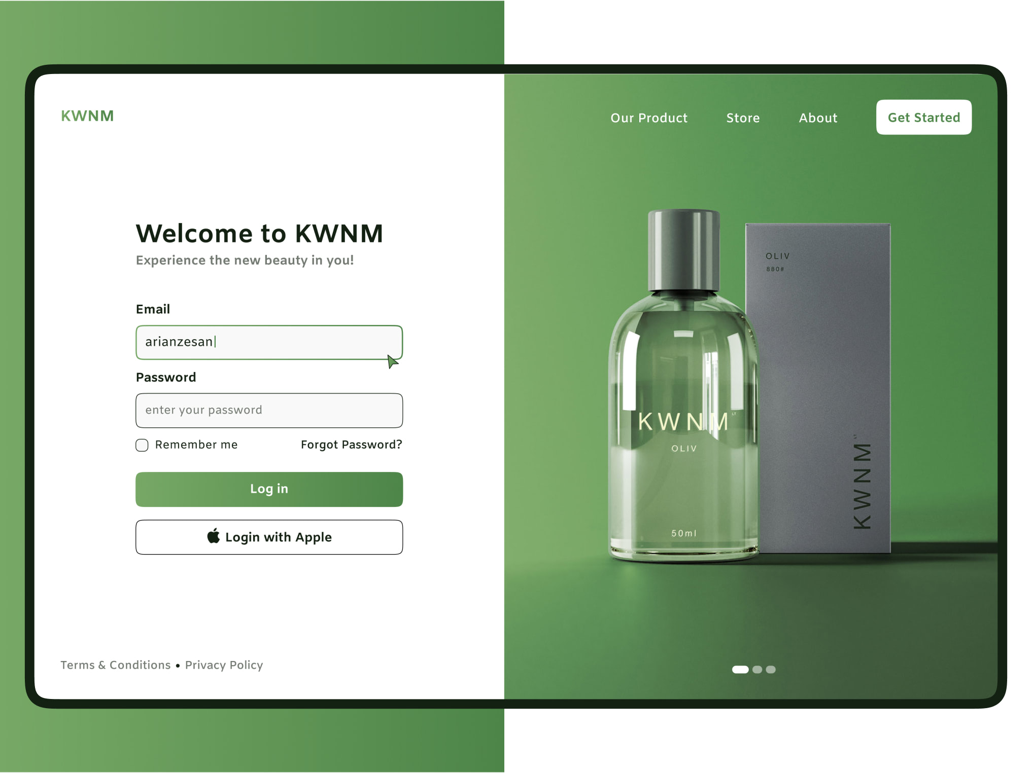
Beautiful Login Form Examples for Websites and Apps
We have compiled a list of beautiful login form examples for websites and apps so that you can thoroughly examine concepts and real-life projects to get helpful insights on how to bring our tips to life and make your next login form a superstar.
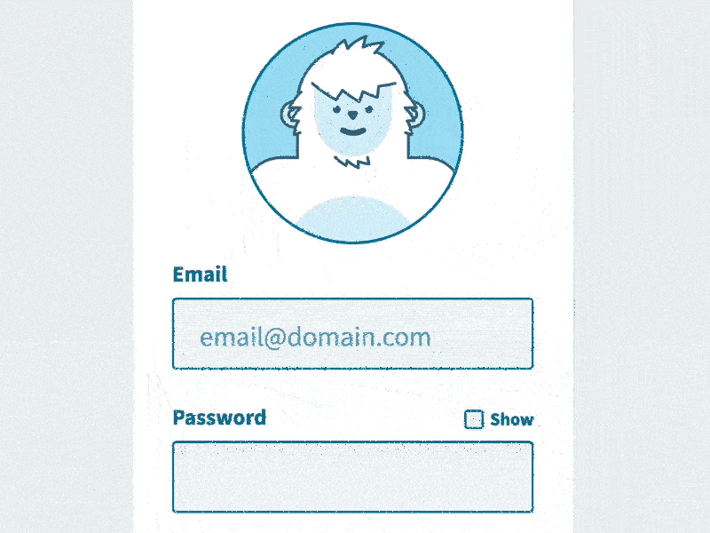
Yeti Login by Darin
Yeti Login by Darin made a lot of fuss several years ago. This concept was so inspiring that it gave a boost to numerous projects out there. The thing is, Darin has shown us how to use illustrations not just to establish the proper atmosphere or add a touch of brand identity, but also to assist the process.
How? Easy. He created an animated Yeti that follows the user’s actions, thereby transforming interaction with the login form into an enjoyable play. This trick certainly decreases a sense of tension in the air. Even if you do something wrong, it will be a mere pleasure to repeat all the routine once again.
Darin’s concept is one of those login form examples that demonstrate how to make the artistic approach to work for you and provide users with an unforgettable experience.
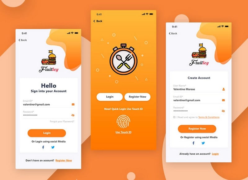
Restaurant Registration by Vihaan AK
Restaurant Registration by Vihaan AK is a neat and smart concept that shows us the advantages of splitting “sign-in” and “sign up” into two separate screens and using an illustrative approach.
First, is a splash screen with several options. Along with buttons that lead to logging in and registration, there is a TouchID option that is super handy for iPhone owners. This trick certainly adds a touch of sophistication to the concept.
Second, each process has a screen where fields and elements comfortably sit.
Third, graphics and coloring speak on behalf of the brand, but the focus still is on the form.
Finally, each form has only necessary elements with beautiful designs that offer a smooth experience.
As a result, the concept is handy and pleasant to use.
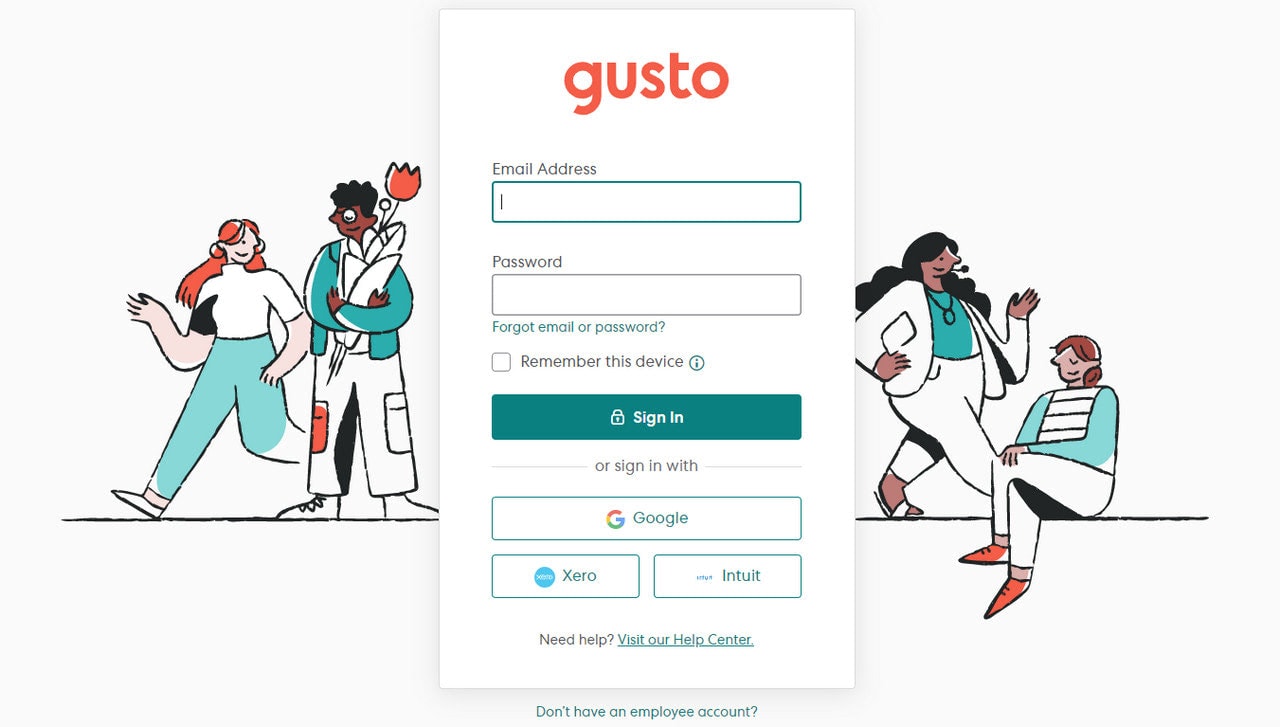
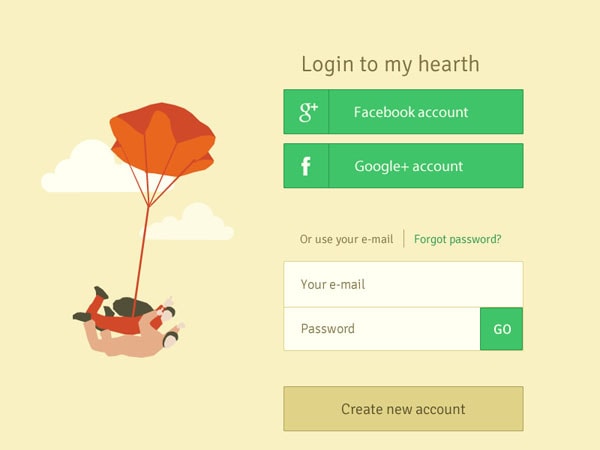
Gusto Login
Gusto is another login form example where an illustrative approach adds to the user interface.
The team has skillfully used human drawings to appeal to our nature and hint about the services provided by the platform. Even though graphics are attention magnets, the form is the star thanks to contrast and an enviable central position. Simple yet effective.
As for functionality, the login form has two fields (email address and password) and alternative options that are uncommon. Xero and Intuit may seem a bit odd at first sight; however, they fit here since these platforms have the same target audience.
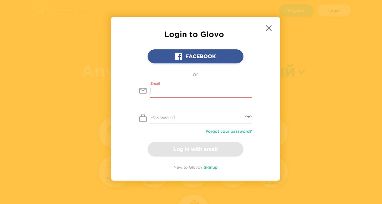
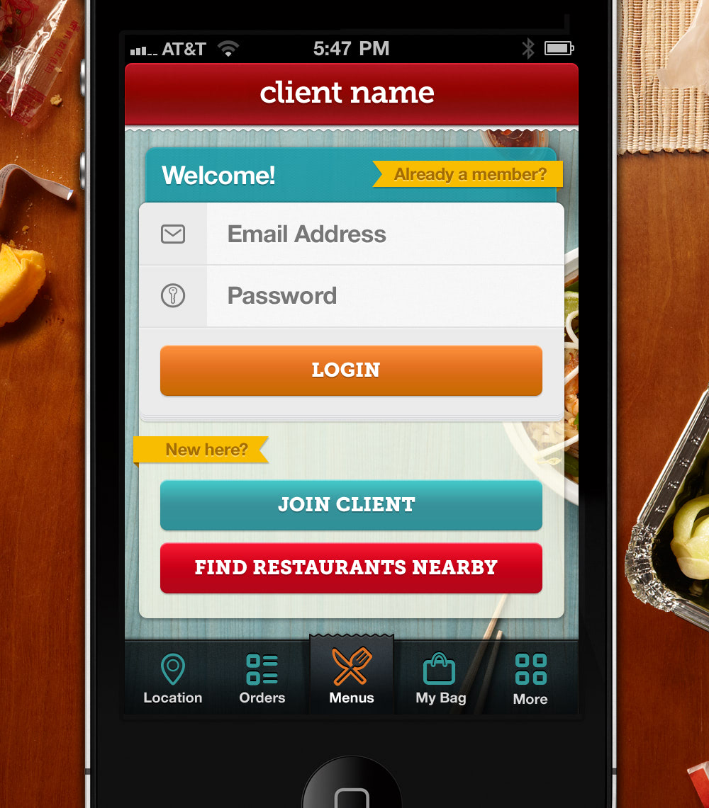
Glovo App
Glovo App is an excellent case in point for those who prefer using modal windows. When it comes to lightboxes that invade the entire screen eliminating all accidental escapes for the visitors, this trick can certainly work.
Here the login form is inside a modal window that is stretched from top to bottom and from side to side. Thanks to a solid monochrome backdrop, nothing distracts user attention. The latter has a minimal design, and includes everything you may need: two inputs, a Facebook button to connect, a link to “Forgot your Password” flow, an icon to show the password, and a link to sign up.
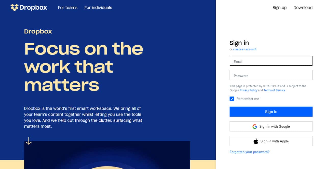
Dropbox is one of those excellent login form examples where the component is exposed right away. You can see a panel with the registration and sign in form. Dropbox is a platform that requires you to log in first. It is only logical to provide users with convenient access to their accounts.
Note, even though the hero area is a bit clumsy due to lots of information; thanks to split layout, forms have a solid foundation. They do not have proper visual weight, but it is enough for engaged users to get what they need.
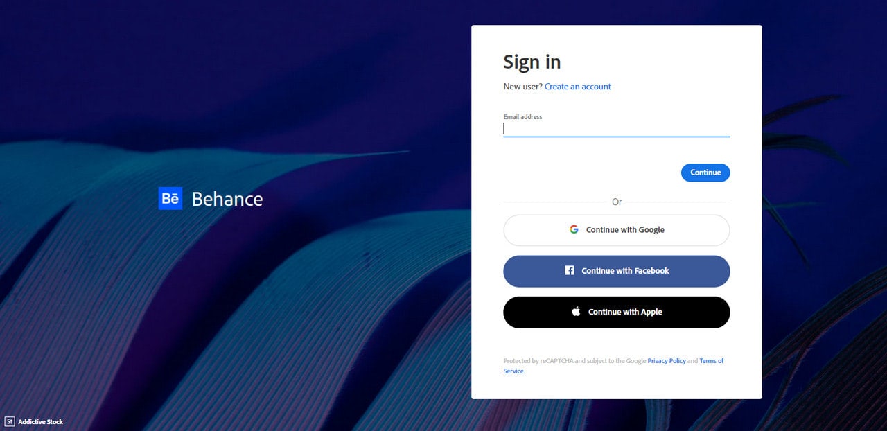
Behance
We have said earlier that using full-screen image background can distract the user’s attention. Therefore, it is considered a bad practice. However, if you use it wisely, things may work out for you. Behance is one of those examples that prove it with its login form page.
Here you can see a beautiful backdrop. It is used to hint about the platform’s sphere of expertise. The design team masterfully played with contrast by darkening the image and placing the form on the clean white canvas. Of course, the login form lacks a proper visual weight. Still, it is enough to transform it into a second focal point.
As for realization, the login form has a two-step system. First, enter your email address and then your password. Alternatively, you can use your Facebook or Apple account. The solution is excellent for people who often confuse input fields.
Login by Todd Piersall
Login form by Todd Piersall is an excellent concept where you can see for yourself how a full-screen background can ruin everything, whereas a solid monochromatic one can save the day.
The project includes two variants of sign-in form. Compare and contrast them. Both include the same range of user interface elements; they have the same styles and arrangements. However, the first certainly provides a worse user experience due to insufficient contrast.
The screen on the right is a different story. It has a clean white backdrop. It is more comfortable to use. In such a distraction-free environment, users will easily complete their mission.
More Examples
In the spirit of the release of iOS7, this login screen takes the subtle animation of iOS7 backgrounds to a new level. Here, the background is a completely animated graphic – possibly a gif.
Although the background is actually not too subtle, it is something you don’t see often.
Once more in the spirit of iOS7, this login screen and accompanying interface, embrace blurry but colorful background and keep things simple. Both interfaces are minimal, with the thin lines and lack of actual input field backgrounds. But, the lusciously colored background adds a bit of personality to make this interface friendly and awesome.
A lovely design if there ever was one; the blue background is bold compared to the crisp white logo, text, and input fields. The green button actually looks like a button – although the rest of the UI is flat – and the hue works well.
What a strong color palette! And, of course, what a different way to think about logging in; the reason this is not a common sign up flow because it has its usability flaws. But, in terms of design, we can all dream about this out of the box login.
Compared to the previous shots in this line-up, this one is fairly calm and simple. The color choices are wonderful. The page is very to the point; it does not have any unnecessary or, worse, distracting shenanigans as no login page ever should.
Here, the dark login UI in addition to the dark and blurred background and the bright, slick and thin text has a very good essence of mystery and glamour going on. What else could you possibly want but a sexy login page?
Now we are presented with a dark login and an unconventional red text and red button. It is different and daring, let’s applaud that.
The fear with red in buttons is irrational as it is the context in which a red button is used that determines how the user will react to it not the color itself.
This shot is simple and clean but not boring. The color combination in this design is amazing as these three different shades work so well together. And, it looks so good! What a way to create a simple but good looking login interface.
Here is a bit more complex and more extensive interface. As with many platforms, you are allowed to login with preexisting credentials from Google, Twitter, or Facebook and forego creating a new account. But, if you want to you still can create your own account.
Thanks to the handwritten notes and arrows, the color scheme is quite nice and different from the typical blue and silvers we see everywhere. At the same time, the background images are not a focal point like we see on every landing page, it is a light login/register page and that is it.
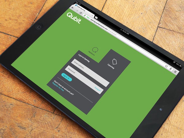
This clutter-free design is nice. There is no navigation to distract you; there is no side content to annoy you either. The user flow is simple, and so are the user goals: you can choose between Platform and Opentag and just login. If this is your first time here, you are welcome to check out the create an account link toward the bottom.
The simplicity of this flat design is ideal. The focus is on logging in. You have a clear logo present and if you don’t have an account you have a way of creating one as well. On top of that, the color choices are cohesive and work well together.
This design includes things that are big: the login button is big, the text on the button is big, the icons are big. Additionally, the login button is bright orange so you can’t miss it.
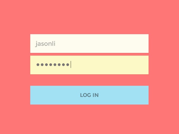
The color choices here are a little off, with a lack of contrast between the input background and text colors. But the two input fields are attached because they obviously belong with each other. The sign-in button stands out.
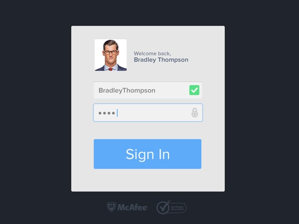
The fact that the website remembers who you were before you were logged out is awesome; it is actually pretty cool. By the looks of it, this is meant to be a secure login and it does feel as such thanks to the two logos – McAfee and VeriSign – below it.
The comical avatar used for this is fresh and makes the experience pleasant even though it is supposed to be serious.
Yes, this is a flat design; yes, this is so elementary is can be boring, but it is not. Flat design with well-picked colors can often come off as friendly and character-filled and this login interface is exactly that!
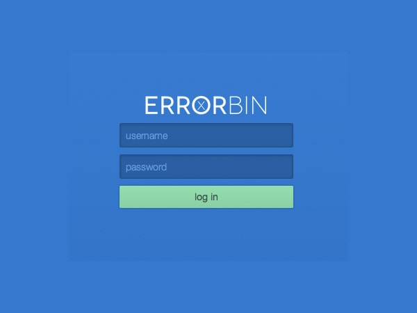
One more blue interface! The green here is questionable, but the blue shades work well with the white text. Informal lowercase text gives this interface some personality as well.
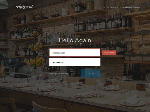
This form is obviously the focal point of the page. Sure there is a logo and a registration invitation link but they are nowhere as prominent as the big login UI. Against the darkened background, bright inputs call for your attention.
Here we have a combination between a skeuomorphic badge and flat UI. This is done quite well. Do not think about insulting the shadows in the badge as they are not hurting the design, it is quite cute thanks to hints of skeuomorphism, as well as the font choices and color scheme.
Once more we have a fascinating login the screen; it is actually more busy then some examples in this post but the color scheme used is well chosen and makes the whole thing come together pretty well actually.
The first option looks more artistic and creative; however, it fails to provide a comfortable workflow for the users. The second option is preferable.
Other Login Examples for Websites
Login Form from Impressionist UI by Designmodo
Although, at first sight, it seems that inputs slightly soar in the air, since gradients and vector realization placed on a textured canvas leads to a slight balanced in harmony. Nevertheless, this tooltip-inspired basic login form looks interesting and unique.
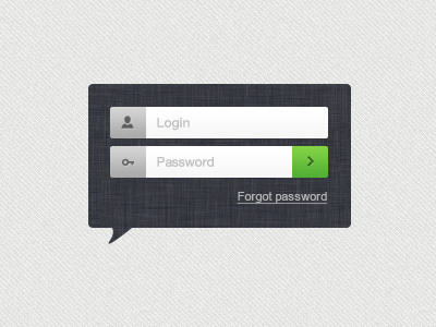
Login by Haziq Mir
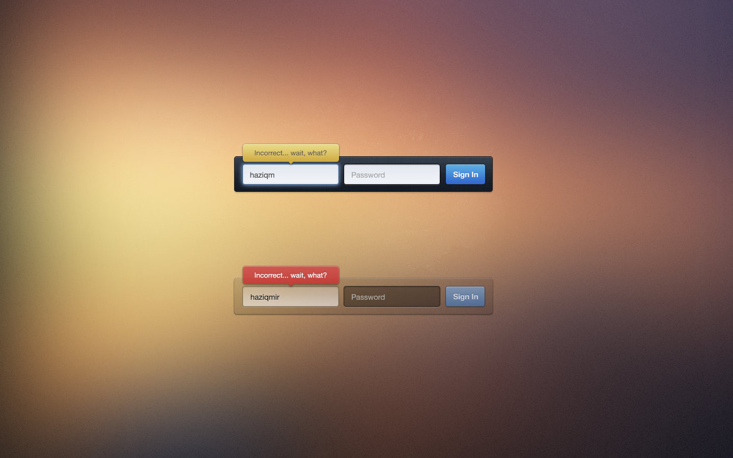
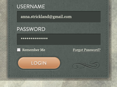
The designer places fields in line, making the overall component suitable for standard relatively narrow headers. While soft, warm brownish coloring paired with inner shadows give each item pleasant, smooth and finished appearance, the dark version has a more sophisticated look.
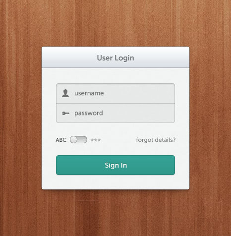
Stellar Login, Improved by Haziq Mir
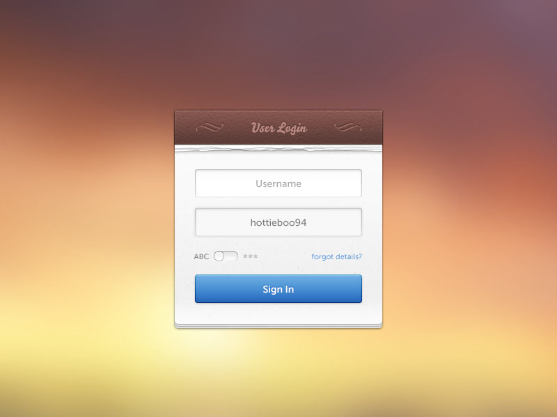
The first thing that catches the eye is a background that can become an excellent complement to any intricate or illustrative design, where natural textures such as wood or paper run the show. While sleek inputs and grayish coloring ideally suit to the notebook-styled canvas, the huge blue ‘Sign In’ button grabs the whole attention with its great visual weight.
Login Form by Sergey Shmidt
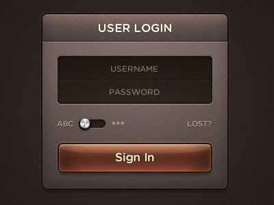
This is an excellent example of a dark login form that exudes an image of sophistication without being brutal. The glossy brown button instantly strikes the eye, calling to action. Tiny metallic toggle adds a lovely skeuomorphic flair to the composition.
Login form for personal application by Ionut Zamfir
The backdrop of the form mimics a common notebook surface where we usually make notes. Wooden canvas enhances the overall aesthetics. Although shiny gradient buttons slightly break away from the theme, here flat or sketchy buttons might look more natural, yet still the component achieves a sense of harmony.
Sign In Widget
The designer exhibits a subtle and elegant web form, the wow factor of which is produced by its semi-transparent background. It has an optimal contrast that sets apart lettering and icons from the backdrop, and as usual, massive almost overwhelming bulging CTA.
iPhone App Login Form
iPhone App Login Form by Mason Yarnell is executed in the best traditions of iOS designs of previous years. There are lots of glossy stuff, ornamental ribbons, embossed icons and, of course, complicated textured backdrop. Nevertheless, in general, the component looks clean, fresh and with lots of air.
Light login by Maxwell Barvian
Light login by Maxwell Barvian looks exactly as stated on the nameplate: light, clean and crisp. Grey and white colors together can do wonders easily providing users with an excellent experience. As befits, for better conversions, the main button is intentionally oversized and is painted in a bright tone.
How to Create Login Form with CSS3 and jQuery
![How to Create Login Form with CSS3 and jQuery [Tutorial]](https://designmodo.com/wp-content/uploads/2012/03/preview.png)
It is a small tutorial that is subservient even to novice web developers. Although the design is quite simple and input fields at first look like buttons because of a gradient styling; however, it is a representative example of a sleek and well-structured web form that can come in handy in numerous UIs.
Login by Paresh Khatri
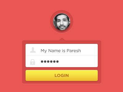
Some login by Paresh Khatri is a tiny web component that boasts of a vibrant color scheme and meticulous attention to details. The tooltip-inspired shape, circular photo thumbnail, inset treatment, semi-transparent backdrop make this design easily stand out from the crowd.
App Login
Carefully laying out each element of form one above the other, Mynus is managed to tie the design together and ditch the backdrop that would only distract attention from a refined screen. The coloring, edges, shapes, rounded corners, typography, amount of white space and embossed touches make the design unique and crisp.
Dark login by Adam Whitcroft
Dark login by Adam Whitcroft looks sophisticated and top-notch. An excellent choice of font in tandem with contrasting colors offers users optimal readability. ‘Sign In’ button, grayish glyphs and switch look a bit seamless, yet they ideally blend in the environment.
Snappy Login by Charlie Waite
Snappy Login by Charlie Waite is an interesting take on a web form that has a simple yet original appearance mainly thanks to flat transparent inputs. Although text inside fields experiences some illegibility, when the backdrop is too washy, yet on the whole, it certainly has a charm. The decorative font and embossed button look exceptional, and as it should be, an attention-grabbing.
Sazzi Login by Ionut Zamfir
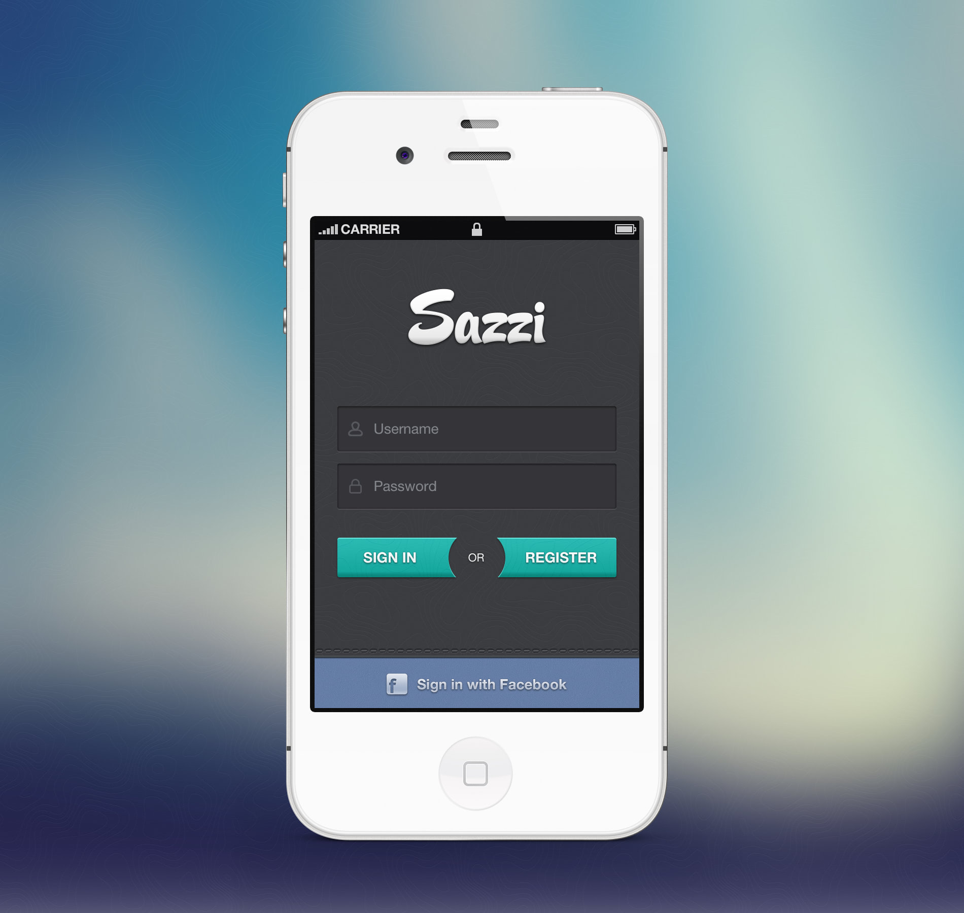
Sazzi Login by Ionut Zamfir features a nice twist produced by the CTA buttons. The primary coloring is neatly selected, and the accent tone perfectly complements the overall aesthetics. The form looks great on a monotone or noisy canvases, especially input fields that seem to be naturally inbuilt.
Notepad Login final by Haziq Mir
Notepad Login final by Haziq Mir is another illustrative take on a common minimalistic form in our collection that is planned down to the last detail. The background holds the theme together, original dashed-styled fields and elegant cursive typography have an artistic flair.
Elegant Login Form Design
Much like the previous example, the login form owes its sleek and clean appearance to fresh light coloring, a ton of white space and legible font. Smooth bluish button with rounded corners and highlighting effect assigned for selected fields are subtle touches that add to usability.
Mail login form by Andrey
The design incorporates some distinctive features that uniquely connect the form with common mail attributes thereby separating it from others. 2 decorative lines along the edges handle such effect. The rest is fairly conventional: line style inputs, grayish coloring, solid icons and gradient-based CTA with sleek 3d dimensional feel.
Login interface by Andrey
The layout is neatly split into two parts that have a clear boundary. In such a way the author provides users with two options to sign in: via a regular form and social media platforms. The structure is standard: 2 input fields, ‘Sign In’ button and buttons for connecting through Twitter and Facebook. Here the aesthetics get its cutting-edge feel from embossed touches, perfect contrast, well-balanced arrangement and beautiful accent colors.
Login by Jake Stutzman
Login by Jake Stutzman features a great texture work that produces a sophisticated aesthetics. Leather backdrop nicely supports a set of default inputs that, thanks to vigilantly crafted embossed effect, fit here like a glove. The bulgy orange button stands in sharp contrast to the overall environment, gently drawing the attention, and a tiny ornamental element in the lower right corner adds an artistic touch.
Clean login form
The clean login form has a super fresh and crisp appearance with an open feel. Transparent sticker, notebook-styled backdrop, light grey color scheme, outline shapes fit together like pieces of the puzzle. Along with this harmonious composition, the yellow convex CTA seems to be an eyesore that calls the attention.
Login Page – Premier List by Vadim Sherbakov
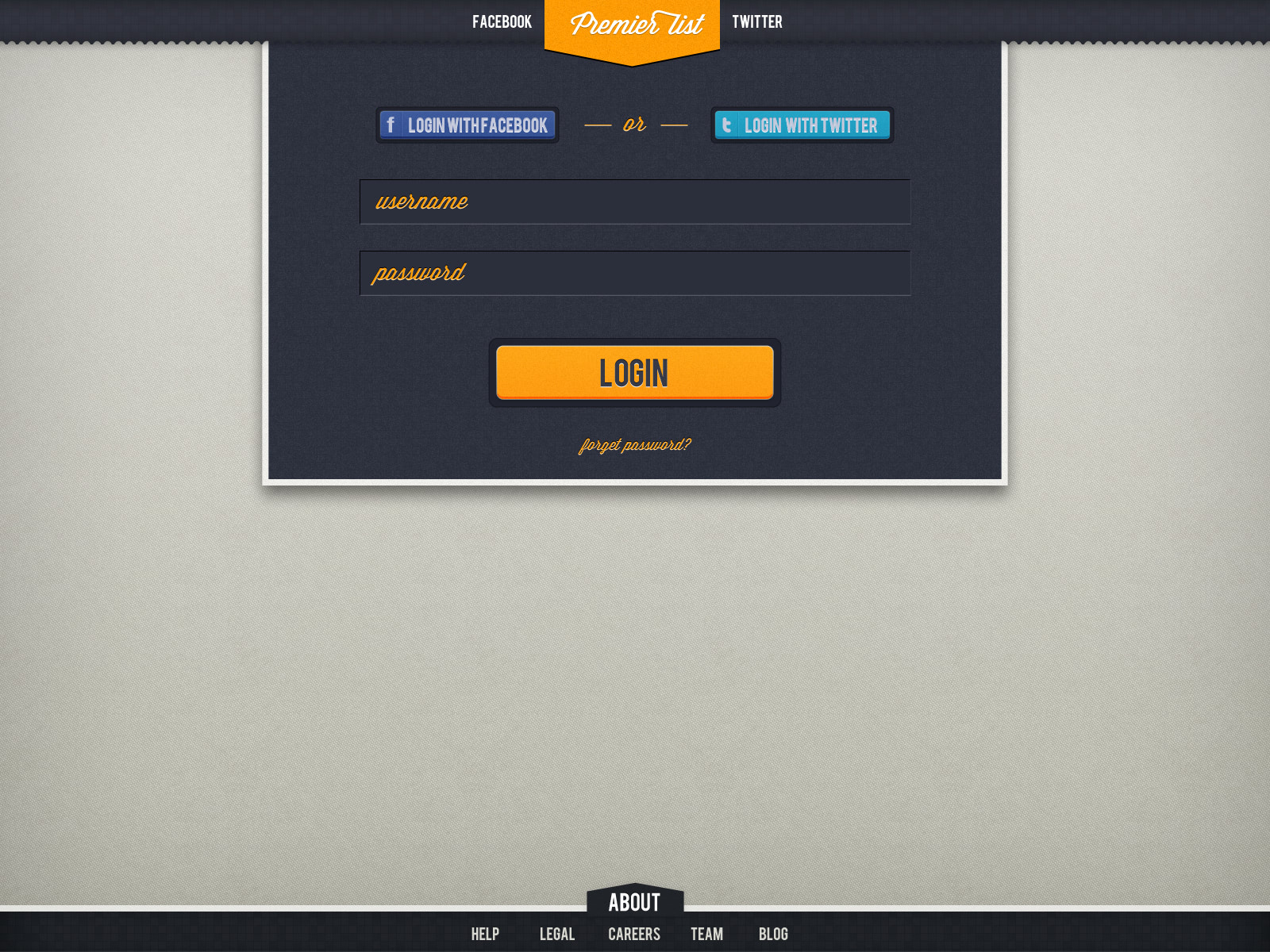
The artist is managed to carefully enrich the basic form with extra functionality. Skillfully crafted textured background serves as a solid foundation for bright and eye-catching buttons and for a pair of inputs that neatly stand out in relief.
Login by Oli Dale
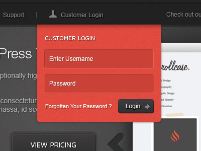
Login by Oli Dale should overlap some foreground content so that it needs to stay in contrast to it. Here the red rules the roost. Although the component is quite modest and does not have a usual open feel, yet thanks to primary coloring it catches the eye. The subtle shadow on the top is a lovely touch.
Login Form by Ashish Thakkar
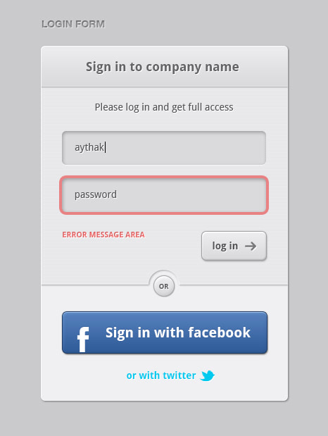
Login Form by Ashish Thakkar has a flavor of a carefully executed web form that boats of a crisp and clean appearance. Due to some delicate decorative details such as a pattern used on the bottom, smooth curly corners, metal pieces that connect 2 fields together, this simple form gets an exquisite appeal.
Login or Register
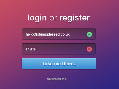
Login or Register by Daryl Ginn proves that transparency is an excellent trait that can revamp the appearance of any web form. Here input fields go native with any background, providing the users with a perfect place for filling in data. An overwhelming green CTA is a focal point that intends to increase conversions.
iPhone Login by Vasjen Katro
iPhone Login by Vasjen Katro has a certain level of personality that enhances brand identity. The coloring echoes with the main design of an app. The light grey inputs and a green button with a distinctive shadow naturally excel from the clean black backdrop.
Clean & Simple Login Form
The two first words in the nameplate perfectly describe this form. The structure is pretty trivial, the color scheme also is not much to boast of, yet upon the whole, it is pleasing to eyes and pretty straightforward; exactly what is needed for the majority of regular users.
Fabric textured login by Ionut Zamfir
Here work with textures steals the show. The designer demonstrates a high level of skills by creating such a harmonious composition where basic inputs have been treated like pieces of art. Curved lines, stitched borders, embossed lettering are distinctive traits that power the design.
Login form by Gil
Login form by Gil was certainly inspired by glossy and glassy surfaces since the web form’s aesthetics is basically based on them. Of course, the color scheme is also well-chosen. There are plenty of tiny killer details that put the puzzle together: metallic toggles, paper canvas, neatly crafted chain, shadows, and gradients.
Conclusion
In conclusion, user experience and security must be carefully considered while building an effective login page design. You can design a login page that is both useful and aesthetically pleasing by adhering to best practices and maintaining current with industry standards. Even though login forms for websites and apps are as old as the hills, people still experience problems with handling them properly. Many things can scare them away: too many options, fancy input fields, confusing design, suspicious elements, to name a few. Therefore, it is your task to convert a login form into a UI unit that provides a comfortable user experience.
Being almost the primary method of interaction with users in website design, the form quite often stays misjudged and overlooked in terms of design.
Though, of course, not every project demands a creative take on a component, yet it always pleasing and delightful to experience a good-looking, neatly crafted and well-balanced sign-in box that has a note of piquancy and complements the overall design.
Follow our guide, use UX tips, and get some inspiration from our collection of the best login form examples to achieve this goal.