Most Popular Articles
-
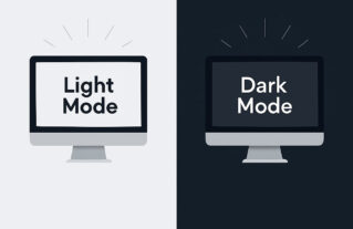 UX Design • Website • Website Design • Website Examples
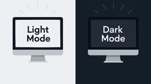
Dark Mode Websites: Web Design Tips, Examples & Best Practices
-
 UX Design • Website • Website Design • Website Examples • Website Tools
How to Make an Animated Website That Stands Out: Step-by-Step Guide
-
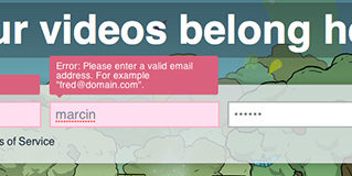 UX Design
The Ultimate UX Design of Form Validation
-
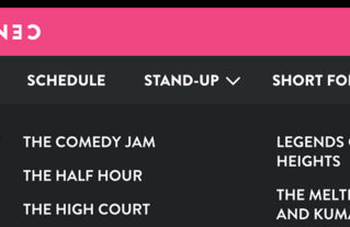 UX Design
UX Design Tips For Dropdown Navigation Menus