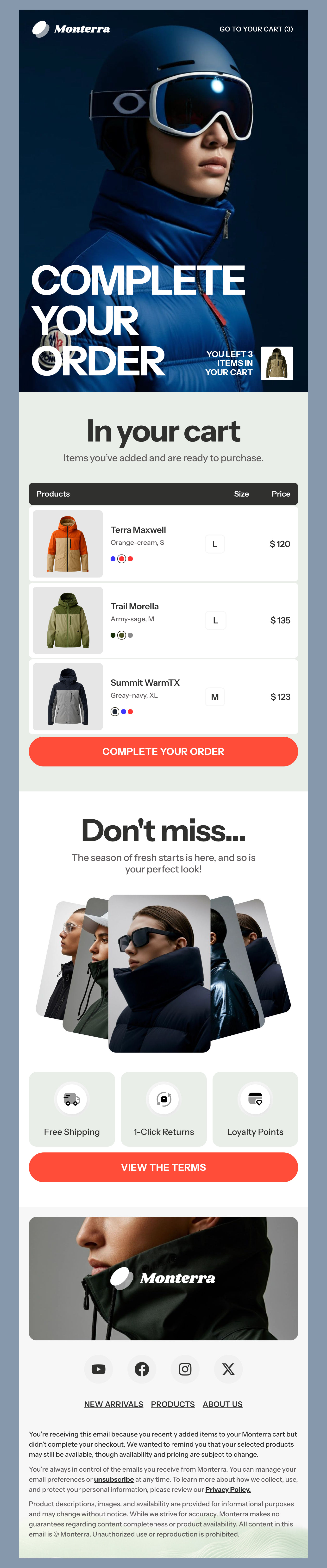
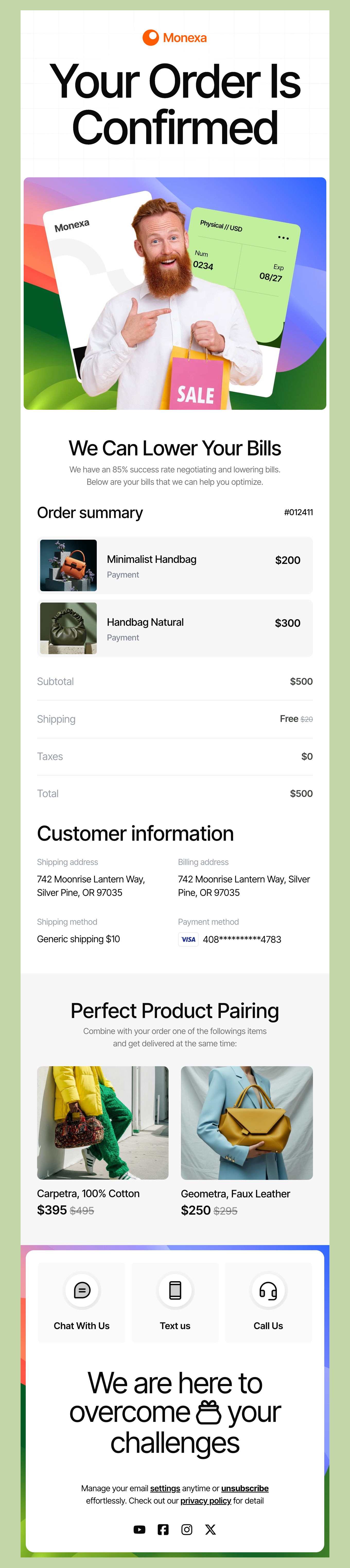
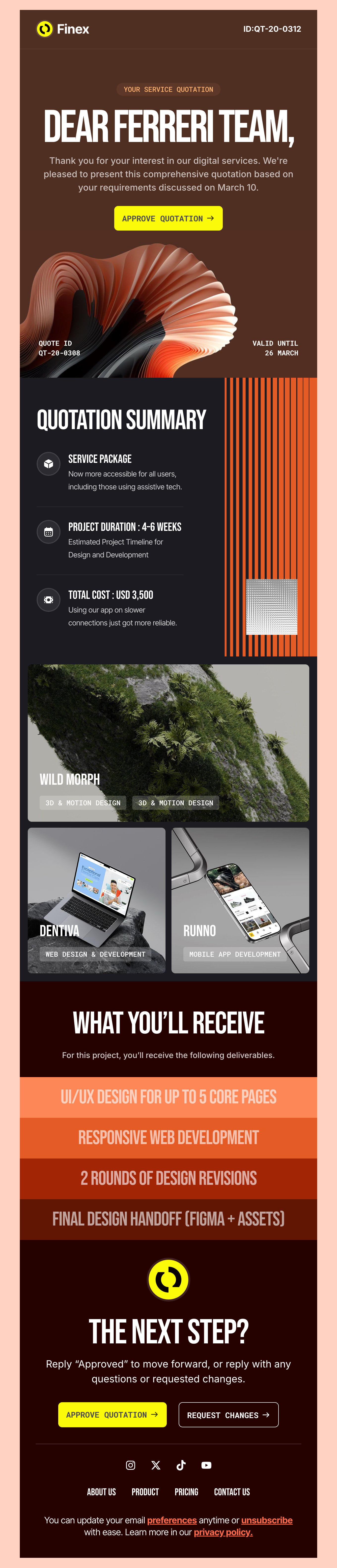
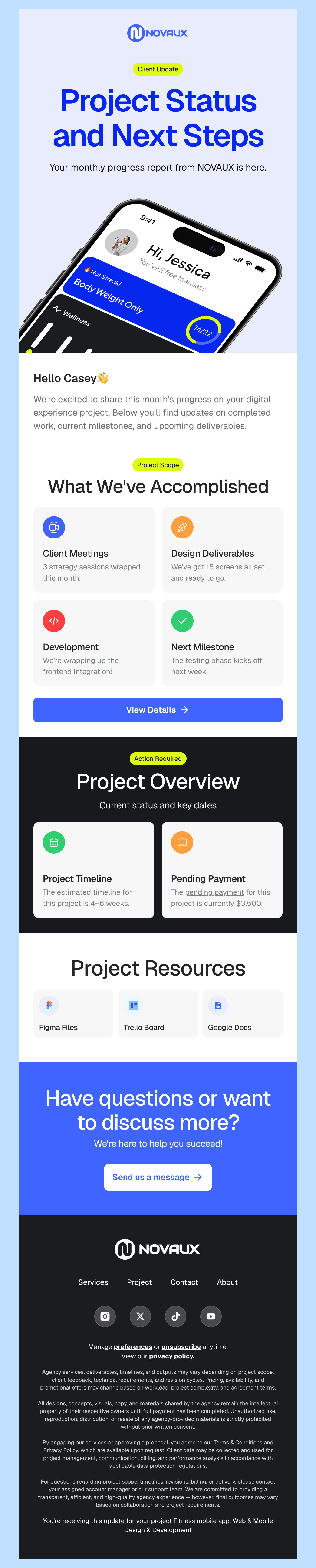
How to Code a Mobile-First Responsive Email Template [Tutorial]

• 9 minutes READ

In this tutorial, I’m going to show you how simple and easy it can be to code a fully responsive and fluid email template. This isn’t complicated or intimidating at all.

All it takes is understanding the designs for the different breakpoints and a solid order of operations. Follow along to learn how to code your own mobile-first email.

Note: Check out our new email template builder – Postcards. Try it for free!

The design

Check out the below screenshots to see both of the designs we’ll be coding today. The design of this email is perfect for beginners to follow along with.

Easy to follow mobile-first responsive email tutorial

The setup

Before we get started with anything, we must have the basic HTML set up ready to go. In the below HTML, I have just added the basics such as a title, meta tags for responsive functionality, the CSS section and a sample container div in the body.

<!DOCTYPE html>
<html lang="en">
<head>
    <title>Mobile-first email demo</title>
    <meta http-equiv="Content-Type" content="text/html; charset=utf-8">
    <meta name="viewport" content="width=device-width, initial-scale=1, maximum-scale=1" />
    <style media="screen">
    </style>
</head>
<body>
  <div class="container">
  </div>
</body>
</html>

For developing the email, you’re free to keep the CSS in a separate file and link to it. I’m going to keep it in the HTML document for simplicity’s sake and ease of use.

No-Code Email Template Builder

With Postcards Email Builder you can create and edit email templates online without any coding skills! Includes more than 100 components to help you create custom emails templates faster than ever before.

Free Email BuilderFree Email Templates

Creating the HTML sections

We also have to define the different sections for the email’s contents. Don’t worry about aligning any of the content just yet. For now, we need to create the structure around the content itself. When you open the email in the browser, it should all be in a single column for now. Let’s break down what’s happening in the container div.

First, I divided the email into three sections, logo, body-content and footer. In the logo div, I’ve only added the logo image and made it into a link. The link should take you to the homepage of your site.

<div class="logo">
      <a href="#">
        <img src="images/moon-logo.png" alt="Yellow Moon Logo">
      </a>
</div>

The next section, the content-body, is the whole blue section of the design – including the red moon image. There are two ways we can go about including the full-width moon image. For now, I’ve placed it via an image tag. We’ll discuss the second option later.

<div class="content-body">
      <div class="content-body-text">
        <h1>The history of the moon</h1>
        <p>In the solar system's early days, a first Earth is thought to have been pulverised by a planet that scientists call Theia. We don't know what it was made of or where it came from, only that it may have been the size of Mars. The powerful collision destroyed both planets so completely that scientists can only guess what they were like.</p>
        <p>What scientists are more certain of is that the two planets became a mass of molten material that gradually cooled to form the Earth and moon.</p>
        <div class="button" class="button-link">
          <a href="#">Tell me more</a>
        </div>
      </div>
      <div class="content-body-image">
        <img src="images/moon-image-600px.jpg" alt="Blood moon image">
      </div>
</div>

Lastly, we have the footer. It’s the most complex section of this whole email. I’ve chosen to divide it into four sections. Giving the header its own section will make coding for the design change easier later on.

<div class="footer">
      <div class="footer-header">
        <h2>Happy to have you on the list</h2>
      </div>
      <div class="footer-address">
        <p>The Moon Updates</p>
        <p>999 Main Street</p>
        <p>New York, NY</p>
      </div>
      <div class="footer-social-icons">
        <a href="#"><img src="images/icon-FB.jpg" alt="Facebook icon"></a>
        <a href="#"><img src="images/icon-IG.jpg" alt="Instagram icon"></a>
      </div>
      <div class="footer-sub-links">
        <a href="#">Manage preferences</a>
        <a href="#">Unsubscribe</a>
      </div>
</div>

If you preview the email in the browser you should see something similar to the below images.

Styling the mobile design

Styling the mobile design

Since this is the mobile-first approach, we are going to use CSS to style the default of the email to match the mobile design, well, first. Let’s tackle the overall shape and design first and then get into the details.

The overall design setup

I’ve added a background color to the body of the email (it’s an off-white yellow), and some font styling to the whole document. I’m using local fonts. However, if you’d like to use a custom font, this is where you should add it to the template. Google Fonts has a decent selection of free fonts and clear instructions on using them as well.

body{
    background-color: #FBFAF4;
    line-height: 20px;
    font-size: 12px;
    -webkit-font-smoothing: antialiased;
    -moz-osx-font-smoothing: antialiased;
     font-family: "Proxima Nova", Helvetica, Arial, san-serif;
    padding: 0;
}
How to Code a Mobile-First Responsive Email [Tutorial]

I also defined the container section. Keep in mind, we are developing the mobile version first. This is most important for the different widths and paddings later on.

Low-Code Website Builders

With Startup App and Slides App you can build unlimited websites using the online website editor which includes ready-made designed and coded elements, templates and themes.

Try Startup App Try Slides AppOther Products
.container{
    max-width: 280px;
    margin: 0 auto;
    padding: 0;
}

Now we can go into the details!

Email mobile version first

The logo section

The logo says centered in both of the designs. As soon as we center it, we’re done with it. In order for the logo div to be centered through margins, you need to define the width of the container. I set mine to 40px because that’s the size the design has the logo. The logo could change in size for mobile vs desktop designs; here it simply stays the same width.

.logo{
        width: 40px;
        height: 40px;
        padding: 0;
        margin: 20px auto;
      }
The logo section

The main content area

For the content-body padding, we can do one of two things. First, is to set the padding on the text elements or the container-body itself. Either way, those will have to change depending on the device. I’m going to set the padding on the container instead.  This way, the width of the text will be fluid when set to 100% width no matter the size of the device.

.content-body{
        background-color: #1E4EAA;
        padding: 40px 20px 0 20px;
        
        /* Safari 3-4, iOS 1-3.2, Android 1.6- */
        -webkit-border-radius: 5px;
        /* Firefox 1-3.6 */
        -moz-border-radius: 5px;
        /* Opera 10.5, IE 9, Safari 5, Chrome, Firefox 4, iOS 4, Android 2.1+ */
        border-radius: 5px;
      }

The text styling here is pretty straightforward once again. I’m using my local fonts for the headers as well. Here you’d be referring to your linked font typefaces too.

The main content area

Styling the typography

There are also a lot of things happening in the below snippet. Let’s walk through it.First, I’ve defined all the attributes for the H1. I’ve set a new font family here because I want the design to have a different font from the body. And, I’ve added a defined spacing between the paragraphs.

h1{
        font-weight: 400;
        font-size: 30px;
        line-height: 40px;
        margin-bottom: 40px;
        margin-top: 0;
        text-align: center;
        font-family: "Futura", Helvetica, Arial, sans-serif;
      }
      p{
        margin-bottom: 20px;
      }
Styling the typography

Styling the button

In order for the button to be centered automatically, it needs to have a set width. That width is determined by the width of the link’s text. I set a small width of 10px and instead it by ten until it all fit on the same line.

      .button{
        margin: 40px auto 20px;
        width: 140px;
      }
      a.button-link{
        /* Safari 3-4, iOS 1-3.2, Android 1.6- */
        -webkit-border-radius: 5px;
        /* Firefox 1-3.6 */
        -moz-border-radius: 5px;
        /* Opera 10.5, IE 9, Safari 5, Chrome, Firefox 4, iOS 4, Android 2.1+ */
        border-radius: 5px;

        margin: 0 auto;
        padding: 1em 2em;

        color: #ffffff;
        border: 2px solid #FFFFFF;

        text-align: center;
        line-height: 20px;
        font-size: 12px;
        text-transform: uppercase;
        font-family: "Futura", Helvetica, Arial, sans-serif;
      }

Lastly, I styled the button link itself. Don’t forget to add the hover states! For this design, a color inverse works perfectly.

      a.button-link:hover{
        background-color: #FFFFFF;
        color: #1E4EAA;
      }
Styling the button

The image

I’ve previously mentioned that we have to options for including the red moon image in the body. For now, I’ve just added an img tag into the HTML’s content. We can use CSS to resize it. However, I’m going to change this and set the image as a background email image instead. This is the second treatment option for images.

First, we need to move the content-body-image div out of content-body. That’s because content-body has padding left and right with doesn’t allow us to have a full-width image.

<div class="content-body">
      <div class="content-body-text">
        ...
      </div>
</div>
<div class="content-body-image">
</div>
The image

Next, we’ll add a background image to the content-body-image and style it to match the design as follows:

.content-body-image{
        display: block;
        min-height: 180px;
        width: 100%;
        background-image: url(images/moon-image-600px.jpg);
        background-size: cover;

        /* Safari 3-4, iOS 1-3.2, Android 1.6- */
        -webkit-border-radius: 0 0 5px 5px;
        /* Firefox 1-3.6 */
        -moz-border-radius: 0 0 5px 5px;
        /* Opera 10.5, IE 9, Safari 5, Chrome, Firefox 4, iOS 4, Android 2.1+ */
        border-radius: 0 0 5px 5px; 
      }

Lastly, we must go back to the CSS of content-body class and change the border-radius from 5px for all corners to just 5px on the top ones only.

.content-body{
        ...

          -webkit-border-radius: 5px 5px 0 0;
          -moz-border-radius: 5px 5px 0 0;
        border-radius: 5px 5px 0 0;
      }

Check out the below image, this is what the email should look like now.

Logo Email

The footer

Finally, we’re getting to the fun part – the footer. It’s the most complex section of this whole design. We must keep in mind both of the designs – the mobile and the desktop here while styling.

I’ve gone ahead and added 40px margins to the top and bottom of the footer to give it some space.

.footer{
        margin-top: 40px;
        margin-bottom: 40px;
      }

Then, I copied the styling from the H1 and changed some of the variables to match the H2 design such as font size and margins.

.footer-header h2{
        font-weight: 400;
        font-size: 20px;
        line-height: 40px;
        margin-bottom: 20px;
        text-align: center;
        font-family: "Futura", Helvetica, Arial, sans-serif;
      }

Because I’ve made each line of the address its own p tag, I have to go in and remove the spacing, since that’s what the design dictates. I can change the HTML and add line breaks or remove the margins around the paragraphs with CSS. I’ve decided to remove the margins since I had to go into the CSS and center aligned the text regardless.

.footer-address p{
        margin-bottom: 0;
        margin-top: 0;
          text-align: center;
      }
The email footer

Next, I center aligned the icons. Yes, you could center align all the items in the footer within the .footer class. However, since the individual texts are going to be aligned differently in the mobile version, it’s best to do them individually here for when we add the mobile query.

.footer-social-icons{
    text-align: center;
    margin: 20px 0 10px;
}

And, finally, I centered the links. To make sure they were on individual lines, I added display: block; to each of them. You could also add a p tag around them or a line break in between them in the HTML for the same effect.

.footer-sub-links{
    text-align: center;
}
.footer-sub-links a{
    display: block;
}
The email newsletter footer

Customizing for the desktop version

For now, the email has been optimized for mobile. No matter what device it’s open on, the mobile version will the default. It’s a big part of the progressive enhancement development process and the whole premise behind the mobile-first design. It’s time to turn it into a responsive email with for larger screens. Take a look at the desktop design again; we’ll be using media queries to turn it into such.

Adding default queries

The first thing we must select the default query. 480px is a great standard breakpoint between phones and larger devices like tablets. You can get really detailed with queries depending on the design needs. However, we’re working with two designs here. We’ll use the 480px breakpoint for this tutorial and make sure the design for screens larger then 480px has a fluid layout as well.

@media only screen and (min-width:480px){
    ... 
}

Add the above query to the bottom of your CSS, it will not work otherwise since the defaults will override these queries since it is a cascading style sheet after all. You could add a query below each class you’re updating but to keep things simpler, I will be keeping it in a single query at the bottom of my CSS.

Fluid container width

The below code simply says that for all screens larger then 480px, the max with of the .container class will be 600px. Resize your browser to test it.

@media only screen and (min-width:480px){
        .container{
          max-width: 600px;
        }
      }
Fluid container width

Add a max-width and center the div with margins for the content-body-text class. This way, we don’t have to play around with different padding dimensions while the container is smaller than 600px.

Lastly, for aesthetic reasons I’ve added 20px left and right margins to the body. You could also go ahead and create another container div around the HTML content. These margins make sure the blue container doesn’t go all the way to the edge of the window when it’s between 600px and 480px window size.

@media only screen and (min-width:480px){
        body{
          margin-left: 20px;
          margin-right: 20px;
        }
        .container{
          max-width: 600px;
        }
        .content-body{
          padding-top: 60px;
        }
        .content-body-text{
          max-width: 400px;
          margin: 0 auto;
        }
      }
Email responsive template

Updating the body content section

I’ve also gone ahead and changed the top and bottom margins around the button to match the desktop design. Only change the properties that need to be. Everything else will default to the previously defined styles.

@media only screen and (min-width:480px){
...
    .button{
          margin-top: 60px;
      margin-bottom: 40px;
    }
}

By now you may have noticed that the red moon image is responsive and fluid when resizing the window. That’s because we set it as it’s div’s background and the div to be 100% width, always. The only thing we need to change there is the height.

@media only screen and (min-width:480px){
    ...
    
    .content-body-image{
        height: 300px;
    }
}

Updating the footer

Once again the footer is the fun and exciting part of this tutorial. We’ll have to adjust all each section, one by one, starting with H2 and left-aligning it for the desktop view.

@media only screen and (min-width:480px){
    ...
    
    .footer-header h2{
      text-align: left;
    }
}
Updating the footer

To create the three column look, we’ll be using floats. First, we must add a reset to the floats this way we’ll still have consistent spacing below the footer – in the case of this specific design, it would be just the bottom margins.

@media only screen and (min-width:480px){
    ...
    
    .footer{
        content: "";
        display: table;
        clear: both;
    }
}

Next, we’ll set the float to be left and width of all three columns to be 33.33% so that they are evenly spaced out.

@media only screen and (min-width:480px){
    ...
    .footer-address, .footer-social-icons, .footer-sub-links {
        float: left;
         width: 33.33%;
    }
}
Email text alignments

Finally, we’ll have to adjust the text alignments for the address and the link.

@media only screen and (min-width:480px){
    ...
    .footer-address p{
        text-align: left;
    }
  .footer-sub-links{
          text-align: right;
    }
}
Coding a mobile-first email

Good job! We’re done!

Coding a mobile-first email

Coding a mobile-first email template

As you can see, coding your own email template isn’t a big hassle. It’s just a matter of getting the order of operations right and pick your breakpoints to match the visual designs of the emails. All you have to do is import the email into your platform of choice and update the texts and links with their appointed shortcodes.

Remember: Try free email template builder – Postcards!

Coding anything, including emails with the mobile-first (aka progressive enhancement) approach, does make creating responsive emails such a breeze. Don’t you think?

Paula Borowska

Paula Borowska is an innovative and insightful Senior UX Designer at CVS Health, known for her relentless pursuit of designing the best user experiences. As an expert in design systems, user testing, accessibility, and cross-team collaboration, Paula is dedicated to enhancing digital experiences for all users.

Posts by Paula Borowska