Email Newsletter Design: Layout, Format and Structure
Most newsletter design advice starts with colours and fonts. Start with structure instead: the layout is the part you will reuse every single issue, and it is what separates a newsletter people scan happily from one they close.
The anatomy of a newsletter layout
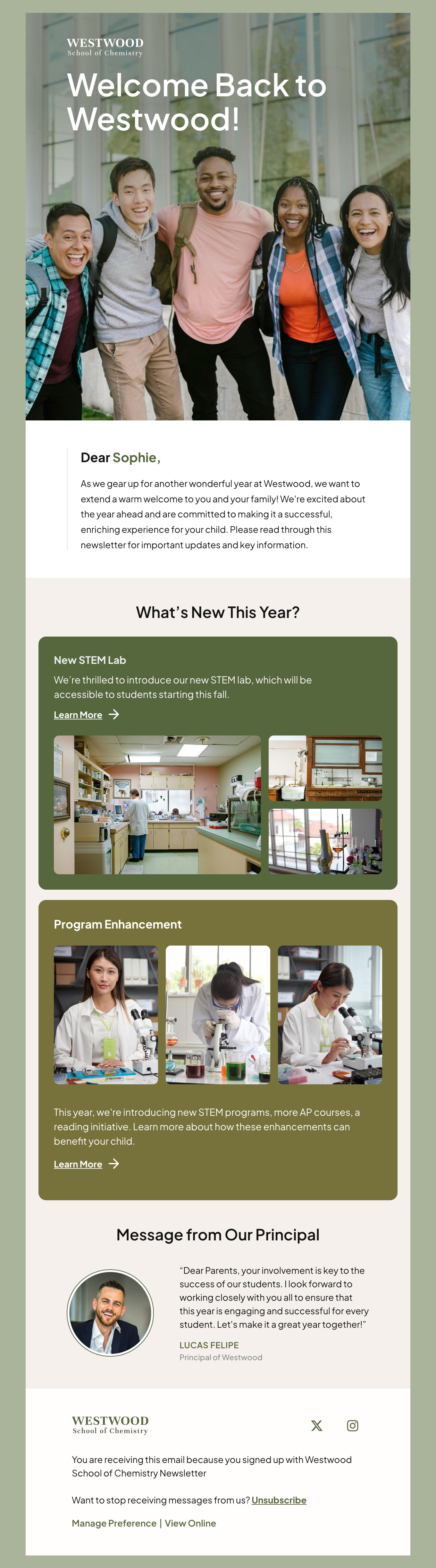
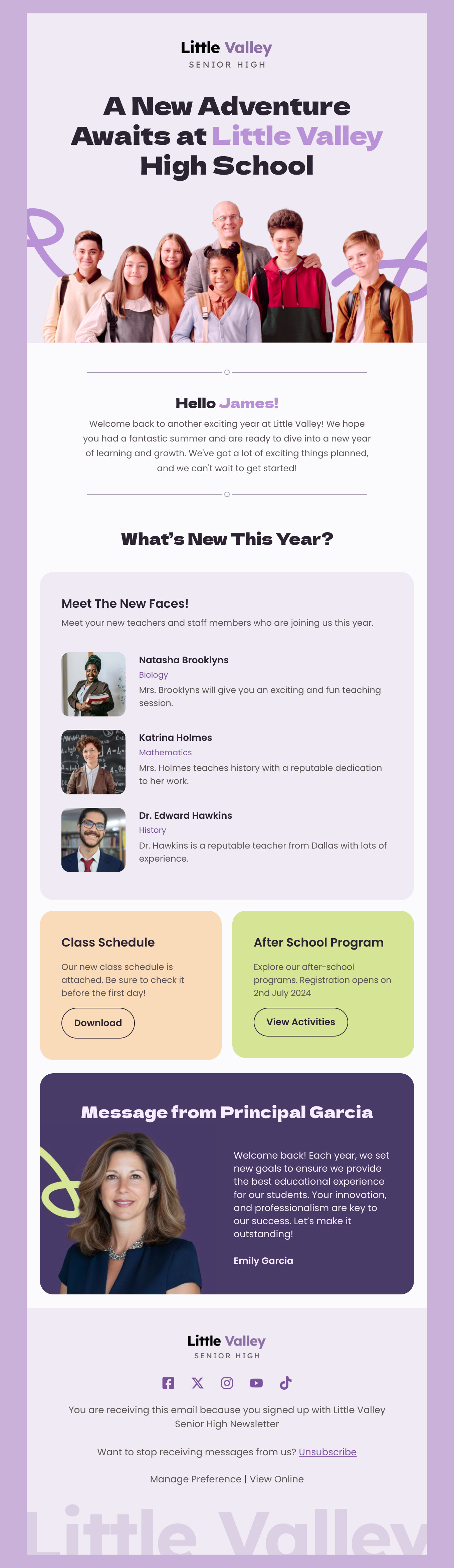
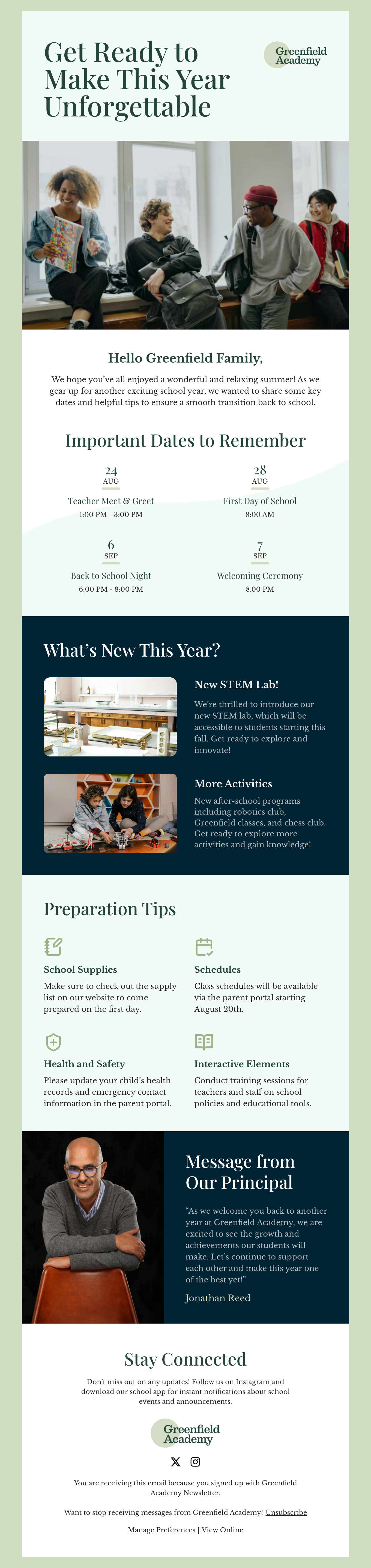
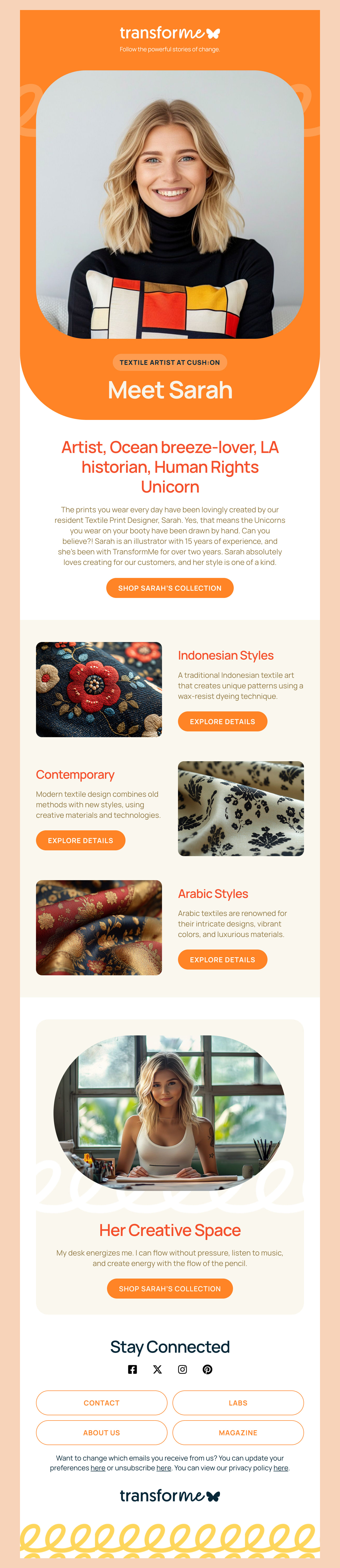
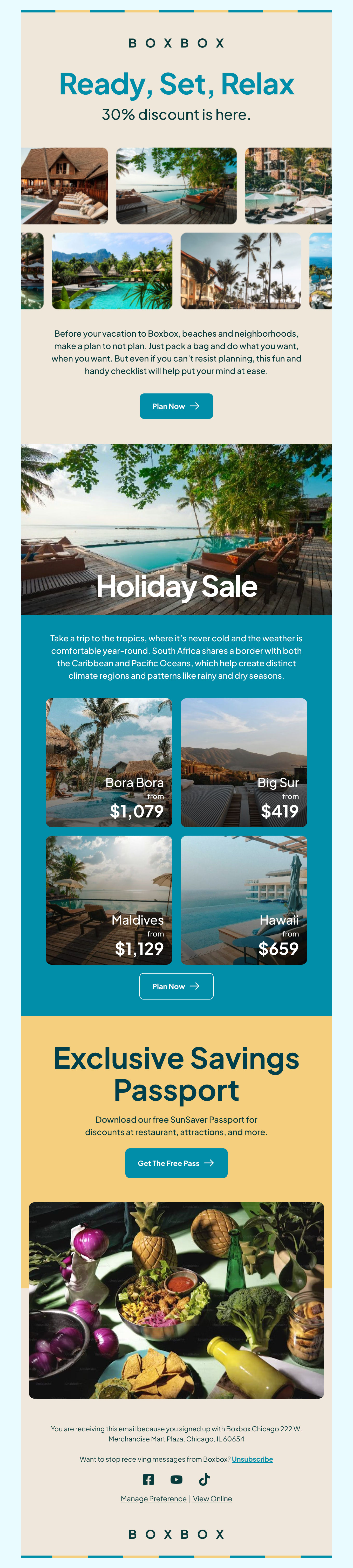
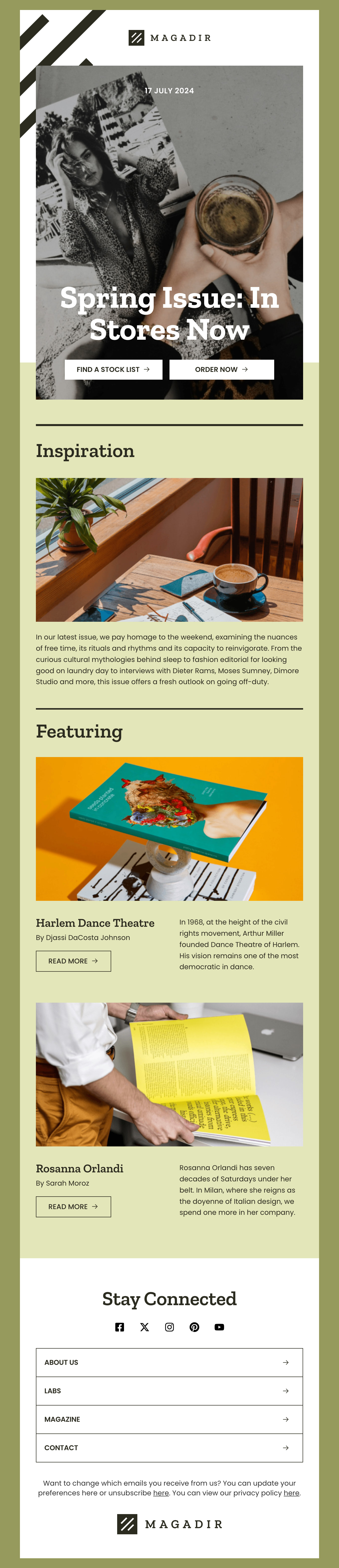
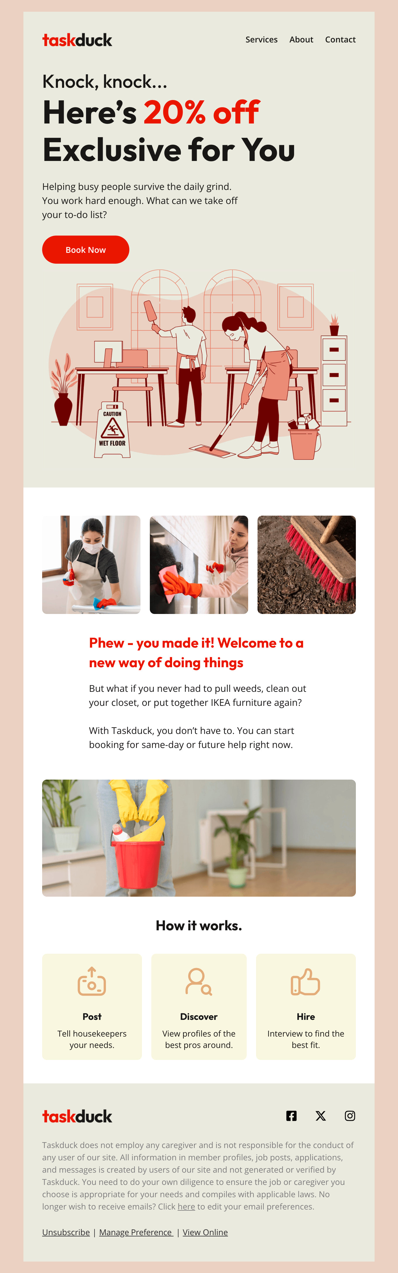
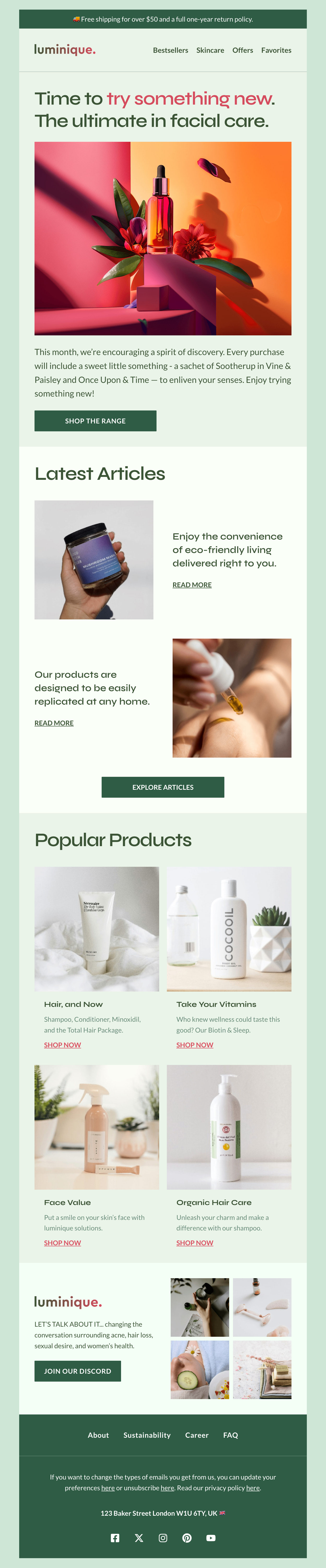
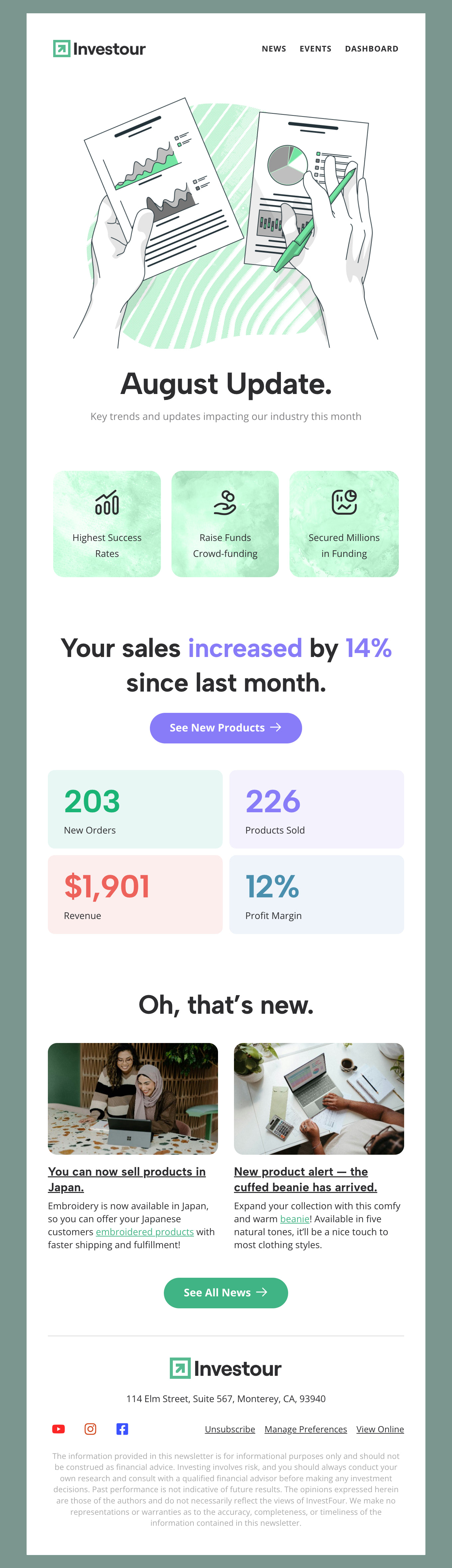
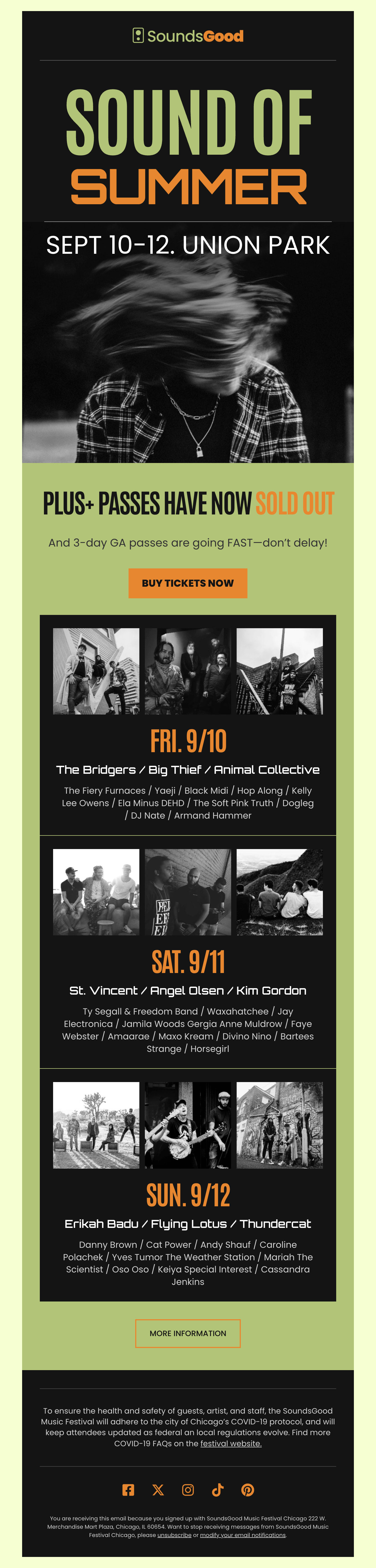
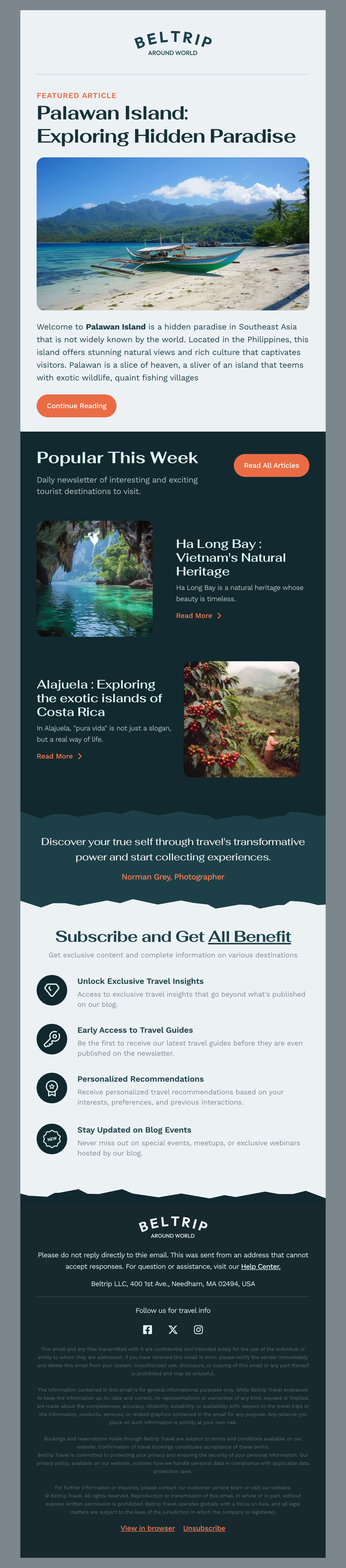
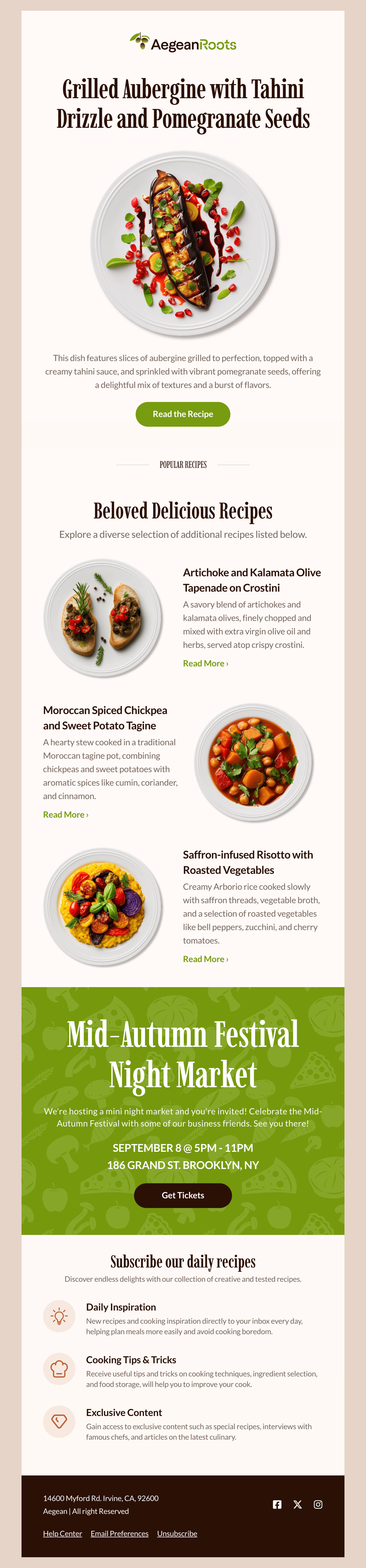
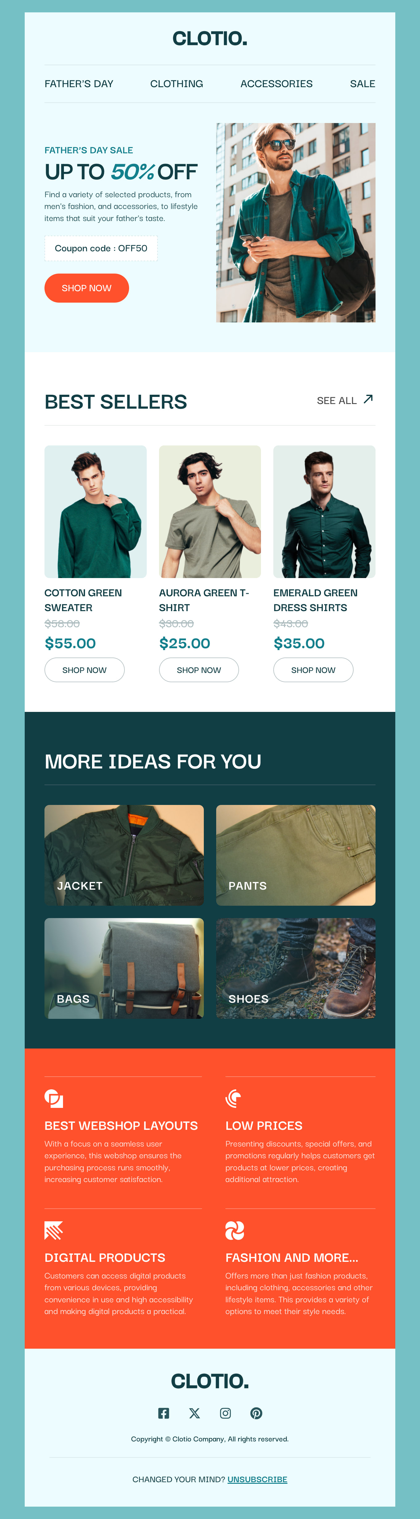
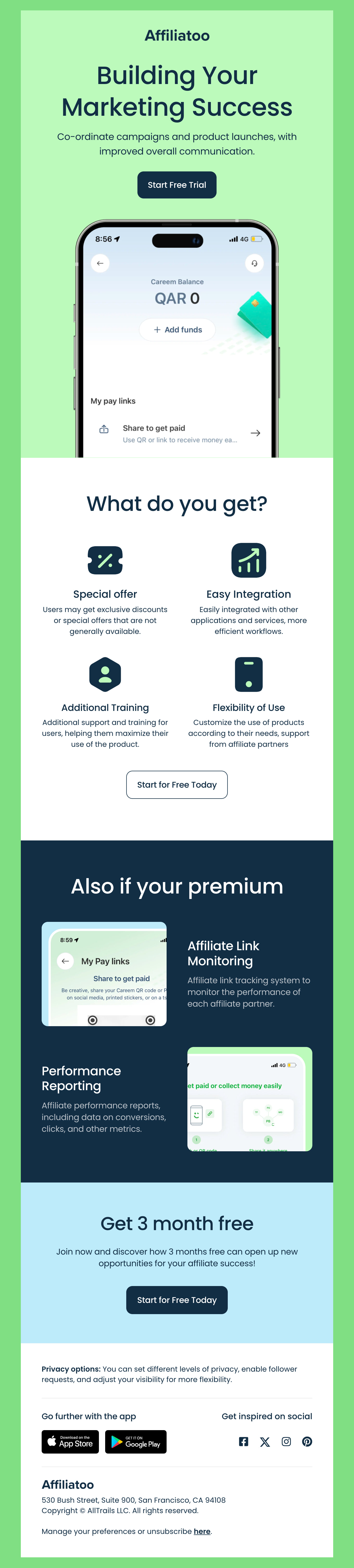
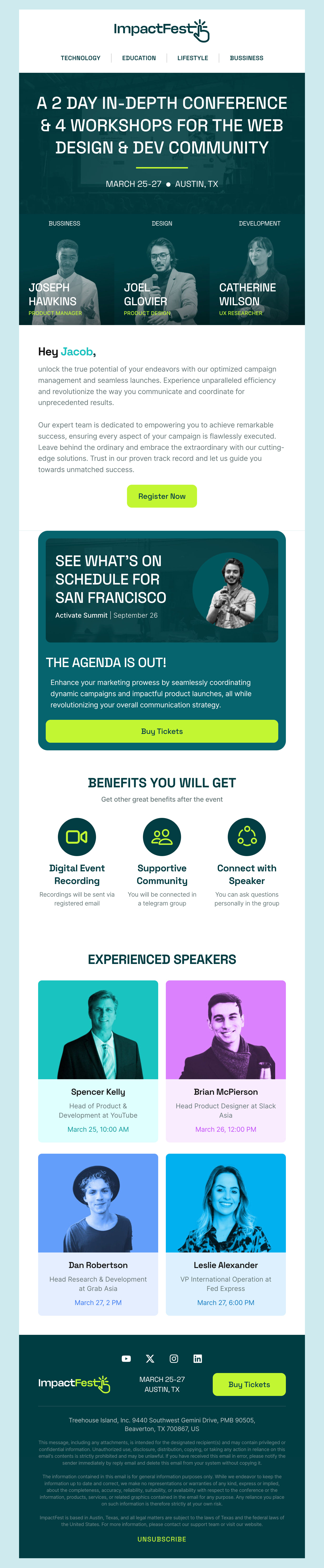
A newsletter format that works almost everywhere has five parts, in order. A recognisable header - your logo and, if you publish on a schedule, the issue date. One lead story with a single image and a few lines of text. Two or three secondary items, each shorter than the lead. One clear call-to-action. And a footer carrying the two things the law, not the designer, puts there: a postal address and a way to unsubscribe.
That order matters because most subscribers never scroll to the bottom. Whatever you most need people to see belongs in the lead slot, not saved for a finale nobody reaches.
One column, 600 pixels
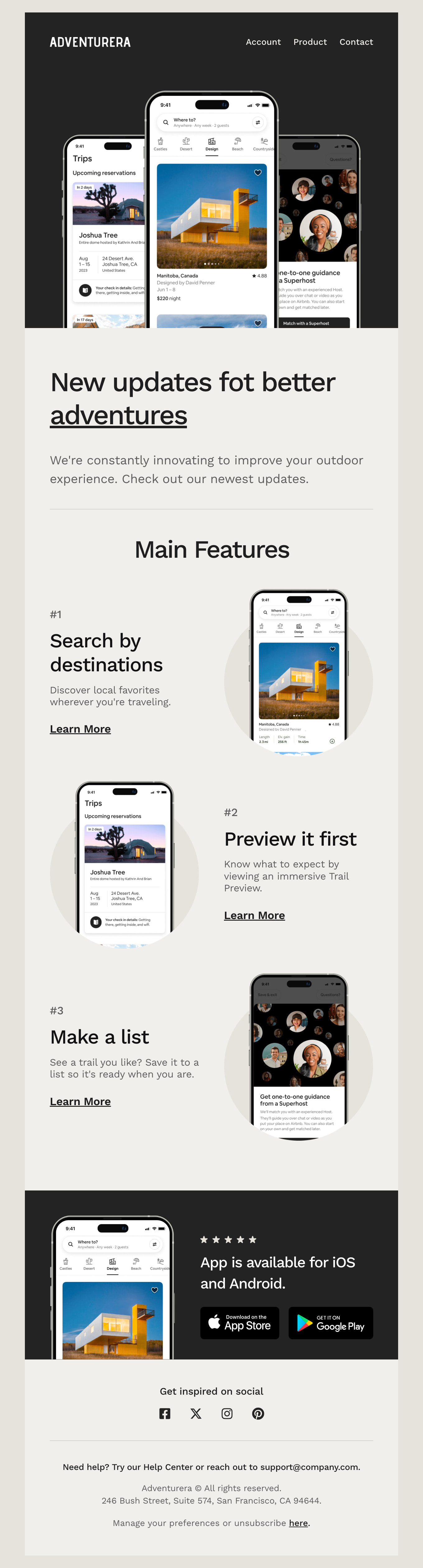
The classic newsletter layout is a single column around 600 pixels wide, and it earns its status: it collapses gracefully on phones, behaves in the desktop clients that punish anything wider, and forces an editorial decision about what actually comes first. Multi-column designs look impressive in a design tool and then fight the phone screen, where every layout becomes one column anyway. If you want visual variety, alternate image-left and image-right story blocks instead - our templates handle that collapse automatically.
Typography and imagery that survive the inbox
Email is a hostile place for fine typography. Keep body text at 14 to 16 pixels, headlines around 22 to 28, and line length short. Use real HTML text for anything that matters: subscribers with images switched off should still get your whole story, so images are for illustration, never for headlines or offers. One good image per story beats a collage - and every image needs alt text, both for accessibility and for the moment it fails to load.
Design for dark mode before you send
A growing share of your list reads in dark mode, where clients invert backgrounds and can turn a transparent dark logo invisible. Give logos and icons a background, avoid text baked into images, and send yourself a test in both modes. It is a two-minute check that regularly catches the most embarrassing class of newsletter bug.
Consistency is the real design decision
A newsletter is not a one-off campaign - it is the same email, refreshed. Readers should recognise your issue from the preview pane alone. Pick a template, adjust it to your brand once, and then resist redesigning it every month. Consistency is also what makes the production fast: with the structure settled, each issue is content, not design work.
Newsletter Ideas, Examples and a Sending Rhythm That Lasts
The hardest part of a newsletter is rarely the design - it is issue number four, when the initial enthusiasm has worn off and the blank page is back. The fix is a repeatable recipe: a handful of recurring segments you fill each time, rather than a fresh invention every issue.
Newsletter content ideas that keep working
For a shop: new arrivals, one product story told properly, a customer photo or review, and one offer. For a service business: one useful tip, a recent project, an answer to a question clients keep asking. For a publication or blog: your best piece since the last issue, a roundup of three links with one-line summaries, one recommendation. For a company or internal newsletter: one plain-spoken update from leadership, team news, and the dates people actually need. Notice the pattern - every recipe has one lead item and a few small ones, which is exactly the layout structure described on the left.
Simple newsletter templates beat clever ones
If you are choosing between a minimal design and a rich one, the simple newsletter template is usually the right call. It loads fast, holds up across the major email clients, reads well in dark mode, and does not compete with your content. Save the elaborate design for campaigns; the newsletter wins on rhythm and recognisability, not spectacle. Digital newsletters that feel like a note from a person tend to outperform ones that feel like a brochure.
Monthly is a strategy, not a compromise
A monthly newsletter template you actually fill every month beats a weekly ambition you abandon by spring. Monthly suits most small businesses; fortnightly or weekly make sense once the content genuinely exists. Whatever rhythm you pick, send on the same day each cycle - a newsletter that arrives predictably trains readers to expect it, and consistent engagement is also what mailbox providers reward with better inbox placement.
Start from a working example
Every template in the gallery above is a complete, working newsletter example - real structure, real content patterns, tested rendering. Pick the one closest to your recipe and make it yours. If your newsletter leans toward a specific job, start in the matching collection instead: welcome emails for new subscribers, promotional emails for launches and sales, order confirmations and thank-you emails for the transactional side, or event emails when there is a date to fill.
Exporting is one click whether you send with Gmail, Outlook, Mailchimp, HubSpot, ActiveCampaign or Zoho Campaigns - every template exports as standard HTML, tested across the major clients. For a deeper walk through the craft itself, The Ultimate Email Design Guide covers everything this page could not.